Gather tools & build easel: Aesthetics
1 Introduction
Before you read this page, we recommend that you understand both the introductory graphics page and the illustrative example.
In this “Details” section of the “Graphing” section of the site, we go through many examples of building a graph while conforming to the following process:

The steps demonstrated in this page are the first two:
- Gather data
-
Select and calculate the data that are needed for the graph
- Build the easel
-
Define how the included columns will be represented in the graph (through aesthetics and facets)
We are drawing the (imperfect) analogy with the painting process. In the following pages, you will see how to paint, construct the frame, and refine the graph with themes and colors.
You might think of these steps of gathering data and building the easel as defining the universal architecture of the graph. It tells R how which data is going to be represented in what way (axis, color, shape, etc.). The information you enter here will apply throughout the graph.
2 Structure
The basic structure of ggplot() is as follows:
Since the x and y arguments are basically always included in that order, you can simplify the formatting in this way:
Each of these arguments can be used to specify a different way to represent a column in a graph. Since a facet can represent one or two columns, a ggplot can represent up to seven different columns! One has to do this with care, as that amount of information within one graph can become quite overwhelming. Sometimes we will use multiple dimensions to represent one column to make it easier to discern that column’s effects.
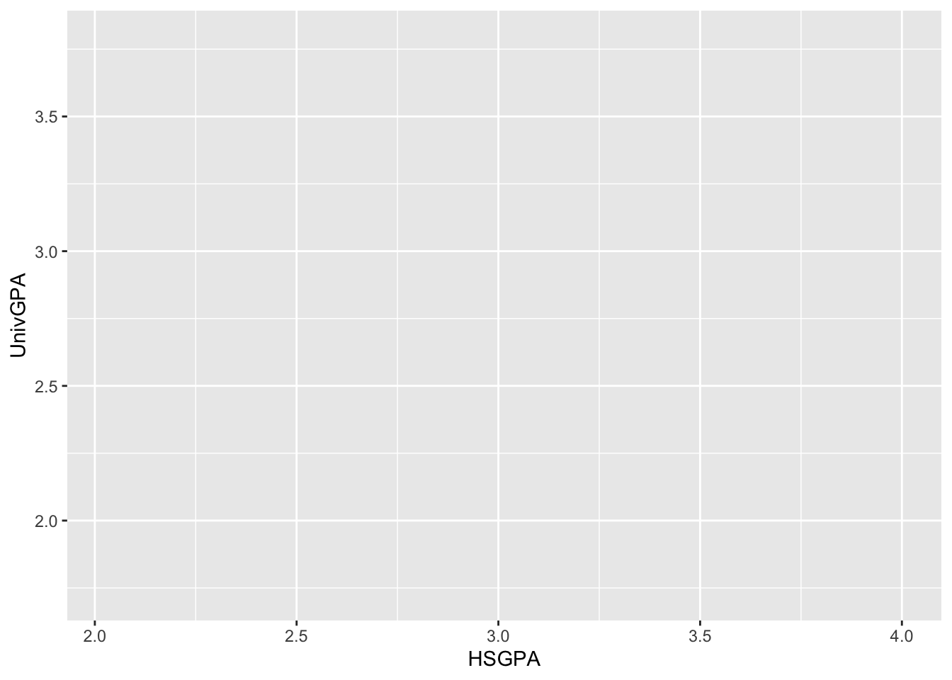
Realize that you aren’t actually plotting anything at this stage! You are merely laying the foundation in the proper way for the data to be plotted (once one of the geometries is specified).
2.1 Arguments for aes()
x-
the data specifying the x-coordinate
y(almost always included)-
the data specifying the y-coordinate
color(optional)-
the data specifying the color of what is going to be plotted (a line, a point, a bar, etc.)
fill(optional)-
the data specifying the fill of what is going to be plotted (usually a bar or shape of some type). This option only makes sense for a few geometries.
size(optional)-
the data specifying the size of what is going to be plotted. Similar to
fill, this only makes sense for a few geometries.
2.2 Specification of facet_X()
The idea behind faceting is that ggplot creates a separate graph for each value of a column (or two columns). This can be useful in the following situation. Suppose that you have created a graph for several sets of data but that single graph is simply too crowded for the reader to discern any pattern. By using faceting, the analyst can create the same graph for each set of data, thus facilitating the comparison of that data.
Here are the two forms of faceting:
facet_wrap(~col)-
This function creates a separate graph (as specified by the
aes()call) for each value ofcol. (Example.) facet_grid(col-across-top ~ col-down-side)-
This function creates a separate graph (again, as specified by the
aes()call) for each combination of the value ofcol-across-topandcol-down-side. (Example.)
You will see below that you can easily and quickly move a column from representation within the aes() call to representation within a facet_X() call. This facilitates experimentation so that the analyst can build the move informative graph possible.
For an in-depth look at facets, you can’t do much better than this book.
3 Examples
The examples on this page are organized by the type of columns that are represented in a graph (discrete, continuous, ordered). Within each section, we provide several different examples of how those types of columns might be represented in a graph.
When the data needed is more than a set of fields from a single data frame, we define a new data frame and print it out so that the reader can see what data ggplot is working with.
Further, at the end of each section, we provide a link to the geometries page so that the reader can see how the definition of each graph evolves with additional ggplot functions.
3.1 1 discrete (with implicit count)
3.1.1 Single stacked bar: x (constant), y (implicit count), fill + bar()
This is essentially the simplest graph that ggplot can render. It is used when the analyst wants to show the distribution of discrete values across one column. R will display one stacked bar.
Next stage: geometries
3.1.2 Bar graph showing distribution: x, y (implicit count) + bar()
This is another way (in addition to the previous graph) for the analyst to display the distribution of values across a discrete column. It relies on calling the geom_bar() function to get R to count up the values implicitly.
Note that the x-axis has the two values that the Sex column takes. The y-axis doesn’t have any identification yet though it represents the count for each Sex; we can fix this missing y-axis label in a later step.
Next stage: geometries
3.2 1 continuous
3.2.1 Histogram for continuous column: x + histogram()
The histogram() function is another one for which R does much of the calculating. R automatically counts up the number of times that Age (which must contain a continuous column) takes on values within its range. All you have to do when defining its aes() function is to define the column for which you want to calculate a histogram. The details of the histogram will come in the next stage.
Next stage: geometries
3.3 2 discrete
3.3.1 Stacked bar: x, y (implicit count), fill + bar()
We want a representation of the responses for each question so that we can see which questions have better response profiles. This graph is going to be a stacked bar chart, one for each question. Each response will be distinguished by a different fill color.
You might notice that the x-axis labels are a bit crowded. We will be able to fix this later in the process; don’t worry about it at this stage.
Next stage: geometries
3.3.2 Grouped bar: x, y (implicit count), fill + bar()
This graph will represent the mix of genders for each race (across the x-axis). This is essentially the same aes() as the previous graph but, in this case, we will generate a grouped bar graph. Since we are planning to use the geom_bar() function, we do not have to either set the y-axis or calculate the appropriate counts.
You can see the version that uses an explicit count to create the same graph here.
Next stage: geometries
3.3.3 Facet wrap around grouped bar: x, y (implicit count), fill (redundant), facet + bar()
This graph presents the same information as the graph just above but, in this case, the bar graphs for each Race have been separated into a different chart. We did this by moving Race from the x-axis to a facet_wrap (and adding Sex to the x-axis while keeping it as the fill).
We will use this query in several places in this document, so let’s go ahead and save it as a data frame:
student_econ_ABHW <-
  student_econ |>
    filter(Race %in% c("A", "B", "H", "W")) |>
    select(Race, Sex)
student_econ_ABHW
# A tibble: 1,955 × 2
Race Sex
<fct> <fct>
1 W M
2 A M
3 W M
4 W M
5 H M
6 W M
7 W M
8 B M
9 H M
10 W M
# ℹ 1,945 more rowsNow, let’s define the appropriate aes() and facet.
Next stage: geometries
3.3.4 Failed plot: x, y + point()
This is a plot that we’re including simply to show you what happens when you haven’t fully thought through the different data-gathering needs for different geom selections.
Next stage: geometries
3.4 1 discrete, 1 continuous
In every example in this section, you will find two columns named in the aes() and facet_X() (if it is used) calls. Sometimes a column might be named 2 or more times, but exactly two different columns will be included.
3.4.1 Point plot of averages: x, y + point()
This is another graph that we’re including as a negative example.
surveyQAvg <-
  survey |>
    group_by(Question) |>
    summarize(Avg = mean(NumResp)) |>
    select(Question, Avg)
surveyQAvg
# A tibble: 10 × 2
Question Avg
<ord> <dbl>
1 TooDifficult 2.99
2 NotRelevant 2.73
3 PoorTeaching 3.42
4 UnsuppFac 3.28
5 Grades 3.02
6 Sched 4.00
7 ClassTooBig 2.52
8 BadAdvising 2.33
9 FinAid 3.83
10 OverallValue 4.11Next stage: geometries
3.4.2 Bar chart of averages: x, y + col()
geom_col() differs from geom_bar() in that it requires that you do the calculation for it; that is, you have to supply both the x and the y values.
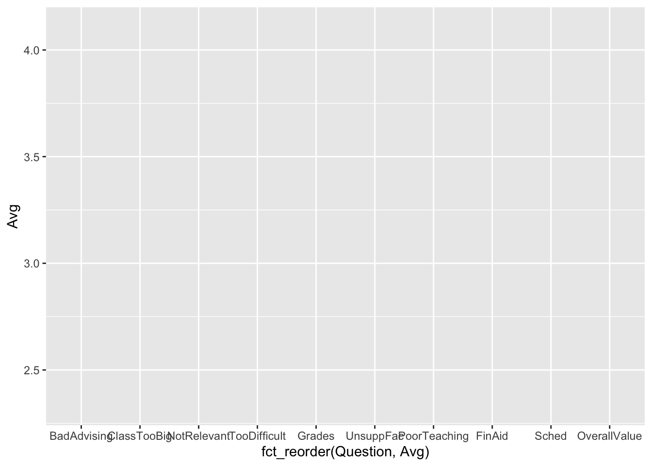
Let’s set up the graph with aes() so that we can plot it with col() later. Notice that the y-axis has values that range from just less than 2.5 to just over 4.0. R is getting the “easel” ready to plot the values.
Next stage: geometries
3.4.3 Bar chart with sorted averages: x (reordered), y + col()
In some instances, it’s useful to see a chart with bars in order by question (such as this previous version); however, in this case, we want to put the bars in order by their height/value.
x-axis-
You’ll notice that the questions on the
x-axisare not in the same order as they were before. The argumentfct_reorder(Question, Avg)tells R to useQuestionas thex-axisbut to put them in (increasing) order by the value ofAvg. y-axis-
As you might have expected, the
y-axishas the same range of values that are appropriate forAvg.
Next stage: geometries
3.4.4 Boxplot reliant on other variable: x, y + boxplot()
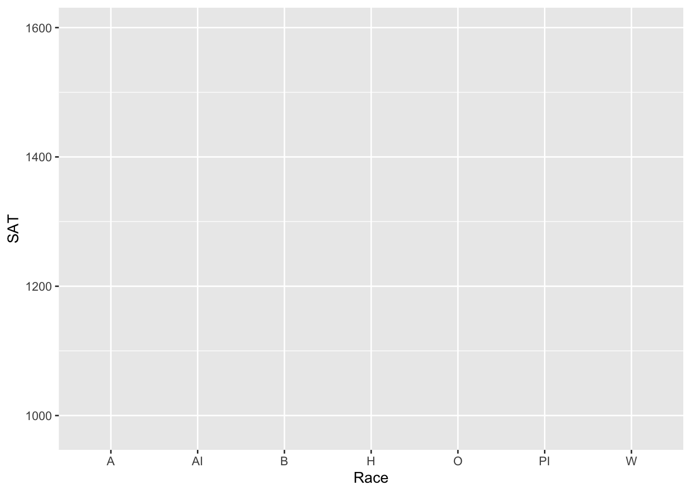
In this section, we are creating two boxplot graphs based on two different data sets. With a boxplot graph, you need to specify a discrete column (with just a few values) for the x-axis and a continuous column for the y-axis. The point of this type of graph is to see if the distribution of values for some continuous column varies depending on the value of the discrete column.
Given this aes(), you should see the different Race values along the x-axis and the appropriate range of SAT values along the y-axis.
For the next several graphs, we are going to use the same data, so let’s create a new dataset for it:
admitdatagenderMFgpa <-
  admitdata |>
    select(HSGPA, UnivGPA, GraduationYear, Gender) |>
    filter(UnivGPA > 0 & GraduationYear != 0 &
           Gender %in% c("Male", "Female"))
admitdatagenderMFgpa
# A tibble: 9,753 × 4
HSGPA UnivGPA GraduationYear Gender
<dbl> <dbl> <chr> <fct>
1 2.89 2.47 2012-13 Male
2 3.05 2.73 2012-13 Male
3 3.36 2.78 2012-13 Male
4 3.25 3.18 2012-13 Male
5 3.07 2.52 2012-13 Female
6 3.07 3.13 2012-13 Female
7 3.57 3.04 2012-13 Female
8 3.55 3.44 2012-13 Female
9 3.31 3.00 2012-13 Male
10 3.09 3.07 2012-13 Female
# ℹ 9,743 more rowsWe filter() on UnivGPA and GraduationYear in the way that we do in order to ensure that we are only choosing data for graduates. If we had wanted to look at all students, then we would have simply filtered on Gender as we did.
If we want to create a chart that shows all the values of Gender, then we should use the following data frame.
admitdatagendergpa <-
  admitdata |>
    select(HSGPA, UnivGPA, GraduationYear, Gender) |>
    filter(UnivGPA > 0 & GraduationYear != 0)
admitdatagendergpa
# A tibble: 10,600 × 4
HSGPA UnivGPA GraduationYear Gender
<dbl> <dbl> <chr> <fct>
1 2.89 2.47 2012-13 Male
2 3.05 2.73 2012-13 Male
3 3.36 2.78 2012-13 Male
4 3.25 3.18 2012-13 Male
5 3.07 2.52 2012-13 Female
6 3.07 3.13 2012-13 Female
7 3.57 3.04 2012-13 Female
8 3.55 3.44 2012-13 Female
9 3.31 3.00 2012-13 Male
10 3.09 3.07 2012-13 Female
# ℹ 10,590 more rowsThis data looks like what we want. Let’s continue with graphing.
Given the following aes(), you should see the Gender values (Male and Female, in this case) along the x-axis and the appropriate range of UnivGPA values on the y-axis.
Next stage: geometries
3.4.5 Violin chart reliant on other variable: x, y + horizontal violin()
In this chart, we want to show how the value of a continuous column changes with the value of a discrete column. This is very much like the situation in which you might use a boxplot; however, with the violin geometry, we can show the actual distribution of the values of the continuous column.
The aes() is set up just as it is for a boxplot (see this graph). For both of the next two graphs, we are going to display the violin graph horizontally, but this is handled at a later stage. For now, let’s set up the first graph with Gender on the x-axis and UnivGPA as the continuous column on the y-axis.
The only difference between this graph and the previous one is that we have added fill as a redundant encoding for Gender. This will make it easier to identify each specific violin plot. (You will see this later.) Note, however, that we still are only calling on two columns in building this graph.
Next stage: geometries
3.5 2 discrete, 1 continuous
3.5.1 Grouped bar (x, y, fill + col())
For the first eight graphs in this section, we are going to use data for survey. We will be displaying the number of students who chose each response to each question for the survey. Here is the calculation:
surveyQRN <-
  survey |>
    group_by(Question, Response) |>
    summarize(n = n()) |>
    select(Question, Response, n)
surveyQRN
# A tibble: 50 × 3
# Groups: Question [10]
Question Response n
<ord> <chr> <int>
1 TooDifficult Agree 5956
2 TooDifficult Disagree 5917
3 TooDifficult Neutral 9052
4 TooDifficult Strongly Agree 2914
5 TooDifficult Strongly Disagree 3040
6 NotRelevant Agree 4898
7 NotRelevant Disagree 7335
8 NotRelevant Neutral 7271
9 NotRelevant Strongly Agree 2465
10 NotRelevant Strongly Disagree 4933
# ℹ 40 more rowsThis and the following graphs will work if the x and y columns are discrete (or, better, factors). In this first one, the values of Question are on the x-axis and the count (n) of the number of respondents is on the y-axis. Again, for this graph and the following, do not worry about the overlapping values on the x-axis; we take care of these in a later step.
Another example, now with Race across the x-axis:
student_econ |>
  group_by(Race, Sex) |>
  summarize(Count = n()) |>
  ggplot(aes(Race, y = Count, fill = Sex))
Next stage: geometries
3.5.2 Facets around bar charts (x, y, facet + col())
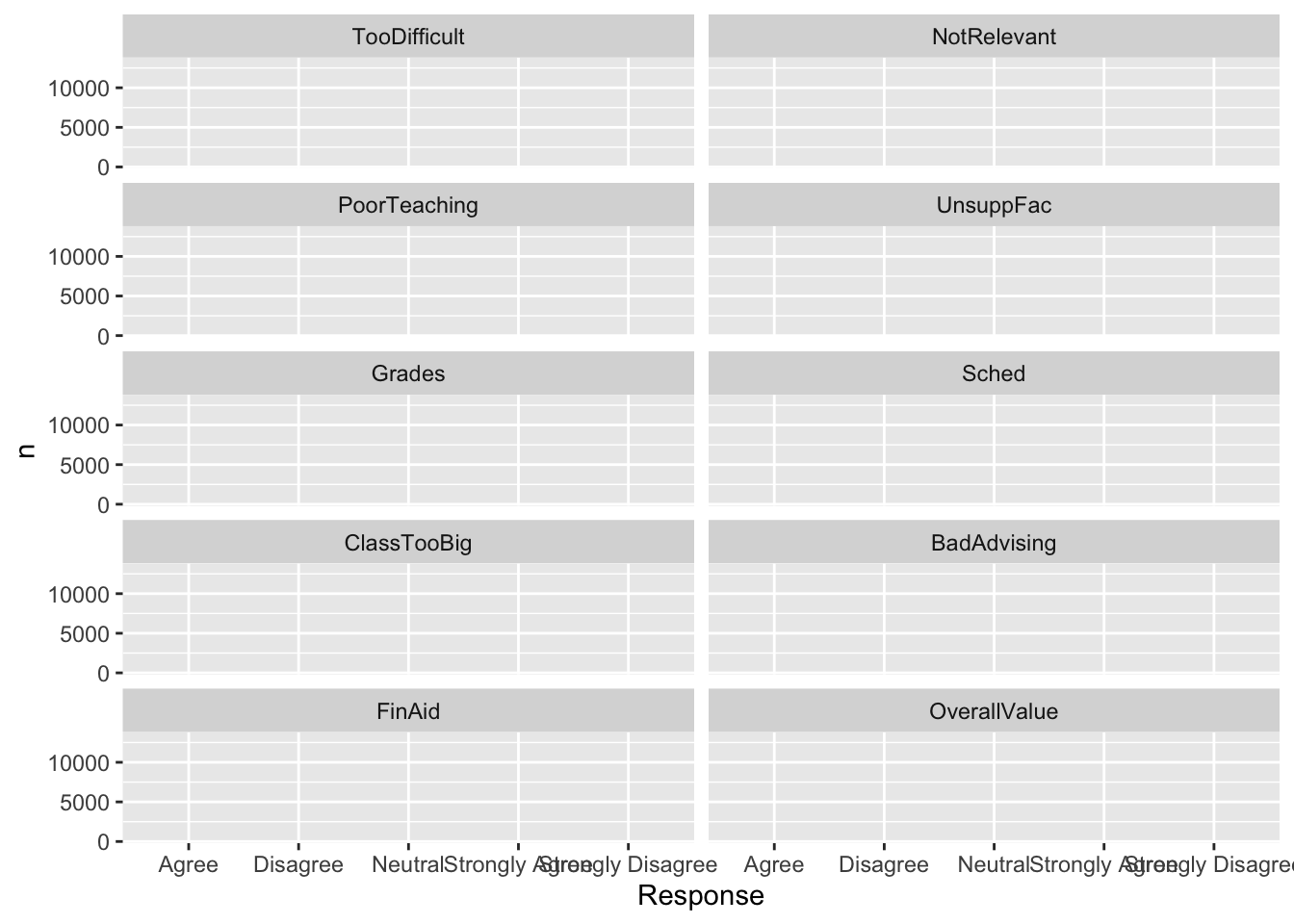
This displays the exact same information as the previous graph. The difference is that the Question column has been moved from the x-axis to the facet; that is, there will be a separate graph for each separate value of Question. Note that we have told R to put the graphs in two columns with ncol. If we had wanted to specify the number of rows, we would have used nrow.
For the labels on the x-axis in this graph, we will have to work especially hard to display these values because of the limited space. We will handle this in a later step.
Next stage: geometries
3.5.3 Facets around horizontal bar (x, y, facet + col())
This also displays the exact same information as the previous graph but with the bar chart presented horizontally. The mechanism to make it do so is quite subtle: Make the discrete column the y-axis and the continuous count column the x-axis — ggplot will take care of the rest for you.
Notice that we also used the ncol argument in facet_wrap to ensure that the separate facets are displayed five on each row.
Note that the Responses on the y-axis are in alphabetical order. Don’t worry about this yet; since Responses is a factor, it will be taken care of in later stages by R.
Next stage: geometries
3.5.4 Grouped bar, narrowed width of bars (x, y, fill + col())
In this graph (and the next few), we want to go back to the graph being created in this section. We will be narrowing each group of bars so that they become a bit separated from each other.
This detail is specified within the geom_col(). Nothing needs to be done differently in the aes() call. Thus, this statement is exactly the same as it is above.
Next stage: geometries
3.5.5 Grouped bar, narrowed & overlapping bars (x, y, fill + col())
In this graph, we will be narrowing the group of bars and setting them to overlap.
This detail is specified within the geom_col(). Nothing needs to be done differently in the aes() call. Thus, this statement is exactly the same as it is above.
Next stage: geometries
3.5.6 Grouped bar, narrowed & spaced bars (x, y, fill + col())
In this graph, we will be narrowing the individual bars and providing a little space in-between each one of them (as well as space between the groups of bars).
This detail is specified within the geom_col(). Nothing needs to be done differently in the aes() call. Thus, this statement is exactly the same as it is above.
Next stage: geometries
3.5.7 Stacked bar (x, y, fill + col())
This graph is identical to one we generated earlier using geom_bar() for which the y-axis value is implicitly calculated by R.
Again, though, note that this graph represents the same information as the previous graph.
Next stage: geometries
3.5.8 Percent Stacked bar (x, y, fill + col())
This graph looks quite similar to the previous one but the y-axis differs quite significantly — the values are going to represent percent of total responses. This change is handled by the call to geom_col(), so we do not see anything different at this stage.
Next stage: geometries
3.5.9 Bar chart wrapped by a facet: x, y (implicit count), fill (redundant), facet + bar()
With this graph, we want to see the distribution of Sex for each Race. With the approach here, we are going to have separate graphs for each Race with Sex on the x-axis. The count will be on the y-axis.
Next stage: geometries
3.5.10 Column chart wrapped by facets: x, y (explicit count), facet + col()
For the next couple of graphs, we want to have the count of students by Race and Sex. We will build an equivalent graph as in the above graph, but count the students explicitly.
student_RaceSexCount <-
  student_econ_ABHW |>
    group_by(Race, Sex) |>
    summarize(Count = n()) |>
    select(Race, Sex, Count)
student_RaceSexCount
# A tibble: 8 × 3
# Groups: Race [4]
Race Sex Count
<fct> <fct> <int>
1 A F 66
2 A M 70
3 B F 129
4 B M 114
5 H F 214
6 H M 189
7 W F 646
8 W M 527This graph lays out the graph in the same way as the previous one: a separate graph for each Race, Sex on the x-axis, and Count on the y-axis.
Next stage: geometries
3.5.11 Colored column chart wrapped by facets: x, y (explicit count), fill (redundant), facet + col()
This graph uses the same data as the previous graph and nearly the same ggplot(). The only difference is that we have added fill=Sex so that each bar has a unique color for each separate value in the Sex column.
Next stage: geometries
3.5.12 Boxplot differentiated by 2 other columns: x, y, color + boxplot()
We are going to build several graphs using the following query, so we are going to save it to a new data frame. We are choosing a subset of IPEDSRaceEthnicity plus PellStatus (discrete) and UnivGPA (continuous).
admitdataRaceGPAPell <-
  admitdata |>
    filter(IPEDSRaceEthnicity %in% c("White", "HisLat",
                                     "BAA", "Asian")) |>
    select(IPEDSRaceEthnicity, UnivGPA, PellStatus)
admitdataRaceGPAPell
# A tibble: 16,588 × 3
IPEDSRaceEthnicity UnivGPA PellStatus
<fct> <dbl> <fct>
1 BAA 2.47 No
2 BAA 2.73 Yes
3 White 2.67 No
4 White 2.78 Yes
5 White 3.25 No
6 White 3.18 No
7 White 2.18 No
8 White 2.52 Yes
9 HisLat 3.13 No
10 White 3.04 No
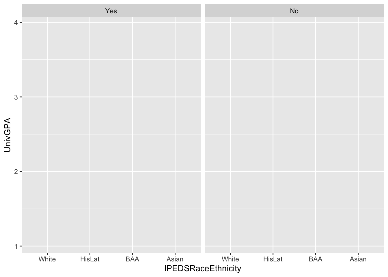
# ℹ 16,578 more rowsWe are going to build a more complex graph here. It will have a pair (one for each value of PellStatus) of boxplots for each value in IPEDSRaceEthnicity. The goal is to show the distribution of UnivGPA (the y-axis column) for each combination of race and Pell status.
Next stage: geometries
3.5.13 Colored boxplot differentiated by 2 other columns: x, y, fill + boxplot()
This graph displays the same information as the previous graph; however, in this case, we are differentiating by fill and not color. Note that we would not want to make color also depend on PellStatus because the contrasting color of the line in the boxplot is needed to show the median value in the distribution.
Next stage: geometries
3.5.14 Boxplot differentiated by one column and wrapped by another: x, y, facet + boxplot()
Again, this graph displays the same information as the previous two graphs. In this case, we have moved PellStatus from color or fill to facet_wrap(). Thus, there is going to be a separate graph for each value of PellStatus with the values of IPEDSRaceEthnicity on the x-axis.
Next stage: geometries
3.5.15 Horizontal boxplot differentiated by one column and wrapped by another: x, y, facet + horizontal boxplot()
And finally, this graph displays the same information as the previous three graphs. Here we are simply going to rotate the boxplots so that they are horizontal. This is handled by later stages in the process so nothing changes.
Next stage: geometries
3.6 Ordered, continuous, discrete
The graphs in this section demonstrate line graphs. These have a very specific purpose: to display the progression of a value on the y-axis over an ordered set of values on the x-axis. The x-axis is usually some dimension of time (day, week, year).
3.6.1 Line chart: x, y, color + line()
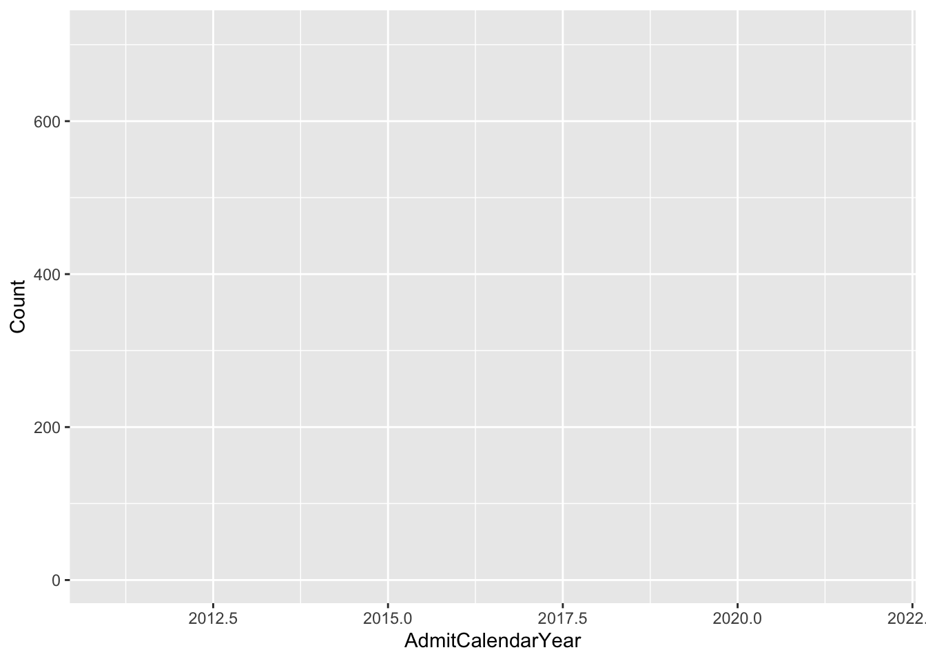
The data that we use in this section is the count of students of each Gender over each AdmitCalendarYear. Let’s calculate that data:
admitdataYearGenderCount <-
  admitdata |>
    select(AdmitCalendarYear, StudentID, Gender) |>
    filter(between(AdmitCalendarYear, 2011, 2022)) |>
    group_by(AdmitCalendarYear, Gender) |>
    summarize(Count = n(),
              .groups = "drop_last")
admitdataYearGenderCount
# A tibble: 48 × 3
# Groups: AdmitCalendarYear [12]
AdmitCalendarYear Gender Count
<dbl> <fct> <int>
1 2011 Male 448
2 2011 Female 473
3 2011 Another 6
4 2011 Unknown 84
5 2012 Male 435
6 2012 Female 584
7 2012 Another 7
8 2012 Unknown 79
9 2013 Male 542
10 2013 Female 710
# ℹ 38 more rowsIn order to display this data, we set the x-axis to AdmitCalendarYear (the ordered column) and y-axis to Count (the number of students). Setting the color attribute to Gender tells R to draw a separate line (with a unique color) for each value of the Gender column.
In this example, we filter data for five separate female names, and then we define the x-axis, y-axis, and color. The final graph should have a similar structure as the previous one.
babynames |>
  filter(Name %in% c("Jennifer", "Teresa", "Karen",
                     "Linda", "Nancy") &
           Sex == "F") |>
  ggplot(aes(x = YearOfBirth, y = Number, color=Name))
Next stage: geometries
3.6.2 Line chart wrapped by facets: x, y, facet + line()
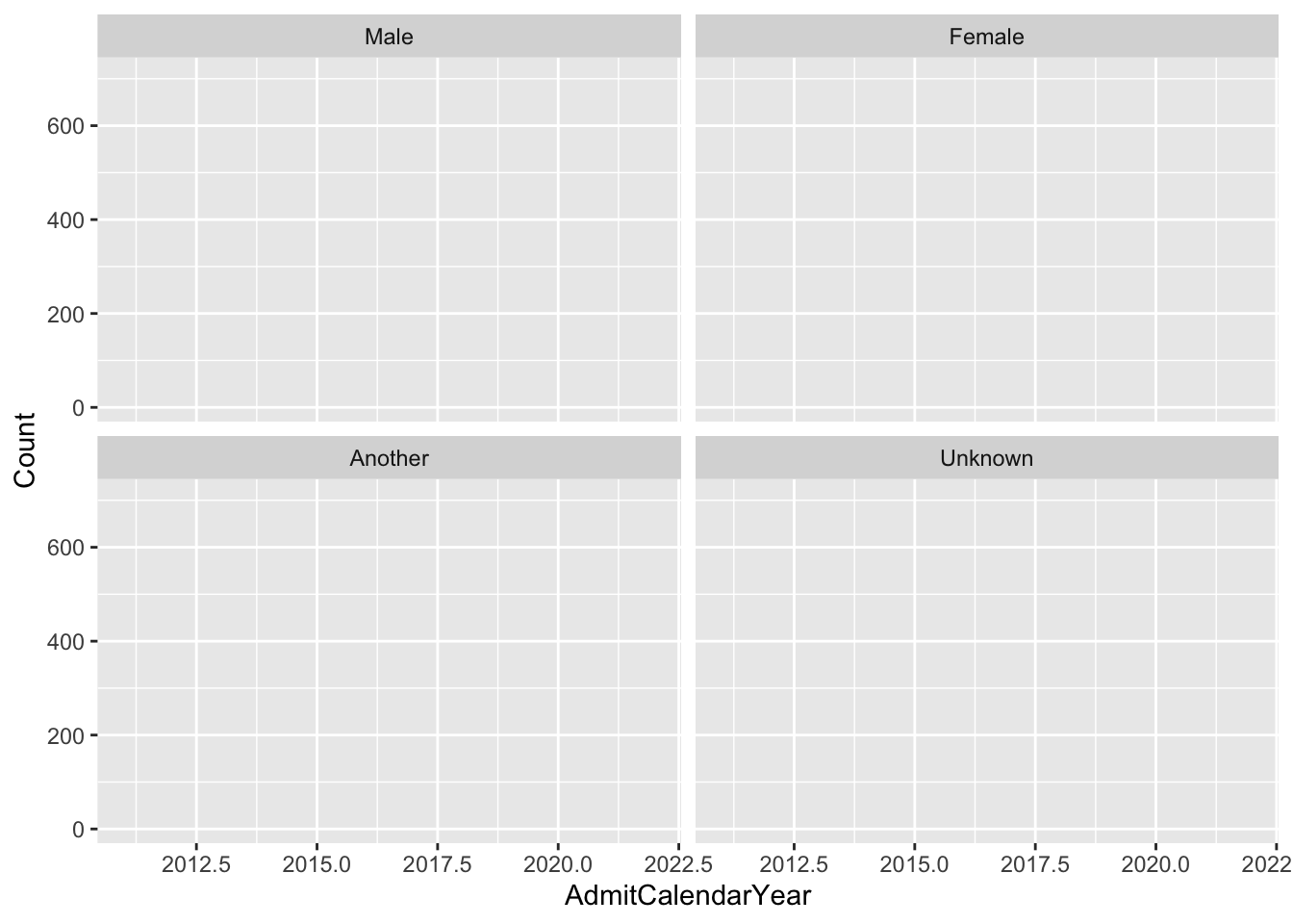
This graph depicts the same data as shown in this graph. The difference is that we have moved Gender from color to facet_wrap(). Thus, instead of separate lines for each value of Gender, we will have separate graphs.
Next stage: geometries
3.7 2 continuous
The graphs in this section depict the relationship for values in two different continuous columns. The result is that, if you are dealing with a large data set, you will need to choose an approach that summarizes the data.
3.7.1 Point plot with fitted line: x, y + point() + smooth()
The graph in the next few sections use the same data, so let’s define a new data frame. We are selecting a few columns for students who have graduated:
admitdataIncGPAGender <-
  admitdata |>
    select(FamilyIncome, UnivGPA, HSGPA,
           GraduationYear, Gender) |>
    filter(UnivGPA > 0 & GraduationYear != 0)
admitdataIncGPAGender
# A tibble: 10,600 × 5
FamilyIncome UnivGPA HSGPA GraduationYear Gender
<dbl> <dbl> <dbl> <chr> <fct>
1 100733 2.47 2.89 2012-13 Male
2 18560 2.73 3.05 2012-13 Male
3 28495 2.78 3.36 2012-13 Male
4 79412 3.18 3.25 2012-13 Male
5 47359 2.52 3.07 2012-13 Female
6 110531 3.13 3.07 2012-13 Female
7 143502 3.04 3.57 2012-13 Female
8 94088 3.44 3.55 2012-13 Female
9 65507 3.00 3.31 2012-13 Male
10 89147 3.07 3.09 2012-13 Female
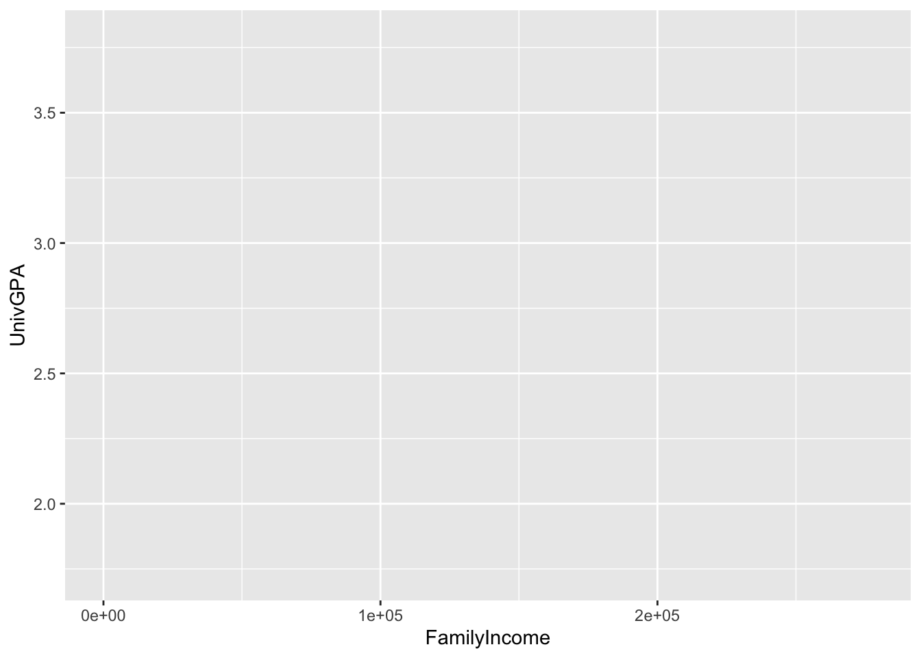
# ℹ 10,590 more rowsHere, we are plotting FamilyIncome on the x-axis and UnivGPA on the y-axis to see if higher final GPA values are associated with a family’s financial position. We will end up plotting individual points plus a regression line to highlight the overall trend.
Next stage: geometries
3.7.2 Hexplot with fitted line: x, y + hex() + smooth()
In this graph, we are going to try to show the same relationship as in the previous graph, but we are taking a different approach with the point plotting. When lots of points are graphed, this approach might better demonstrate the density of points because it can better differentiate in the most dense areas. Here we will end up using the geom_hex() plot instead of geom_point(). For now, the ggplot() looks the same.
Next stage: geometries
3.7.3 Density/2D plot with fitted line: x, y + density_2d() + smooth()
In this graph, we are trying to solve the same problem with the point() plot as the previous graph — differentiating in the most dense area of the plot. In this case, we will use the geom_density_2d() and geom_density_2d_filled() plots to do so. Again, the ggplot() looks the same.
Next stage: geometries
3.7.4 Boxplot based on continuous column: x, y + boxplot()
In this graph, we take a different approach to showing the relationship between FamilyIncome and UnivGPA. First, note that the aes() is the same as the previous graph. However, what we are going to do differently is that we are going to create boxplots showing the distribution of UnivGPA values for different ranges of the values in FamilyIncome.
Next stage: geometries
3.8 2 continuous, 1 discrete
In this section, we are going to demonstrate five different ways to depict the relationship among three columns (2 with continuous values and 1 with discrete). The power of R and the tidyverse really shines here as it becomes simple to move from one version to another during the data exploration phase.
3.8.1 Point plot with fitted line for subsets: x, y, color + point() + smooth()
For the five graphs in this section, we are going to work with data from three columns: HSGPA, UnivGPA, and Gender (specifically, just those rows for "Male" and "Female").
admitdataIncGPAMF <-
  admitdataIncGPAGender |>
    filter(Gender %in% c("Male", "Female"))
admitdataIncGPAMF
# A tibble: 9,753 × 5
FamilyIncome UnivGPA HSGPA GraduationYear Gender
<dbl> <dbl> <dbl> <chr> <fct>
1 100733 2.47 2.89 2012-13 Male
2 18560 2.73 3.05 2012-13 Male
3 28495 2.78 3.36 2012-13 Male
4 79412 3.18 3.25 2012-13 Male
5 47359 2.52 3.07 2012-13 Female
6 110531 3.13 3.07 2012-13 Female
7 143502 3.04 3.57 2012-13 Female
8 94088 3.44 3.55 2012-13 Female
9 65507 3.00 3.31 2012-13 Male
10 89147 3.07 3.09 2012-13 Female
# ℹ 9,743 more rowsFor this graph, we are going to plot every point (of HSGPA vs UnivGPA) and draw a fitted line for each set of points for Gender. (The graph for which the fitted line is drawn against all points can be seen here).
Next stage: geometries
3.8.2 Point plot with fitted line wrapped by facets: x, y, facet + point() + smooth()
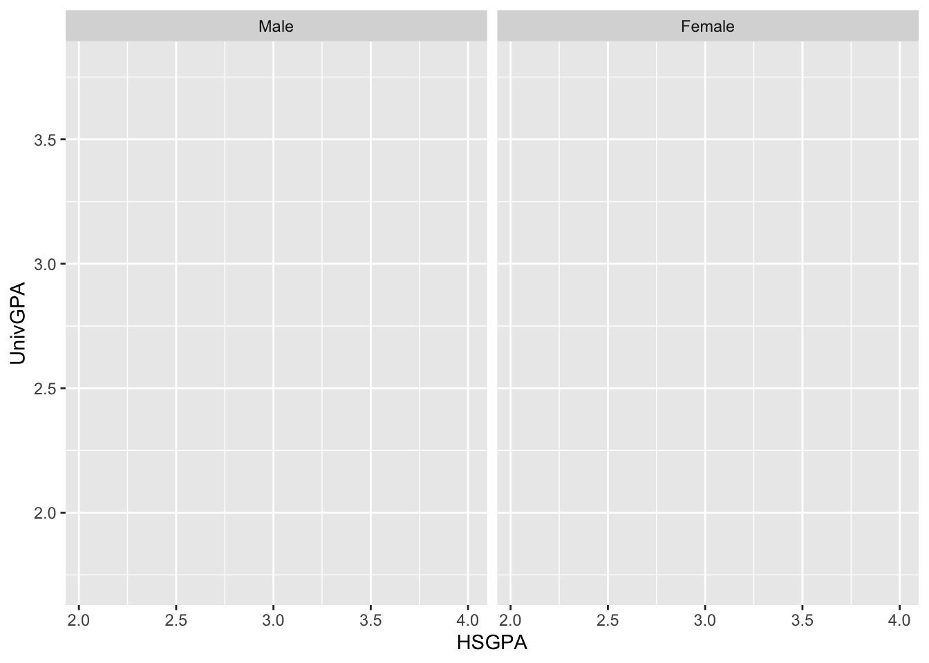
For this graph, instead of plotting all the points and drawing the lines on one graph, we are going to plot the points and draw the lines on two separate graphs, one for each value of Gender. We do this by moving Gender from color to facet_wrap().
Next stage: geometries
3.8.3 Boxplot wrapped by facets: x, y, facet + boxplot()
This graph has the same aes() and facet_wrap() values as the previous graph; however, for this one we are going to draw boxplots for a range of values of HSGPA. As before, R creates two separate graphs because there are two values in the Gender column in this data frame.
Next stage: geometries
3.8.4 Violin plot wrapped by facets: x, y, facet + violin()
Again, this graph has the same aes() and facet_wrap() values as the two previous graphs. In this case, we are going to draw a violin plot for ranges of values of HSGPA. The idea is to get more insight into the actual distribution of UnivGPA values within each subrange.
Next stage: geometries
3.8.5 Jitter plot by subset: x, y, color + jitter()
This graph uses the same aes() as is used in this graph. Thus, we’re going to have the two Gender values on the x-axis and the appropriate range of values for UnivGPA on the y-axis.
Next stage: geometries
3.9 2 continuous, 2 discrete
3.9.1 Point plot with fitted line for subsets wrapped by facet: x, y, color, facet + point() + smooth()
We are going to use this same set of data for five graphs, so let’s save it in a new data frame:
admitdataHSUnivMFMajor <-
  admitdata |>
    select(HSGPA, UnivGPA, GraduationYear,
           Gender, ProbableMajorType) |>
    filter(UnivGPA > 0 & GraduationYear != 0 &
             Gender %in% c("Male", "Female"))
admitdataHSUnivMFMajor
# A tibble: 9,753 × 5
HSGPA UnivGPA GraduationYear Gender ProbableMajorType
<dbl> <dbl> <chr> <fct> <fct>
1 2.89 2.47 2012-13 Male HUMA
2 3.05 2.73 2012-13 Male HUMA
3 3.36 2.78 2012-13 Male HUMA
4 3.25 3.18 2012-13 Male BUSI
5 3.07 2.52 2012-13 Female HUMA
6 3.07 3.13 2012-13 Female STEM
7 3.57 3.04 2012-13 Female BUSI
8 3.55 3.44 2012-13 Female BUSI
9 3.31 3.00 2012-13 Male ARTS
10 3.09 3.07 2012-13 Female ARTS
# ℹ 9,743 more rowsThis is an evolution of this chart.
admitdataHSUnivMFMajor |>
  ggplot(aes(x = HSGPA, y = UnivGPA, color = Gender)) +
    facet_wrap(~ProbableMajorType)
Next stage: geometries
3.9.2 Point plot with fitted line wrapped by a facet grid: x, y, facet_grid + point() + smooth()
This is an evolution of this chart.
admitdataHSUnivMFMajor |>
  ggplot(aes(x = HSGPA, y = UnivGPA)) +
    facet_grid(ProbableMajorType~Gender)
Next stage: geometries
3.9.3 Boxplot wrapped by a facet grid: x, y, facet_grid + boxplot()
This is an evolution of this chart.
admitdataHSUnivMFMajor |>
  ggplot(aes(x = HSGPA, y = UnivGPA)) +
    facet_grid(ProbableMajorType~Gender)
Next stage: geometries
3.9.4 Violin wrapped by a facet grid: x, y, facet_grid + violin()
This is an evolution of this chart.
admitdataHSUnivMFMajor |>
  ggplot(aes(x = HSGPA, y = UnivGPA)) +
    facet_grid(ProbableMajorType~Gender)
Next stage: geometries
3.9.5 Jitter plot for subsets wrapped by a facet: x, y, color, facet + jitter()
This is an evolution of this chart. We have used ncol=4 to tell ggplot to put the facets in four columns.
admitdataHSUnivMFMajor |>
  ggplot(aes(x = Gender, y = UnivGPA, color = HSGPA)) +
    facet_wrap(~ProbableMajorType,
               ncol=4)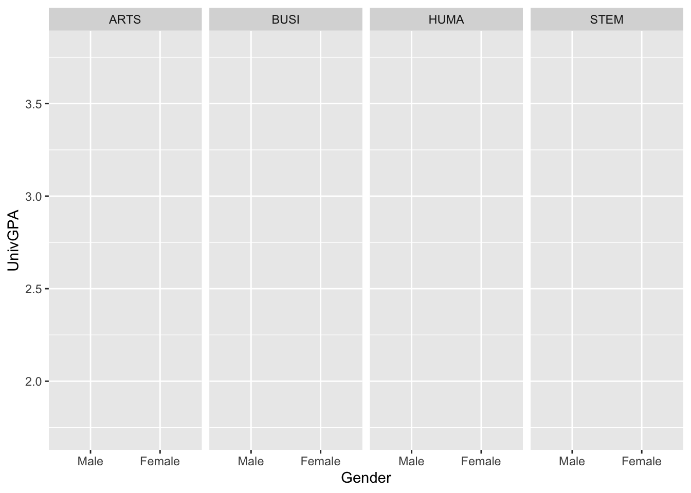
Next stage: geometries
3.9.6 Boxplot differentiated by two columns and wrapped by a facet: x, y, color, facet + boxplot()
This is an evolution of this graph.
admitdataRaceUnivPellMajor <-
  admitdata |>
    filter(IPEDSRaceEthnicity %in% c("White", "HisLat",
                                     "BAA", "Asian")) |>
    select(IPEDSRaceEthnicity, UnivGPA, PellStatus,
           ProbableMajorType, StudentType)
admitdataRaceUnivPellMajor
# A tibble: 16,588 × 5
IPEDSRaceEthnicity UnivGPA PellStatus ProbableMajorType StudentType
<fct> <dbl> <fct> <fct> <fct>
1 BAA 2.47 No HUMA FTF
2 BAA 2.73 Yes HUMA FTF
3 White 2.67 No ARTS FTF
4 White 2.78 Yes HUMA FTF
5 White 3.25 No BUSI FTF
6 White 3.18 No BUSI FTF
7 White 2.18 No STEM FTF
8 White 2.52 Yes HUMA FTF
9 HisLat 3.13 No STEM FTF
10 White 3.04 No BUSI FTF
# ℹ 16,578 more rowsadmitdataRaceUnivPellMajor |>
ggplot(aes(IPEDSRaceEthnicity, UnivGPA,
color = PellStatus)) +
facet_wrap(~ProbableMajorType)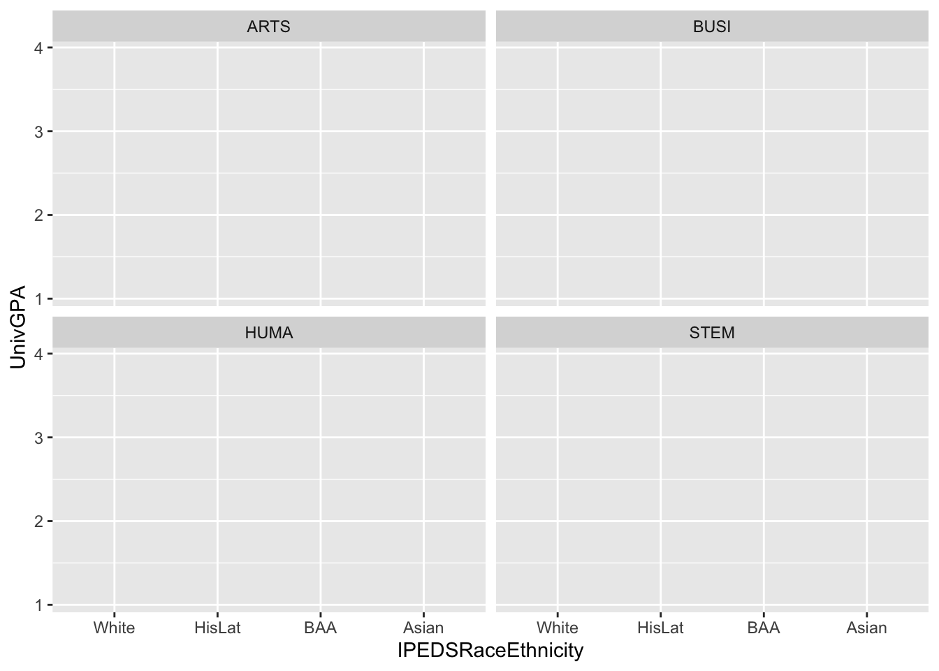
Next stage: geometries
3.9.7 Boxplot differentiated by one column and wrapped by a facet grid: x, y, facet_grid + boxplot()
This is an evolution of this graph.
admitdataRaceUnivPellMajor |>
  ggplot(aes(IPEDSRaceEthnicity, UnivGPA)) +
    facet_grid(StudentType~PellStatus)
Next stage: geometries
3.9.8 Horizontal boxplot differentiated by one column and wrapped by a facet grid: x, y, facet_grid + horizontal boxplot()
This is an evolution of this chart.
admitdataRaceUnivPellMajor |>
  ggplot(aes(IPEDSRaceEthnicity, UnivGPA)) +
    facet_grid(StudentType~PellStatus)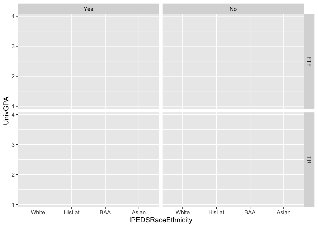
Next stage: geometries
3.9.9 Boxplot and jitter differentiated by two discrete and one continuous column: x, y, size, color + boxplot() + jitter()
# A tibble: 2,000 × 4
   Race  Sex     SAT PCI20
   <fct> <fct> <dbl> <dbl>
 1 W     M      1436 52106
 2 A     M      1398 52376
 3 W     M      1090 35376
 4 W     M      1516 56428
 5 O     M      1440 43456
 6 H     M      1438 56428
 7 W     M      1452 44051
 8 W     M      1536 68720
 9 B     M      1487 51986
10 H     M      1373 41135
# ℹ 1,990 more rows
to be added (just a note for write-up):
    geom_boxplot() +
    geom_jitter(aes(size = PCI20,
                   color = Sex),
               alpha = 0.3)
This is an evolution of this chart.
We have something different going on here!—Only two columns are show in the aes() (and, in this case, non-existent facet) specification even though the chart is going to include four total columns.
How is this going to happen (later in the process, of course)? In this case, the jitter() function is going to include two new columns when this geom is specified.
Next stage: geometries
3.9.10 Horizontal boxplot and jitter differentiated by two discrete and one continuous column: x, y, size, color + horizontal boxplot() + point()
just a note for write-up
This chart is obviously a variant of the previous chart, with the axes flipped. Of course, it also will have two new columns specified in the process of defining the jitter() function. The coordinates will also be flipped at a later stage. For now, the aes() will stay the same as before.
Next stage: geometries
3.9.11 Horizontal boxplot and jitter differentiated by one discrete and one continuous column wrapped by a facet: x, y, size, facet + horizontal boxplot() + point()
just a note for later:
+
    geom_boxplot() +
    geom_point(aes(size = PCI20),
               alpha = 0.5) +
    coord_flip()
Again, this chart is obviously a variant of the previous chart. This time we are going to create two separate charts, one for each value of Gender. We have done this by simply adding a facet_wrap() to the specification:
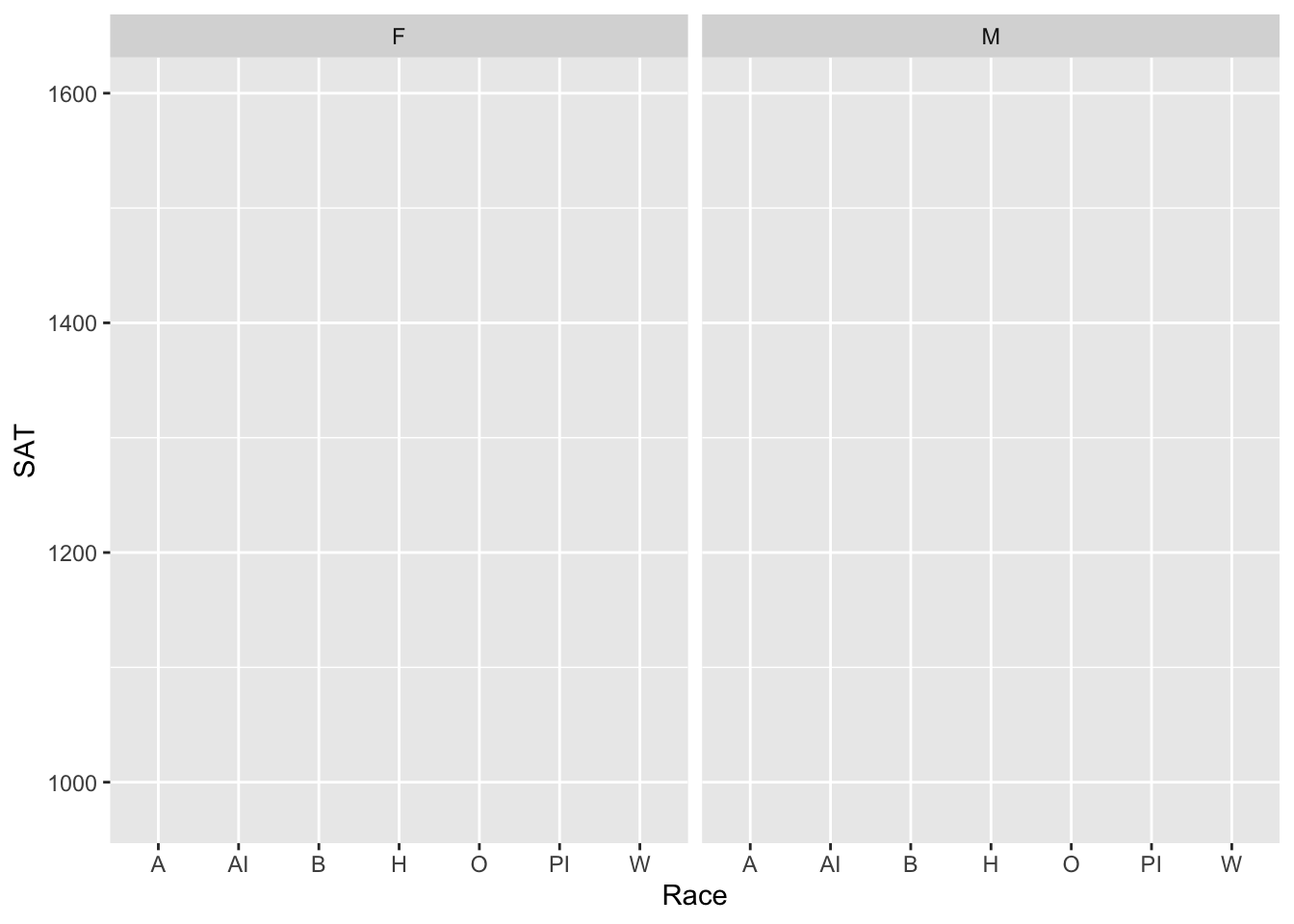
In this chart, we have specified three of the columns at this stage by moving Sex into a facet_wrap(). This means that only one remains to be specified later.
Next stage: geometries
3.10 3 continuous, 2 discrete
3.10.1 Horizontal boxplot and point differentiated by one discrete and two continuous wrapped by a facet: x, y, size, color, facet + horizontal boxplot() + point()
just a note for write-up
    geom_boxplot() +
    geom_point(aes(size = PCI20,
                   colour = Age),
               alpha = 0.5) +
    coord_flip()
In plotting the same data as before (though this time we’re going to use point() instead of jitter()), we are going to add information related to Age to the point() plot.
Here’s the query that brings the data together:
student_WHBASATPCIAge <-
  student_econ |>
    filter(Race %in% c("W", "H", "B", "A")) |>
    select(Race, SAT, PCI20, Sex, Age)
student_WHBASATPCIAge
# A tibble: 1,955 × 5
Race SAT PCI20 Sex Age
<fct> <dbl> <dbl> <fct> <dbl>
1 W 1436 52106 M 21.5
2 A 1398 52376 M 21.6
3 W 1090 35376 M 21.4
4 W 1516 56428 M 21.4
5 H 1438 56428 M 22.1
6 W 1452 44051 M 21.8
7 W 1536 68720 M 21.4
8 B 1487 51986 M 22.2
9 H 1373 41135 M 21.5
10 W 1297 43812 M 21.7
# ℹ 1,945 more rowsAgain, now that we have three columns included at this stage, we still have to add two more columns at a later stage.
Next stage: geometries
3.10.2 Horizontal boxplot and jitter differentiated by one discrete and two continuous wrapped by a facet: x, y, size, color, facet + horizontal boxplot() + jitter()
just a note for write-up
 +
    geom_boxplot() +
    geom_jitter(aes(size = PCI20,
                   colour = Age),
               alpha = 0.5,
               width = 0.25) +
    coord_flip()
This graph is exactly the same as the previous one, but it is going to use jitter() instead of point(). Notice that the aes() and facet_wrap() specifications are exactly the same.
Next stage: geometries
3.10.3 Horizontal violin and jitter differentiated by one discrete and two continuous wrapped by a facet: x, y, size, color, facet + horizontal violin() + jitter()
just a note for write-up
    geom_violin(scale = "count") +
    geom_jitter(aes(size = PCI20,
                   colour = Age),
               alpha = 0.3,
               width = 0.2) +
    coord_flip()
This also is almost identical to the previous graphs; it only differs in that it uses a violin() graph instead of a boxplot(). Note that the aes() specification is the same as the previous graphs.
Next stage: geometries
