Refining: Themes & colors
Before you read this page, we recommend that you understand both the introductory graphics page and the illustrative example.
1 Introduction
This page continues the process of building a graph while conforming to the following process:

The “gather tools & build easel” page goes through the first two steps in the process. The “paint” page goes through the process of choosing and setting up geometries (the data on the graph). The “framing” page goes through the process of constructing the frame, while this page goes through the process of refining the graph with colors and themes.
The analogy to the painting process breaks down for this step. You are retroactively choosing the look of the easel and frame in this step (with the theme) and setting the colors of the graphed data (with the colors). You will define the theme for every graph but the colors for only a subset of the graphs.
2 Structure
Here’s the structure of the basic statement to build a ggplot, highlighting the commands that we focus on in this page:
As you can see above, the effects that we achieve on this page require very few statements.
3 Focus of this page
Within this page, we provide examples of both themes and colors.
3.1 Themes
The themes specify the overall look of your graphs. You should, in almost every case, choose one theme and use it for all of your graphs across all of your documents (or, at least, all of the documents within a particular use case or target audience).
- Themes built in to
ggplot, such astheme_bw(),theme_minimal(), and others. You don’t have to do anything special to use these themes. - Other
ggthemes(such astheme_tufte()andtheme_fivethirtyeight()) can be found at this page.- Install this into RStudio with
install.packages("ggthemes"). - Use this package with
library(ggthemes).
- Install this into RStudio with
3.2 Colors
Color palettes specify the colors of the data plots in your graphs. You have almost an infinite amount of choices for specifying colors, with the following basic decisions:
- Pre-defined: Many color palettes exist already, and it’s a good idea to start your learning process by simply using them. These palettes are either built-in to R or can be downloaded in libraries. We provide examples of each.
- Install
ColorBrewerwithinstall.packages("RColorBrewer").- Use the package with
library(RColorBrewer). - Information about
ColorBreweron this page.
- Use the package with
- Information about colorblind-friendly palettes can be found on this page.
- Install
- Manual: In certain use cases, it makes sense to define your own color palettes. Lots of digital resources exist that can help you do this, and we’ll show you how to apply them to your graphs.
- Attractive color palettes (for manual) can be found here.
- This page for choosing HTML hex codes is easy to use.
3.3 Introductory examples
All of this discussion might seem a bit abstract, so in this section we’ll present a set of examples that illuminate the effects of themes versus the effects of color palettes. In this section, we present three examples of the theme theme_bw() with three different color palettes. In the following section, we present three examples of a different theme, theme_fivethirtyeight(), with those same three color palettes.
These examples are not meant to highlight nuances in the use of themes and colors but are simply meant to demonstrate their general effects. Details follow in all of the examples that follow.
3.3.1 theme_bw()
You’ll see in this and the next two graphs the use of the theme_bw() theme, one that is built-in to ggplot. It sets the font faces and sizes and formatting for the titles, axes, and legends. Look at this graph and the following two, and notice the similar look of the frame among the first three (especially compared to the following three).
3.3.1.1 A palette from brewer
ColorBrewer has many nice color palettes. In this case, we use the YlGnBu (yellow, green, blue) color palette. You can see the results in the colors of the bars. Note that this is a fill palette; we knew to use this palette for the following reason: In the aes() function, we have fill=Response, meaning a different fill color is used for each different value of Response.
survey |>
  ggplot(aes(Question, fill=Response)) +
    geom_bar(color="black") +
    labs(title = "Number of responses per question",
         subtitle = "For all years",
         x = "Question",
         y = "Number of each response") +
    scale_y_continuous(limits = c(0, 30000),
                       breaks = c(0, 5000, 10000,
                                  15000, 20000,
                                  25000, 30000),
                       labels = c("0", "5k", "10k",
                                  "15k", "20k",
                                  "25k", "30k")) +
    scale_x_discrete(guide = guide_axis(n.dodge = 2)) +
    theme_bw() +
    scale_fill_brewer(palette = "YlGnBu")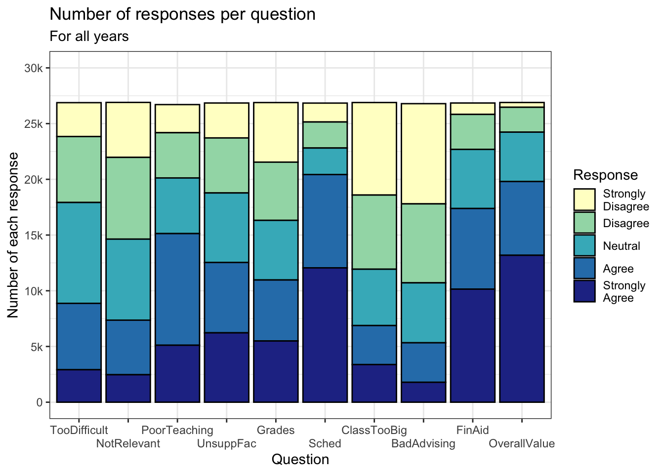
3.3.1.2 A manual palette
This graph uses the same theme as the previous graph. The only difference between the two is in the color palette specified in scale_fill_manual(). Since there are five different values of Response, we need to specify five different hex codes. Go to this section for information about hex codes.
survey |>
  ggplot(aes(Question, fill=Response)) +
    geom_bar(color="black") +
    labs(title = "Number of responses per question",
         subtitle = "For all years",
         x = "Question",
         y = "Number of each response") +
    scale_y_continuous(limits = c(0, 30000),
                       breaks = c(0, 5000, 10000,
                                  15000, 20000,
                                  25000, 30000),
                       labels = c("0", "5k", "10k",
                                  "15k", "20k",
                                  "25k", "30k")) +
    scale_x_discrete(guide = guide_axis(n.dodge = 2)) +
    theme_bw() +
    scale_fill_manual(values = c("#2a4d69", "#4b86b4",
                                 "#adcbe3", "#e7eff6",
                                 "#63ace5"))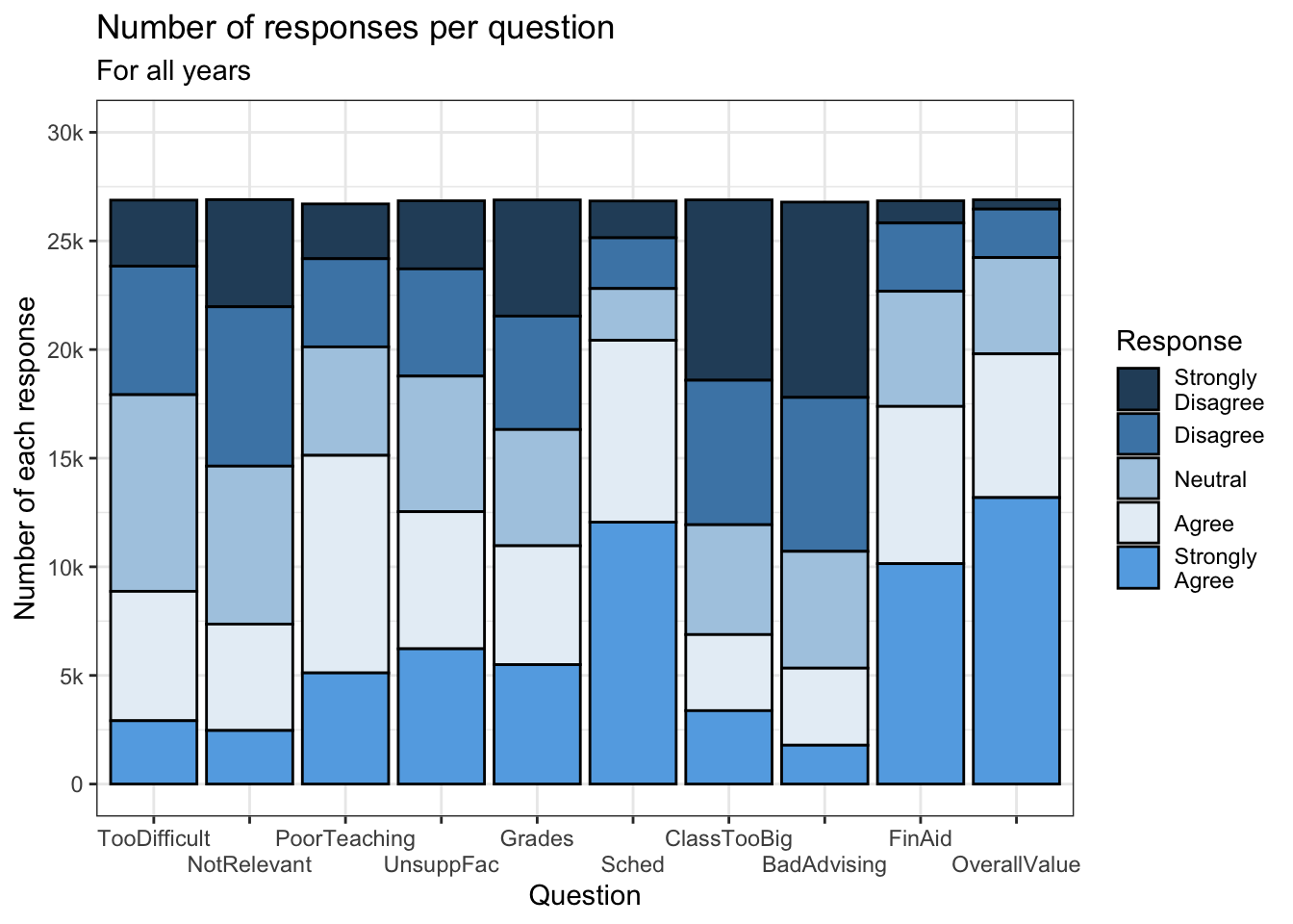
3.3.1.3 A palette for colorblind users
Again, in this graph we use the theme_bw() theme so the different look can be attributed to the color palette. The viridis color palette (with more information on this page) is designed to enable colorblind users to interpret graphs.
You can see that the full command is scale_fill_viridis_d() — the fill is specified as before, but also note the d at the end. This stands for discrete and is chosen since Response is a discrete variable; the alternative is c for continuous.
survey |>
  ggplot(aes(Question, fill=Response)) +
    geom_bar(color="black") +
    labs(title = "Number of responses per question",
         subtitle = "For all years",
         x = "Question",
         y = "Number of each response") +
    scale_y_continuous(limits = c(0, 30000),
                       breaks = c(0, 5000, 10000,
                                  15000, 20000,
                                  25000, 30000),
                       labels = c("0", "5k", "10k",
                                  "15k", "20k",
                                  "25k", "30k")) +
    scale_x_discrete(guide = guide_axis(n.dodge = 2)) +
    theme_bw() +
    scale_fill_viridis_d()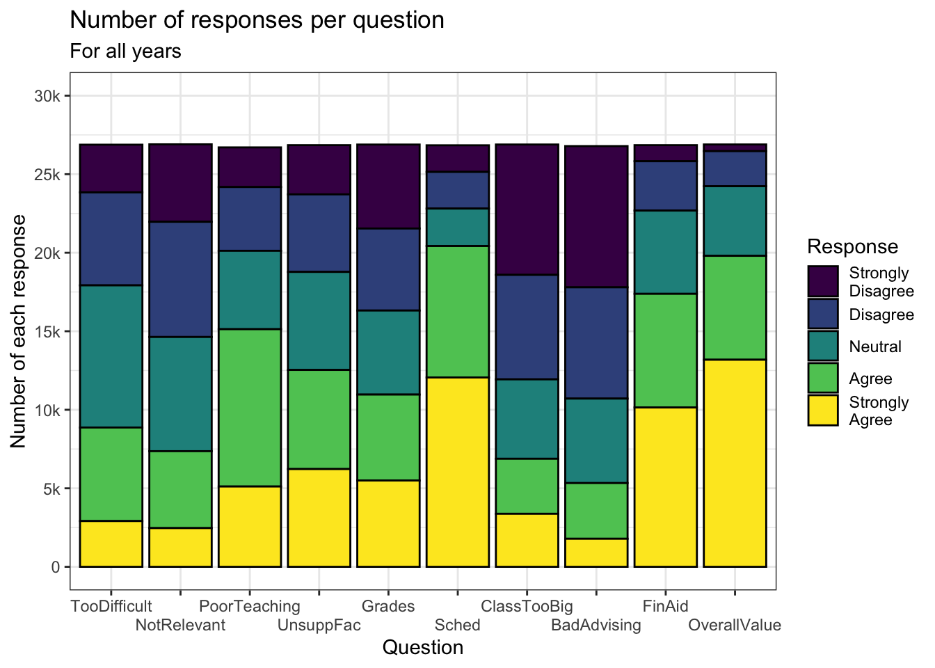
3.3.2 theme_fivethirtyeight()
In this section, we use a different theme, theme_fivethirtyeight(), in combination with the same palettes that we used above. The discussions in this section are not needed since the only difference is the theme that is used. Be sure to compare each of these graphs with the corresponding one in the previous section.
3.3.2.1 A palette from brewer
survey |>
  ggplot(aes(Question, fill=Response)) +
    geom_bar(color="black") +
    labs(title = "Number of responses per question",
         subtitle = "For all years",
         x = "Question",
         y = "Number of each response") +
    scale_y_continuous(limits = c(0, 30000),
                       breaks = c(0, 5000, 10000,
                                  15000, 20000,
                                  25000, 30000),
                       labels = c("0", "5k", "10k",
                                  "15k", "20k",
                                  "25k", "30k")) +
    scale_x_discrete(guide = guide_axis(n.dodge = 2)) +
    theme_fivethirtyeight() +
    scale_fill_brewer(palette = "YlGnBu")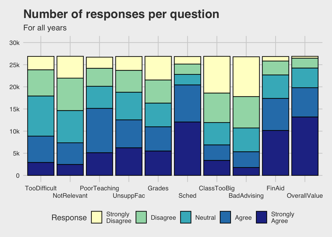
3.3.2.2 A manual palette
survey |>
  ggplot(aes(Question, fill=Response)) +
    geom_bar(color="black") +
    labs(title = "Number of responses per question",
         subtitle = "For all years",
         x = "Question",
         y = "Number of each response") +
    scale_y_continuous(limits = c(0, 30000),
                       breaks = c(0, 5000, 10000,
                                  15000, 20000,
                                  25000, 30000),
                       labels = c("0", "5k", "10k",
                                  "15k", "20k",
                                  "25k", "30k")) +
    scale_x_discrete(guide = guide_axis(n.dodge = 2)) +
    theme_fivethirtyeight() +
    scale_fill_manual(values = c("#2a4d69", "#4b86b4",
                                 "#adcbe3", "#e7eff6",
                                 "#63ace5"))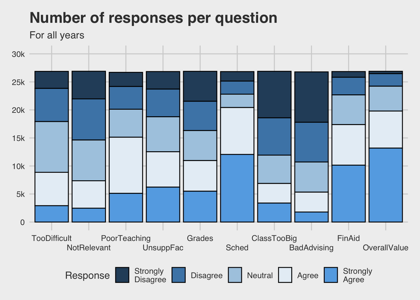
3.3.2.3 A palette for colorblind users
survey |>
  ggplot(aes(Question, fill=Response)) +
    geom_bar(color="black") +
    labs(title = "Number of responses per question",
         subtitle = "For all years",
         x = "Question",
         y = "Number of each response") +
    scale_y_continuous(limits = c(0, 30000),
                       breaks = c(0, 5000, 10000,
                                  15000, 20000,
                                  25000, 30000),
                       labels = c("0", "5k", "10k",
                                  "15k", "20k",
                                  "25k", "30k")) +
    scale_x_discrete(guide = guide_axis(n.dodge = 2)) +
    theme_fivethirtyeight() +
    scale_fill_viridis_d()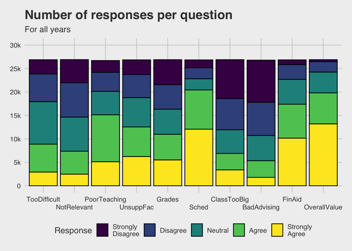
4 Examples
For these 50+ examples, we are following the graph creation process started on the aesthetics page. At the bottom of each graph, you can find a link to the first step so you can follow the graph creation process from the beginning for each graph.
For most of the examples, we use the same theme so as to demonstrate the feel of consistency of theme usage within a document. We recommend that you do the same…no matter your choice of theme.
4.1 1 discrete (with implicit count)
4.1.1 Single stacked bar: x (constant), y (implicit count), fill + bar()
We use the color-blind fill/discrete palette. We have also added color="grey" to geom_bar() to outline the fill areas on the bar. This is especially needed since the color for NA is so light.
This is not the most attractive graph, for sure. Many times when there are large blocks of color in a graph, lighter pastel colors look better. However, the viridis color palette is not designed to be attractive; it is designed to be useful for color-blind users.
survey |>
  ggplot(aes(x = "All responses", fill=Status)) +
    geom_bar(color="grey") +
    labs(title = "Number of question responses by Student Status",
         subtitle = "For all years",
         x = element_blank(),
         y = "Number of responses",
         fill = "Student status") +
    scale_y_continuous(limits = c(0, 300000),
                       breaks = c(0, 50000, 100000,
                                  150000, 200000,
                                  250000, 300000),
                       labels = c("0", "50k", "100k",
                                  "150k", "200k",
                                  "250k", "300k")) +
    theme_bw() +
    scale_fill_viridis_d()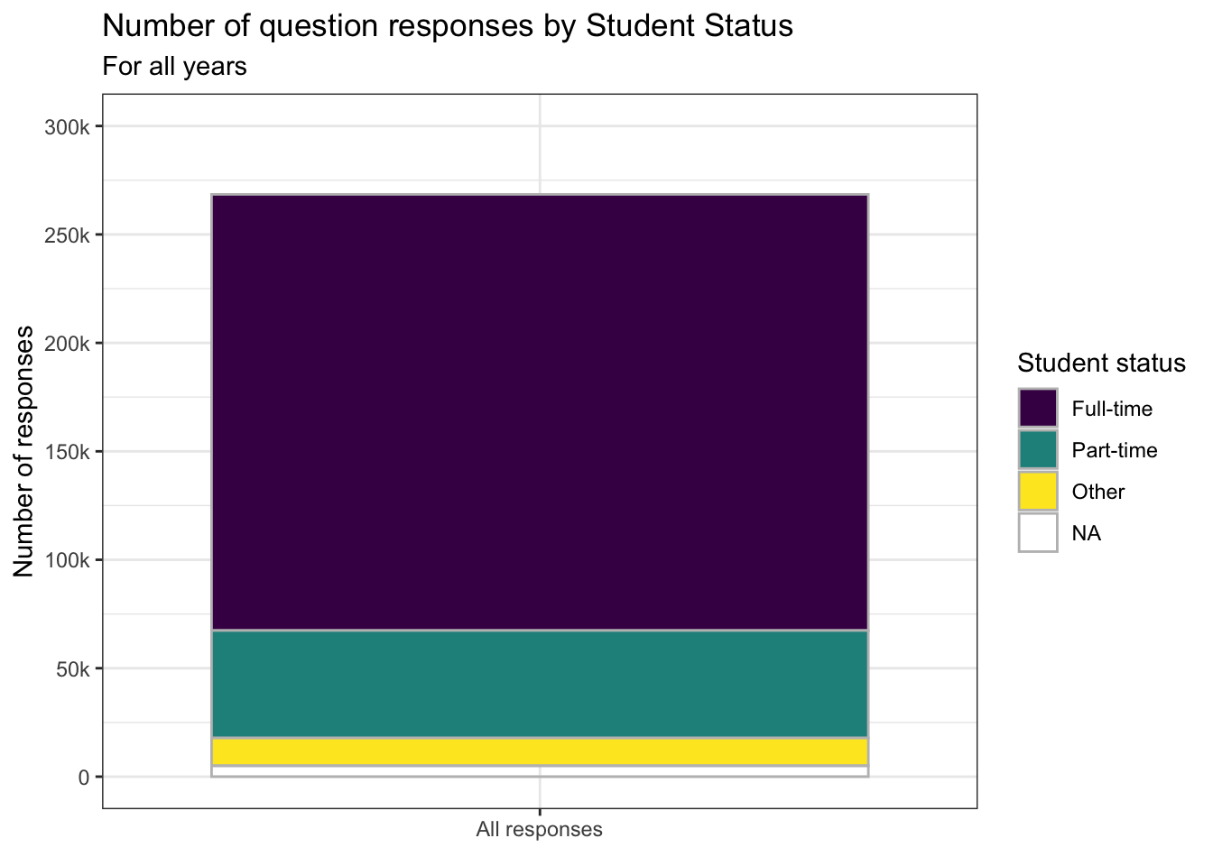
4.1.2 Bar graph showing distribution: x, y (implicit count) + bar()
Since this graph only has one color and fill, no color palette needs to be chosen. However, in order to lessen the intensity of the large block of color, we have set alpha in the geom_bar().
4.2 1 continuous
4.2.1 Histogram for continuous column: x + histogram()
Again, since this graph has just one color, we had previously set the fill and color are set outside of the aes() in geom_histogram() since they are unchanging. Further, a color palette does not need to be specified.
4.3 2 discrete
4.3.1 Stacked bar: x, y (implicit count), fill + bar()
In the previous step, we showed two different ways to handle the x-axis labels. We’ll drop one here since that choice does not affect choices of themes or colors.
4.3.1.1 Just the bar chart
Sometimes you are designing for the graph to be read on a black-and-white printer so you want to you grey-scales rather than colors. A very good choice for this situation is the "Greys" palette from brewer for fill.
survey |>
  ggplot(aes(Question, fill=Response)) +
    geom_bar(color="black") +
    labs(title = "Number of responses per question",
         subtitle = "For all years",
         x = "Question",
         y = "Number of each response") +
    scale_y_continuous(limits = c(0, 30000),
                       breaks = c(0, 5000, 10000,
                                  15000, 20000,
                                  25000, 30000),
                       labels = c("0", "5k", "10k",
                                  "15k", "20k",
                                  "25k", "30k")) +
    scale_x_discrete(guide = guide_axis(angle = 45)) +
    theme_bw() +
    scale_fill_brewer(palette = "Greys")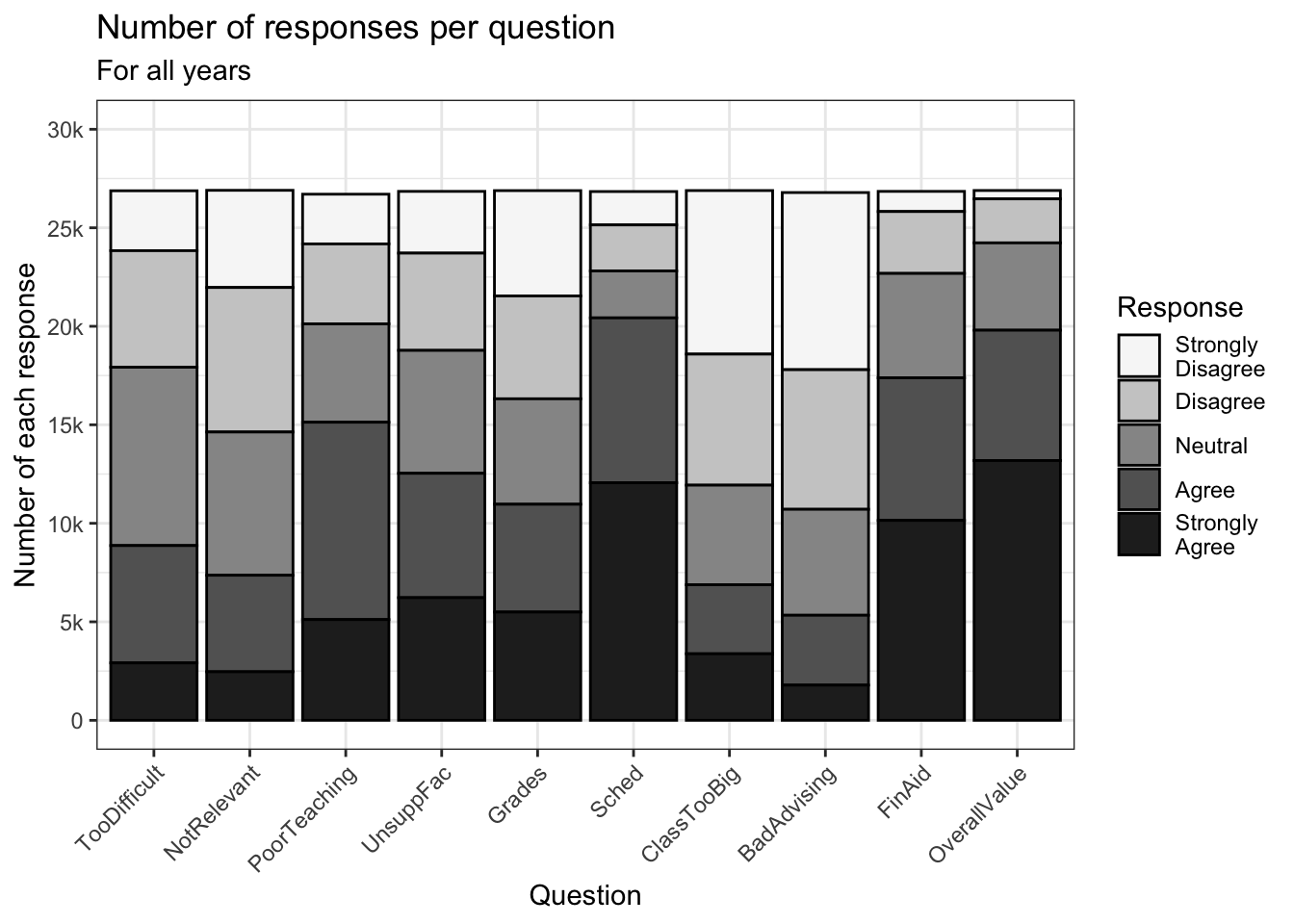
4.3.1.2 Adding a text label to the bar chart
Now, further suppose that we want to show the underlying values on the graph itself. In the next two charts, we demonstrate how to show the value itself or a calculated value (percent, in this case).
Our first step it to create a data frame containing the values that we need — in this case, n which is the count of the number of a particular response to a particular question.
surveycalc <-
  survey |>
    group_by(Question, Response) |>
    summarize(n = n())
surveycalc |>
  select(Question, Response, n) |>
  arrange(Question, Response)
# A tibble: 50 × 3
# Groups: Question [10]
Question Response n
<ord> <fct> <int>
1 TooDifficult "Strongly\nDisagree" 3040
2 TooDifficult "Disagree" 5917
3 TooDifficult "Neutral" 9052
4 TooDifficult "Agree" 5956
5 TooDifficult "Strongly\nAgree" 2914
6 NotRelevant "Strongly\nDisagree" 4933
7 NotRelevant "Disagree" 7335
8 NotRelevant "Neutral" 7271
9 NotRelevant "Agree" 4898
10 NotRelevant "Strongly\nAgree" 2465
# ℹ 40 more rowsAs you can see from the data above, we now have the n column available containing the number of times a response to a question was chosen.
Now that we have the data, it is only a matter of adding the geom_label() function to the graph:
aes(label): specifies that the value to be printed is thencolumn (that we just calculated).position: since this is a stacked graph, we need to specifyposition_stack()for the placement of the label. Further, since we want it to be placed in the middle (vertically) of the bar, then we justvjust = 0.5. If we had wanted it near the top of each bar section, we might have specified0.9instead.fill: specifies the background fill color of each label.color: specifies the color of the font.fontface: specifies the font face to be used.size: specifies the size of the text label.
One other change is on line 3. (To be clear, this feels more like a bug than a feature, but we need to add this in order to make it work, so here we go.) In order to get the positioning of the labels to be placed in the right position, the fill position has to be specified as being reversed. Why? We have no idea. Just do it.
surveycalc |>
  ggplot(aes(Question, y = n,
             fill=fct_rev(Response))) +
    geom_bar(stat = "identity", color="black") +
    geom_label(aes(label = n),
               position = position_stack(vjust = 0.5),
               fill = "black",
               color = "white", fontface = "bold",
               size = 3) +
    labs(title = "Number of responses per question",
         subtitle = "For all years",
         x = "Question",
         y = "Number of each response",
         fill = "Response") +
    scale_y_continuous(limits = c(0, 30000),
                       breaks = c(0, 5000, 10000,
                                  15000, 20000,
                                  25000, 30000),
                       labels = c("0", "5k", "10k",
                                  "15k", "20k",
                                  "25k", "30k")) +
    scale_x_discrete(guide = guide_axis(angle = 45)) +
    theme_bw() +
    scale_fill_brewer(palette = "Greys")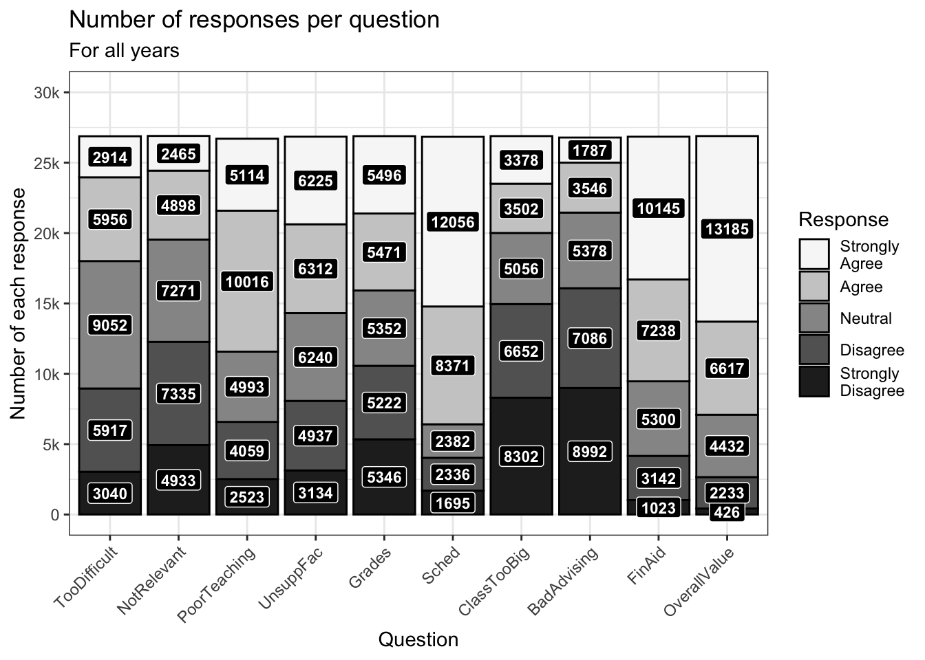
4.3.1.3 Adding a calculated percent label
We’re going to build on the previous example. This time we want to show the percentage of times (not the raw count) that a response to a question is chosen. This requires a two-step calculation, first involving summarize() and then a mutate(). The summarize() portion removes all columns other than Question, Response, and n. We want to retain these columns after the next group_by(), so we use mutate() to calculate two more columns:
totquestresponses: the sum of all thenvalues for a particularQuestion.percent: the percent of times a particular response is chosen for a particular question.
You can see from the printed data that the total of the n column for a particular value in the Question column equals the value in any one of its totquestresponses column values (which are all the same). The percent column is, just as is specified, the n column divided by the totquestresponses column.
surveycalc <-
  survey |>
    group_by(Question, Response) |>
    summarize(n = n()) |>
    group_by(Question) |>
    mutate(totquestresponses = sum(n),
           percent = n/totquestresponses)
surveycalc |>
  select(Question, Response, n, totquestresponses, percent) |>
  arrange(Question, Response)
# A tibble: 50 × 5
# Groups: Question [10]
Question Response n totquestresponses percent
<ord> <fct> <int> <int> <dbl>
1 TooDifficult "Strongly\nDisagree" 3040 26879 0.113
2 TooDifficult "Disagree" 5917 26879 0.220
3 TooDifficult "Neutral" 9052 26879 0.337
4 TooDifficult "Agree" 5956 26879 0.222
5 TooDifficult "Strongly\nAgree" 2914 26879 0.108
6 NotRelevant "Strongly\nDisagree" 4933 26902 0.183
7 NotRelevant "Disagree" 7335 26902 0.273
8 NotRelevant "Neutral" 7271 26902 0.270
9 NotRelevant "Agree" 4898 26902 0.182
10 NotRelevant "Strongly\nAgree" 2465 26902 0.0916
# ℹ 40 more rowsHaving done the calculations, the only change that needs to be made here is in line 5 below. Let’s explain it piece-by-piece:
- The value that we’re printing is
percent * 100. Thus0.113247would be11.3247. - However, we want to show
11.3in the graph. The tool for this is thesprintf()function. - Now, at the end of
11.3we want to concatenate (join together) a percent sign. The tool for this is thestr_c()function (described on this page)
FYI, a great resource to learn about sprintf() can be found on this page.
surveycalc |>
  ggplot(aes(Question, y = n,
             fill=forcats::fct_rev(Response))) +
    geom_bar(stat = "identity", color="black") +
    geom_label(aes(label = str_c(sprintf("%1.1f",
                                         percent * 100),
                                 "%",
                                 sep = "")),
               position = position_stack(vjust = 0.5),
               fill = "black",
               color = "white", fontface = "bold",
               size = 3) +
    labs(title = "Number of responses per question",
         subtitle = "For all years",
         x = "Question",
         y = "Number of each response",
         fill = "Response") +
    scale_y_continuous(limits = c(0, 30000),
                       breaks = c(0, 5000, 10000,
                                  15000, 20000,
                                  25000, 30000),
                       labels = c("0", "5k", "10k",
                                  "15k", "20k",
                                  "25k", "30k")) +
    scale_x_discrete(guide = guide_axis(angle = 45)) +
    theme_bw() +
    scale_fill_brewer(palette = "Greys")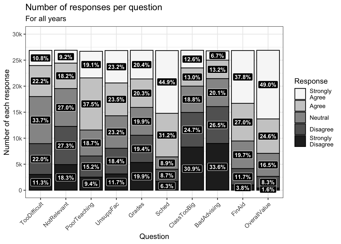
4.3.2 Grouped bar: x, y (implicit count), fill + bar()
This is the first graph of many that contrasts results for males and females. As such, we are going to choose one color for each (in a manual color palette) and then use those colors every time we are representing males and females.
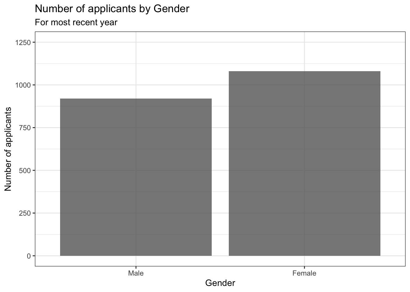
4.3.3 Facet wrap around grouped bar: x, y (implicit count), fill (redundant), facet + bar()
This graph presents the same information as the previous graph. Notice again that we’re using the same colors for male and female bars.
student_econ_ABHW |>
  ggplot(aes(Sex, fill = Sex)) +
    facet_wrap(~Race,
               ncol = 4,
               labeller = label_both) +
    geom_bar() +
    labs(title = "Number of applicants per Gender per Race",
         subtitle = "For most recent year",
         x = "Gender",
         y = "Number of applicants") +
    theme_bw() +
    scale_fill_manual(values = c("#00aedb", "#ffc425"))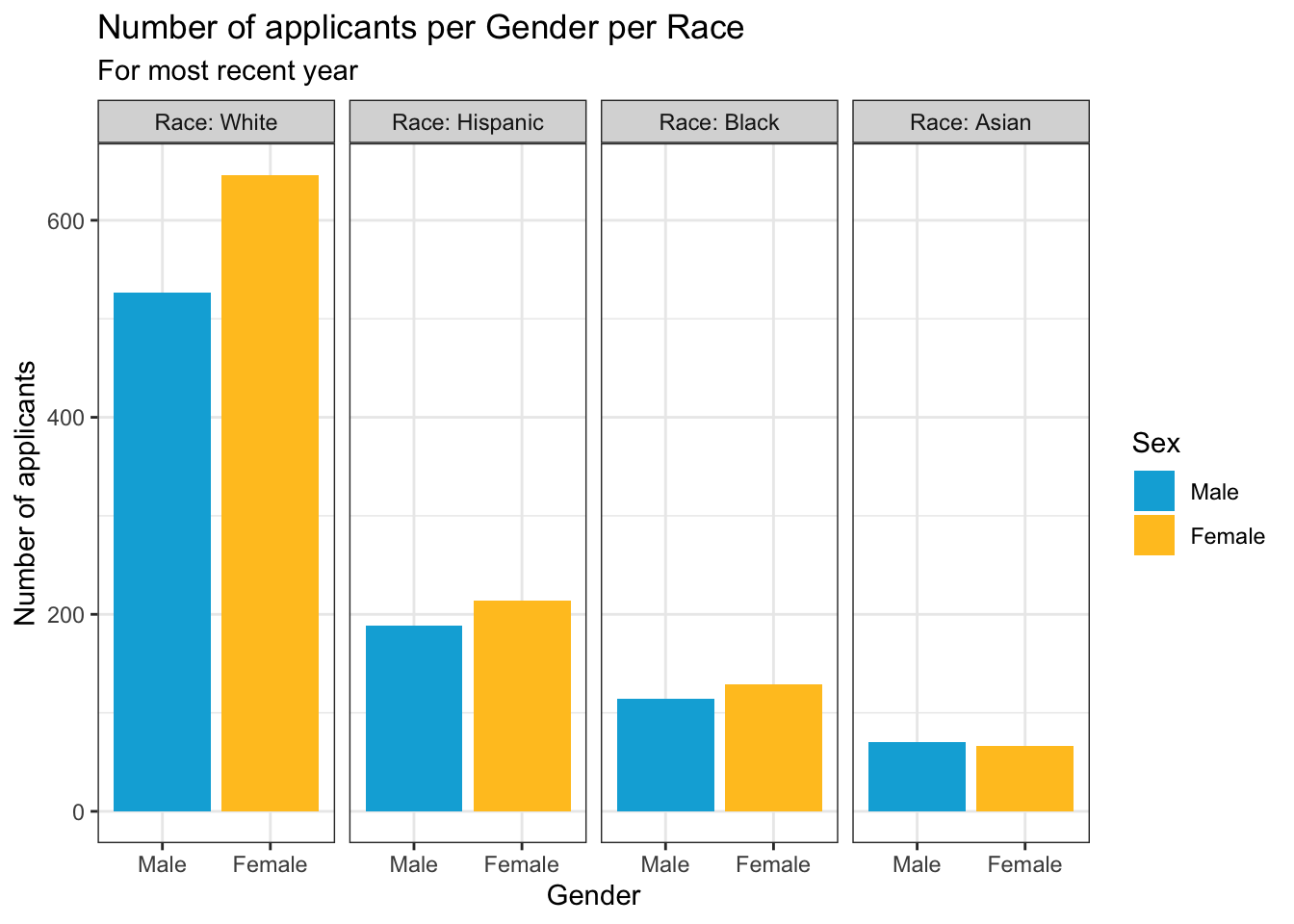
4.4 1 discrete, 1 continuous
4.4.1 Bar chart of averages: x, y + col()
This chart only uses one color so the only thing that needs to be done is to lighten the color a bit using alpha.
surveyQAvg |>
  ggplot(aes(Question, Avg)) +
    geom_col(alpha = 0.8) +
    labs(title = "Average response per Survey Question",
         subtitle = "For all years",
         x = "Question",
         y = "Average score") +
    scale_y_continuous(limits = c(0, 5),
                       breaks = c(1, 2, 3, 4, 5),
                       labels = c("1.0", "2.0",
                                  "3.0", "4.0", "5.0")) +
    scale_x_discrete(guide = guide_axis(angle = 45))  +
    theme_bw()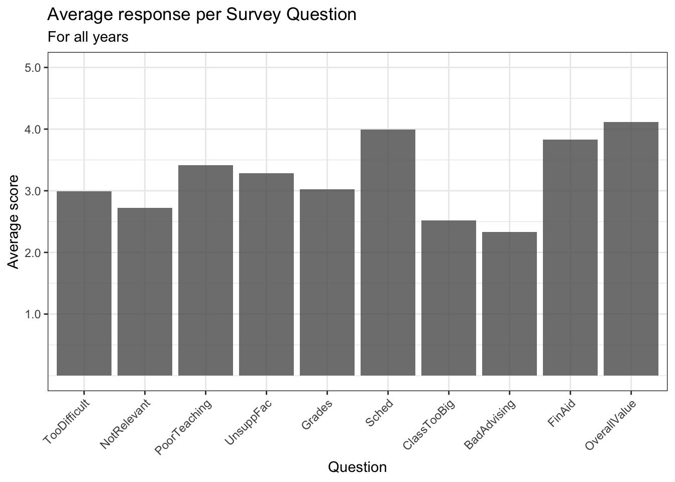
4.4.2 Bar chart with sorted averages: x (reordered), y + col()
This chart only uses one color so the only thing that needs to be done is to lighten the color a bit using alpha and, in this case, changing the color of the outlines to black.
After looking at the value, we have decided at this late stage to show the value on the graph as well. To do this, we use geom_text(). Its attributes here require a bit of explaining:
aes(label): the text displayed on the graph. We use thesprintf()function to format the number so that it has 2 digits after the decimal point.aes(y): the vertical (y) position of the text. Here we want it above the top of the bar so we add a value from theyposition of the top line of the bar (Avgin this graph). If we had wanted it below, we would have used subtraction. The needed value per graph depends on the values in they-axis, so you will probably need to experiment a few times to get the position that you want.size: the size of the text. Again, you’ll need to experiment with this value. You might also put it inside theaes()and have it vary depending on a column.color: the color of the text.
We didn’t use geom_label() here because we did not need the text background box.
surveyQAvg |>
  ggplot(aes(x = fct_reorder(Question, Avg, .desc = TRUE),
             Avg)) +
    geom_col(alpha = 0.8, color = "black") +
    geom_text(aes(label = sprintf("%1.2f", Avg),
                  y = Avg + 0.15),
              size = 3, color = "black") +
    labs(title = "Average response per Survey Question (in descending order)",
         subtitle = "For all years",
         x = "Question",
         y = "Average score") +
    scale_y_continuous(limits = c(0, 5),
                       breaks = c(1, 2, 3, 4, 5),
                       labels = c("1.0", "2.0",
                                  "3.0", "4.0", "5.0")) +
    scale_x_discrete(guide = guide_axis(angle = 45)) +
    theme_bw()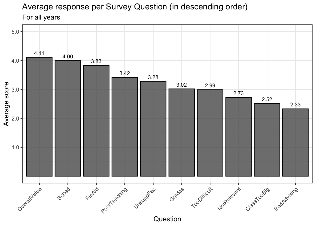
4.4.3 Boxplot reliant on other variable: x, y + boxplot()
Since neither the fill nor the color varies by a variable with these boxplots, we normally would see black outlines and white fills. In this case, we think it’s easier to interpret the graphs by changing the fill color. We do this for both of the graphs in this section.
student_econ |>
  ggplot(aes(Race, SAT)) +
    geom_boxplot(alpha = 0.5, fill = "grey") +
    labs(title = "Range of SAT scores per applicant race",
         subtitle = "For all years",
         x = "Race",
         y = "SAT scores") +
    scale_y_continuous(limits = c(800, 1600),
                       breaks = c(800, 1000, 1200,
                                  1400, 1600)) +
    theme_bw()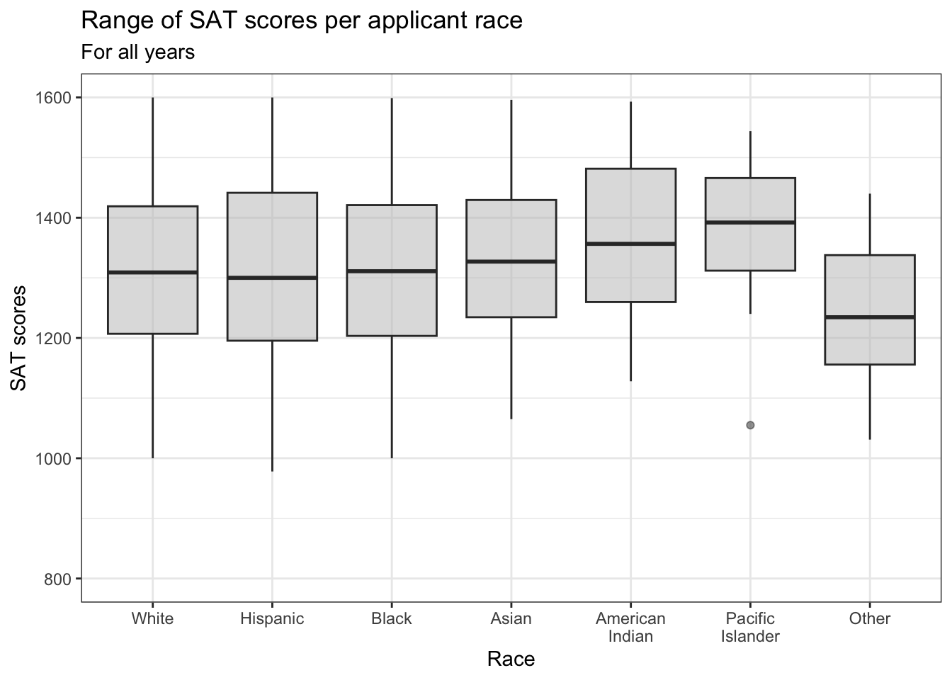
In this example, we show the distribution of UnivGPA values by the Gender of the applicant:
admitdatagenderMFgpa |>
  ggplot(aes(x = Gender, y = UnivGPA)) +
    geom_boxplot(alpha = 0.5, fill = "lightblue") +
    labs(title = "Range of University GPA per student gender",
         subtitle = "For all years",
         x = "Gender",
         y = "University GPA") +
    scale_y_continuous(limits = c(0, 4),
                       breaks = c(0, 1, 2, 3, 4),
                       labels = c("0.0", "1.0",
                                  "2.0", "3.0", "4.0")) +
    theme_bw() +
    scale_fill_brewer(palette = "Greys")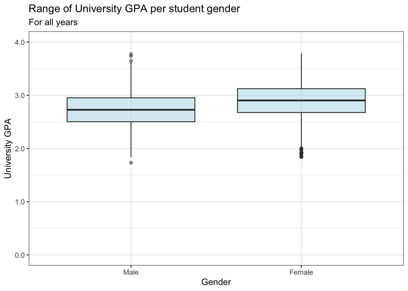
4.4.4 Violin chart reliant on other variable: x, y + horizontal violin()
In this graph we use a manual fill color palette to set the colors since we want to be consistent with the gender colors that we have previously used.
admitdatagendergpa |>
  ggplot(aes(x = Gender,
             y = UnivGPA,
             fill=Gender)) +
    geom_violin(scale="count")+
    labs(title = "Distribution of University GPA per student gender",
         subtitle = "For all years",
         x = "Gender",
         y = "University GPA",
         fill = "Student Gender") +
    scale_x_discrete(limits = rev) +
    scale_y_continuous(limits = c(0, 4),
                       breaks = c(0, 1, 2, 3, 4),
                       labels = c("0.0", "1.0",
                                  "2.0", "3.0", "4.0")) +
    coord_flip()+
    theme_bw() +
    scale_fill_manual(values = c("#00aedb", "#ffc425",
                                 "darkgrey", "lightgrey"))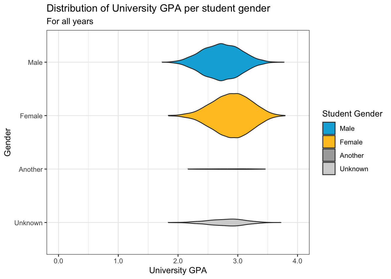
4.5 2 discrete, 1 continuous
4.5.1 Grouped bar (x, y, fill + col())
This one is similar to this graph but uses geom_col(). This uses the familiar viridis color palette, adding black outlines and muting the colors somewhat.
surveyQRN |>
  ggplot(aes(x = Question,
             y = n,
             fill = Response)) +
    geom_col(color = "black", alpha = 0.75) +
    labs(title = "Number of responses per question",
         subtitle = "For all years",
         x = "Question",
         y = "Number of each response") +
    scale_y_continuous(limits = c(0, 30000),
                       breaks = c(0, 5000, 10000,
                                  15000, 20000,
                                  25000, 30000),
                       labels = c("0", "5k", "10k",
                                  "15k", "20k",
                                  "25k", "30k")) +
    scale_x_discrete(guide = guide_axis(angle = 45))+
    theme_bw() +
    scale_fill_viridis_d()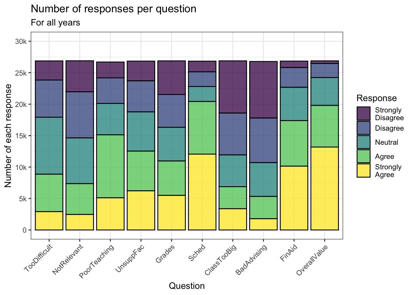
Sometimes, we want to show the bars next to each other rather than stacked. Here we use a manual color palette while, again, adding a black outline to the bars. We think the black outlines are a near requirement when one or more of the fill-colors are very light.
surveyQRN |>
  ggplot(aes(x = Question, y = n,
             fill = Response)) +
    geom_col(position="dodge",
             color = "black") +
    labs(title = "Number of responses per question",
         subtitle = "For all years",
         x = "Question",
         y = "Number of each response") +
    scale_y_continuous(limits = c(0, 15000),
                       breaks = c(0, 3000, 6000,
                                  9000, 12000, 15000),
                       labels = c("0", "3k", "6k",
                                  "9k", "12k", "15k")) +
    scale_x_discrete(guide = guide_axis(angle = 45))+
    theme_bw() +
    scale_fill_manual(values = c("#2a4d69", "#4b86b4",
                                 "#adcbe3", "#e7eff6",
                                 "#63ace5"))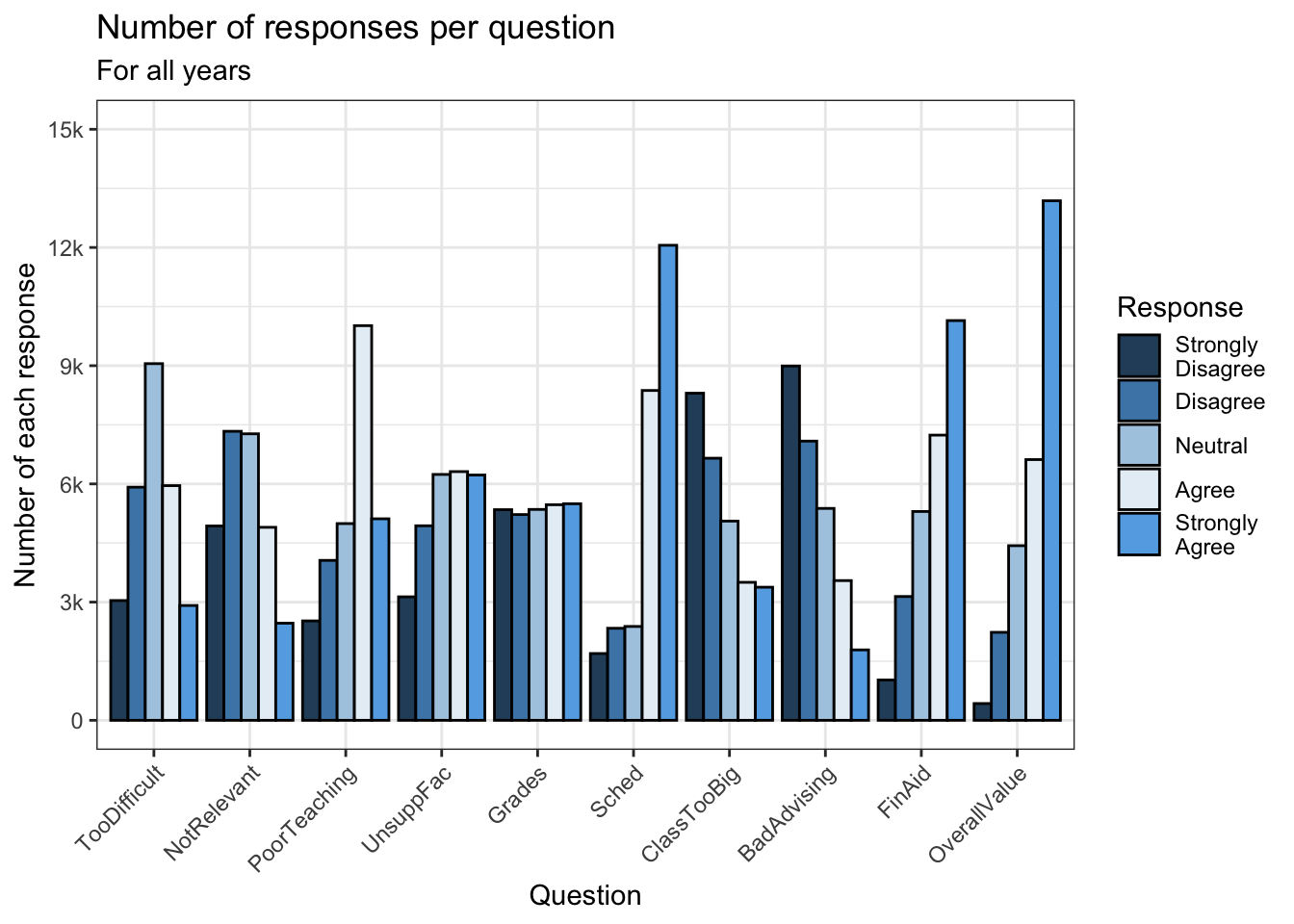
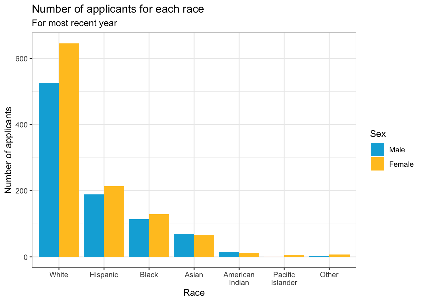
Another example which displays the same graph as shown in this section. This uses our typical manual color palette for male and female.
student_econ |>
  group_by(Race, Sex) |>
  summarize(Count = n()) |>
  ggplot(aes(Race, y = Count, fill = Sex)) +
    geom_col(position="dodge") +
    labs(title = "Number of applicants for each race",
         subtitle = "For most recent year",
         x = "Race",
         y = "Number of applicants")+
    theme_bw() +
    scale_fill_manual(values = c("#00aedb", "#ffc425"))
4.5.2 Facets around bar (x, y, facet + col())
This graph, again, displays the data shown in the graphs in this section. No color palette is used here though we do set an alpha in order to tone down the fill color.
surveyQRN |>
  ggplot(aes(x = Response, y = n)) +
    facet_wrap(~Question, ncol = 2) +
    geom_col(position="dodge",
             alpha = 0.8) +
    labs(title = "Distributions of responses for each question",
         subtitle = "For all years",
         x = "Response",
         y = "Number of responses") +
    scale_y_continuous(limits = c(0, 14000),
                       breaks = c(0, 3500, 7000,
                                  10500, 14000),
                       labels = c("0", "3.5k", "7k",
                                  "10.5k", "14k"))+
    theme_bw()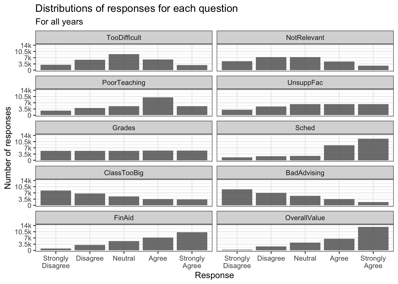
4.5.3 Facets around horizontal bar (x, y, facet + col())
In this graph, we display the same data as in the previous graph. The only difference, obviously, is that the bars are displayed horizontally. The theme and fill stay the same.
surveyQRN |>
  ggplot(aes(x = n, y = Response)) +
    facet_wrap(~Question, ncol = 5) +
    geom_col(position="dodge",
             alpha = 0.8) +
    labs(title = "Distributions of responses for each question",
         subtitle = "For all years",
         y = "Response",
         x = "Number of responses") +
    scale_x_continuous(limits = c(0, 14000),
                       breaks = c(0, 3500, 7000,
                                  10500, 14000),
                       labels = c("0", "3.5k", "7k",
                                  "10.5k", "14k"),
                       guide = guide_axis(angle = 45))+
    theme_bw()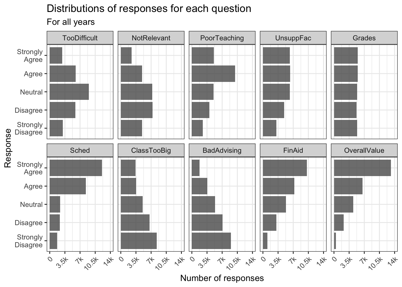
4.5.4 Grouped bar, narrowed width of bars (x, y, fill + col())
In this and the following two sections, we are going to modify the graph shown in this section. We had already set the color outlines to black in a previous step; here, we just use the usual theme and set a manual color palette.
surveyQRN |>
  ggplot(aes(x = Question,
             y = n,
             fill = Response)) +
    geom_col(position="dodge",
             width=0.8,
             color = "black") +
    labs(title = "Number of responses per question",
         subtitle = "For all years",
         x = "Question",
         y = "Number of each response") +
    scale_y_continuous(limits = c(0, 15000),
                       breaks = c(0, 3000, 6000,
                                  9000, 12000, 15000),
                       labels = c("0", "3k", "6k",
                                  "9k", "12k", "15k")) +
    scale_x_discrete(guide = guide_axis(angle = 45))+
    theme_bw() +
    scale_fill_manual(values = c("#2a4d69", "#4b86b4",
                                 "#adcbe3", "#e7eff6",
                                 "#63ace5"))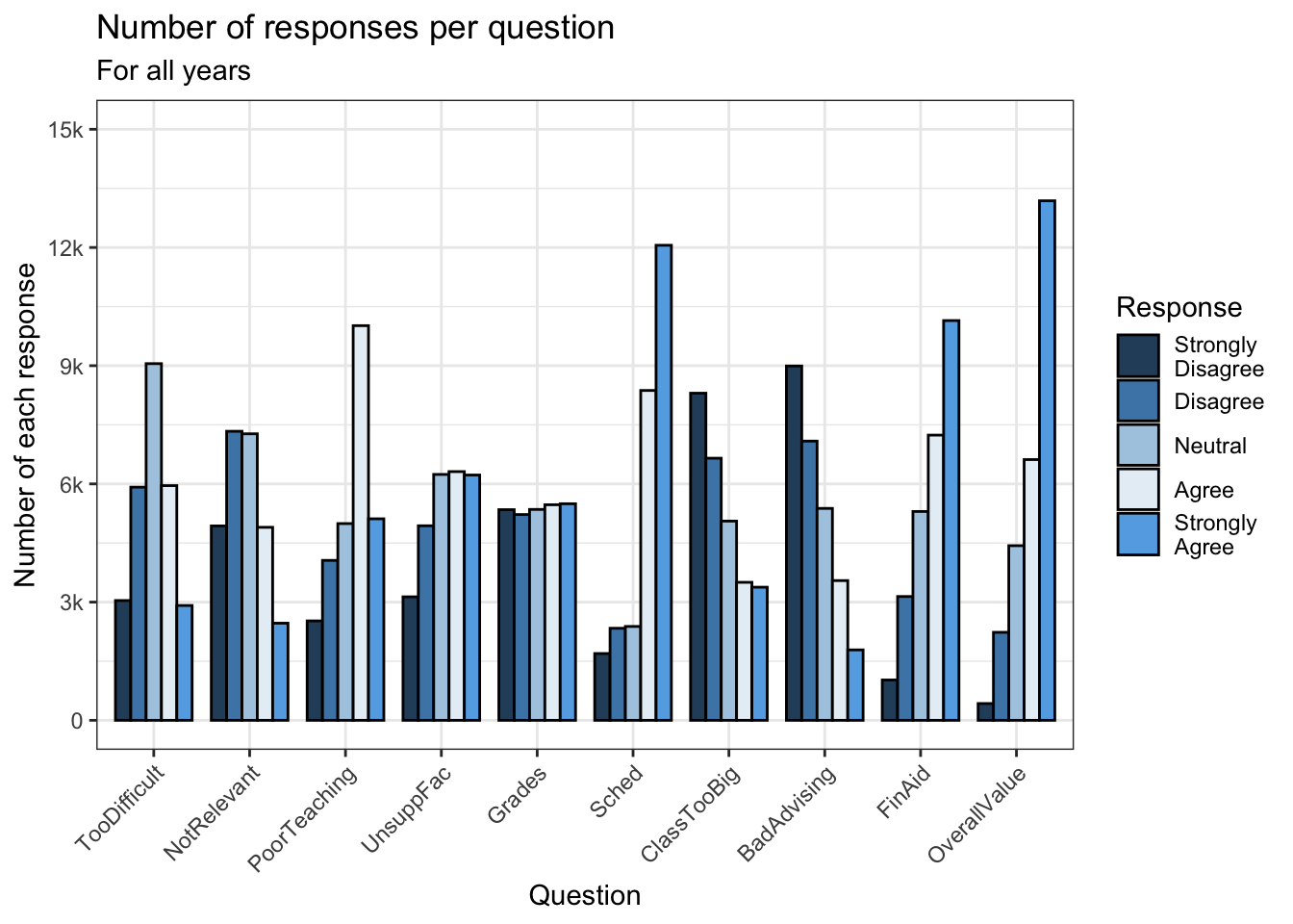
4.5.5 Grouped bar, narrowed & overlapping bars (x, y, fill + col())
Again, we are displaying the same data as the previous graph. We also use the same theme and color palette.
surveyQRN |>
  ggplot(aes(x = Question,
             y = n,
             fill = Response)) +
    geom_col(position=position_dodge(width=0.5),
             width=0.9,
             color = "black") +
    labs(title = "Number of responses per question",
         subtitle = "For all years",
         x = "Question",
         y = "Number of each response") +
    scale_y_continuous(limits = c(0, 15000),
                       breaks = c(0, 3000, 6000,
                                  9000, 12000, 15000),
                       labels = c("0", "3k", "6k",
                                  "9k", "12k", "15k")) +
    scale_x_discrete(guide = guide_axis(angle = 45))+
    theme_bw() +
    scale_fill_manual(values = c("#2a4d69", "#4b86b4",
                                 "#adcbe3", "#e7eff6",
                                 "#63ace5"))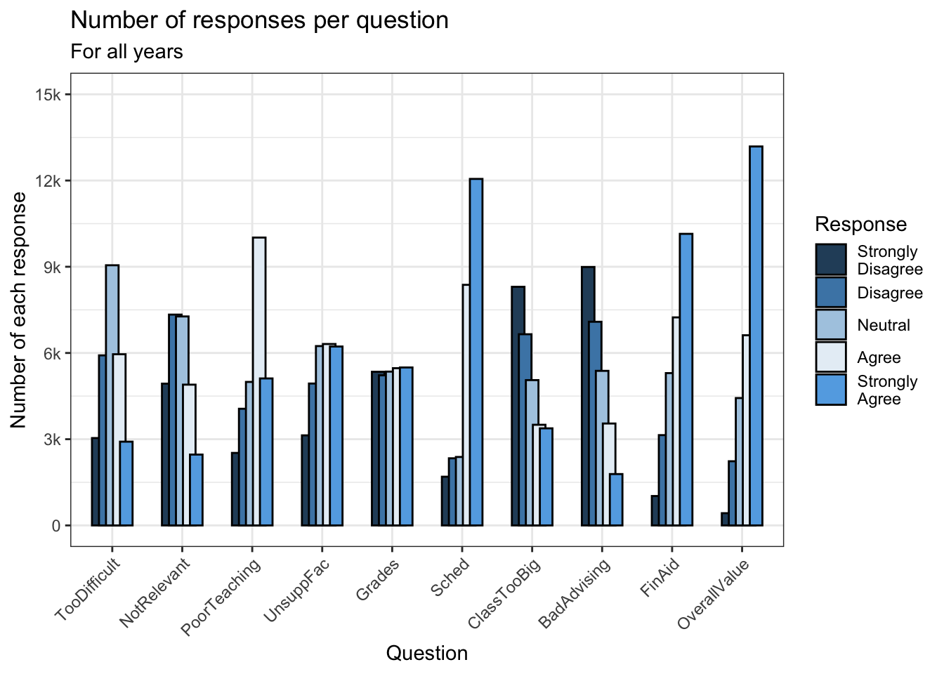
4.5.6 Grouped bar, narrowed & spaced bars (x, y, fill + col())
In this graph, we take the opposite approach to graph in the previous section. We narrow the groups by a small amount but narrow each individual bar even more. We still use the same theme and color palette.
surveyQRN |>
  ggplot(aes(x = Question,
             y = n,
             fill = Response)) +
    geom_col(position=position_dodge(width=0.9),
             width=0.5,
             color = "black") +
    labs(title = "Number of responses per question",
         subtitle = "For all years",
         x = "Question",
         y = "Number of each response") +
    scale_y_continuous(limits = c(0, 15000),
                       breaks = c(0, 3000, 6000,
                                  9000, 12000, 15000),
                       labels = c("0", "3k", "6k",
                                  "9k", "12k", "15k")) +
    scale_x_discrete(guide = guide_axis(angle = 45))+
    theme_bw() +
    scale_fill_manual(values = c("#2a4d69", "#4b86b4",
                                 "#adcbe3", "#e7eff6",
                                 "#63ace5"))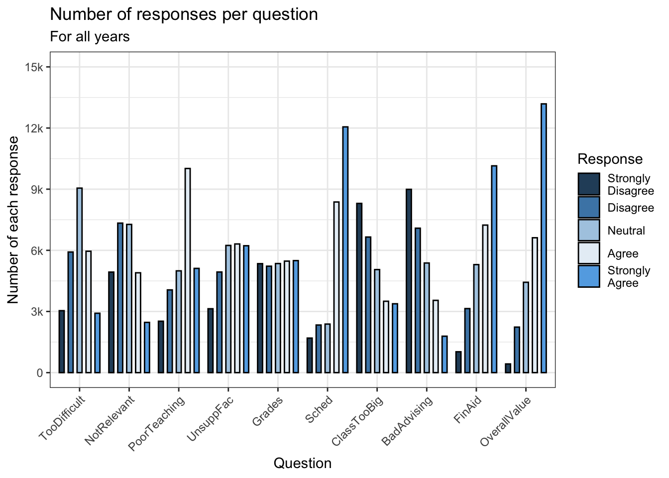
4.5.7 Percent Stacked bar (x, y, fill + col())
Back in this section, we created a graph that showed the raw counts of the number of each response for each question. This time we want to show the percent of answers for each response to each question. Again, we use the same theme and color palette as before.
surveyQRN |>
  ggplot(aes(x = Question,
             y = n,
             fill = Response)) +
    geom_col(position = "fill", color = "black") +
    labs(title = "Percentage of each response to each question",
         subtitle = "For all years",
         x = "Question",
         y = "Percent of each response") +
    scale_y_continuous(breaks = c(0.0, 0.25, 0.5,
                                  0.75, 1.0),
                       labels = c("0%", "25%", "50%",
                                  "75%", "100%")) +
    scale_x_discrete(guide = guide_axis(angle = 45))+
    theme_bw() +
    scale_fill_manual(values = c("#2a4d69", "#4b86b4",
                                 "#adcbe3", "#e7eff6",
                                 "#63ace5"))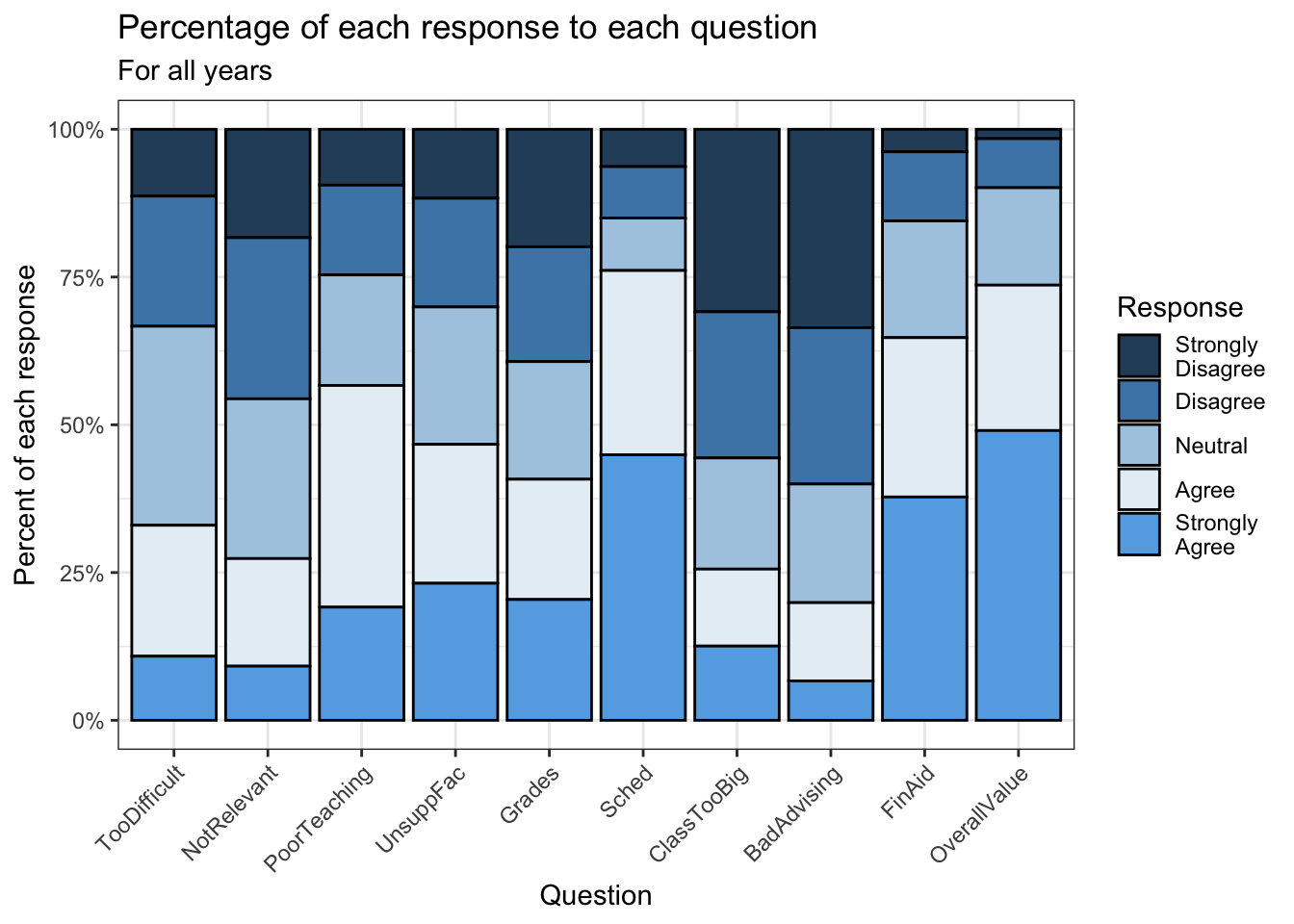
4.5.8 Bar chart wrapped by a facet: x, y (implicit count), fill (redundant), facet + bar()
This graph presents the same information as in this section but without specifying the ncol argument. Notice how we don’t have to change the theme and color palette when working with facets; they automatically get applied to each facet.
4.5.9 Column chart wrapped by facets: x, y (explicit count), facet + col()
This graph displays the same information as the previous graph but goes about it entirely differently. Neither the theme nor the color palette changes.
student_RaceSexCount |>
  ggplot(aes(Sex, Count)) +
    geom_col(aes(fill = Sex),
             alpha = 0.8) +
    facet_wrap(~Race) +
    labs(title = "Number of applicants per Gender per Race",
         subtitle = "For most recent year",
         x = "Gender",
         y = "Number of applicants")+
    theme_bw() +
    scale_fill_manual(values = c("#00aedb", "#ffc425"))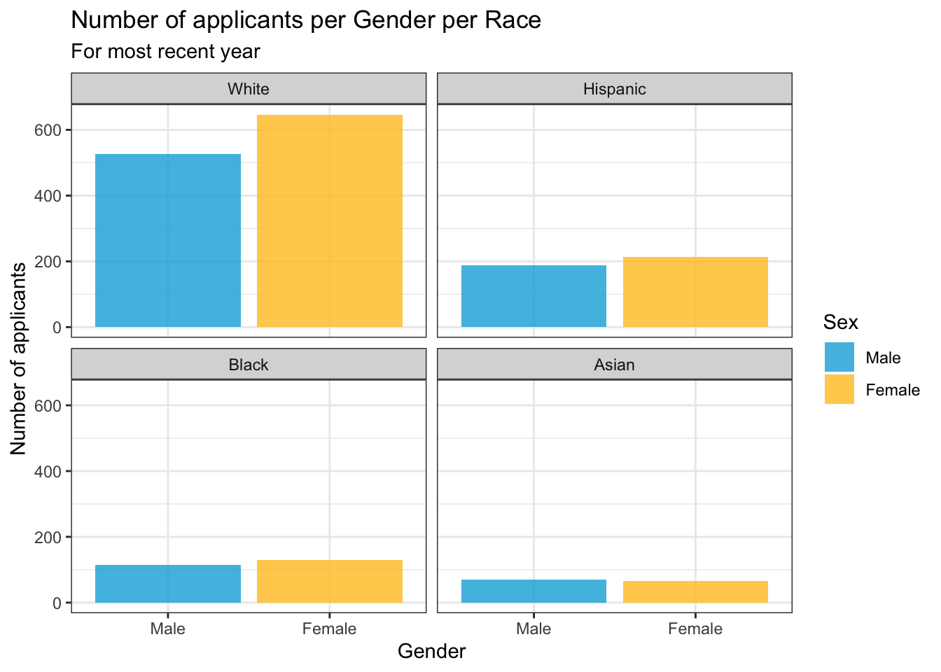
If you decide that you want to show the value on the graph as well, you should use the geom_text() geom. Its attributes here require a bit of explaining:
label: the text displayed on the graph.y: the vertical (y) position of the text. Here we want it below the top of the bar so we subtract a value from theyposition of the top line of the bar (Countin this graph). If we had wanted it above, we would have used addition. The needed value per graph depends on the values in they-axis, so you will probably need to experiment a few times to get the position that you want.size: the size of the text. Again, you’ll need to experiment with this value. You might also put it inside theaes()and have it vary depending on a column.color: the color of the text.
student_RaceSexCount |>
  ggplot(aes(Sex, Count)) +
    geom_col(aes(fill = Sex),
             alpha = 0.8) +
    geom_text(aes(label = Count, y = Count - 20),
              size = 3, color = "black") +
    facet_wrap(~Race) +
    labs(title = "Number of applicants per Gender per Race",
         subtitle = "For most recent year",
         x = "Gender",
         y = "Number of applicants")+
    theme_bw() +
    scale_fill_manual(values = c("#00aedb", "#ffc425"))
4.5.10 Colored column chart wrapped by facets: x, y (explicit count), fill (redundant), facet + col()
Clearly, this is the same graph as the previous section but with bar colors specified by fill=Sex. Everything else is the same. Again, we’re using the same theme and manual color palette.
student_RaceSexCount |>
  ggplot(aes(Sex, Count, fill=Sex)) +
    geom_col(alpha = 0.8) +
    facet_wrap(~Race) +
    labs(title = "Number of applicants per Gender per Race",
         subtitle = "For most recent year",
         x = "Gender",
         y = "Number of applicants")+
    theme_bw() +
    scale_fill_manual(values = c("#00aedb", "#ffc425"))
4.5.11 Boxplot differentiated by 2 other columns: x, y, color + boxplot()
In this graph, we set the fill to lightgrey so that it is easier to read the graph. We used a manual color palette for the outline color. Contrast this with the next graph to see what you prefer.
admitdataRaceGPAPell |>
  ggplot(aes(IPEDSRaceEthnicity, UnivGPA,
             color = PellStatus)) +
    geom_boxplot(varwidth=TRUE,
                 fill = "lightgrey") +
    labs(title = paste("University GPA range per",
                       "race and Pell Grant Status",
                       sep=" "),
         subtitle = "For all years",
         x = "Race/ethnicity",
         y = "University GPA",
         color = "Pell Grant\nStatus")+
    theme_bw() +
    scale_color_manual(values = c("#2a4d69", "#4b86b4"))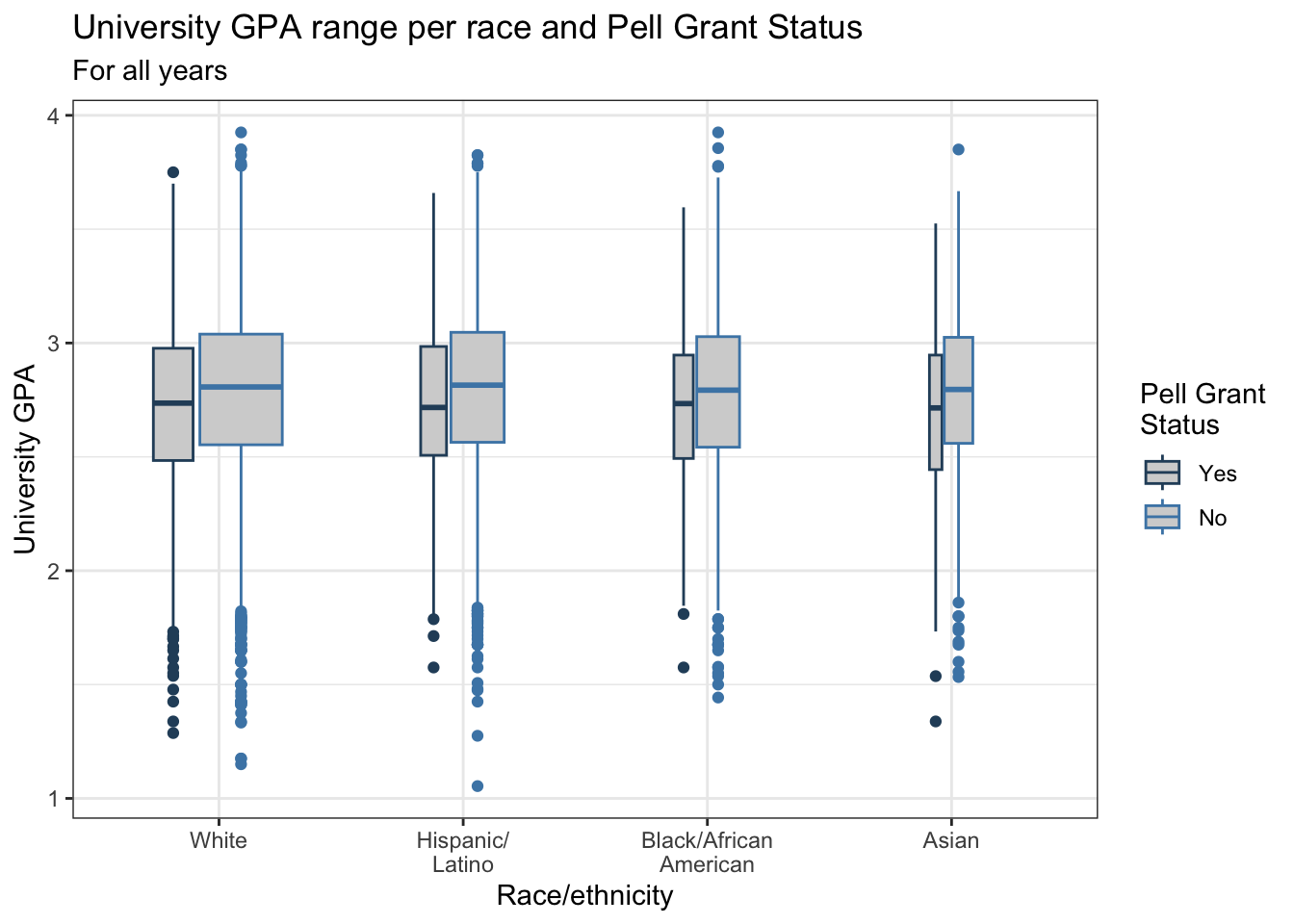
4.5.12 Colored boxplot differentiated by 2 other columns: x, y, fill + boxplot()
This graph is exactly the same as the graph in the previous section except that it uses fill instead of color to highlight Pell Status. We use a fill color palette that changes based on the PellStatus.
admitdataRaceGPAPell |>
  ggplot(aes(IPEDSRaceEthnicity, UnivGPA,
             fill = PellStatus)) +
    geom_boxplot(varwidth=TRUE) +
    labs(title = paste("University GPA range per",
                       "race and Pell Grant Status",
                       sep=" "),
         subtitle = "For all years",
         x = "Race/ethnicity",
         y = "University GPA",
         fill = "Pell Grant Status")+
    theme_bw() +
    scale_fill_manual(values = c("#2a4d69", "#4b86b4"))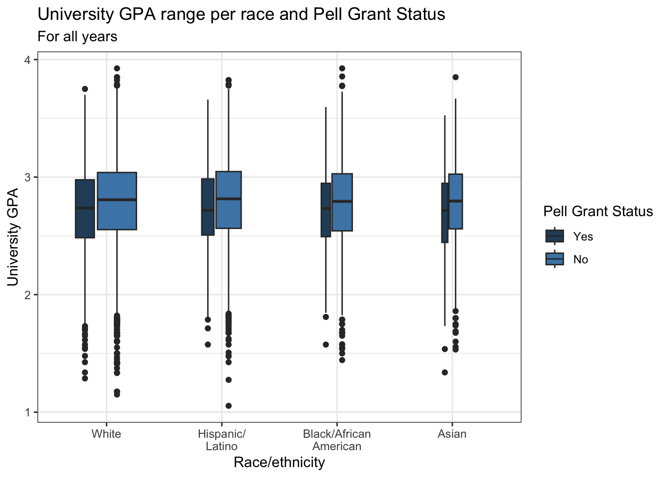
4.5.13 Boxplot differentiated by one column and wrapped by another: x, y, facet + boxplot()
This graph displays the same data as in the previous graph except that it uses facet_wrap() instead of fill or color to differentiate Pell Status. We did set the fill for the boxplot to make it easier to compare the plots.
admitdataRaceGPAPell |>
  ggplot(aes(IPEDSRaceEthnicity, UnivGPA)) +
    facet_wrap(~PellStatus,
               labeller = label_both) +
    geom_boxplot(varwidth=TRUE,
                 fill = "lightblue") +
    labs(title = paste("University GPA range per",
                       "race and Pell Grant Status",
                       sep=" "),
         subtitle = "For all years",
         x = "Race/ethnicity",
         y = "University GPA")+
    theme_bw()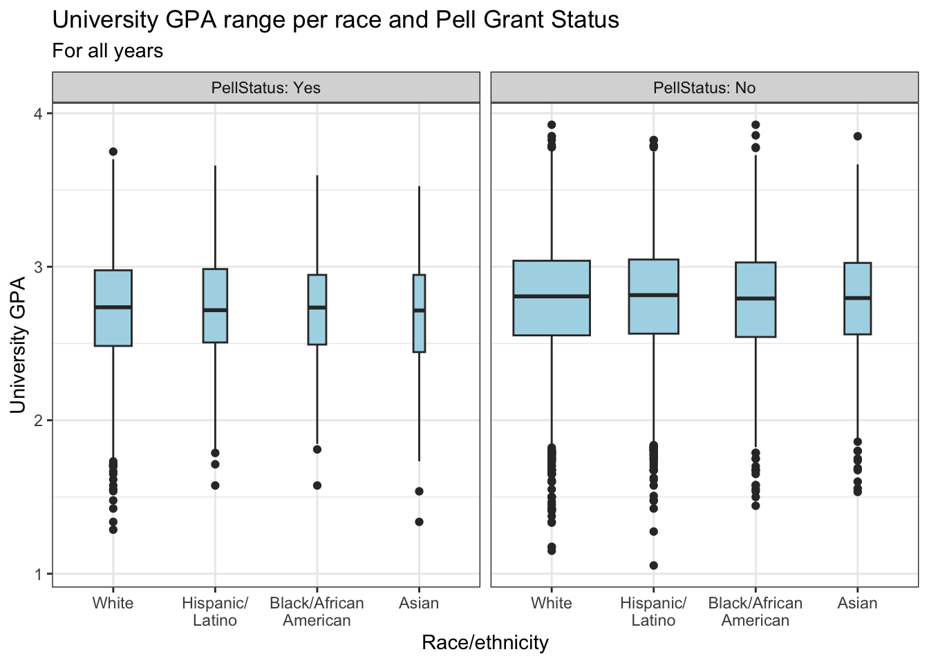
4.5.14 Horizontal boxplot differentiated by one column and wrapped by another: x, y, facet + horizontal boxplot()
This graph displays the same data as in the previous graph except that it displays the boxplots horizontally. The themes and fills are the same for both graphs.
admitdataRaceGPAPell |>
  ggplot(aes(IPEDSRaceEthnicity, UnivGPA)) +
    facet_wrap(~PellStatus,
               labeller = label_both) +
    geom_boxplot(varwidth=TRUE, fill = "lightblue") +
    coord_flip() +
    labs(title = paste("University GPA range per",
                       "race and Pell Grant Status",
                       sep=" "),
         subtitle = "For all years",
         x = "Race/ethnicity",
         y = "University GPA")+
theme_bw() 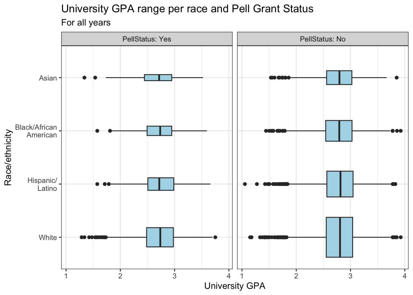
4.6 Ordered, numeric, discrete
If you have one column that is ordered (e.g., a series of dates), another that is discrete (e.g., sex, Pell Grant Status, race/ethnicity, etc.), and another column that is numeric, then the situation is calling out for a line graph that further differentiates (based on the discrete column) via either colors or facets. Let’s look at a few examples.
4.6.1 Line chart: x, y, color + line()
As per usual, we set the usual theme and a color palette for the color of the lines. In a previous step, we set the linewidth to 1 to make it easier to see.
admitdataYearGenderCount |>
  ggplot(aes(x = AdmitCalendarYear,
             y = Count,
             color = Gender,
             shape = Gender)) +
    geom_line(linewidth = 1) +
    labs(title = paste("Number of Admits by",
                       "Gender Per Calendar Year",
                       sep = " "),
         x = "Calendar Year",
         y = "Number of Admits") +
    scale_y_continuous(limits = c(0, 900),
                       breaks = c(0, 150, 300, 450,
                                  600, 750, 900)) +
    scale_x_continuous(limits = c(2011, 2022),
                       breaks = c(2012, 2014, 2016,
                                  2018, 2020, 2022)) +
    theme_bw() +
    scale_color_manual(values = c("#00aedb", "#ffc425",
                                 "darkgrey", "lightgrey"))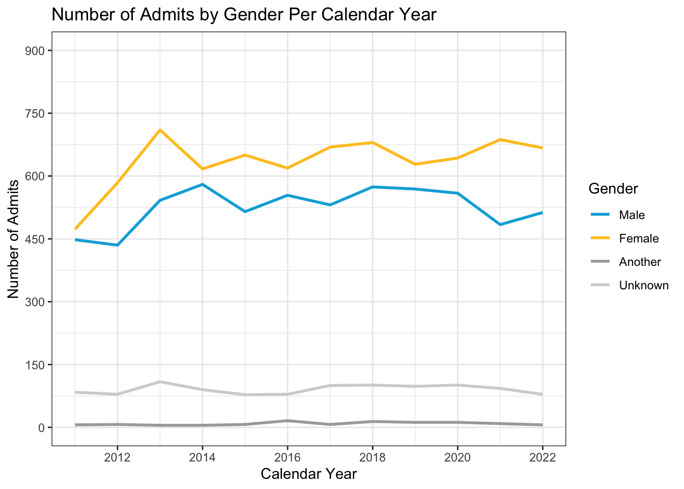
If you are worried that the reader will not be able to see the line colors well enough, you might consider adding a point plot to the graph. We plot the Count against AdmitCalendarYear (as is done for the line) and we set size=3 so that the shapes are easier to see. The legend changes to show both the colors and the shapes for all the lines.
admitdataYearGenderCount |>
  ggplot(aes(x = AdmitCalendarYear,
             y = Count,
             color = Gender,
             shape = Gender)) +
    geom_line(linewidth = 1) +
    geom_point(aes(AdmitCalendarYear, Count),
               size = 3) +
    labs(title = paste("Number of Admits by",
                       "Gender Per Calendar Year",
                       sep = " "),
         x = "Calendar Year",
         y = "Number of Admits") +
    scale_y_continuous(limits = c(0, 900),
                       breaks = c(0, 150, 300, 450,
                                  600, 750, 900)) +
    scale_x_continuous(limits = c(2011, 2022),
                       breaks = c(2012, 2014, 2016,
                                  2018, 2020, 2022)) +
    theme_bw() +
    scale_color_manual(values = c("#00aedb", "#ffc425",
                                 "darkgrey", "lightgrey"))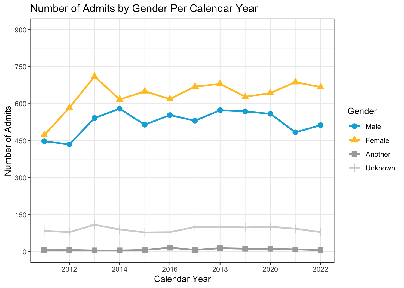
If knowing the underlying values is important, then you might want to plot the values on the graph. Both geom_text() and geom_label() can accomplish this. You can learn about the subtleties of both on this page. The geom_label() option plots text within a background rectangle. Let’s examine the arguments for a moment:
label: the text that is displayed on the graph.fill: sets the color of the label background.color: sets the color of the label text to a constant value (since it’s outside of theaes()).fontface: makes the text a little easier to read against the fill.hjust: puts the text directly over the plotted point.
Notice that we also removed the shape argument from the ggplot(aes()) because the label prints over it.
admitdataYearGenderCount |>
  ggplot(aes(x = AdmitCalendarYear,
             y = Count,
             color = Gender)) +
    geom_line(linewidth = 1) +
    geom_point(aes(AdmitCalendarYear, Count),
               size = 3) +
    geom_label(aes(label = Count, fill = Gender),
               color = "white", fontface = "bold",
               hjust = "center") +
    labs(title = paste("Number of Admits by",
                       "Gender Per Calendar Year",
                       sep = " "),
         x = "Calendar Year",
         y = "Number of Admits") +
    scale_y_continuous(limits = c(0, 900),
                       breaks = c(0, 150, 300, 450,
                                  600, 750, 900)) +
    scale_x_continuous(limits = c(2011, 2022),
                       breaks = c(2012, 2014, 2016,
                                  2018, 2020, 2022)) +
    theme_bw() +
    scale_color_manual(values = c("#00aedb", "#ffc425",
                                 "darkgrey", "lightgrey"))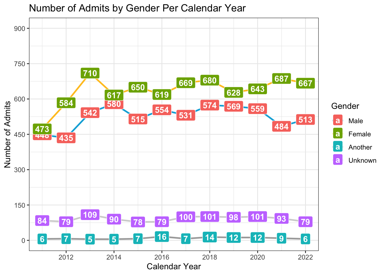
In the following, we have a similar setup to the first graph in this section. We are not going to use a point plot here because there are far too many points on each line.
babynames |>
  filter(Name %in% c("Jennifer", "Teresa", "Karen",
                     "Linda", "Nancy") &
           Sex == "F") |>
  ggplot(aes(x = YearOfBirth,
             y = Number,
             color=Name)) +
  geom_line(linewidth = 1) +
    labs(title = paste("Number of Births with",
                       "a Given Name Per Year",
                       sep = " "),
         x = "Calendar Year",
         y = "Number of babies born with a given name") +
    scale_x_continuous(limits = c(1880, 2020),
                       breaks = c(1880, 1900, 1920,
                                  1940, 1960, 1980,
                                  2000, 2020)) +
    scale_y_continuous(breaks = c(0, 20000, 40000,
                                  60000, 80000,
                                  100000),
                       labels = c("0", "20k", "40k",
                                  "60k", "80k", "100k")) +
    theme_bw() +
    scale_color_manual(values = c("#d11141", "#00b159",
                                  "#00aedb", "#f37735",
                                  "#ffc425"))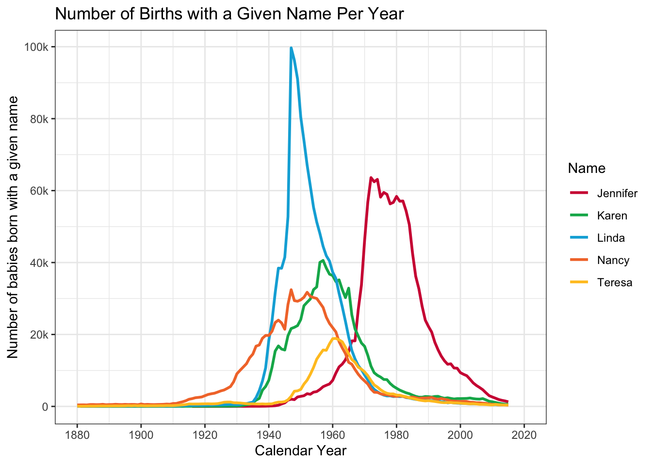
4.6.2 Line chart wrapped by facets: x, y, facet + line()
This graph displays the same data as in the previous section; however, we are now differentiating on Gender via a facet_wrap() instead of color. We have no need to use a color or fill palette here.
admitdataYearGenderCount |>
  ggplot(aes(x = AdmitCalendarYear,
             y = Count)) +
    facet_wrap(~Gender,
               labeller = label_both) +
    geom_line(linewidth = 1) +
    labs(title = paste("Number of Admits by",
                       "Gender Per Calendar Year",
                       sep = " "),
         x = "Calendar Year",
         y = "Number of Admits") +
    scale_y_continuous(limits = c(0, 900),
                       breaks = c(0, 150, 300, 450,
                                  600, 750, 900)) +
    scale_x_continuous(limits = c(2011, 2022),
                       breaks = c(2012, 2014, 2016,
                                  2018, 2020, 2022)) +
    theme_bw()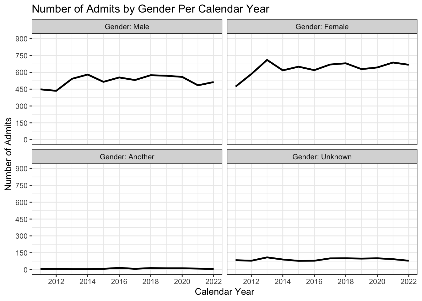
4.7 2 continuous
4.7.1 Point plot with fitted line: x, y + point() + smooth()
The default colors for both the line and point plots work just fine here. Let’s also talk for a moment about the alpha values set.
- We can see the value of
alpha=0.2for point by noticing the heavy black in the middle. This stands out much more prominently because of the transparency of the points. The single points at the edge of the graph are much lighter since they are only 1- or 2-deep whereas the points in the middle of the cluster are deeply layered, and thus much darker. - The
alpha=1.0for the line means that it is fully opaque. That, combined with it being plotted after the point plots means that it is shown on top of the point plots.
admitdataIncGPAGender |>
  ggplot(aes(x = FamilyIncome, y = UnivGPA)) +
    geom_point(alpha = 0.2) +
    geom_smooth(alpha = 1.0) +
    labs(title = "University GPA by Family Income",
         subtitle = "For all years",
         x = "Family Income",
         y = "University GPA") +
    scale_y_continuous(limits = c(1.0, 4.0),
                       breaks = c(1.0, 2.0, 3.0, 4.0),
                       labels = c("1.0", "2.0",
                                  "3.0", "4.0")) +
    scale_x_continuous(breaks = c(0, 50000, 100000,
                                  150000, 200000,
                                  250000),
                       labels = c("$0", "$50k",
                                  "$100k", "$150k",
                                  "$200k", "$250k")) +
    theme_bw()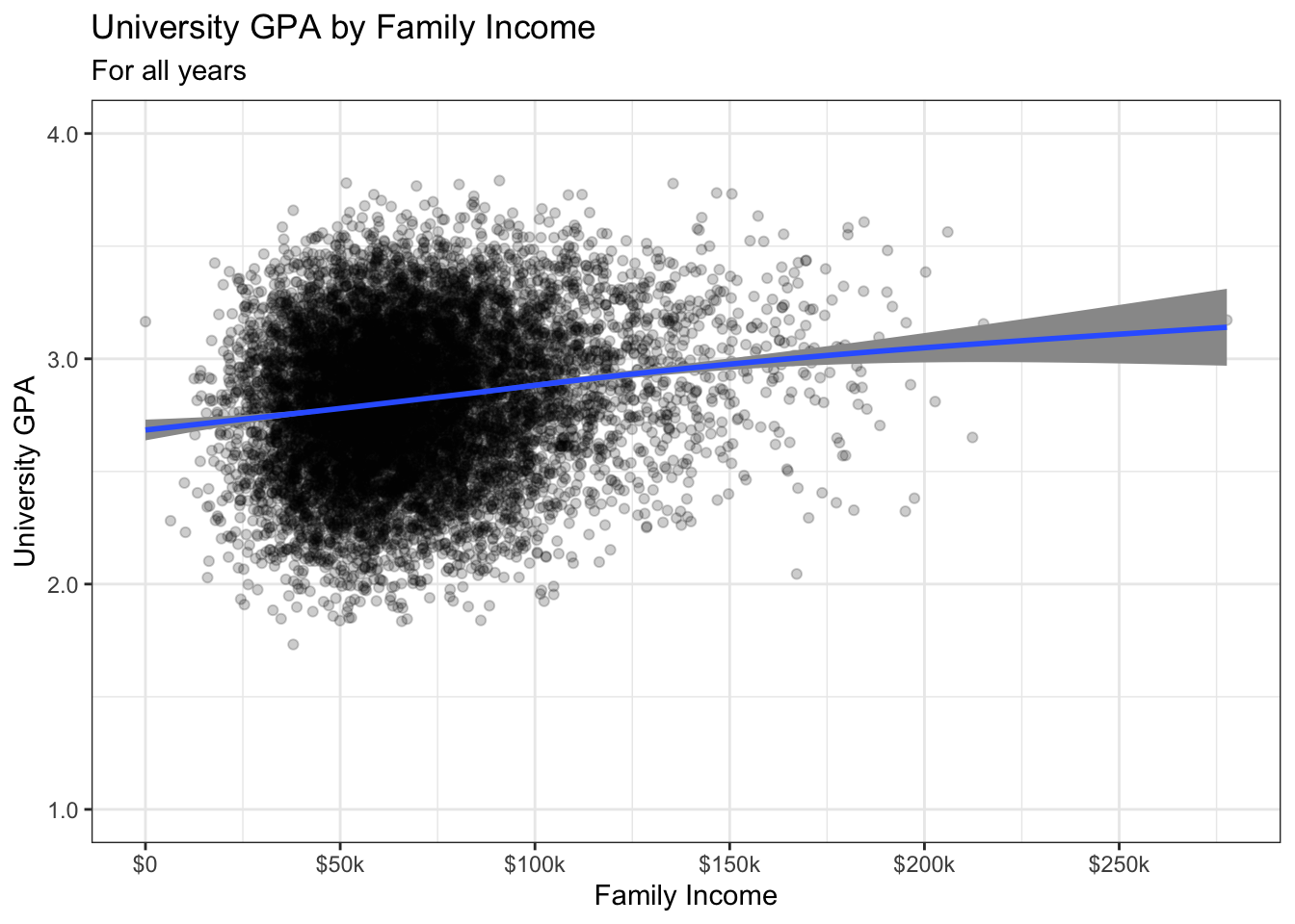
4.7.2 Hexplot with fitted line: x, y + hex() + smooth()
In this section, we present three different ways to apply colors to the geom_hex() plot. The theme stays the same for all three.
This first version simply shows the default colors.
admitdataIncGPAGender |>
  ggplot(aes(FamilyIncome, UnivGPA)) +
    geom_hex(bins = 50) +
    geom_smooth() +
    labs(title = "University GPA range by Family Income",
         subtitle = "For all years",
         x = "Family Income",
         y = "University GPA") +
    scale_y_continuous(limits = c(1.0, 4.0),
                       breaks = c(1.0, 2.0, 3.0, 4.0),
                       labels = c("1.0", "2.0",
                                  "3.0", "4.0")) +
    scale_x_continuous(breaks = c(0, 50000, 100000,
                                  150000, 200000,
                                  250000),
                       labels = c("$0", "$50k",
                                  "$100k", "$150k",
                                  "$200k", "$250k")) +
    theme_bw()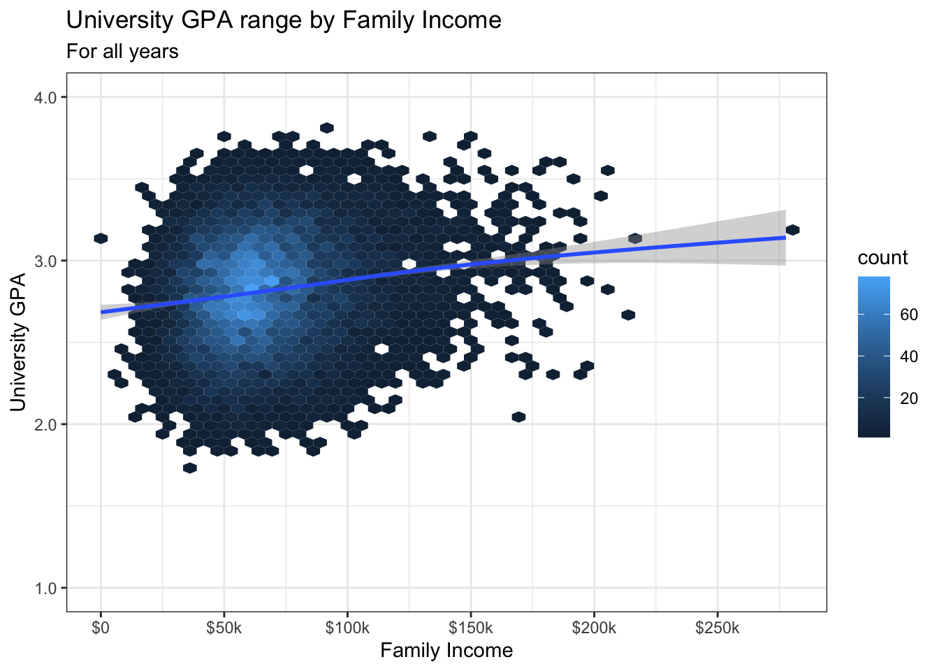
This second version demonstrates the use of scale_fill_distiller() to set the colors. This is from the Brewer library. The direction argument tells the function to use colors from light-to-dark. The name argument sets the name of the fill legend to the right of the graph. Finally, the palette argument sets the color palette that the function will use.
"Blues" is what’s known as as sequential palette. This is in contrast to a divergent palette. From this page: “If your story emphasizes the highest (=darkest) values, go for a sequential color scale. If your story is about the lowest and highest values, go for a diverging scale.” The use of a diverging scale is especially useful if there is a meaningful middle point.
The following are some of Brewer’s palettes:
- Diverging: BrBG, PiYG, PRGn, PuOr, RdBu, RdGy, RdYlBu, RdYlGn, Spectral
- Sequential: Blues, BuGn, BuPu, GnBu, Greens, Greys, Oranges, OrRd, PuBu, PuBuGn, PuRd, Purples, RdPu, Reds, YlGn, YlGnBu, YlOrBr, YlOrRd
In this case, we’re choosing a sequential palette because we want to emphasize the most dense areas and there is not a meaningful middle point.
admitdataIncGPAGender |>
  ggplot(aes(FamilyIncome, UnivGPA)) +
    geom_hex(bins = 50) +
    geom_smooth() +
    labs(title = "University GPA range by Family Income",
         subtitle = "For all years",
         x = "Family Income",
         y = "University GPA") +
    scale_y_continuous(limits = c(1.0, 4.0),
                       breaks = c(1.0, 2.0, 3.0, 4.0),
                       labels = c("1.0", "2.0",
                                  "3.0", "4.0")) +
    scale_x_continuous(breaks = c(0, 50000, 100000,
                                  150000, 200000,
                                  250000),
                       labels = c("$0", "$50k",
                                  "$100k", "$150k",
                                  "$200k", "$250k")) +
    scale_fill_distiller(palette = "Blues",
                         direction = 1,
                         name = "Count") +
    theme_bw()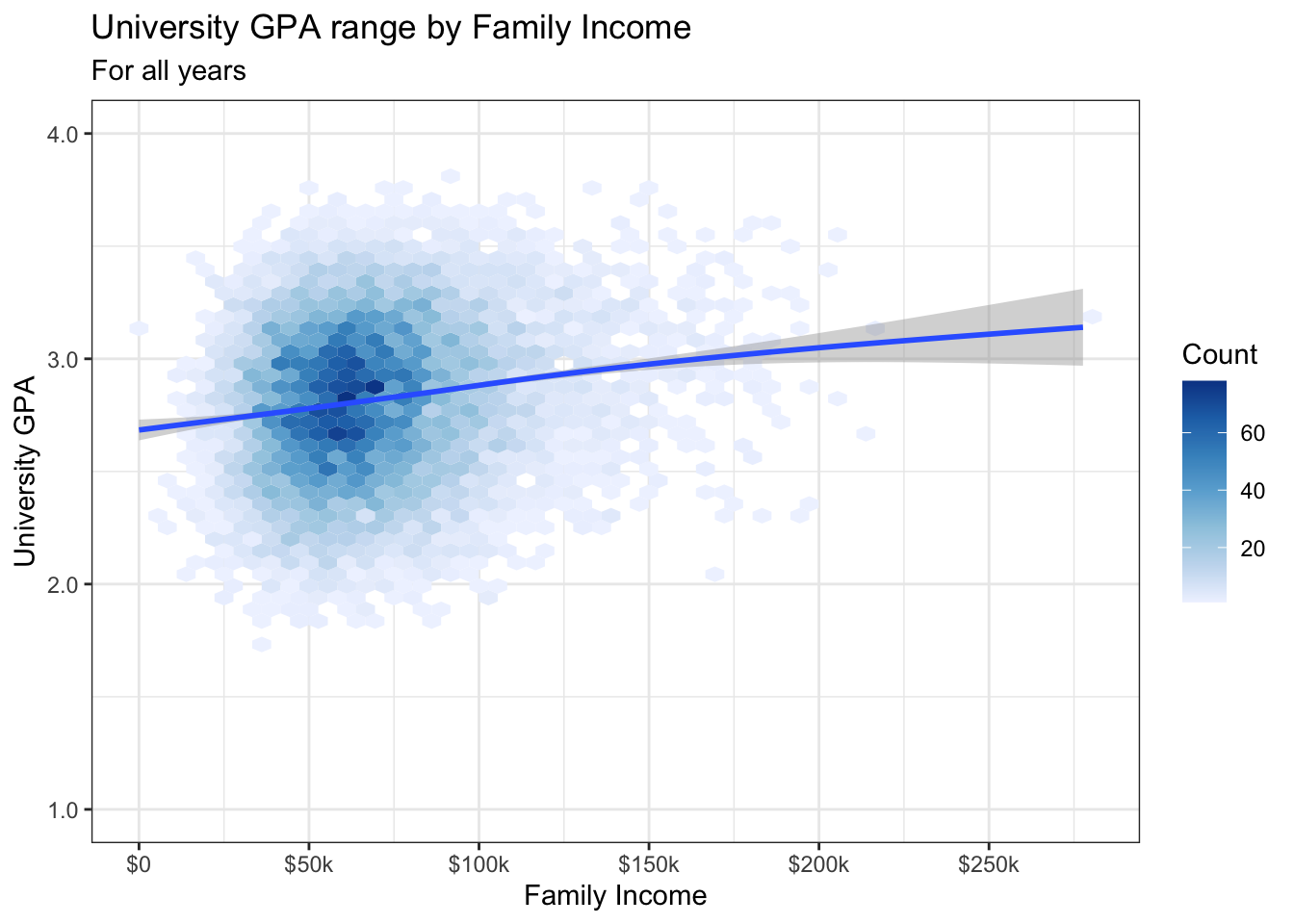
Finally, in this third case, we create our own sequential palette using the scale_fill_gradient() function. This has several arguments:
name(required): the legend title forfill.limits: the limits of the scale; this will remove data outside of these limits. We created the graph without this function first (see above), and noted the limits of the data in the legend. We then used those limits.breaks: these are the breaks that we want to appear in the legend.labels: these are the labels for each break.na.values: the color for the missing values. We use"white"here because we want it to look like the white background of the theme.low: the color of the smallest values in the graph.high: the color of the largest values in the graph.
admitdataIncGPAGender |>
  ggplot(aes(FamilyIncome, UnivGPA)) +
    geom_hex(bins = 50) +
    geom_smooth() +
    labs(title = "University GPA range by Family Income",
         subtitle = "For all years",
         x = "Family Income",
         y = "University GPA") +
    scale_y_continuous(limits = c(1.0, 4.0),
                       breaks = c(1.0, 2.0, 3.0, 4.0),
                       labels = c("1.0", "2.0",
                                  "3.0", "4.0")) +
    scale_x_continuous(breaks = c(0, 50000, 100000,
                                  150000, 200000,
                                  250000),
                       labels = c("$0", "$50k",
                                  "$100k", "$150k",
                                  "$200k", "$250k")) +
    scale_fill_gradient("Count",
                        limits = c(0, 80),
                        breaks = c(0, 20, 40, 60, 80),
                        labels = c("0", "20", "40",
                                   "60", "80"),
                        na.value = "white",
                        low = "lightyellow",
                        high = "darkblue") +
    theme_bw()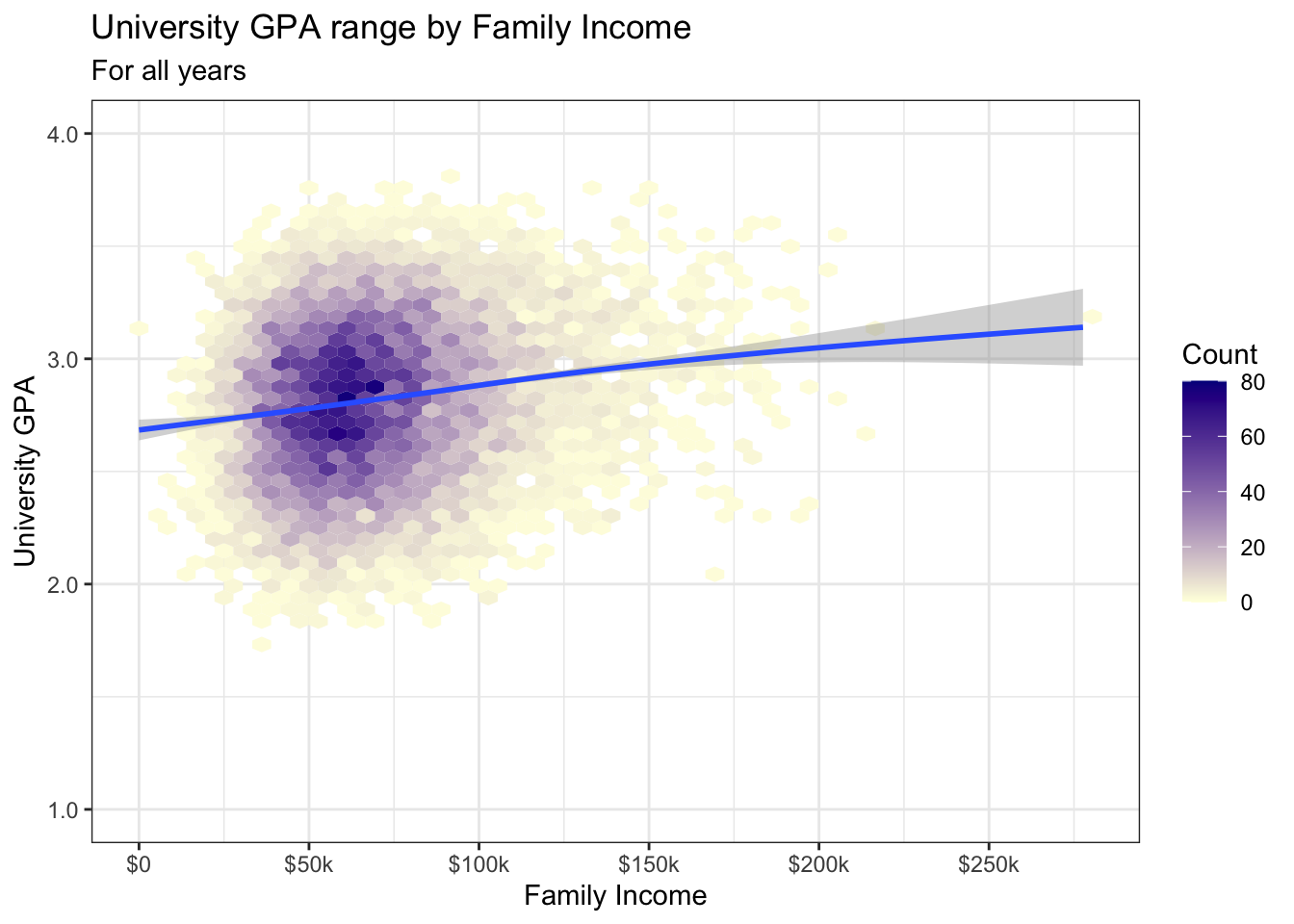
4.7.3 Density/2D plot with fitted line: x, y + density_2d() + smooth()
The geom_density_2d geoms are yet another way to show density. We use the filled version to show the fill colors in the graph. We use the geom_density_2d() version to show the lines on the graph.
In this first version, we use scale_fill_brewer() to set the colors using a sequential palette. Here, we discover a problem with this palette for our present purposes — the graph has 11 separate levels, but the palette only has 9 colors. Thus, the last two (highest/greatest) levels go back and reuse the light colors from the first two (lowest/smallest) levels. Not good.
admitdataIncGPAGender |>
  ggplot(aes(FamilyIncome, UnivGPA)) +
    geom_density_2d_filled(alpha = 0.5) +
    geom_density_2d(linewidth = 0.25, color = "black") +
    geom_smooth() +
    labs(title = "University GPA range by Family Income",
         subtitle = "For all years",
         x = "Family Income",
         y = "University GPA") +
    scale_y_continuous(limits = c(1.0, 4.0),
                       breaks = c(1.0, 2.0, 3.0, 4.0),
                       labels = c("1.0", "2.0",
                                  "3.0", "4.0")) +
    scale_x_continuous(breaks = c(0, 50000, 100000,
                                  150000, 200000,
                                  250000),
                       labels = c("$0", "$50k",
                                  "$100k", "$150k",
                                  "$200k", "$250k")) +
    scale_fill_brewer(palette = "Blues",
                      direction = 1) +
    theme_bw()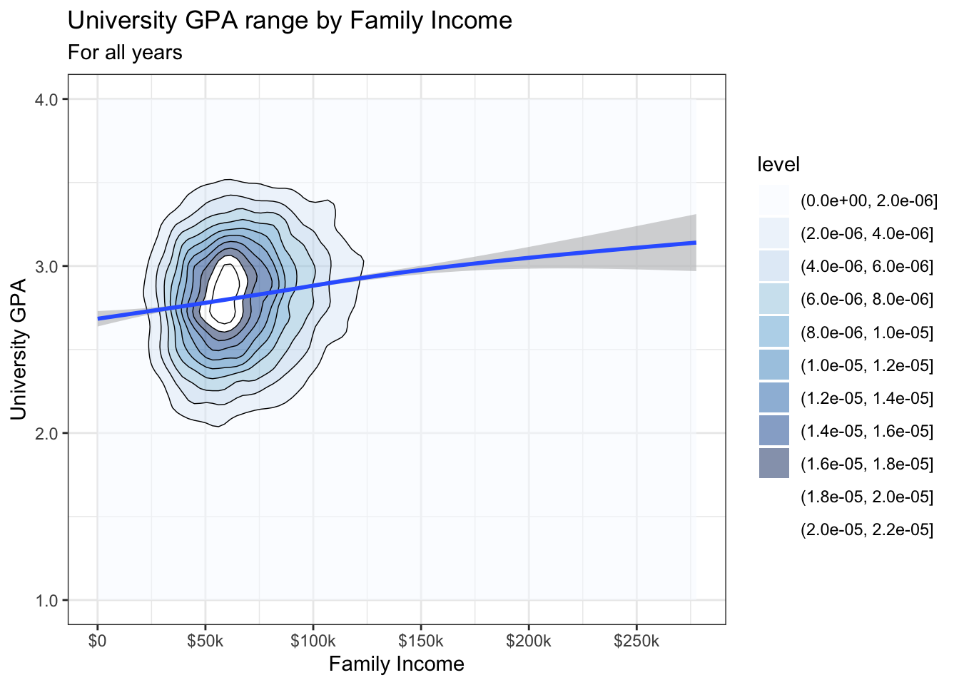
In order to fix this, we create our own sequential color palette using the colorRampPalette() function. We mimic the "Blues" palette but create a palette with 11 color levels. We also get rid of the alpha setting for the filled() geom in order to make the color intensity more obvious.
wbcolors <- colorRampPalette(c("white", "darkblue"))(11)
admitdataIncGPAGender |>
  ggplot(aes(FamilyIncome, UnivGPA)) +
    geom_density_2d_filled() +
    geom_density_2d(linewidth = 0.25, color = "black") +
    geom_smooth() +
    labs(title = "University GPA range by Family Income",
         subtitle = "For all years",
         x = "Family Income",
         y = "University GPA") +
    scale_y_continuous(limits = c(1.0, 4.0),
                       breaks = c(1.0, 2.0, 3.0, 4.0),
                       labels = c("1.0", "2.0",
                                  "3.0", "4.0")) +
    scale_x_continuous(breaks = c(0, 50000, 100000,
                                  150000, 200000,
                                  250000),
                       labels = c("$0", "$50k",
                                  "$100k", "$150k",
                                  "$200k", "$250k")) +
    scale_fill_manual("Levels",
                      values = wbcolors) +
    theme_bw()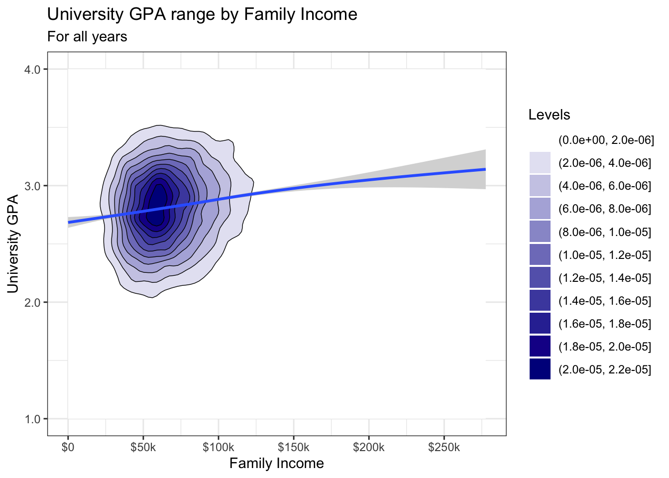
4.7.4 Boxplot based on continuous column: x, y + boxplot()
There is little to do here other than set the theme. We also set the fill for the boxplot because we like how this makes it stand out from the graph.
admitdataIncGPAGender |>
  ggplot(aes(x = FamilyIncome, y = UnivGPA)) +
    geom_boxplot(aes(group=cut_width(FamilyIncome,
                                     width=25000,
                                     boundary=0),
                     varwidth=TRUE),
                 fill = "lightgrey") +
    labs(title = "University GPA range by Family Income",
         subtitle = "For all years",
         x = "Family Income",
         y = "University GPA") +
    scale_y_continuous(limits = c(1.0, 4.0),
                       breaks = c(1.0, 2.0, 3.0, 4.0),
                       labels = c("1.0", "2.0",
                                  "3.0", "4.0")) +
    scale_x_continuous(breaks = c(0, 50000, 100000,
                                  150000, 200000,
                                  250000),
                       labels = c("$0", "$50k",
                                  "$100k", "$150k",
                                  "$200k", "$250k")) +
    theme_bw()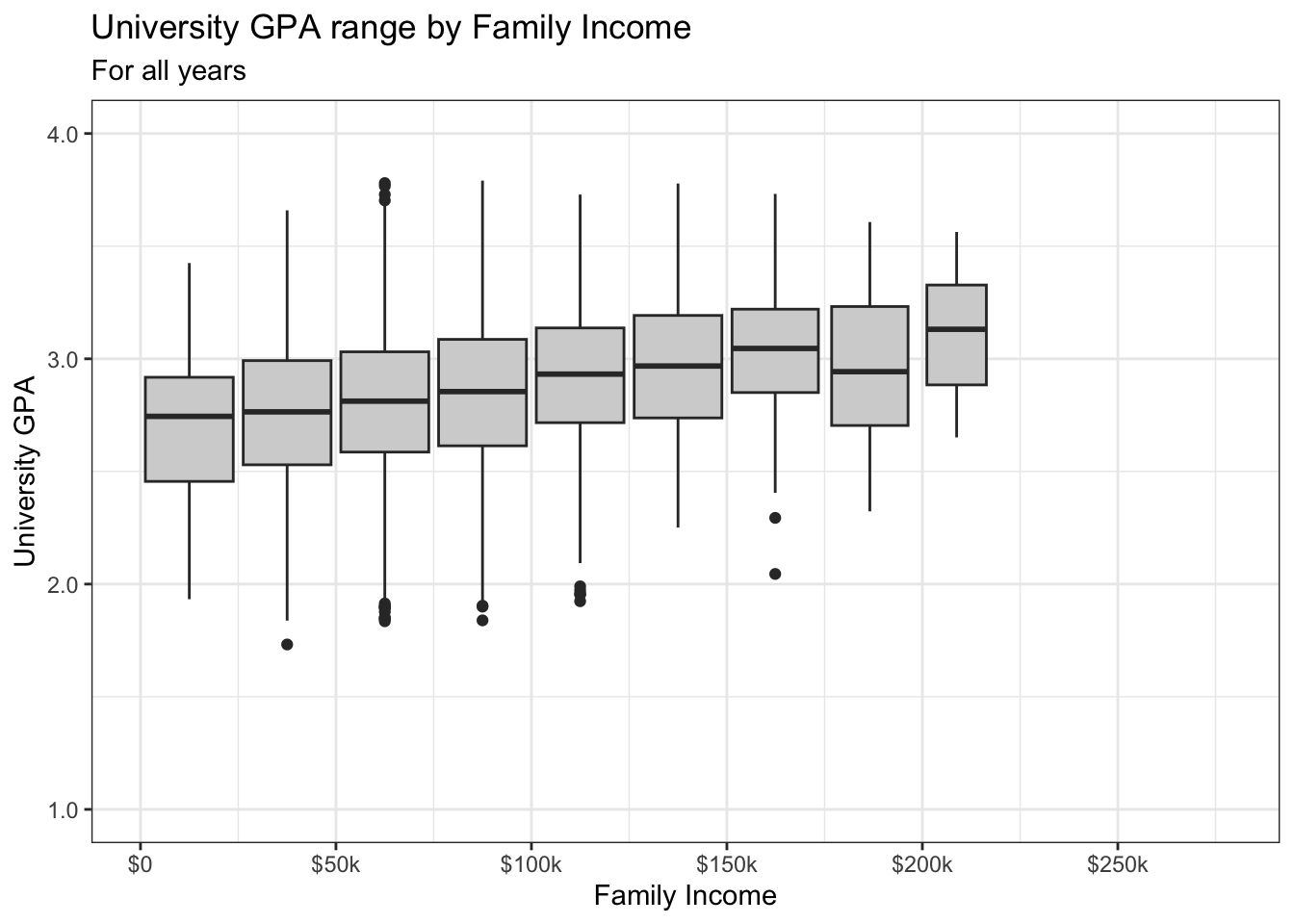
4.8 2 continuous, 1 discrete
4.8.1 Point plot with fitted line for subsets: x, y, color + point() + smooth()
Other than setting the theme, we apply our usual color palette for males and females. In a previous step, we had already set the alpha for the point plots.
admitdataIncGPAMF |>
  ggplot(aes(x = HSGPA, y = UnivGPA, color = Gender)) +
    geom_point(alpha = 0.3) +
    geom_smooth(method = "gam", alpha = 1.0) +
    labs(title = paste("University GPA vs.",
                       "High School GPA by Gender",
                       sep = " "),
         subtitle = "For all years",
         x = "HS GPA",
         y = "University GPA") +
    scale_y_continuous(limits = c(1.0, 4.0),
                       breaks = c(1.0, 2.0, 3.0, 4.0),
                       labels = c("1.0", "2.0",
                                  "3.0", "4.0")) +
    theme_bw() +
    scale_color_manual(values = c("#00aedb", "#ffc425"))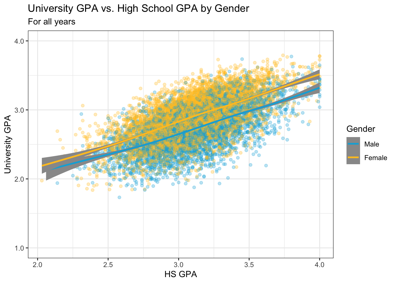
4.8.2 Point plot with fitted line wrapped by facets: x, y, facet + point() + smooth()
This is the same data as shown in this graph; however, here we use facets to differentiate the gender values rather than colors. The only thing that we have to do here is set the theme.
admitdataIncGPAMF |>
  ggplot(aes(x = HSGPA, y = UnivGPA)) +
    facet_wrap(~Gender) +
    geom_point(alpha = 0.3) +
    geom_smooth(method = "gam", alpha = 1.0) +
    labs(title = paste("University GPA vs.",
                       "High School GPA by Gender",
                       sep = " "),
         subtitle = "For all years",
         x = "HS GPA",
         y = "University GPA") +
    scale_y_continuous(limits = c(1.0, 4.0),
                       breaks = c(1.0, 2.0, 3.0, 4.0),
                       labels = c("1.0", "2.0",
                                  "3.0", "4.0")) +
    theme_bw()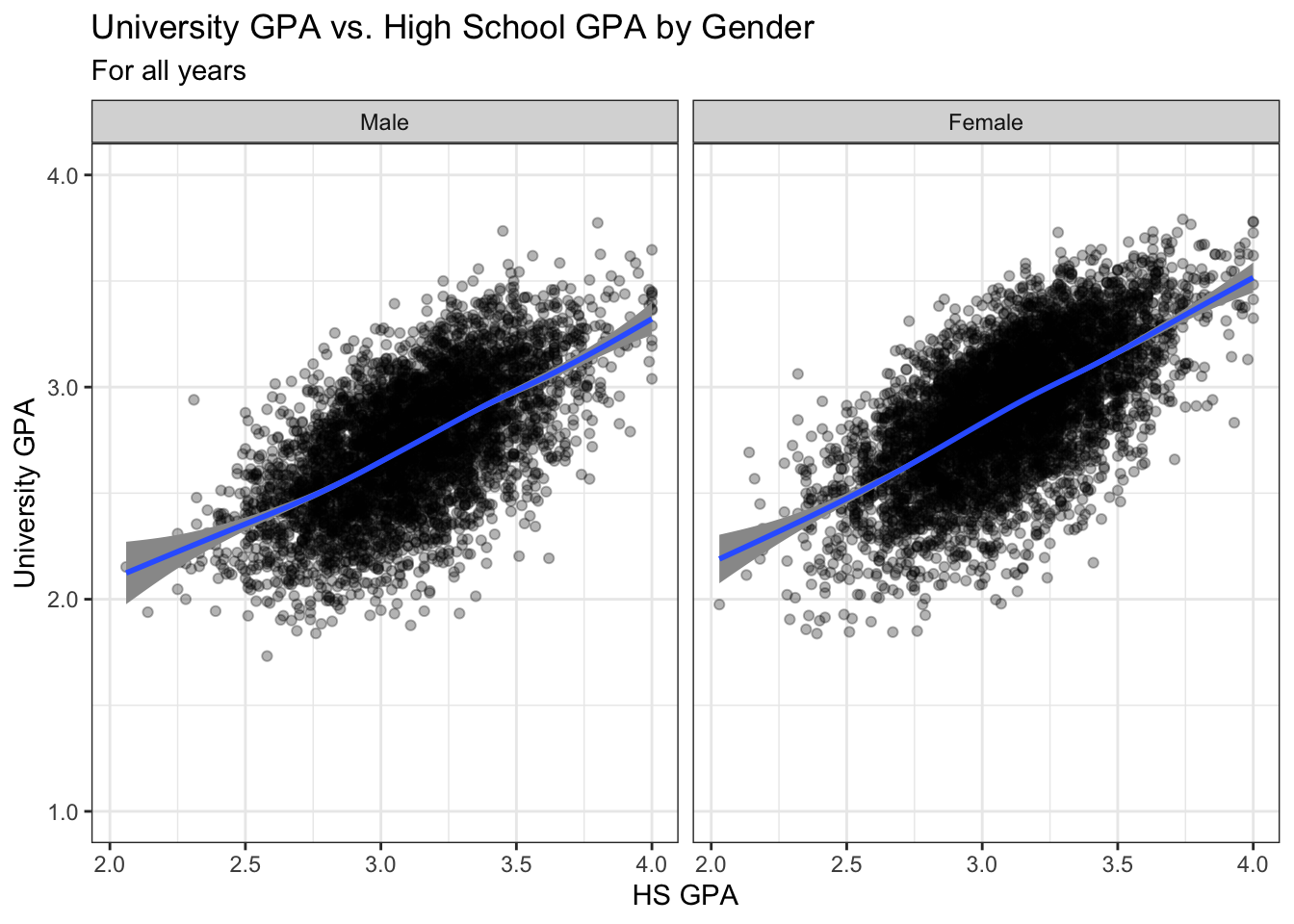
4.8.3 Boxplot wrapped by facets: x, y, facet + boxplot()
Again, this is the same data as in the previous section; however, this time, instead of displaying all of the data with point, we display a summary of the data with a boxplot. We set both the fill of the boxplot and the theme for the whole graph.
admitdataIncGPAMF |>
  ggplot(aes(x = HSGPA, y = UnivGPA)) +
    facet_wrap(~Gender) +
    geom_boxplot(aes(group=cut_width(HSGPA,
                                     width=0.25,
                                     boundary=2.0)),
                 fill = "lightgrey") +
    labs(title = paste("University GPA vs.",
                       "High School GPA by Gender",
                       sep = " "),
         subtitle = "For all years",
         x = "HS GPA",
         y = "University GPA") +
    scale_y_continuous(limits = c(1.0, 4.0),
                       breaks = c(1.0, 2.0, 3.0, 4.0),
                       labels = c("1.0", "2.0",
                                  "3.0", "4.0")) +
    theme_bw()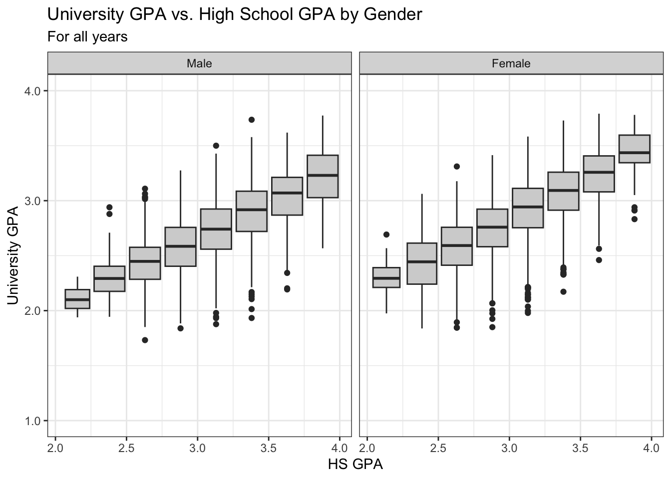
The following graph simplifies the previous one by ignoring Gender and displaying a boxplot for all data in each bin. Look how clear it is now that the bulk of the data is in the middle of the HS GPA range of values.
admitdataIncGPAMF |>
  ggplot(aes(x = HSGPA, y = UnivGPA)) +
    geom_boxplot(aes(group=cut_width(HSGPA,
                                     width=0.25,
                                     boundary=2.0)),
                 fill = "lightgrey",
                 varwidth=TRUE) +
    labs(title = "University GPA ranges vs. High School GPA",
         subtitle = "For all years",
         x = "HS GPA",
         y = "University GPA") +
    scale_y_continuous(limits = c(1.0, 4.0),
                       breaks = c(1.0, 2.0, 3.0, 4.0),
                       labels = c("1.0", "2.0",
                                  "3.0", "4.0")) +
    scale_x_continuous(limits = c(2.0, 4.0),
                       breaks = c(2, 2.5, 3.0, 3.5, 4.0),
                       labels = c("2.0", "2.5",
                                  "3.0", "3.5",
                                  "4.0")) +
theme_bw() 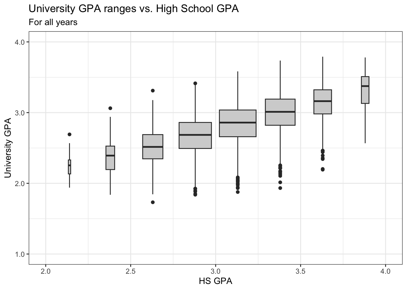
4.8.4 Violin plot wrapped by facets: x, y, facet + violin()
We are, again, displaying the same data as in the previous section. Since there are not multiple colors, we do not have to set a fill or color palette. We set the fill for the violin plot to make it easier to read.
admitdataIncGPAMF |>
  ggplot(aes(x = HSGPA, y = UnivGPA)) +
    facet_wrap(~Gender) +
    geom_violin(aes(group=cut_width(HSGPA,
                                    width=0.25,
                                    boundary=2.0),
                    scale="count"),
                fill = "lightgrey") +
    labs(title = paste("University GPA distributions vs.",
                       "High School GPA by Gender",
                       sep = " "),
         subtitle = "For all years",
         x = "HS GPA",
         y = "University GPA") +
    scale_y_continuous(limits = c(1.0, 4.0),
                       breaks = c(1.0, 2.0, 3.0, 4.0),
                       labels = c("1.0", "2.0",
                                  "3.0", "4.0")) +
    theme_bw()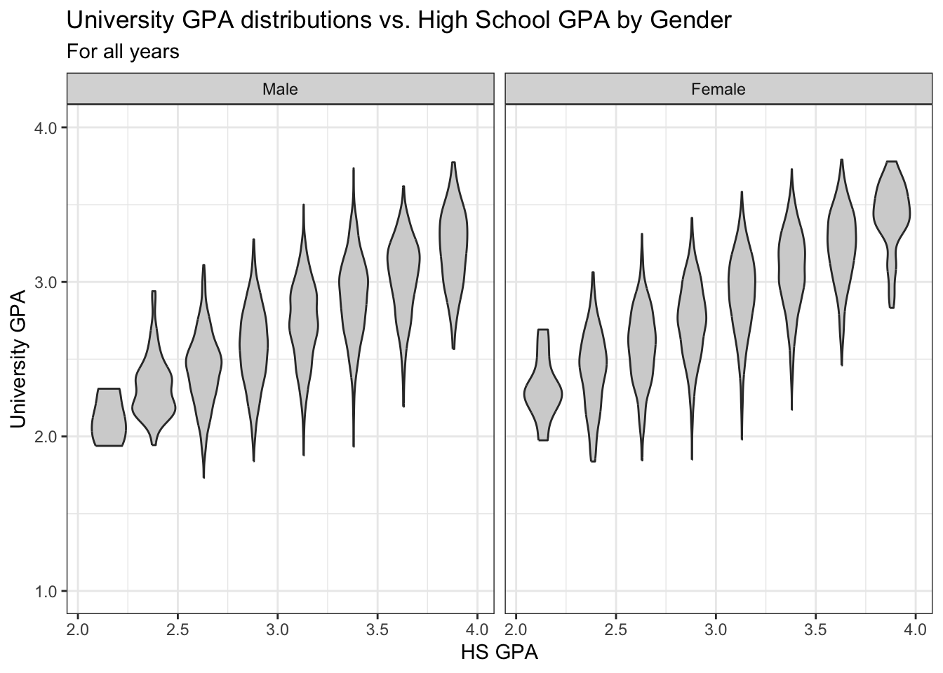
4.8.5 Jitter and box plot by subset: x, y, color + jitter() + boxplot()
This graph, again displaying the same underlying data as in this previous section.
This is something a bit different. Our color palette for the continuous variable HSGPA is set to scale_color_viridis_c (note the c at the end for continuous). This makes the point plot vary depending on the value of the applicant’s HSGPA.
admitdataIncGPAMF |>
  ggplot(aes(x = Gender,
             y = UnivGPA,
             color = HSGPA)) +
    geom_jitter(alpha = 0.3) +
    geom_boxplot(alpha = 1.0,
                 linewidth=0.75,
                 color = "black",
                 fill = NA) +
    labs(title = paste("University GPA",
                       "distributions by",
                       "Gender (and HS GPA)",
                       sep = " "),
         subtitle = "For all years",
         x = "Gender",
         y = "University GPA",
         color = "HS GPA") +
    scale_y_continuous(limits = c(1.0, 4.0),
                       breaks = c(1.0, 2.0, 3.0, 4.0),
                       labels = c("1.0", "2.0",
                                  "3.0", "4.0")) +
    theme_bw() +
    scale_color_viridis_c()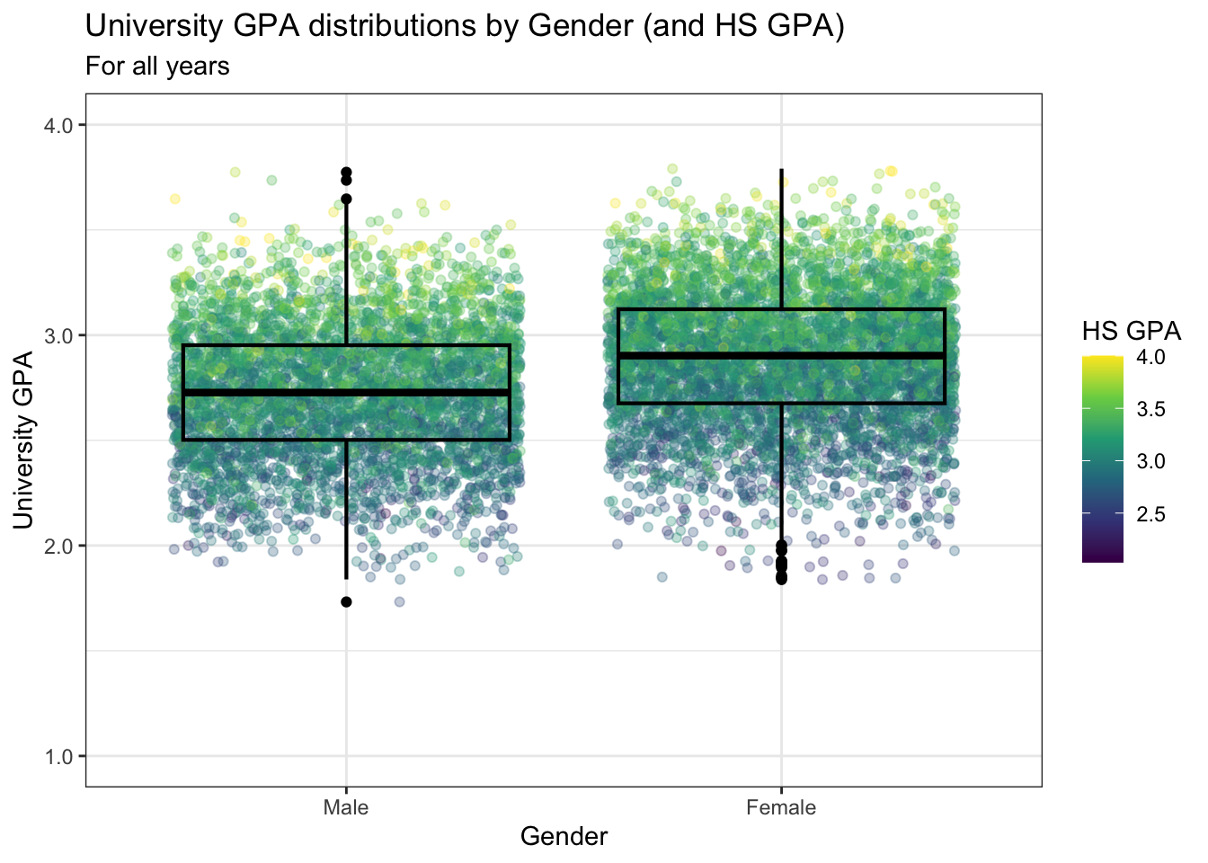
4.9 2 continuous, 2 discrete
In this section we will be working with three fairly complex sets of data and showing varying ways of highlighting relationships within that data. We are very much drawing on ggplot’s strengths and flexibility with these graphs.
4.9.1 Point plot with fitted line for subsets wrapped by facet: x, y, color, facet + point() + smooth()
In this step we set our usual color palette for male and female and also set the graph theme.
to_full_name <- as_labeller(c("ARTS" = "Arts",
                           "BUSI" = "Business",
                           "HUMA" = "Humanities",
                           "STEM" = "STEM"))
admitdataHSUnivMFMajor |>
  ggplot(aes(x = HSGPA, y = UnivGPA, color = Gender)) +
    facet_wrap(~ProbableMajorType,
               labeller = to_full_name) +
    geom_point(alpha = 0.3) +
    geom_smooth(method = "gam", alpha = 1.0) +
    labs(title = paste("University GPA",
                       "distributions by",
                       "Gender (and HS GPA)",
                       sep = " "),
         subtitle = "For all years",
         x = "HS GPA",
         y = "University GPA") +
    scale_y_continuous(limits = c(1.0, 4.0),
                       breaks = c(1.0, 2.0, 3.0, 4.0),
                       labels = c("1.0", "2.0",
                                  "3.0", "4.0")) +
    theme_bw()  +
    scale_color_manual(values = c("#00aedb", "#ffc425"))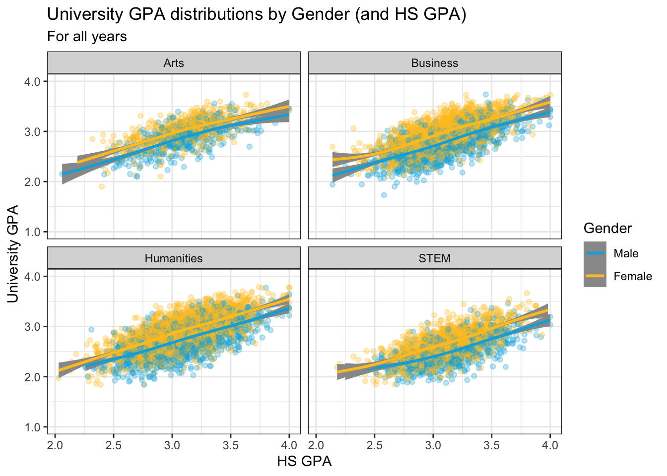
4.9.2 Point plot with fitted line wrapped by a facet grid: x, y, facet_grid + point() + smooth()
We are, again, displaying the same data as shown in the previous section; however, in this case, we are using facet_grid() instead of facet_wrap(). We use the default color scheme and our usual theme.
to_title <- function(string_input) str_to_title(string_input)
admitdataHSUnivMFMajor |>
  ggplot(aes(x = HSGPA, y = UnivGPA)) +
    facet_grid(
      ProbableMajorType~Gender,
      labeller = labeller(Gender = label_both,
                          ProbableMajorType = as_labeller(to_title))) +
    geom_point(alpha = 0.3) +
    geom_smooth(method = "gam", alpha = 1.0) +
    labs(title = paste("University GPA vs.",
                       "HS GPA by Gender",
                       "& Student Type",
                       sep = " "),
         subtitle = "For all years",
         x = "HS GPA",
         y = "University GPA") +
    scale_y_continuous(limits = c(1.0, 4.0),
                       breaks = c(1.0, 2.0, 3.0, 4.0),
                       labels = c("1.0", "2.0",
                                  "3.0", "4.0")) +
    scale_x_continuous(guide = guide_axis(angle = 45)) +
    theme_bw()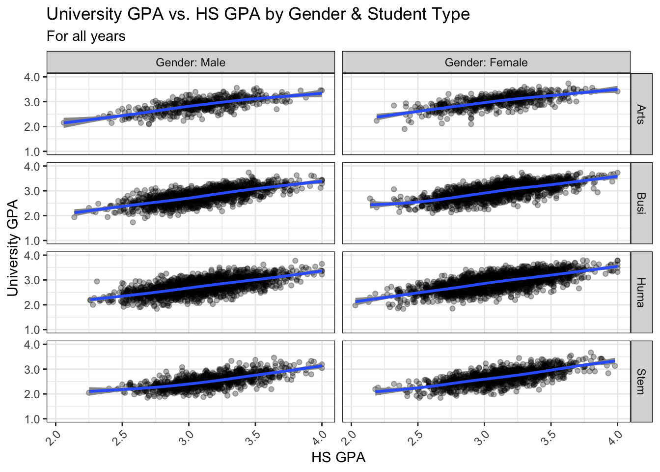
4.9.3 Boxplot wrapped by a facet grid: x, y, facet_grid + boxplot()
This is, again, plotting the same values as shown in the previous section. We are building on the approach used in this section.
Again, we use the default color scheme (except for setting the fill to lightgrey) and our usual theme.
admitdataHSUnivMFMajor |>
  ggplot(aes(x = HSGPA, y = UnivGPA)) +
    facet_grid(ProbableMajorType~Gender) +
    geom_boxplot(aes(group=cut_width(HSGPA,
                                     width=0.25,
                                     boundary=2.0)),
                 fill = "lightgrey") +
    labs(title = paste("University GPA vs.",
                       "HS GPA by Gender",
                       "& Student Type",
                       sep = " "),
         subtitle = "For all years",
         x = "HS GPA",
         y = "University GPA") +
    scale_y_continuous(limits = c(1.0, 4.0),
                       breaks = c(1.0, 2.0, 3.0, 4.0),
                       labels = c("1.0", "2.0",
                                  "3.0", "4.0")) +
    theme_bw()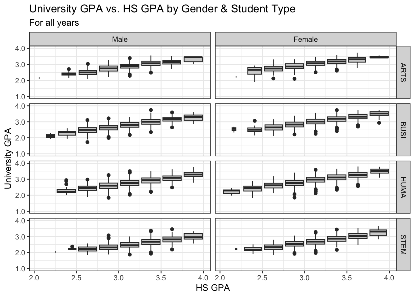
4.9.4 Violin wrapped by a facet grid: x, y, facet_wrap + violin()
Again, this graph is based on the same data as the previous section. Again, we use the standard colors, set the fill to lightgrey, and apply our usual theme.
Notice how this graph makes it very clear that some combinations of student type and gender have many fewer than the norm.
admitdataHSUnivMFMajor |>
  ggplot(aes(x = HSGPA, y = UnivGPA)) +
    facet_grid(ProbableMajorType~Gender) +
    geom_violin(aes(group=cut_width(HSGPA,
                                     width=0.25,
                                     boundary=2.0)),
                 fill = "lightgrey") +
    labs(title = paste("University GPA vs.",
                       "HS GPA by Gender",
                       "& Student Type",
                       sep = " "),
         subtitle = "For all years",
         x = "HS GPA",
         y = "University GPA") +
    scale_y_continuous(limits = c(1.0, 4.0),
                       breaks = c(1.0, 2.0, 3.0, 4.0),
                       labels = c("1.0", "2.0",
                                  "3.0", "4.0")) +
    theme_bw()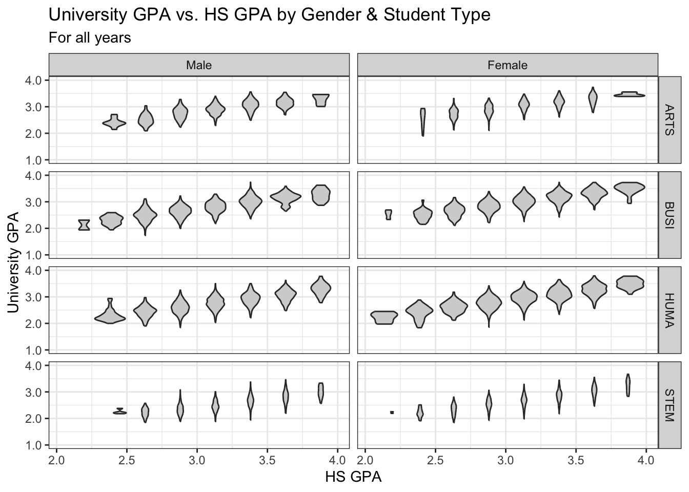
4.9.5 Jitter and box plot for subsets wrapped by a facet: x, y, color, facet + jitter()
This graph is based on the data shown in the previous graph and builds on the approach used in this section. This step adds our usual theme plus the color palette for continuous data specially for color-blind readers.
admitdataHSUnivMFMajor |>
  ggplot(aes(x = Gender,
             y = UnivGPA,
             color = HSGPA)) +
    facet_wrap(~ProbableMajorType,
               ncol=4) +
    geom_jitter(alpha = 0.3) +
    geom_boxplot(alpha = 1.0,
                 linewidth=0.75,
                 color = "black",
                 fill = NA,
                 varwidth = TRUE) +
    labs(title = paste("University GPA vs.",
                       "HS GPA by Gender",
                       "& Student Type",
                       sep = " "),
         subtitle = "For all years",
         x = "HS GPA",
         y = "University GPA",
         color = "HS GPA") +
    scale_y_continuous(limits = c(1.0, 4.0),
                       breaks = c(1.0, 2.0,
                                  3.0, 4.0),
                       labels = c("1.0", "2.0",
                                  "3.0", "4.0")) +
    theme_bw() +
    scale_color_viridis_c()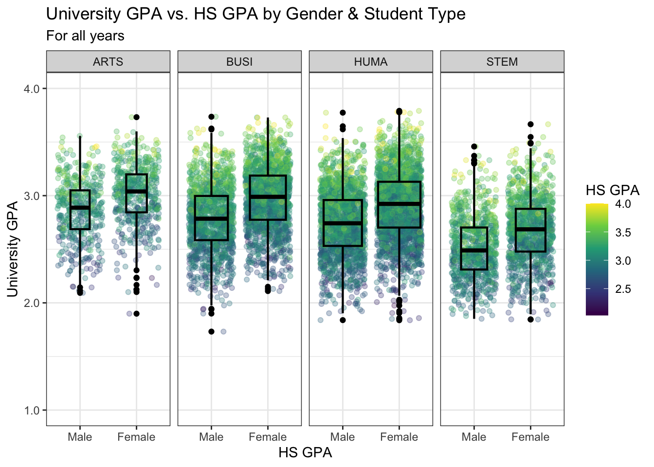
4.9.6 Boxplot differentiated by two columns and wrapped by a facet: x, y, color, facet + boxplot()
In this section we are working with new data, but we are building on the approach used in this section. This step adds our usual theme plus a manual color palette. As always, carefully specify whether it’s scale_color_manual or scale_fill_manual depending on the contents of the aes().
admitdataRaceUnivPellMajor |>
  ggplot(aes(IPEDSRaceEthnicity, UnivGPA,
             color = PellStatus)) +
    facet_wrap(~ProbableMajorType) +
    geom_boxplot(varwidth=TRUE) +
    labs(title = paste("University GPA ranges",
                       "by Race/ethnicity",
                       "and by Gender &",
                       "Pell Grant status",
                       sep = " "),
         subtitle = "For all years",
         x = "Race/ethnicity",
         y = "University GPA",
         color = "Pell Grant\nStatus") +
    scale_y_continuous(limits = c(1.0, 4.0),
                       breaks = c(1.0, 2.0, 3.0, 4.0),
                       labels = c("1.0", "2.0",
                                  "3.0", "4.0")) +
    theme_bw() +
    scale_color_manual(values = c("#2a4d69", "#4b86b4"))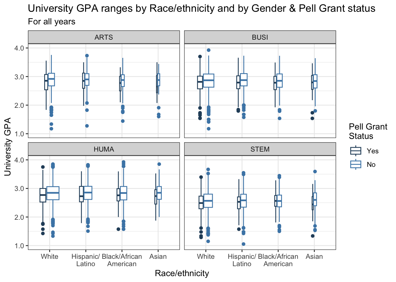
4.9.7 Boxplot differentiated by one column and wrapped by a facet grid: x, y, facet_grid + boxplot()
In this graph, we are again displaying the distribution of UnivGPA against race/ethnicity; however, in this case we are using facet_grid() on both StudentType (first time freshmen vs. transfer) and PellStatus (yes or no).
Since there’s only one color, no color or fill palette is needed for this graph. We add a fill to the boxplot to make it easier to read. We also use our typical theme.
admitdataRaceUnivPellMajor |>
  ggplot(aes(IPEDSRaceEthnicity, UnivGPA)) +
    facet_grid(StudentType~PellStatus) +
    geom_boxplot(varwidth=TRUE,
                 fill = "lightgrey") +
    labs(title = paste("University GPA ranges",
                       "by Race/ethnicity",
                       "and by Gender &",
                       "Pell Grant status",
                       sep = " "),
         subtitle = "For all years",
         x = "Race/ethnicity",
         y = "University GPA",
         color = "Pell Grant\nStatus") +
    scale_y_continuous(limits = c(1.0, 4.0),
                       breaks = c(1.0, 2.0, 3.0, 4.0),
                       labels = c("1.0", "2.0",
                                  "3.0", "4.0")) +
    theme_bw()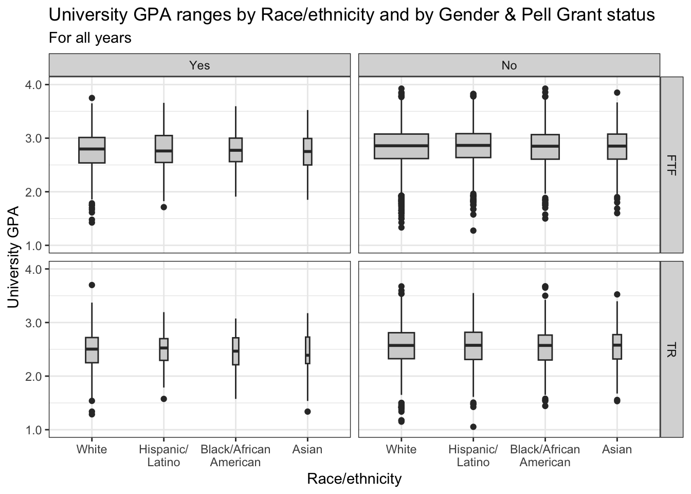
4.9.8 Horizontal boxplot differentiated by one column and wrapped by a facet grid: x, y, facet_grid + horizontal boxplot()
This is exactly the same graph as in the previous section except that we flipped the graph horizontally using coord_flip().
This is the same as the previous graph — add a fill to the boxplot and use our usual theme.
admitdataRaceUnivPellMajor |>
  ggplot(aes(IPEDSRaceEthnicity, UnivGPA)) +
    facet_grid(StudentType~PellStatus) +
    geom_boxplot(varwidth=TRUE,
                 fill = "lightgrey") +
    coord_flip() +
    labs(title = paste("University GPA ranges",
                       "by Race/ethnicity",
                       "and by Gender &",
                       "Pell Grant status",
                       sep = " "),
         subtitle = "For all years",
         x = "Race/ethnicity",
         y = "University GPA",
         color = "Pell Grant\nStatus") +
    scale_y_continuous(limits = c(1.0, 4.0),
                       breaks = c(1.0, 2.0, 3.0, 4.0),
                       labels = c("1.0", "2.0",
                                  "3.0", "4.0")) +
    theme_bw()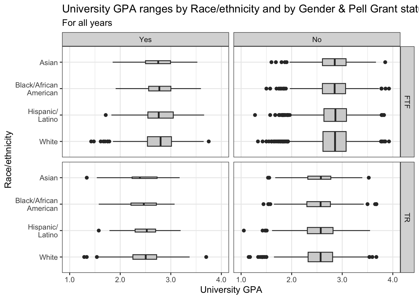
4.9.9 Boxplot and jitter differentiated by two discrete and one continuous column: x, y, size, color + boxplot() + jitter()
student_RaceSexPCISAT |>
  ggplot(aes(Race, SAT)) +
    geom_jitter(aes(size = PCI20,
                    color = Sex),
               alpha = 0.25,
               width = 0.25) +
    geom_boxplot(fill = NA,
                 color = "black",
                 varwidth = TRUE) +
    labs(title = paste("SAT ranges by",
                       "Race/ethnicity and",
                       "by Gender & Per",
                       "Capita Income",
                       sep = " "),
         subtitle = "For all years",
         x = "Race/ethnicity",
         y = "SAT scores",
         color = "Gender",
         size = "Per Capita\nIncome '20") +
    scale_y_continuous(limits = c(800, 1600),
                       breaks = c(800, 1000, 1200,
                                  1400, 1600)) +
    theme_minimal() +
    scale_color_manual(values = c("#00aedb", "#ffc425"))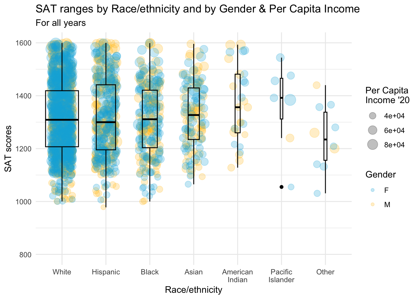
4.9.10 Horizontal boxplot and jitter differentiated by two discrete and one continuous column: x, y, size, color + horizontal boxplot() + point()
This is the same graph as in the previous section except that it has had the coordinates flipped and differentiates based on Sex for both points and boxplot.
Since the plot color for jitter and the fill color for boxplot are based on the same column (Sex), we specify both the fill and color color palettes to be the same hex codes.
student_RaceSexPCISAT |>
  ggplot(aes(Race, SAT))+
    geom_jitter(aes(size = PCI20,
                   color = Sex),
               alpha = 0.25,
               width = 0.25) +
    geom_boxplot(aes(fill = Sex),
                 color = "black",
                 varwidth = TRUE) +
    coord_flip() +
    labs(title = paste("SAT ranges by",
                       "Race/ethnicity and",
                       "by Gender & Per",
                       "Capita Income",
                       sep = " "),
         subtitle = "For all years",
         x = "Race/ethnicity",
         y = "SAT scores",
         color = "Gender",
         fill = "Gender",
         size = "Per Capita\nIncome '20") +
    scale_y_continuous(limits = c(800, 1600),
                       breaks = c(800, 1000, 1200,
                                  1400, 1600)) +
    scale_x_discrete(limits = rev) +
    theme_bw() +
    scale_fill_manual(values = c("#00aedb", "#ffc425")) +
    scale_color_manual(values = c("#00aedb", "#ffc425"))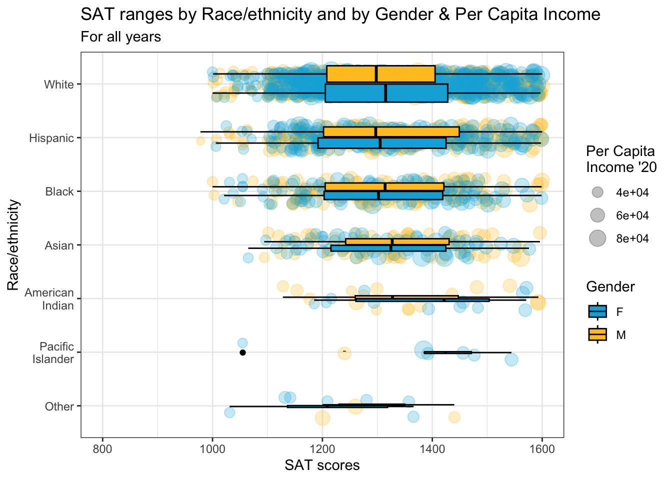
4.9.11 Horizontal boxplot and jitter differentiated by one discrete and one continuous column wrapped by a facet: x, y, size, facet + horizontal boxplot() + point()
This graph represents the same data as shown in the previous section. The only difference is that we are using a facet_wrap() based on Sex instead of using a color in the plots.
In this step we only add our usual theme. Everything else stays the same. We do want to highlight that we set color="blue" to make the boxplot stand out against the plotted points and fill=NA to ensure that the boxplots are transparent so that the plotted points are still visible.
student_RaceSexPCISAT |>
  ggplot(aes(Race, SAT)) +
    geom_jitter(aes(size = PCI20),
               alpha = 0.3,
               width = 0.25) +
    geom_boxplot(color = "blue",
                 fill = NA) +
    facet_wrap(~Sex) +
    coord_flip() +
    labs(title = paste("SAT ranges by",
                       "Race/ethnicity and",
                       "by Gender & Per",
                       "Capita Income",
                       sep = " "),
         subtitle = "For all years",
         x = "Race/ethnicity",
         y = "SAT scores",
         color = "Gender",
         size = "Per Capita\nIncome '20") +
    scale_y_continuous(limits = c(800, 1600),
                       breaks = c(800, 1000, 1200,
                                  1400, 1600)) +
    scale_x_discrete(limits = rev) +
    theme_bw()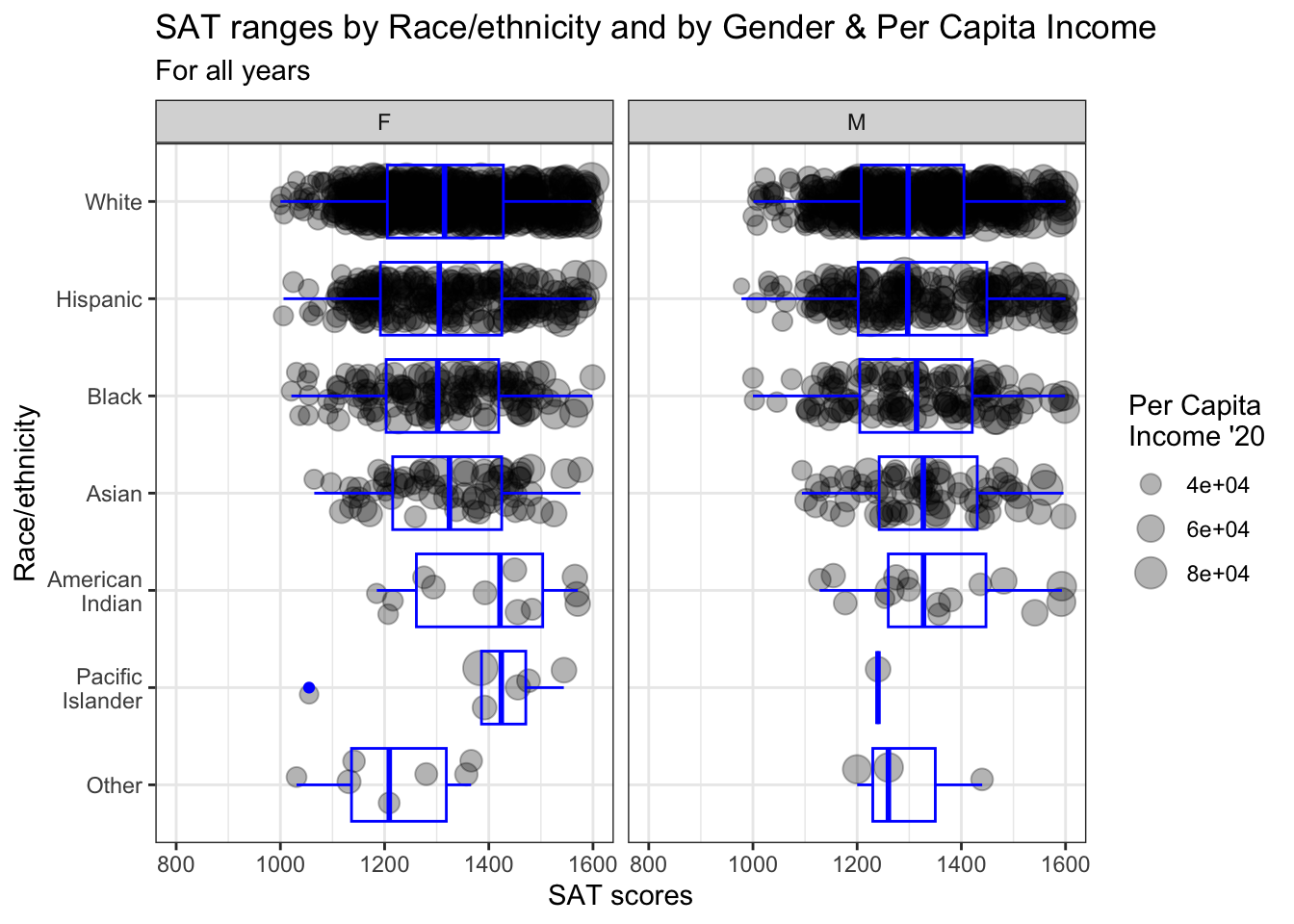
4.10 3 continuous, 2 discrete
In this last section, we display data based on five separate columns, with three of them being continuous. We have to make decisions very carefully here in order to help the reader interpret the data as easily as possible.
4.10.1 Horizontal boxplot and point differentiated by one discrete and two continuous columns wrapped by a facet: x, y, size, color, facet + horizontal boxplot() + jitter()
The only additions made in this step are the addition of our usual theme plus the color-blind color palette for continuous values (for the Age values). Previously, we had set the linewidth for the boxplot to make it more visible against the dark colors of the plotted points.
student_WHBASATPCIAge |>
  ggplot(aes(Race, SAT)) +
  geom_point(aes(size = PCI20,
                 colour = Age),
             alpha = 0.3) +
  geom_boxplot(linewidth = 1,
               fill = NA,
               varwidth = TRUE) +
  facet_wrap(~Sex) +
  coord_flip() +
    labs(title = paste("SAT ranges by",
                       "Race/ethnicity and",
                       "by Gender, Age, &",
                       "Per Capita Income",
                       sep = " "),
         subtitle = "For all years",
         x = "Race/ethnicity",
         y = "SAT scores",
         color = "Age",
         size = "Per Capita\nIncome '20") +
    scale_y_continuous(limits = c(800, 1600),
                       breaks = c(800, 1000, 1200,
                                  1400, 1600)) +
    scale_x_discrete(limits = rev) +
    theme_bw() +
    scale_color_viridis_c()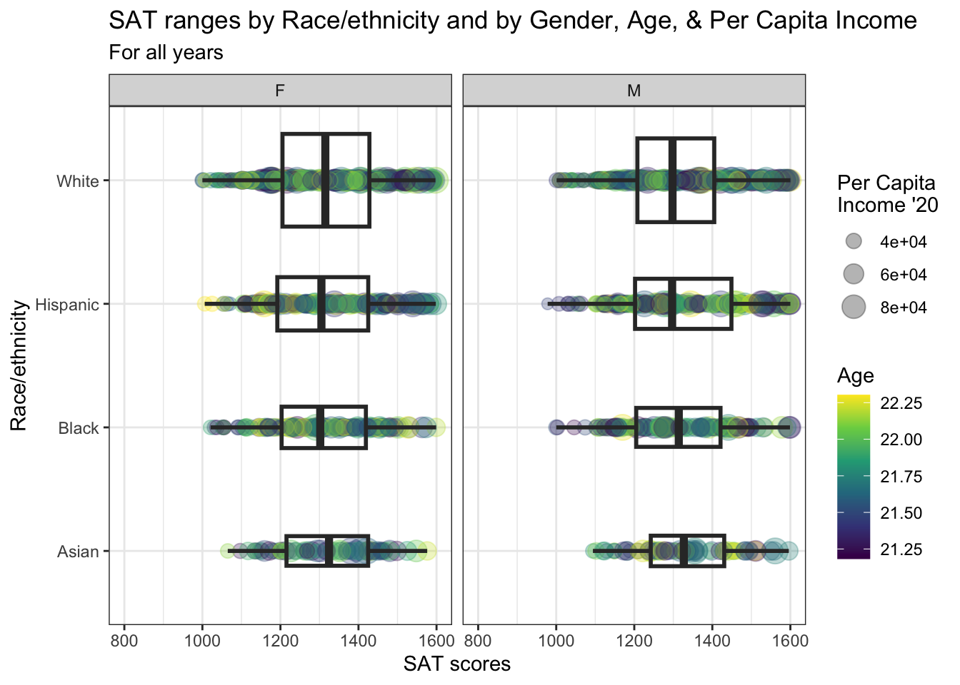
4.10.2 Horizontal boxplot and jitter differentiated by one discrete and two continuous columns wrapped by a facet: x, y, size, color, facet + horizontal boxplot() + jitter()
We are displaying the exact same information that we did in the previous section. The pjalette and theme are the same as the previous graph.
student_WHBASATPCIAge |>
  ggplot(aes(Race, SAT)) +
    geom_jitter(aes(size = PCI20,
                   color = Age),
               alpha = 0.3) +
    geom_boxplot(linewidth = 1,
                 fill = NA,
                 varwidth = TRUE) +
    facet_wrap(~Sex) +
    coord_flip() +
    labs(title = paste("SAT ranges by",
                       "Race/ethnicity and",
                       "by Gender, Age, &",
                       "Per Capita Income",
                       sep = " "),
         subtitle = "For all years",
         x = "Race/ethnicity",
         y = "SAT scores",
         color = "Age",
         size = "Per Capita\nIncome '20") +
    scale_y_continuous(limits = c(800, 1600),
                       breaks = c(800, 1000, 1200,
                                  1400, 1600)) +
    scale_x_discrete(limits = rev) +
    theme_bw() +
    scale_color_viridis_c()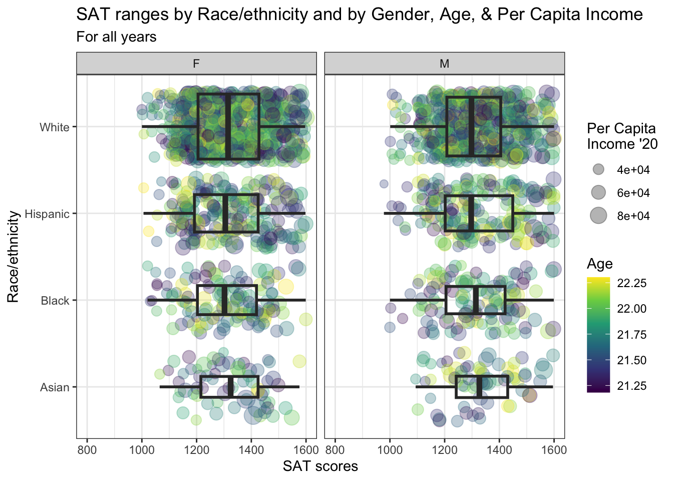
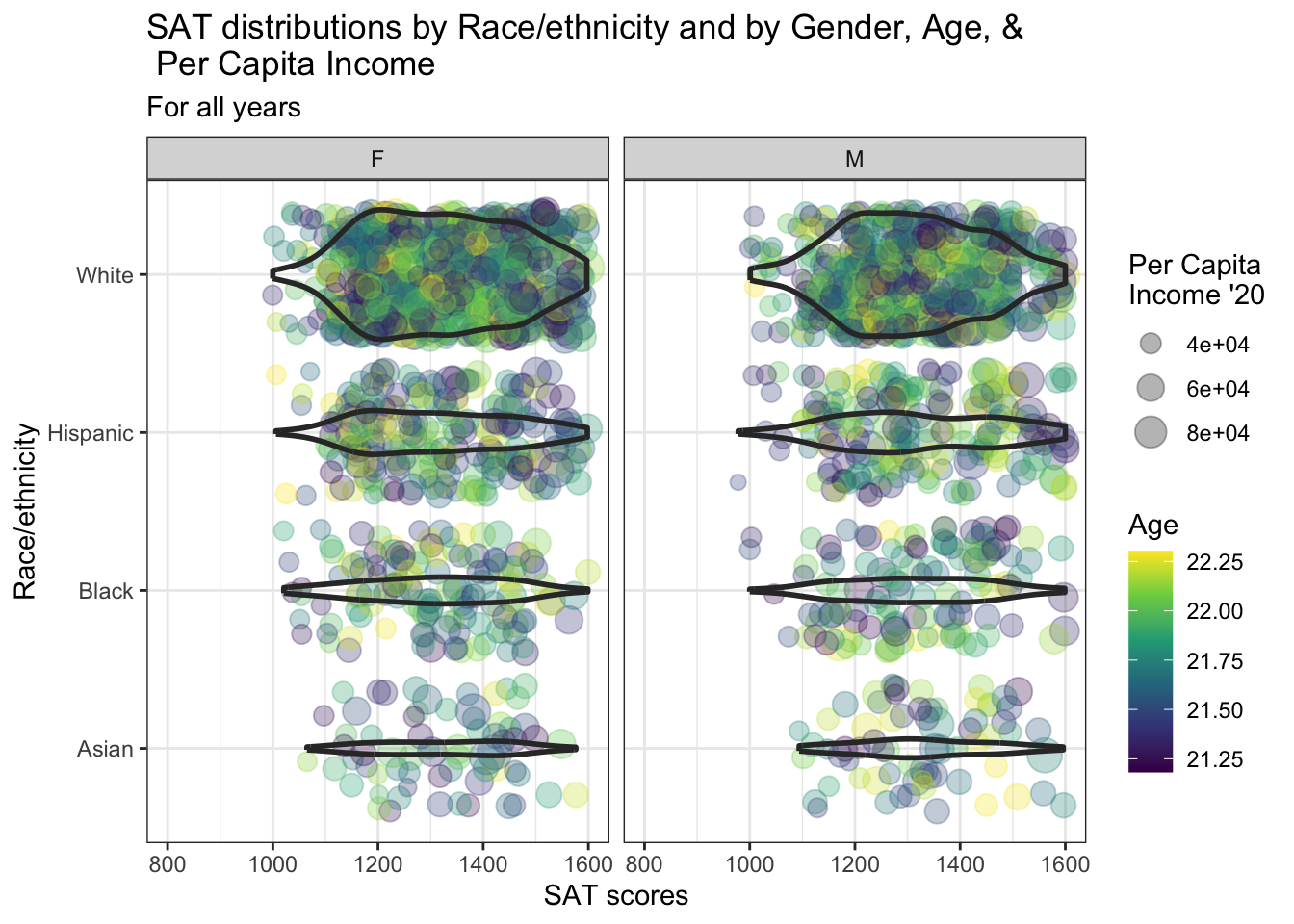
4.10.3 Horizontal violin and jitter differentiated by one discrete and two continuous columns wrapped by a facet: x, y, size, color, facet + horizontal violin() + jitter()
Again, we are displaying the same information as shown in the previous section. The palette and theme are the same as the previous graph as well.
student_WHBASATPCIAge |>
  ggplot(aes(Race, SAT)) +
    geom_jitter(aes(size = PCI20,
                   colour = Age),
               alpha = 0.3) +
    geom_violin(scale = "count",
                linewidth = 1,
                fill = NA) +
    facet_wrap(~Sex) +
    coord_flip() +
    labs(title = paste("SAT distributions by",
                       "Race/ethnicity and",
                       "by Gender, Age, &\n",
                       "Per Capita Income",
                       sep = " "),
         subtitle = "For all years",
         x = "Race/ethnicity",
         y = "SAT scores",
         color = "Age",
         size = "Per Capita\nIncome '20") +
    scale_y_continuous(limits = c(800, 1600),
                       breaks = c(800, 1000, 1200,
                                  1400, 1600)) +
    scale_x_discrete(limits = rev) +
    theme_bw() +
    scale_color_viridis_c()