Graphing details
This page provides a one-stop-shopping overview of ggplot, the R tidyverse graphing package. It demonstrates the pieces used to construct a graph while also showing a few of the most used graph types that an analyst builds. While reviewing all of this, the reader should try to appreciate the flexibility of ggplot’s construction process in light of Excel’s graph selection process.
This site provides a variety of ways for you to build your understanding of how to create graphs in R:
- This page provides a conceptual overview,
- This page provides an illustrative example, and
- The four pages starting with this one show the construction process for a large library of graph types.
1 Mapping (aesthetics)
The basic structure of the most important part of ggplot() is as follows:
You have to define this part of the statement before you do anything else — it defines the most basic information about the graph.
Using the above statement to demonstrate what aes() can do, let’s look at the parts of the statement:
XVar: This defines the variable that will be on thex-axis. Note that this might also be specified asx = XVar; this is mandatory.YVar: This defines the variable that will be on they-axis. Note that this might also be specified asy = YVar; this is mandatory.color = ColorVar: This defines the color of the lines (or outlines) in the graph. (It is easy to confuse this withfill, below.) As the underlying value ofColorVarchanges, the color of the line being plotted changes. You can also specify a constant here instead, such ascolor = blackorcolor = "#21618C". More information about colors can be found here.fill = FillVar: This defines the color of the object fills in the graph. As the underlying value ofFillVarchanges, the color of the fills being plotted changes. This can also be set to a constant (as just above).size = SizeVar: This defines the size of a point being plotted. As the underlying value ofSizeVarchanges, the size of the object being plotted changes. This can be set to a constant value (usually between 1 and 5, with 1.5 being the default).
You can see an example of an aes() function in a simple graph here.
2 Geometry
Below are a few of the available geometries (what the tidyverse calls graph types). Here are some short descriptions with pointers to examples provided on this page. Many other examples are provided in our extensive gallery.
geom_line(): line segments plotted between points. Examples: 1, 2.geom_bar(): bars, displayed either side-by-side or stacked, whose height reflects the underlying data. Examples: 1, 2.geom_boxplot(): a boxplot, sometimes known as a box-and-whisker plot, reflects the underlying distribution of the data, displaying quartiles and the maximum and minimum values. Examples: 1, 2, 3, 4, 5.geom_point(): plotted points reflecting the values of the underlying data. Examples: 1, 2, 3, 4, 5.geom_histogram(): a common type of bar graph used to display the underlying distribution of values. Examples: 1.geom_smooth(): a tool used to display a trend/regression line along with a confidence interval around the line. Examples: 1, 2.
Note that the information specified in the aes() (above) is inherited by the specific geom_X() defined in this step (unless it is overwritten).
2.1 Line plot example
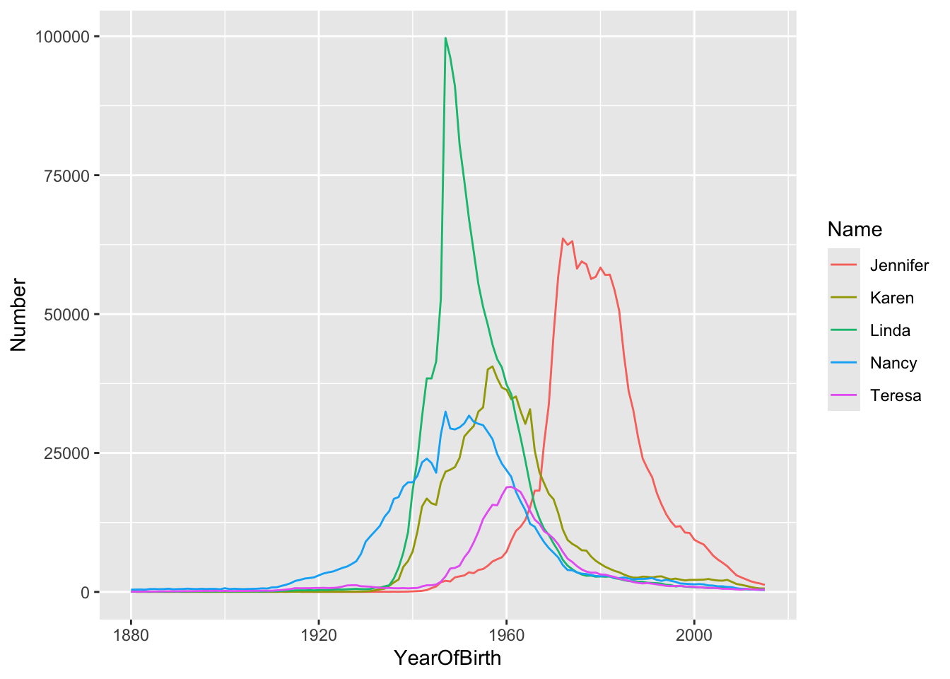
Here we are plotting the frequency of five particular female baby names in a particular year. After telling ggplot() that the x-axis is YearOfBirth and the y-axis is Number, we tell it to plot different line graphs for each of the different Name values.
2.2 Bar graph examples
2.2.1 Stacked bar
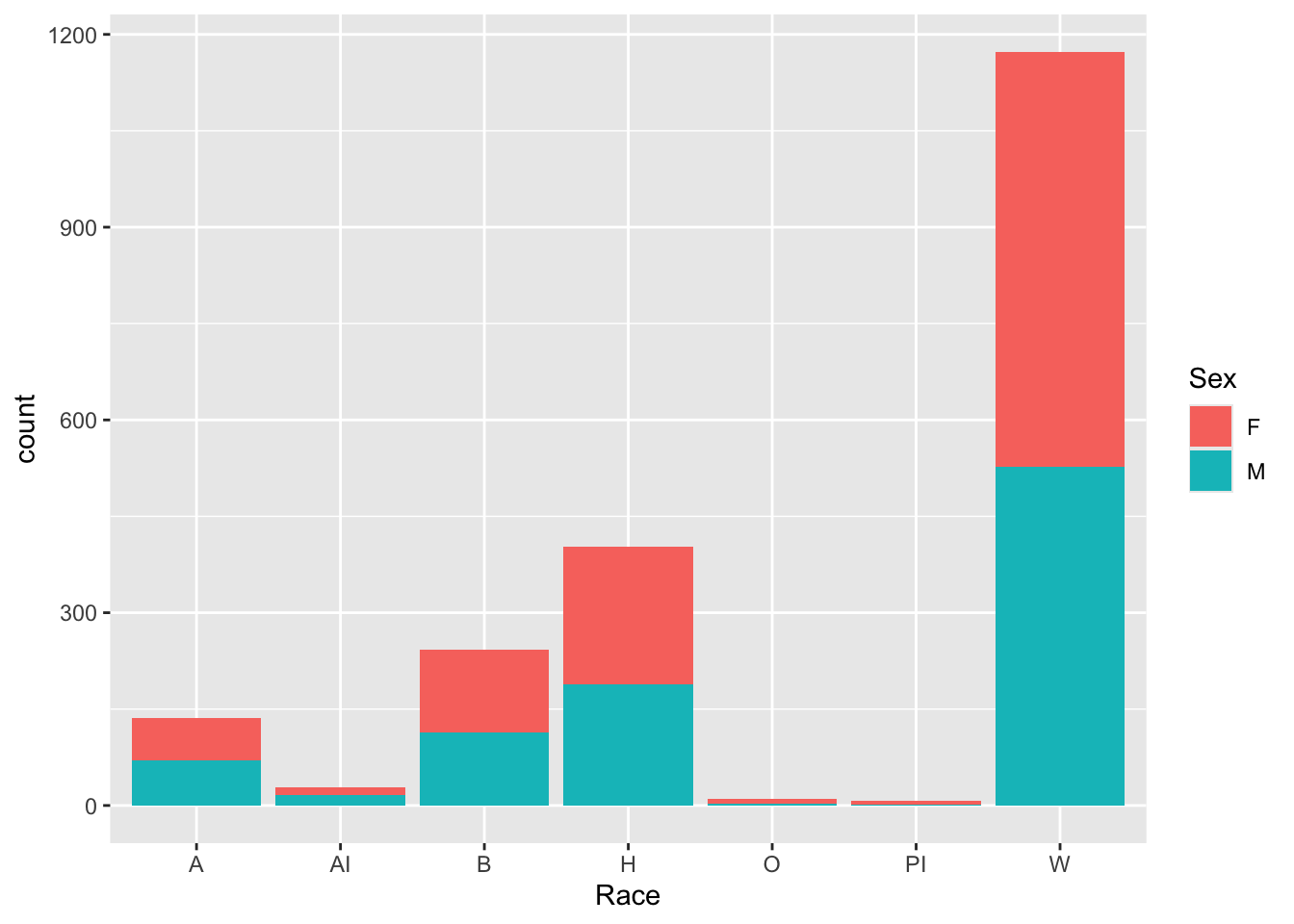
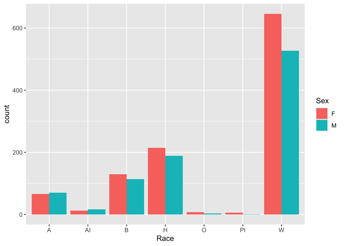
Stacked bar graphs are the default in ggplot. The following tells ggplot to create different bars for each value of Race (the x-axis variable), and to use a different fill color in those bars depending on the number of students of each Sex.
2.2.2 Grouped bar
To change from the stacked bar above, it is simply a matter of adding position = "dodge" to the last line of the graph description, as follows.
2.3 Boxplot example
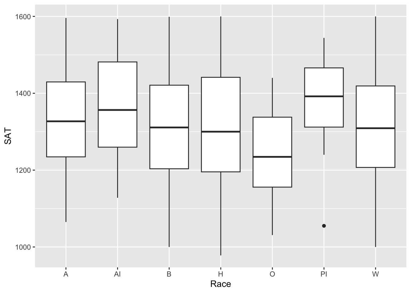
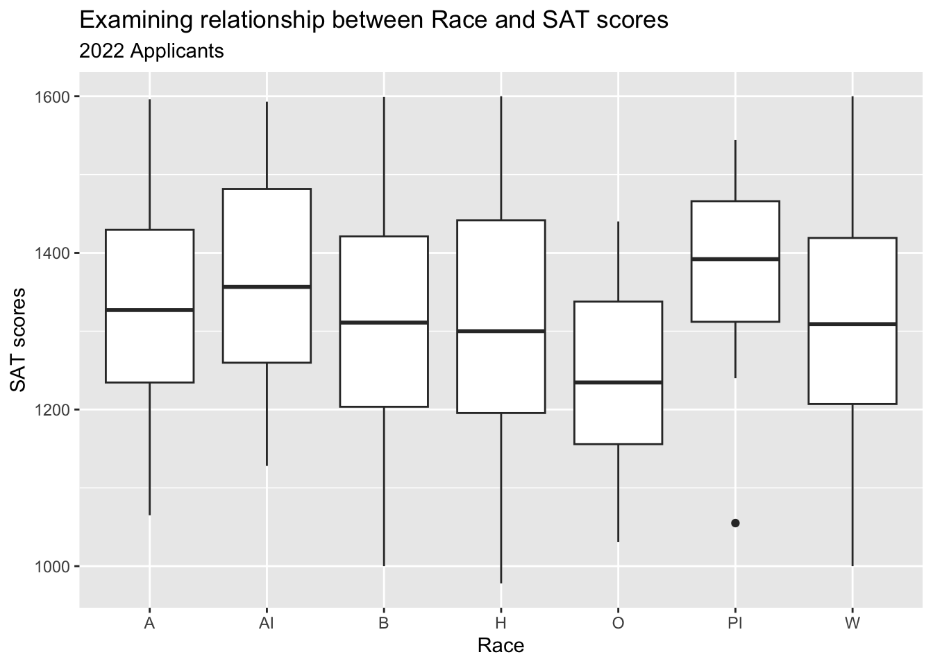
A boxplot displays a graph that reflects the data’s underlying distribution. Here, it displays the distribution of SAT values for applicants by Race.
2.4 Point examples
Point plots can be used by themselves but they are frequently combined with other graph types.
2.4.1 Point (with boxplot) example
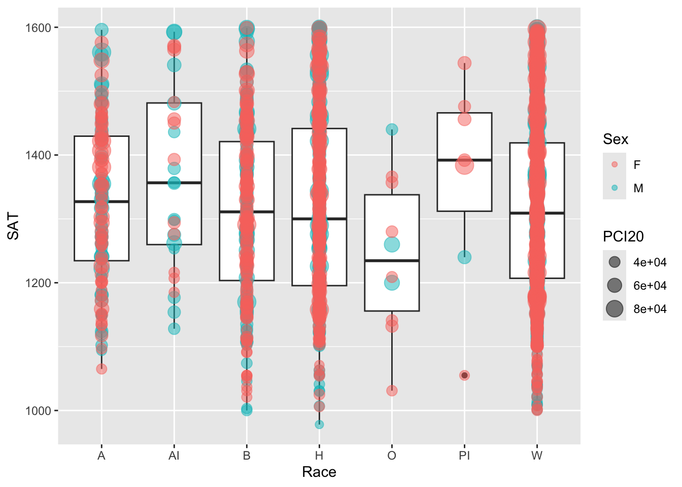
In this example, we add a point plot to the above boxplot. We specify that the size of the point should reflect the applicant’s PCI20 value and the color of the point should reflect the applicant’s Sex. The alpha value ensures that the points plotted are semi-transparent so that points below it aren’t obscured.
2.4.2 Point (with line) example
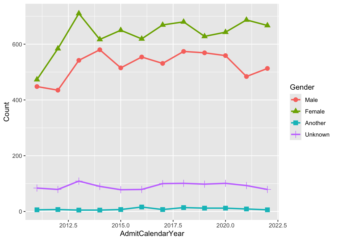
In this example, we use a point plot to emphasize the specific points that are plotted on the line plot. Each line has a different color/shape combination based on Gender (as specified in the aes() function).
2.5 Histogram example
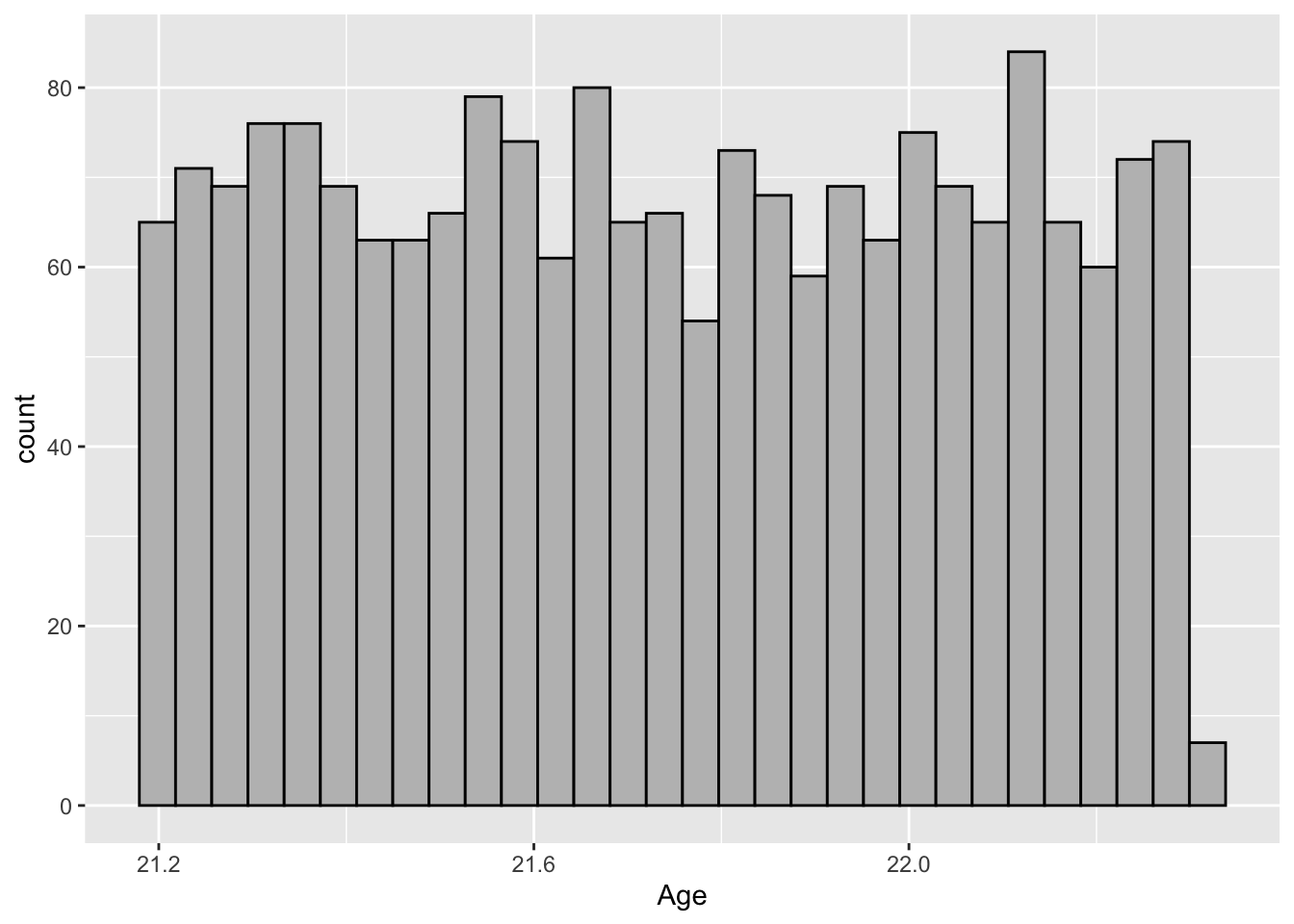
A histogram is one of the few graphs for which a y variable need not be specified. In this case, we define a histogram with 30 bins/bars to show the distribution of students by Age.
3 Facet
R’s faceting capabilities are both hard to wrap one’s head around (since they’re so different than the possibilities available in other applications) while simultaneously being very easy to try out.
Simply put, to add a facet to a graph means that you want ggplot to create a separate graph for every single value of a discrete variable. You would use facet_wrap to define graphs based on one variable and facet_grid to define graphs based on all the value combinations of two variables.
3.1 One-dimensional grid of plots
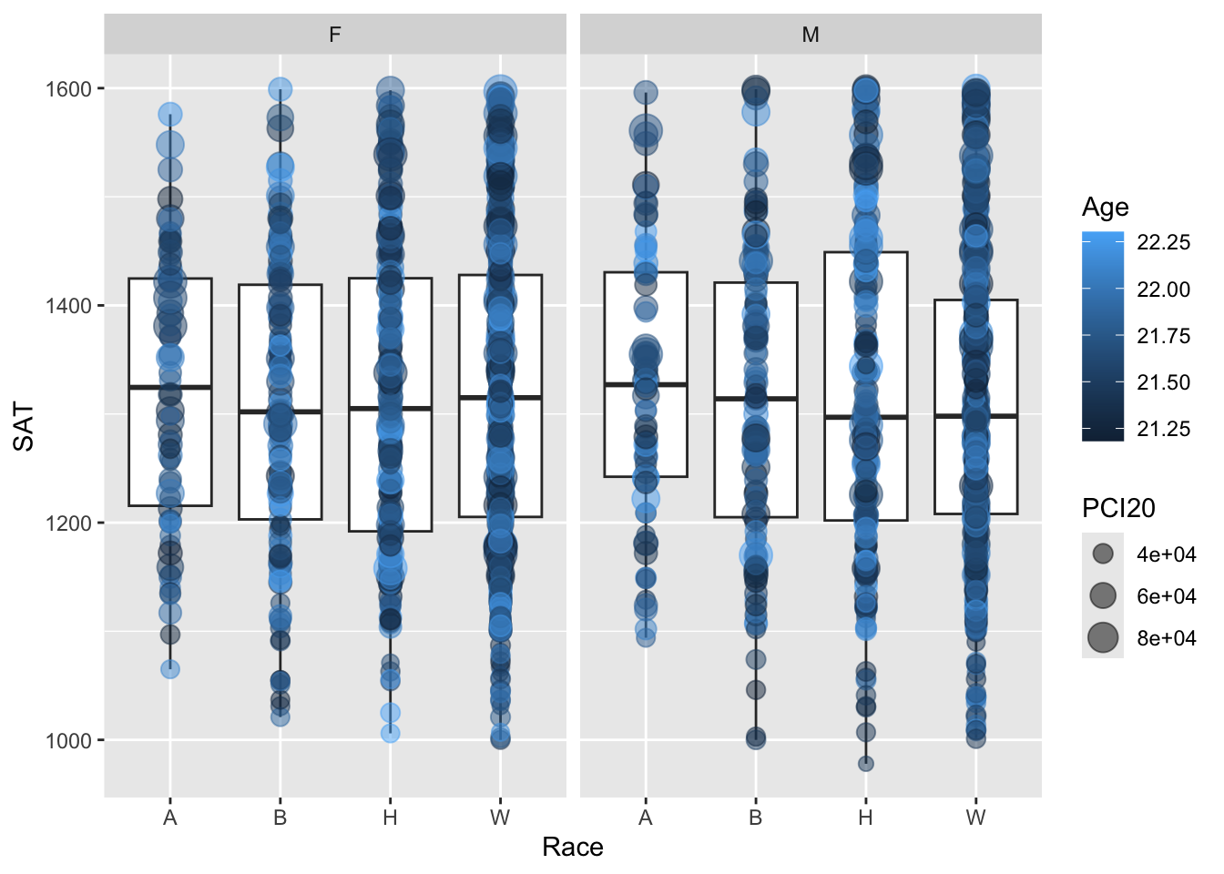
In this example, we build on this example shown above. As before, the x is set to Race, the y is set to SAT, and the size is set to PCI20. The main difference is that here the color was based on Sex while here we define a facet for it. We, instead, set the color here to be based on Age (which isn’t shown in the previous graph).
Thus, because of the faceting, we now have two graphs (one for F and one for M) so that we can more easily see how the value of Sex affects the distribution of values as represented by both the boxplot and the point plot.
3.2 Two-dimensional grid of plots
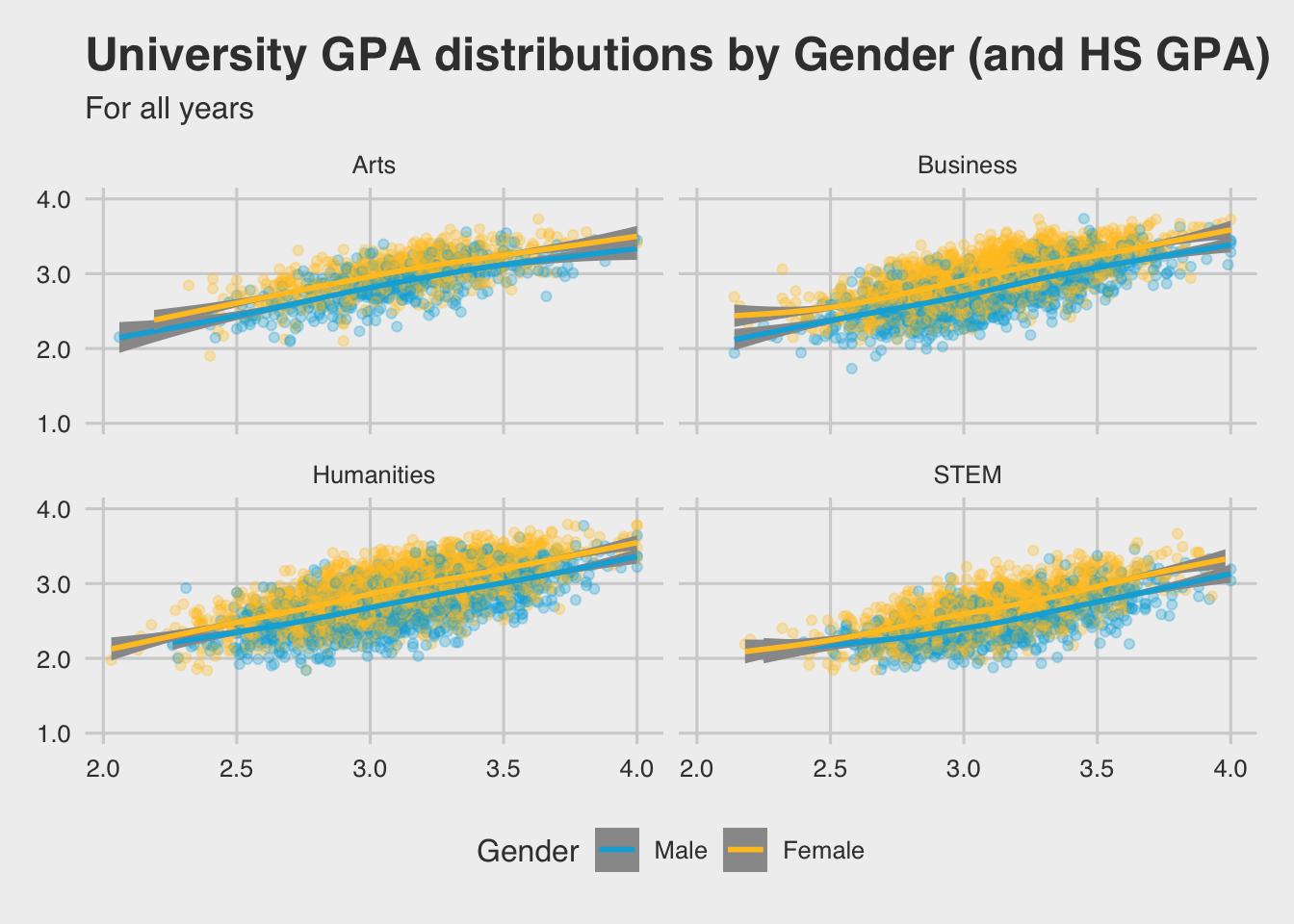
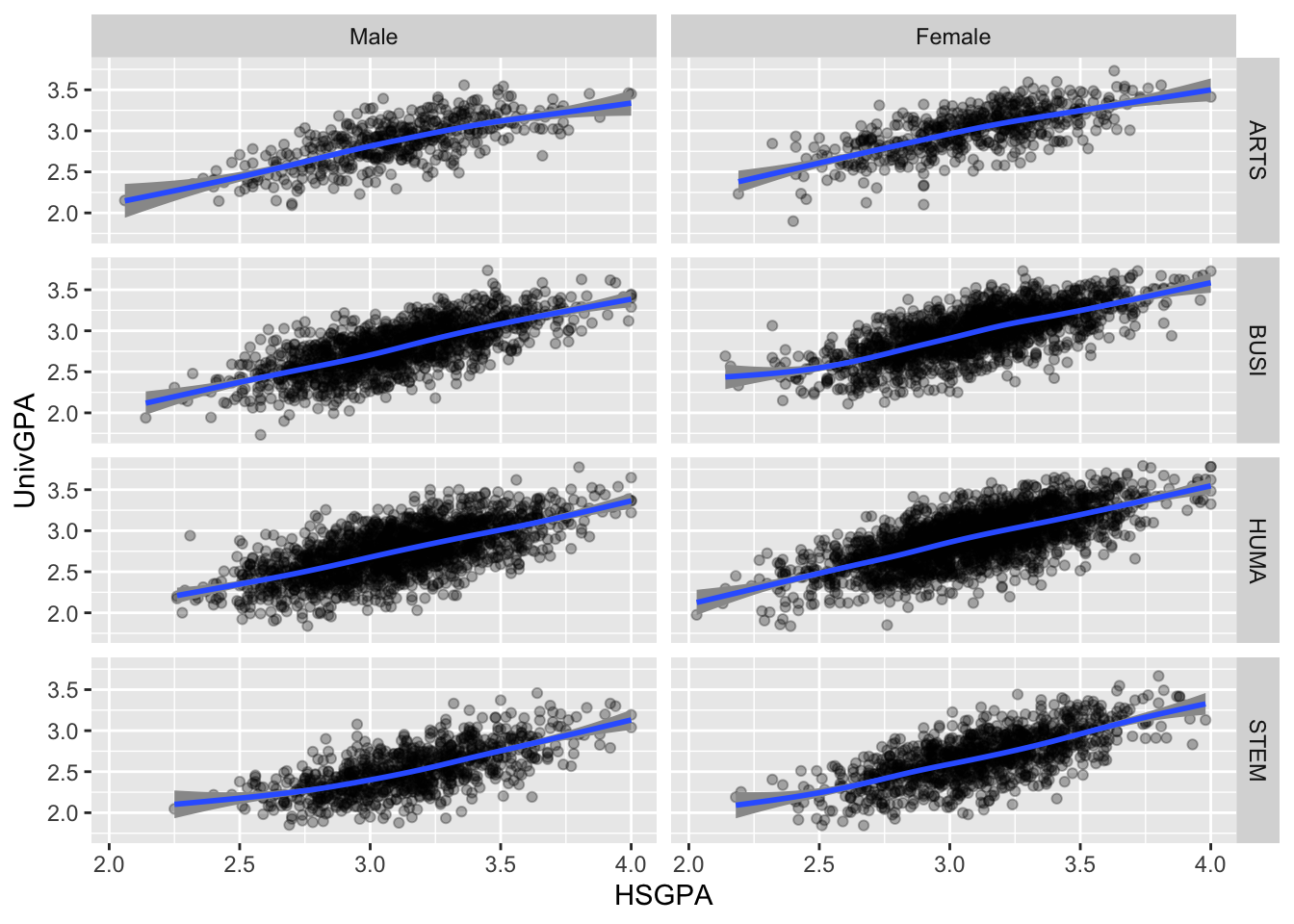
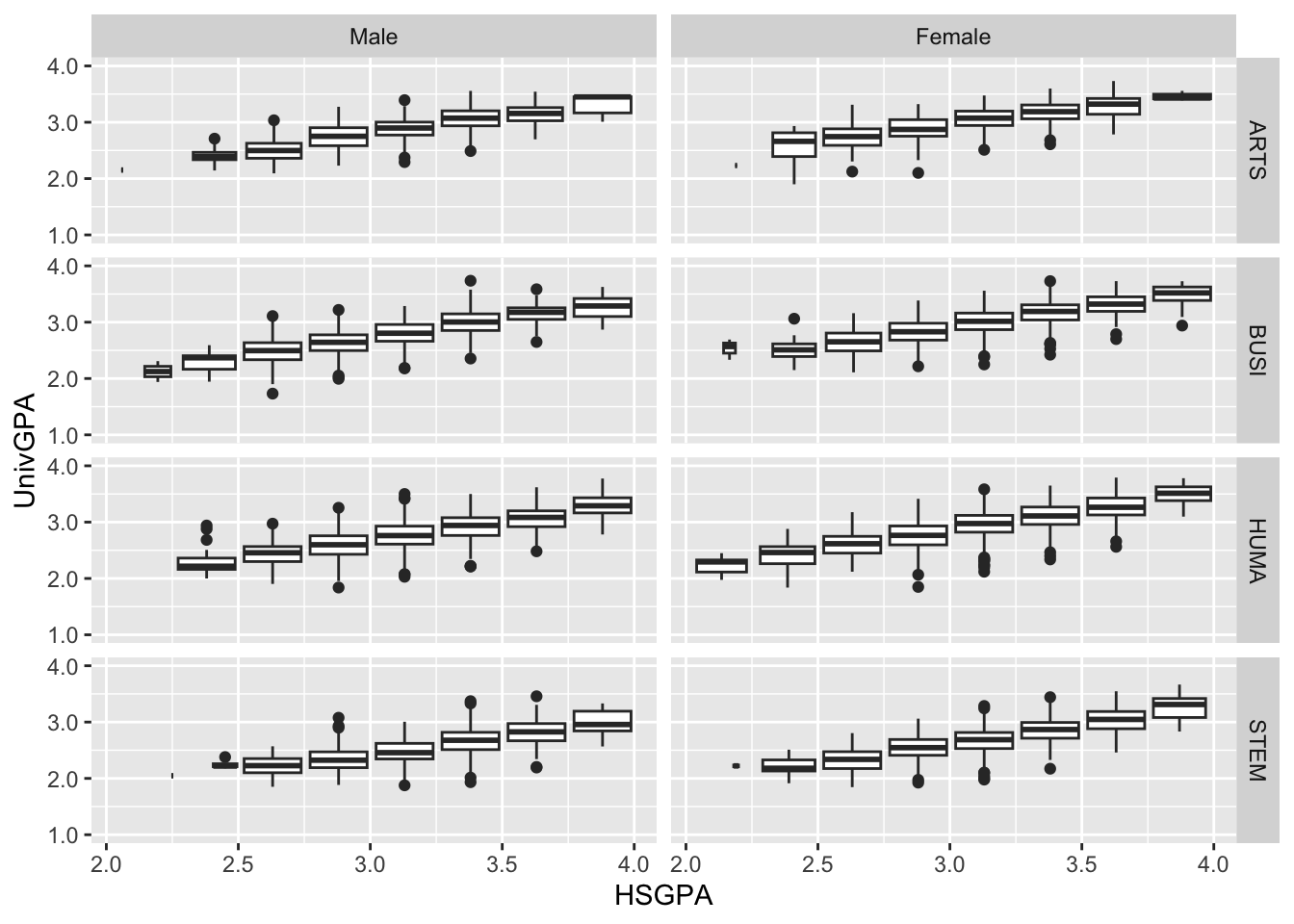
In this graph, we define a 4x2 grid of graphs based on the applicants possible major types and gender. In this default setup, each graph has the same x- and y-axes.
Here, after defining the facet grid, we set up both a point plot and a trend line (with its associated confidence interval). We put the trend line after the point plot because we want it to appear on top of the points.
4 Coordinate space
The ggplot package provides many options for changing how the axes are displayed. This example shows some options for setting up the y-axis when it has continuous values:
limitsdefines the minimum and maximum values on the axis.breaksdefines where you want “ticks” to appear; they can be evenly spaced or not.labelsdefines what you want to show on each one of the ticks.
This type of information, and more, can be similarly set up for discrete or continuous axes on the x- or y-axis.
5 Labels
The labs() function enables ggplot to define the text that appears in many places outside of the graph itself — the title, subtitle, x-axis label, and more.
This graph builds on the graph shown in this section. Here we add a title, subtitle, x-axis name, and y-axis name.
6 Theme & colors
Themes are used to define the overall look of the graph, from the fonts to the location of the legends and much more. Here we use the theme_fivethirtyeight() theme from the ggthemes library. Compare the look of this graph to the one in the previous section — the fonts are different and many other details differ as well.
We have already discussed colors in this section, but here we show how it can be used to set colors within the graph. We use scale_color_manual() to define the color for each value of Gender (since it is the color variable); a similar function exists for fill.
Code
to_full_name <- as_labeller(c("ARTS" = "Arts",
                           "BUSI" = "Business",
                           "HUMA" = "Humanities",
                           "STEM" = "STEM"))
admitdataHSUnivMFMajor |>
  ggplot(aes(x = HSGPA, y = UnivGPA, color = Gender)) +
    facet_wrap(~ProbableMajorType,
               labeller = to_full_name) +
    geom_point(alpha = 0.3) +
    geom_smooth(method = "gam", alpha = 1.0) +
    labs(title = paste("University GPA",
                       "distributions by",
                       "Gender (and HS GPA)",
                       sep = " "),
         subtitle = "For all years",
         x = "HS GPA",
         y = "University GPA") +
    scale_y_continuous(limits = c(1.0, 4.0),
                       breaks = c(1.0, 2.0, 3.0, 4.0),
                       labels = c("1.0", "2.0",
                                  "3.0", "4.0")) +
    theme_fivethirtyeight()  +
    scale_color_manual(values = c("#00aedb", "#ffc425"))