dataframename |>
  ggplot(aes(X)) +
    geom_Y(optional-stuff) +
    facet_Z(column-info) +
    labs(title = ...,
         subtitle = ...,
         x = ...,
         y = ...,
         color = ...,
         fill = ...,
         size = ...) +
    scale_x_continuous/discrete(limits = ...,
                                breaks = ...,
                                labels = ...) +
    scale_y_continuous/discrete(limits = ...,
labels = ...)Framing: Coordinates & Labels
Before you read this page, we recommend that you understand both the introductory graphics page and the illustrative example.
1 Introduction
This page continues the process of building a graph while conforming to the following process:

The “gather tools & build easel” page goes through the first two steps in the process. The “paint” page goes through the process of choosing and setting up geometries (the data on the graph). This page goes through the process of constructing the frame, while the last page goes through the process of refining the graph with colors and themes.
Applying the analogy to the painting process, on this page you will be constructing the frame around the graph that you constructed in the previous steps. To be more specific, this page goes through the process of defining the titles, legends, and axis scales for over 50 graphs.
2 Structure
Here’s the structure of the basic statement for building a ggplot graph:
labs(): Sets the text for the title, subtitle,x-axislabel,y-axislabel, and legend titles forcolor,fill, andsize.scale_x_continuous/discrete(): For thex-axis, sets the minimum and maximum values, the tick marks, and the labels on the tick marks.scale_y_continuous/discrete(): Same for they-axis.limits = c(the-min, the-max): a vector that specifies the minimum and maximum values (for a continuous axis) or all the items, in a particular order (for a discrete axis).breaks = c(tick1, tick2, ..., tickN): a vector that specifies the ticks on a particular axis that you want to display.labels = c(label1, label2, ..., labelN): a vector (for either continuous or discrete axes) that specifies the label that you want to display for each of the items listed inbreaks.
You will see plenty of examples below.
3 Examples
For these 50+ examples, we are following the graph creation process started on the aesthetics page. At the bottom of each graph, you can find a link to the first step and a link to the next step.
For each graph’s write-up, we focus on the effects of the geom_X() function call on the graph.
3.1 1 discrete (with implicit count)
3.1.1 Single stacked bar: x (constant), y (implicit count), fill + bar()
- Details about the general structure of the
labs()andscaleX()functions can be found in the Structure section. element_blank()is used with thex-axislabel to remove it from the graph entirely.- Be sure to include a
labelfor eachbreak. If thelabelsterm is not specified, then the values would be included with no formatting. - Be sure that no
breaklies outside thelimitsspecified. - Note that we defined a
y_continuousscale since they-axisis simply the count of the number of responses (since we’re usinggeom_bar()).
After reading through the command, identify the effect of each command on the graph.
survey |>
  ggplot(aes(x = "All responses", fill=Status)) +
    geom_bar() +
    labs(title = "Number of question responses by Student Status",
         subtitle = "For all years",
         x = element_blank(),
         y = "Number of responses",
         fill = "Student status") +
    scale_y_continuous(limits = c(0, 300000),
                       breaks = c(0, 50000, 100000,
                                  150000, 200000,
                                  250000, 300000),
                       labels = c("0", "50k", "100k",
                                  "150k", "200k",
                                  "250k", "300k"))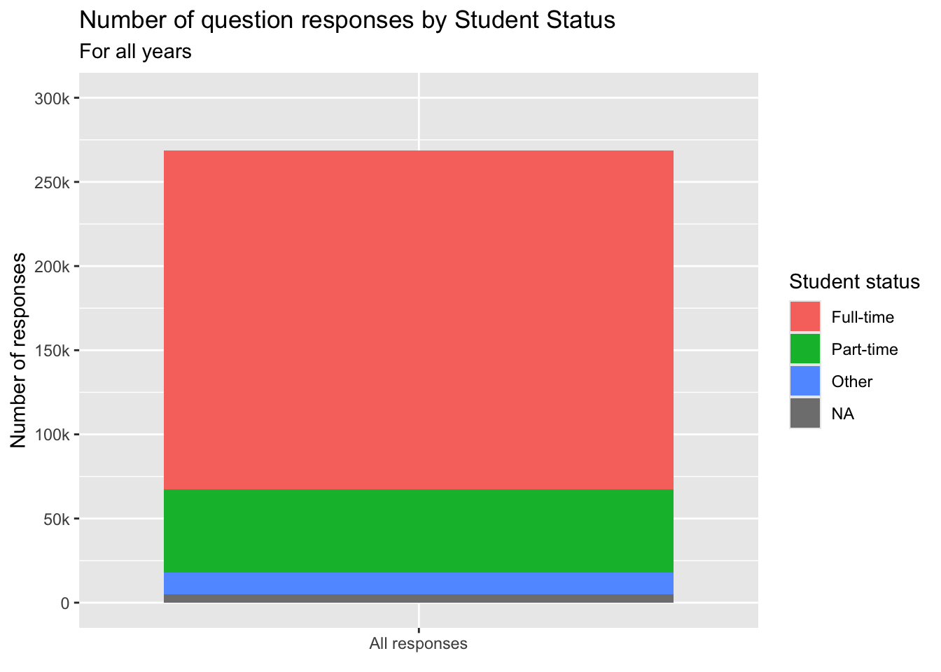
3.1.2 Bar graph showing distribution: x, y (implicit count) + bar()
- Details about the general structure of the
labs()andscaleX()functions can be found in the Structure section. - We do not have to use
labelsfor they-axishere because the defaults work just fine. - In
scale_x_discrete(), we uselimitsto reorder the columns andlabelsto change the label associated with each column.
student_econ |>
  ggplot(aes(Sex)) +
    geom_bar() +
    labs(title = "Number of applicants by Gender",
         subtitle = "For most recent year",
         x = "Gender",
         y = "Number of applicants") +
    scale_y_continuous(limits = c(0, 1250),
                       breaks = c(0, 250, 500, 750,
                                  1000, 1250)) +
    scale_x_discrete(limits = c("M", "F"),
                     labels = c("Male", "Female"))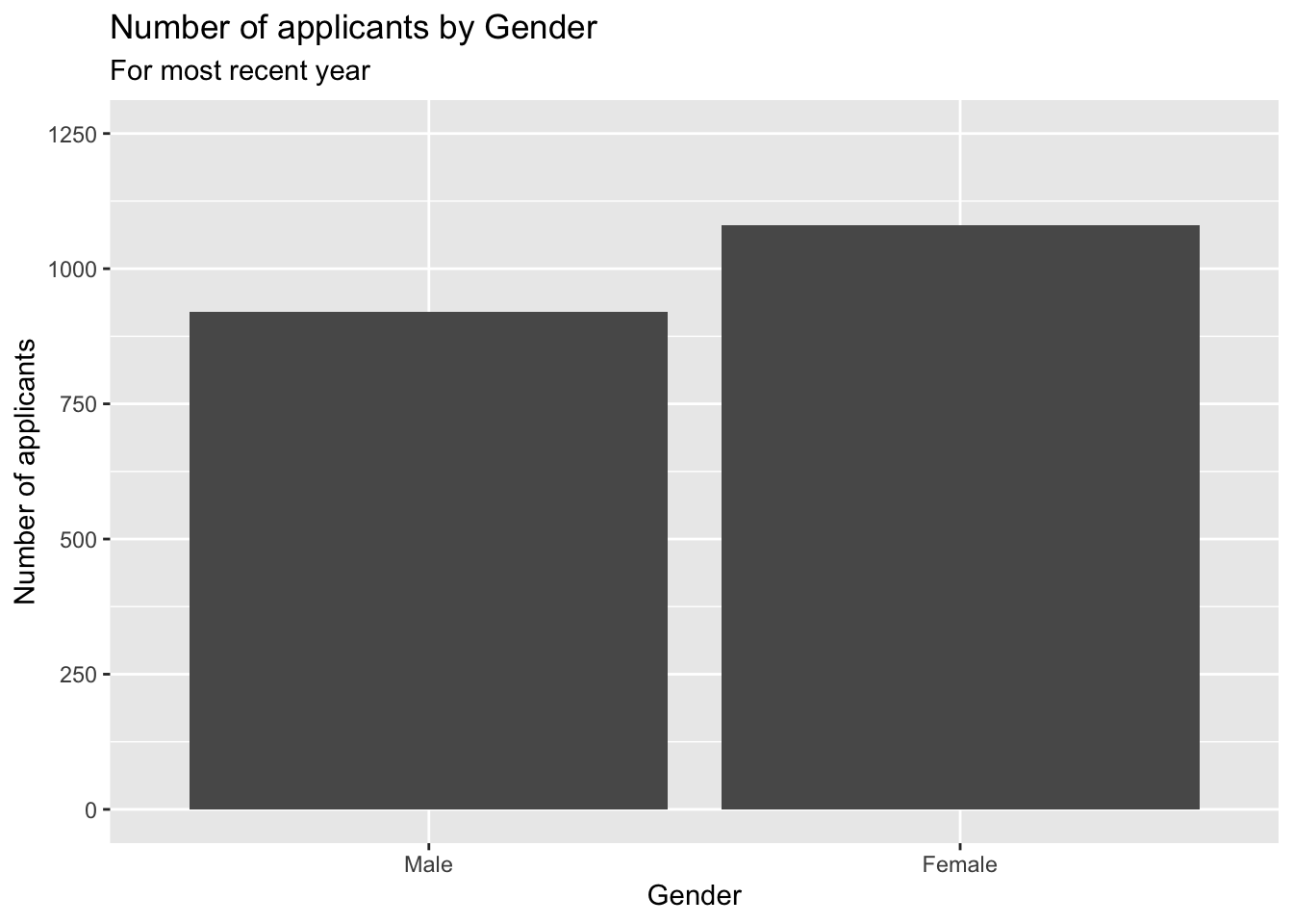
3.2 1 continuous
3.2.1 Histogram for continuous column: x + histogram()
- We do not have to change either the
x-axisory-axisbecause the defaults are both are fine. - Details about the general structure of the
labs()andscaleX()functions can be found in the Structure section.
Note that the minimum that you should do with the commands we’re working with on this page is to specify labs(title, subtitle). Everything else has defaults associated with them. If you’re planning on coming back to the graph or sharing it with others, then you should specify this term.
3.3 2 discrete
3.3.1 Stacked bar: x, y (implicit count), fill + bar()
The challenge with this graph is how to display the x-axis labels so that they are visible. Here we demonstrate the two approaches, both of which are shown in the last line of the graph specification.
guide_axis(angle = X)(in the first graph) displays the label at an angle ofXdown from horizontal. In this case, we chose 45 degrees.guide_axis(n.dodge = 2)(in the next graph) displays the labels on alternating lines.- Details about the general structure of the
labs()andscaleX()functions can be found in the Structure section.
survey |>
  ggplot(aes(Question, fill=Response)) +
    geom_bar(color="black") +
    labs(title = "Number of responses per question",
         subtitle = "For all years",
         x = "Question",
         y = "Number of each response") +
    scale_y_continuous(limits = c(0, 30000),
                       breaks = c(0, 5000, 10000,
                                  15000, 20000,
                                  25000, 30000),
                       labels = c("0", "5k", "10k",
                                  "15k", "20k",
                                  "25k", "30k")) +
    scale_x_discrete(guide = guide_axis(angle = 45))
We have seen the concept of dodge when deciding about displaying bars stacked or next to each other (i.e., dodged). In the case of labels, dodge is used to display the labels in multiple lines.
survey |>
  ggplot(aes(Question, fill=Response)) +
    geom_bar(color="black") +
    labs(title = "Number of responses per question",
         subtitle = "For all years",
         x = "Question",
         y = "Number of each response") +
    scale_y_continuous(limits = c(0, 30000),
                       breaks = c(0, 5000, 10000,
                                  15000, 20000,
                                  25000, 30000),
                       labels = c("0", "5k", "10k",
                                  "15k", "20k",
                                  "25k", "30k")) +
    scale_x_discrete(guide = guide_axis(n.dodge = 2))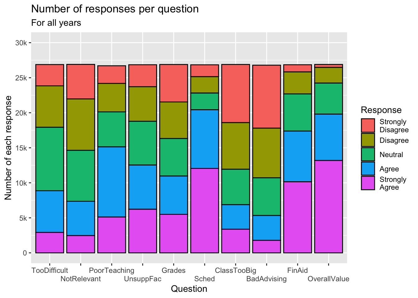
3.3.2 Grouped bar: x, y (implicit count), fill + bar()
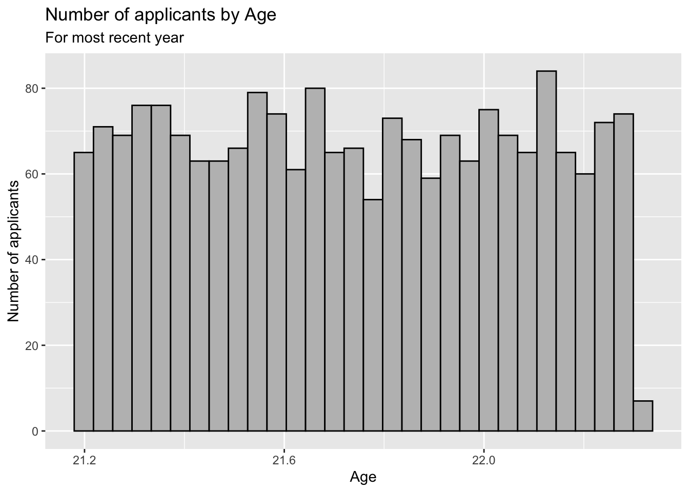
The challenge with this graph is that the x-axis labels are not sufficiently explanatory. The work is done in the scale_x_discrete() function:
- Set
limitsto the order in which you want the bars displayed. - Set
labelsto define the text that you want to display on thex-axis. - If you have some longer labels, you can put a
\nto tellggplotwhere you want to start a new line for the label. - Details about the general structure of the
labs()andscaleX()functions can be found in the Structure section.
student_econ |>
  ggplot(aes(Race, fill = Sex)) +
    geom_bar(position = "dodge") +
    labs(title = "Number of applicants for each race",
         subtitle = "For most recent year",
         x = "Race",
         y = "Number of applicants") +
    scale_x_discrete(limits = c("A", "AI", "B", "H",
                                "O", "PI", "W"),
                     labels = c("Asian", "American\nIndian",
                                "Black", "Hispanic",
                                "Other", "Pacific\nIslander",
                                "White"))
Indication of a problem in the data
See all of that work that we had to do on the x-axis labels? This is an indication of a problem in the data. If the labels are going to be difficult to understand in this graph, then it’s going to be difficult in all of the graphs that it appears.
Instead of changing how the Race appears just in this graph, we should change how it appears in the data, and then let ggplot just display the data as it normally would…but in a new, improved form.
When we initially imported the data and then cleaned it up, we used the following to define a factor for the Race column:
st_info$Race <- factor(st_info$Race)This was fine then. We are finding out that it is not fine now because of this problem that we have now encountered.
The best way to fix this is to go back to the beginning when cleaning up the columns in st_info and replace the above line with this command that reorders the factors (by general size of population) and makes the labels more self-explanatory:
We also go back and add the following lines for other data frames that have a related Race column:
student_econ$Race <- factor(student_econ$Race,
                             levels = c("W", "H", "B", "A",
                                        "AI", "PI", "O"),
                             labels = c("White", "Hispanic",
                                        "Black", "Asian",
                                        "American\nIndian",
                                        "Pacific\nIslander",
                                        "Other"))
student_econ_ABHW$Race <- factor(student_econ_ABHW$Race,
                             levels = c("W", "H", "B", "A",
                                        "AI", "PI", "O"),
                             labels = c("White", "Hispanic",
                                        "Black", "Asian",
                                        "American\nIndian",
                                        "Pacific\nIslander",
                                        "Other"))
The same process needs to happen for the Sex column:
Now we can go back and define the above graph again — but note that we have left the scale_x_discrete() function off entirely! The x-axis has been reordered as have the Sex columns. These same orderings will apply to all future graphs that we create on the above data frames.
student_econ |>
  ggplot(aes(Race, fill = Sex)) +
    geom_bar(position = "dodge") +
    labs(title = "Number of applicants for each race",
         subtitle = "For most recent year",
         x = "Race",
         y = "Number of applicants")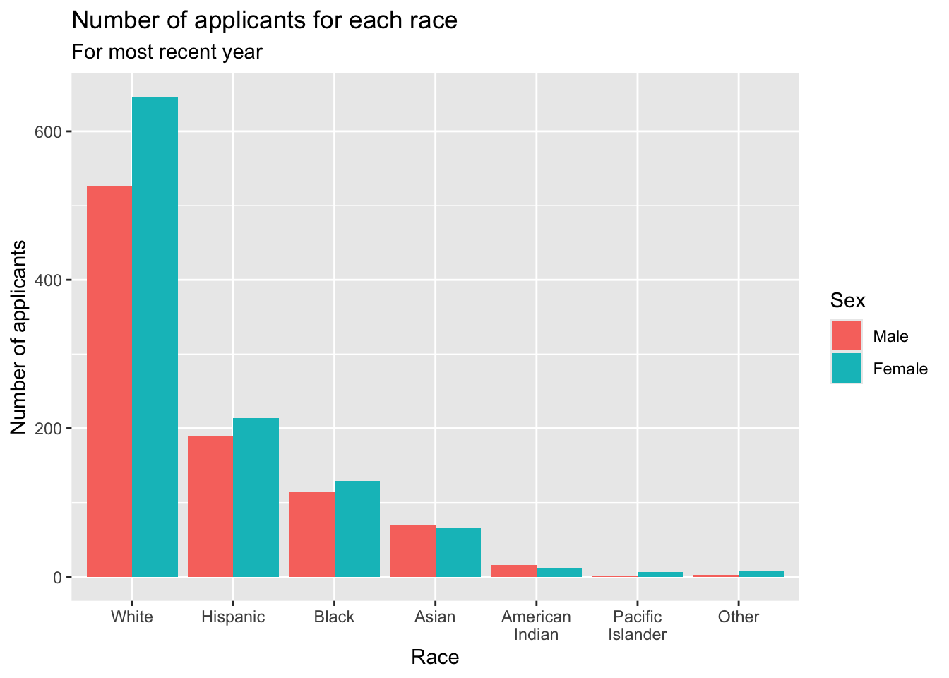
Having the right data makes it much easier to define better, more understandable, and more consistent graphs.
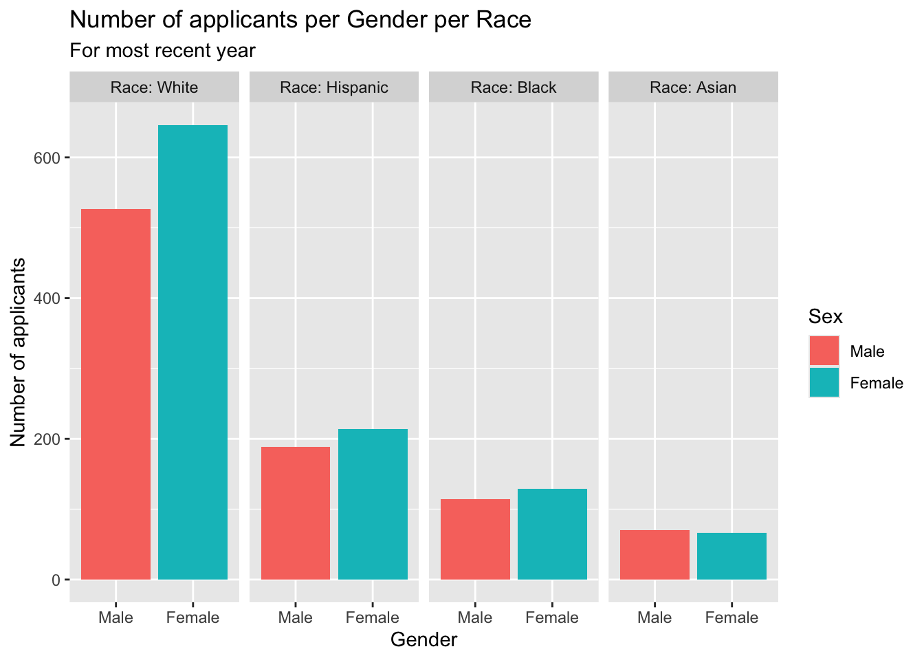
3.3.3 Facet wrap around grouped bar: x, y (implicit count), fill (redundant), facet + bar()
This graph presents the same information as the previous graph.
- Details about the general structure of the
labs()andscaleX()functions can be found in the Structure section.
student_econ_ABHW |>
  ggplot(aes(Sex, fill = Sex)) +
    facet_wrap(~Race,
               ncol = 4) +
    geom_bar() +
    labs(title = "Number of applicants per Gender per Race",
         subtitle = "For most recent year",
         x = "Gender",
         y = "Number of applicants")
In addition to the addition of labs(), if, for some reason we think that it’s not clear what column the facet is defined on, we can also add the labeller argument to facet_wrap().
Here we use label_both; the default is label_value. More information about useful labeller functions can be found on this page.
3.4 1 discrete, 1 continuous
3.4.1 Bar chart of averages: x, y + col()
guide_axis(): Here we use this helper function to display thex-axislabels at a 45 degree angle down from horizontal. You can use this with eitherx-axisory-axisspecifications ordiscreteorcontinuousspecifications. More information can be found on this page.- Setting
y-axiswith limits from 1 to 5 (since those are the minimum and maximum possible responses): To be clear, we tried to set the limits from 1 to 5…but it only displayed a blank canvas after we did so. Once we changed it tolimits = c(0, 5), the graph displayed correctly. Two lessons here:- Set graph limits after setting the
labelsandbreaks. This is the setting that most often causes unexpected outcomes, so make sure that you get the other axis stuff right first. - Always, always, always, verify that your changes work before going on to the next step. (Thank us later.)
- Set graph limits after setting the
- Details about the general structure of the
labs()andscaleX()functions can be found in the Structure section.
surveyQAvg |>
  ggplot(aes(Question, Avg)) +
    geom_col() +
    labs(title = "Average response per Survey Question",
         subtitle = "For all years",
         x = "Question",
         y = "Average score") +
    scale_y_continuous(limits = c(0, 5),
                       breaks = c(1, 2, 3, 4, 5),
                       labels = c("1.0", "2.0",
                                  "3.0", "4.0", "5.0")) +
    scale_x_discrete(guide = guide_axis(angle = 45))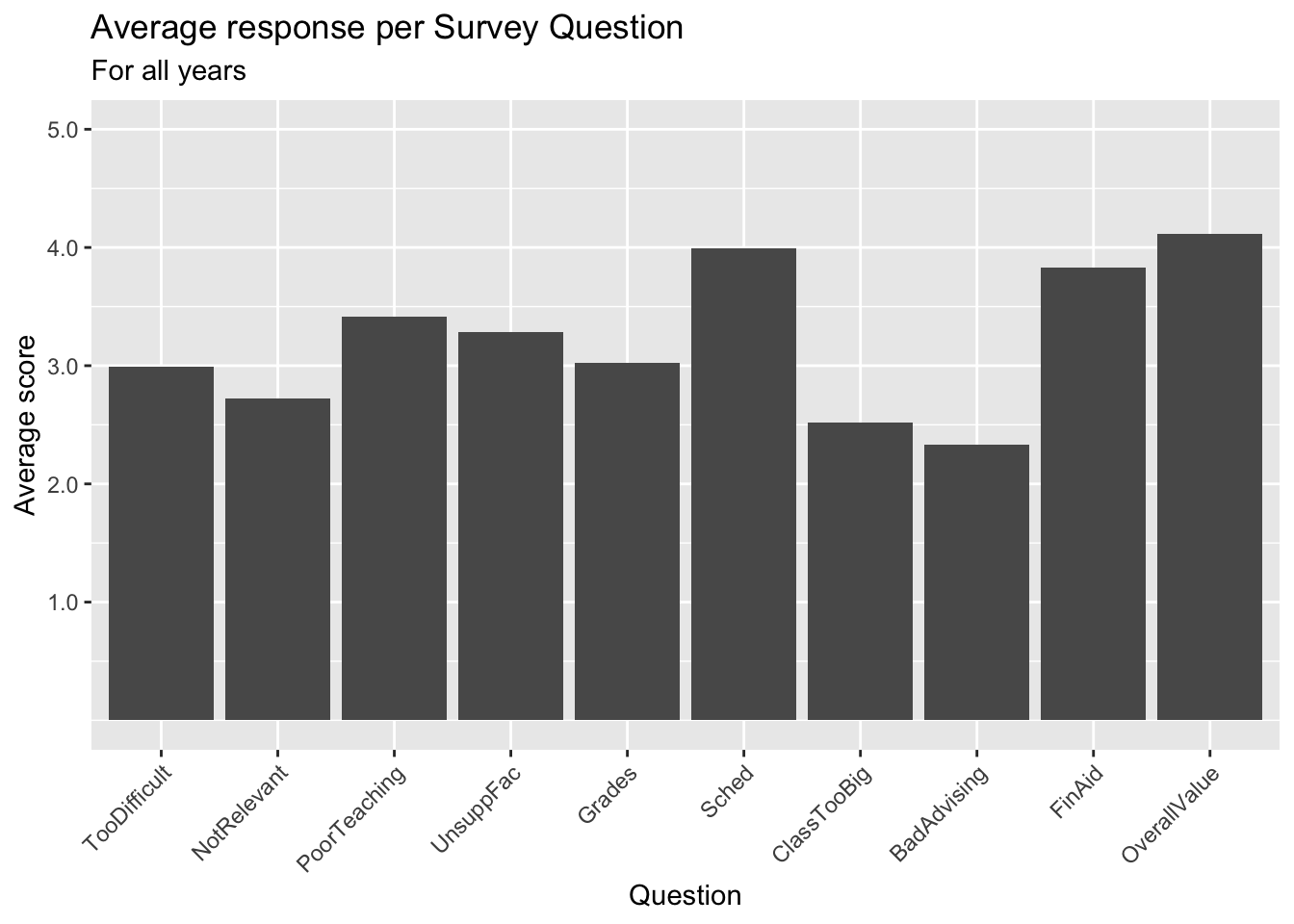
3.4.2 Bar chart with sorted averages: x (reordered), y + col()
Suppose that you liked the previous bar chart but want to display the columns in order by their values?
guide_axis(): explained in this section.- Setting
y-axiswith limits from 1 to 5 (since those are the minimum and maximum possible responses): also explained in that section. - Details about the general structure of the
labs()andscaleX()functions can be found in the Structure section.
surveyQAvg |>
  ggplot(aes(x = fct_reorder(Question, Avg, .desc = TRUE),
             Avg)) +
    geom_col() +
    labs(title = "Average response per Survey Question (in descending order)",
         subtitle = "For all years",
         x = "Question",
         y = "Average score") +
    scale_y_continuous(limits = c(0, 5),
                       breaks = c(1, 2, 3, 4, 5),
                       labels = c("1.0", "2.0",
                                  "3.0", "4.0", "5.0")) +
    scale_x_discrete(guide = guide_axis(angle = 45))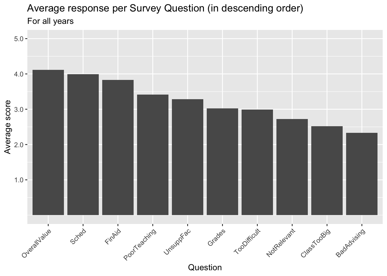
3.4.3 Boxplot reliant on other variable: x, y + boxplot()
In this example, we show the distribution of SAT values by the Race of the applicant:
scale_y_continuous: When a value has a natural range, (such asSATfrom 800 to 1600), we like to display the whole range in almost every case. Here the smallest value isn’t much less than 1000, so a good chunk of the graph is empty. However, this blank space is providing information to the reader — e.g., that very few applicants have SAT scores between 800 and 1000. Further, if you always set the axis for SAT scores to the whole range, then it will make it easier for the reader to compare results across graphs.- Details about the general structure of the
labs()andscaleX()functions can be found in the Structure section.
student_econ |>
  ggplot(aes(Race, SAT)) +
    geom_boxplot() +
    labs(title = "Range of SAT scores per applicant race",
         subtitle = "For all years",
         x = "Race",
         y = "SAT scores") +
    scale_y_continuous(limits = c(800, 1600),
                       breaks = c(800, 1000, 1200,
                                  1400, 1600))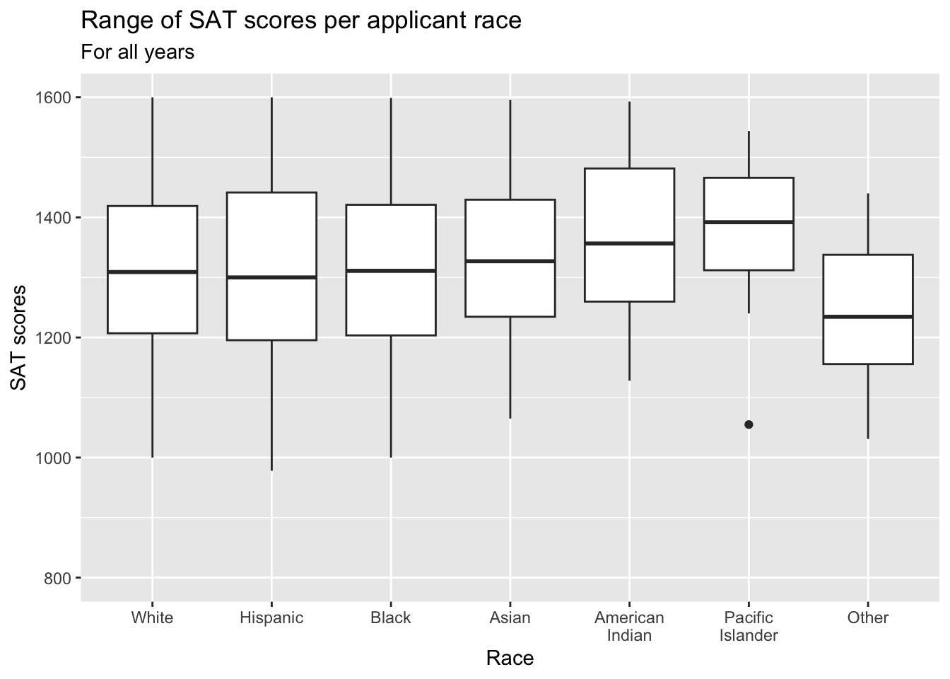
In this example, we show the distribution of UnivGPA values by the Gender of the applicant:
admitdatagenderMFgpa |>
  ggplot(aes(x = Gender, y = UnivGPA)) +
    geom_boxplot() +
    labs(title = "Range of University GPA per student gender",
         subtitle = "For all years",
         x = "Gender",
         y = "University GPA") +
    scale_y_continuous(limits = c(0, 4),
                       breaks = c(0, 1, 2, 3, 4),
                       labels = c("0.0", "1.0",
                                  "2.0", "3.0", "4.0"))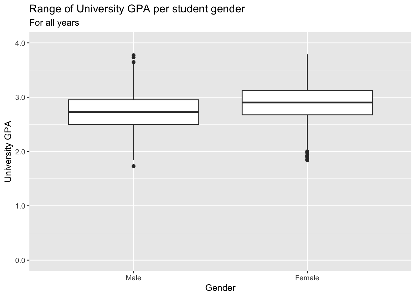
3.4.4 Violin chart reliant on other variable: x, y + horizontal violin()
- Using
coord_flip()didn’t affect how to labelscale_x_discrete()— it can figure out that what we referred to asxnow becomes they-axiswhen displayed. - The
limits = revinscale_x_discrete()means that theGendervalues on the axis should be displayed in reverse order. In standard order, it would have put the firstGendervalue (Male) at the bottom and the lastGendervalue (Unknown) at the top. But since people read from top to bottom, it makes more sense to display the values in the reverse order. - Details about the general structure of the
labs()andscaleX()functions can be found in the Structure section.
admitdatagendergpa |>
  ggplot(aes(x = Gender,
             y = UnivGPA,
             fill=Gender)) +
    geom_violin(scale="count")+
    labs(title = "Distribution of University GPA per student gender",
         subtitle = "For all years",
         x = "Gender",
         y = "University GPA",
         fill = "Student Gender") +
    scale_x_discrete(limits = rev) +
    scale_y_continuous(limits = c(0, 4),
                       breaks = c(0, 1, 2, 3, 4),
                       labels = c("0.0", "1.0",
                                  "2.0", "3.0", "4.0")) +
coord_flip() 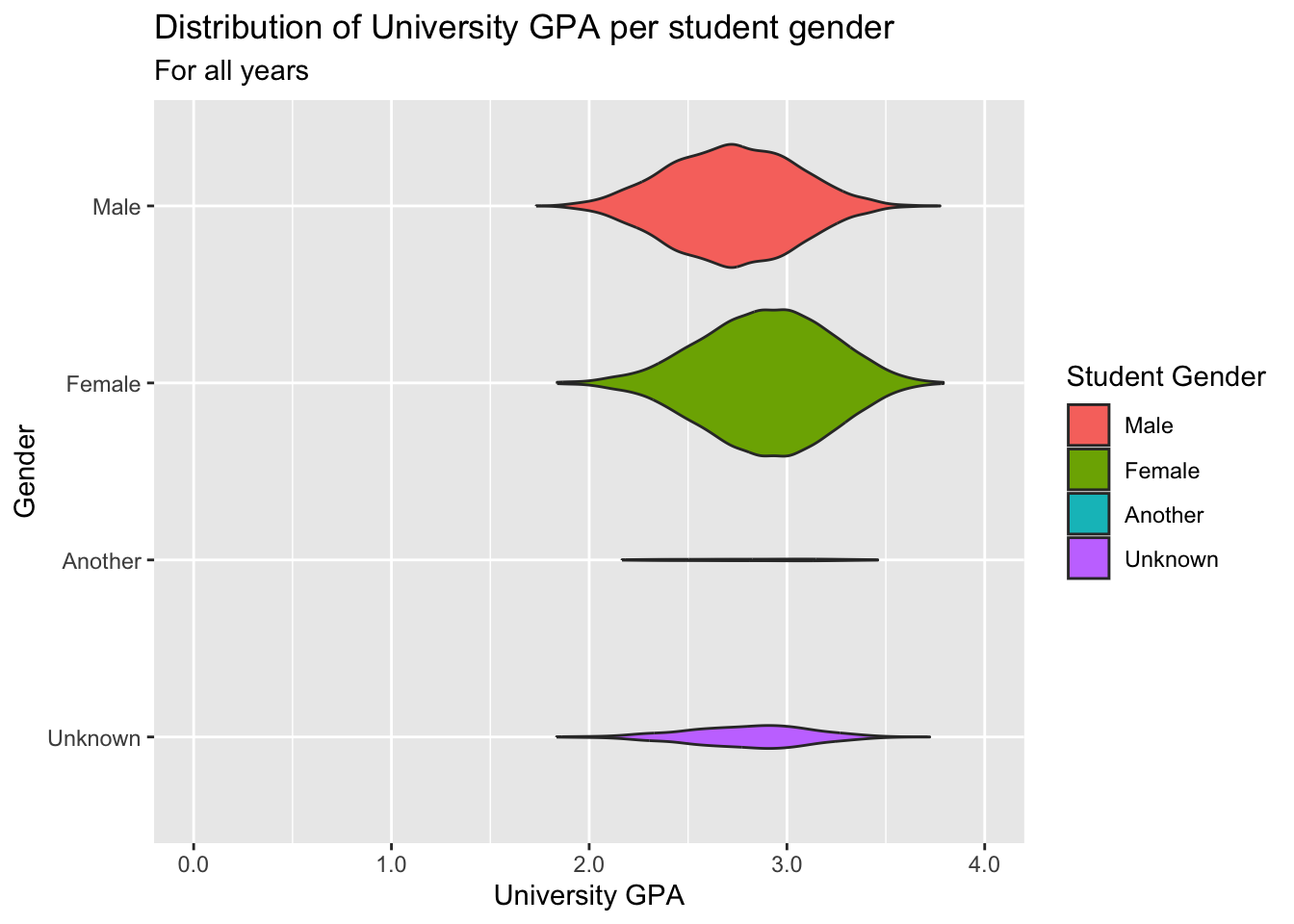
3.5 2 discrete, 1 continuous
3.5.1 Grouped bar (x, y, fill + col())
This one is similar to this graph but uses geom_col().
guide_axis(): explained in this section.- Details about the general structure of the
labs()andscaleX()functions can be found in the Structure section.
surveyQRN |>
  ggplot(aes(x = Question,
             y = n,
             fill = Response)) +
    geom_col() +
    labs(title = "Number of responses per question",
         subtitle = "For all years",
         x = "Question",
         y = "Number of each response") +
    scale_y_continuous(limits = c(0, 30000),
                       breaks = c(0, 5000, 10000,
                                  15000, 20000,
                                  25000, 30000),
                       labels = c("0", "5k", "10k",
                                  "15k", "20k",
                                  "25k", "30k")) +
    scale_x_discrete(guide = guide_axis(angle = 45))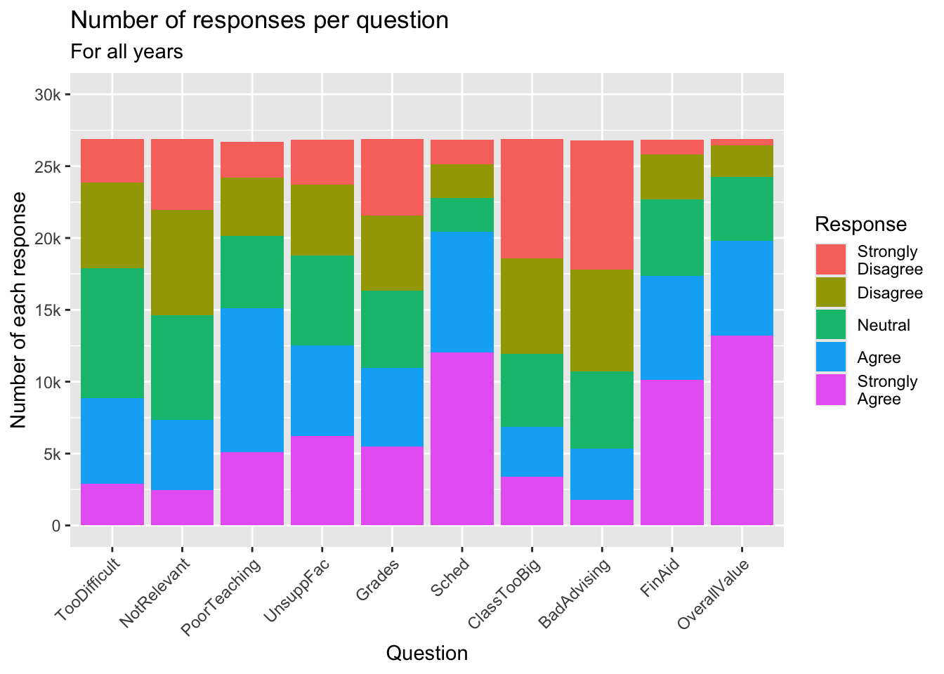
Sometimes, we want to show the bars next to each other rather than stacked.
guide_axis(): explained in this section.- Details about the general structure of the
labs()andscaleX()functions can be found in the Structure section.
surveyQRN |>
  ggplot(aes(x = Question, y = n,
             fill = Response)) +
    geom_col(position="dodge",
             color = "black") +
    labs(title = "Number of responses per question",
         subtitle = "For all years",
         x = "Question",
         y = "Number of each response") +
    scale_y_continuous(limits = c(0, 15000),
                       breaks = c(0, 3000, 6000,
                                  9000, 12000, 15000),
                       labels = c("0", "3k", "6k",
                                  "9k", "12k", "15k")) +
    scale_x_discrete(guide = guide_axis(angle = 45))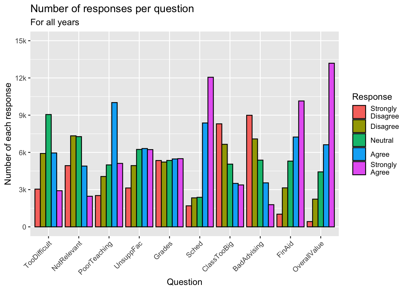
Another example which displays the same graph as shown in this section.
3.5.2 Facets around bar (x, y, facet + col())
This graph, again, displays the data shown in the graphs in this section.
- Details about the general structure of the
labs()andscaleX()functions can be found in the Structure section.
surveyQRN |>
  ggplot(aes(x = Response, y = n)) +
    facet_wrap(~Question, ncol = 2) +
    geom_col(position="dodge") +
    labs(title = "Distributions of responses for each question",
         subtitle = "For all years",
         x = "Response",
         y = "Number of responses") +
    scale_y_continuous(limits = c(0, 14000),
                       breaks = c(0, 3500, 7000,
                                  10500, 14000),
                       labels = c("0", "3.5k", "7k",
                                  "10.5k", "14k"))
3.5.3 Facets around horizontal bar (x, y, facet + col())
In this graph, we display the same data as in the previous graph. The only difference, obviously, is that the bars are displayed horizontally.
guide_axis(): explained in this section.- As contrasted with using
coord_flip(), you need to specify thex-axisas continuous using this approach, sinceResponse(on they-axis) is the continuous column. - Details about the general structure of the
labs()andscaleX()functions can be found in the Structure section.
surveyQRN |>
  ggplot(aes(x = n, y = Response)) +
    facet_wrap(~Question, ncol = 5) +
    geom_col(position="dodge") +
    labs(title = "Distributions of responses for each question",
         subtitle = "For all years",
         y = "Response",
         x = "Number of responses") +
    scale_x_continuous(limits = c(0, 14000),
                       breaks = c(0, 3500, 7000,
                                  10500, 14000),
                       labels = c("0", "3.5k", "7k",
                                  "10.5k", "14k"),
                       guide = guide_axis(angle = 45))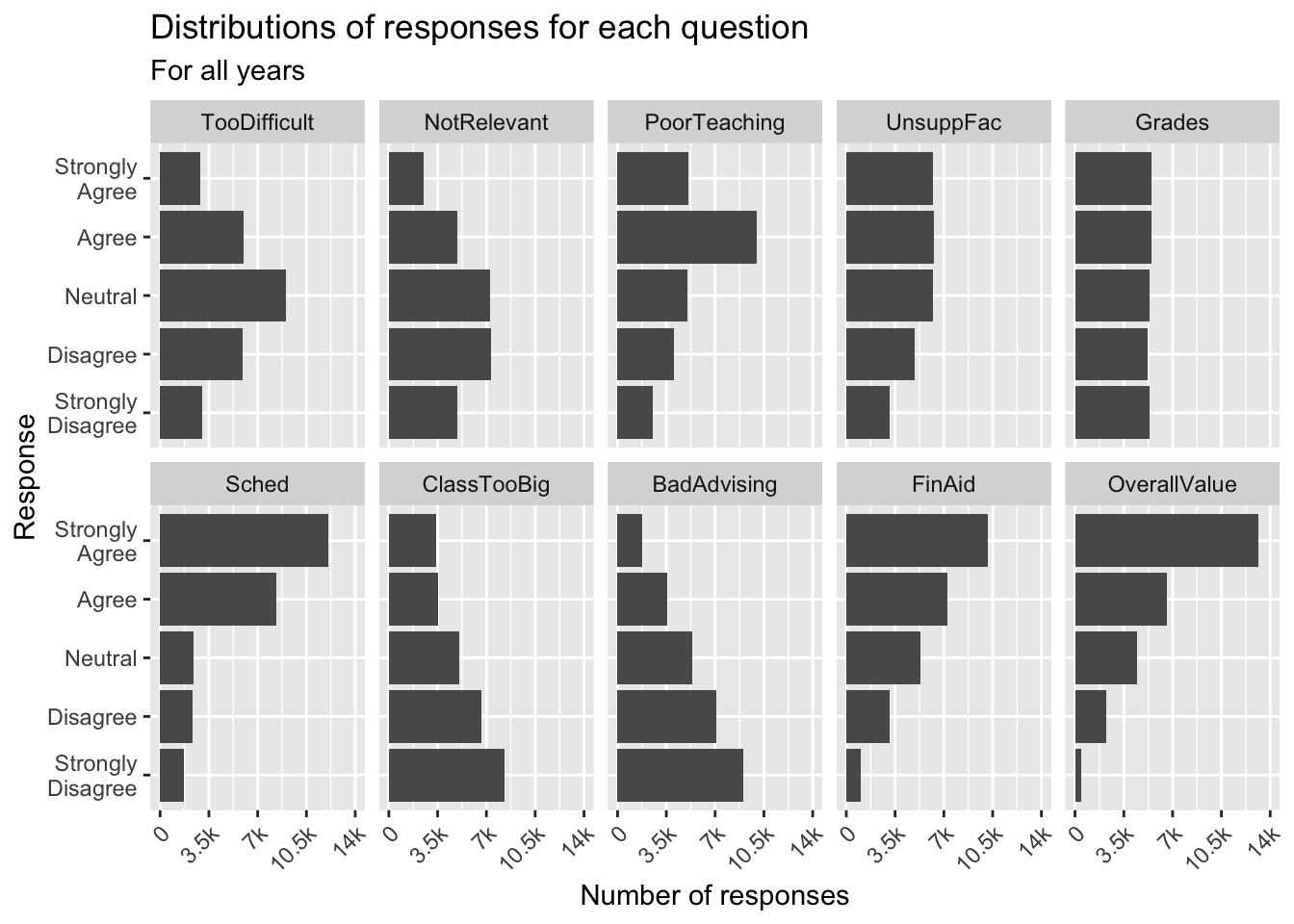
3.5.4 Grouped bar, narrowed width of bars (x, y, fill + col())
In this and the following two sections, we are going to modify the graph shown in this section.
guide_axis(): explained in this section.- Details about the general structure of the
labs()andscaleX()functions can be found in the Structure section.
surveyQRN |>
  ggplot(aes(x = Question,
             y = n,
             fill = Response)) +
    geom_col(position="dodge",
             width=0.8,
             color = "black") +
    labs(title = "Number of responses per question",
         subtitle = "For all years",
         x = "Question",
         y = "Number of each response") +
    scale_y_continuous(limits = c(0, 15000),
                       breaks = c(0, 3000, 6000,
                                  9000, 12000, 15000),
                       labels = c("0", "3k", "6k",
                                  "9k", "12k", "15k")) +
    scale_x_discrete(guide = guide_axis(angle = 45))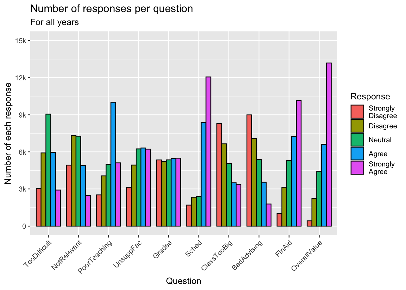
3.5.5 Grouped bar, narrowed & overlapping bars (x, y, fill + col())
Again, we are displaying the same data as the previous graph.
guide_axis(): explained in this section.- Details about the general structure of the
labs()andscaleX()functions can be found in the Structure section.
surveyQRN |>
  ggplot(aes(x = Question,
             y = n,
             fill = Response)) +
    geom_col(position=position_dodge(width=0.5),
             width=0.9,
             color = "black") +
    labs(title = "Number of responses per question",
         subtitle = "For all years",
         x = "Question",
         y = "Number of each response") +
    scale_y_continuous(limits = c(0, 15000),
                       breaks = c(0, 3000, 6000,
                                  9000, 12000, 15000),
                       labels = c("0", "3k", "6k",
                                  "9k", "12k", "15k")) +
    scale_x_discrete(guide = guide_axis(angle = 45))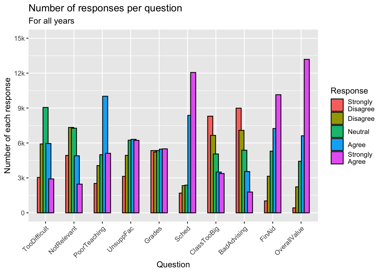
3.5.6 Grouped bar, narrowed & spaced bars (x, y, fill + col())
In this graph, we take the opposite approach to graph in the previous section. We narrow the groups by a small amount (width=0.9) but narrow each individual bar even more (width=0.5 within geom_col()).
guide_axis(): explained in this section.- Details about the general structure of the
labs()andscaleX()functions can be found in the Structure section.
surveyQRN |>
  ggplot(aes(x = Question,
             y = n,
             fill = Response)) +
    geom_col(position=position_dodge(width=0.9),
             width=0.5,
             color = "black") +
    labs(title = "Number of responses per question",
         subtitle = "For all years",
         x = "Question",
         y = "Number of each response") +
    scale_y_continuous(limits = c(0, 15000),
                       breaks = c(0, 3000, 6000,
                                  9000, 12000, 15000),
                       labels = c("0", "3k", "6k",
                                  "9k", "12k", "15k")) +
    scale_x_discrete(guide = guide_axis(angle = 45))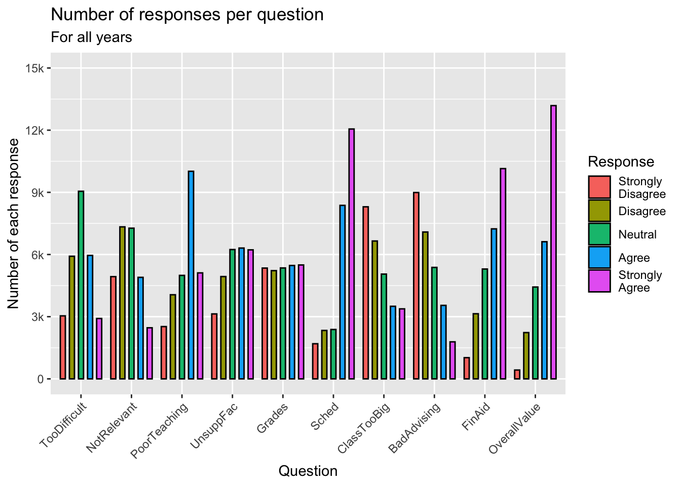
3.5.7 Percent Stacked bar (x, y, fill + col())
Back in this section, we created a graph that showed the raw counts of the number of each response for each question. This time we want to show the percent of answers for each response to each question.
- Specifying
limits = c(0.0, 1.0)forscale_y_continuouscausedggplotnot to show any data at all. We do not know why. guide_axis(): explained in this section.- Details about the general structure of the
labs()andscaleX()functions can be found in the Structure section.
surveyQRN |>
  ggplot(aes(x = Question,
             y = n,
             fill = Response)) +
    geom_col(position = "fill") +
    labs(title = "Percentage of each response to each question",
         subtitle = "For all years",
         x = "Question",
         y = "Percent of each response") +
    scale_y_continuous(breaks = c(0.0, 0.25, 0.5,
                                  0.75, 1.0),
                       labels = c("0%", "25%", "50%",
                                  "75%", "100%")) +
    scale_x_discrete(guide = guide_axis(angle = 45))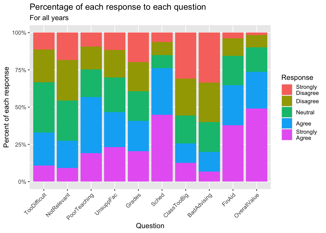
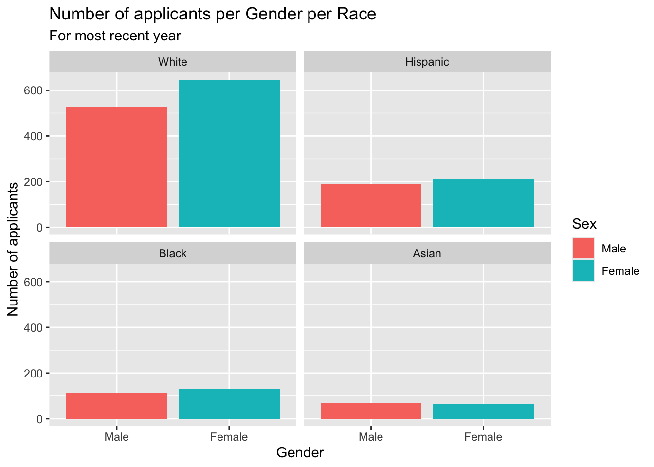
3.5.8 Bar chart wrapped by a facet: x, y (implicit count), fill (redundant), facet + bar()
This graph presents the same information as in this section but without specifying the ncol argument. - Details about the general structure of the labs() and scaleX() functions can be found in the Structure section.
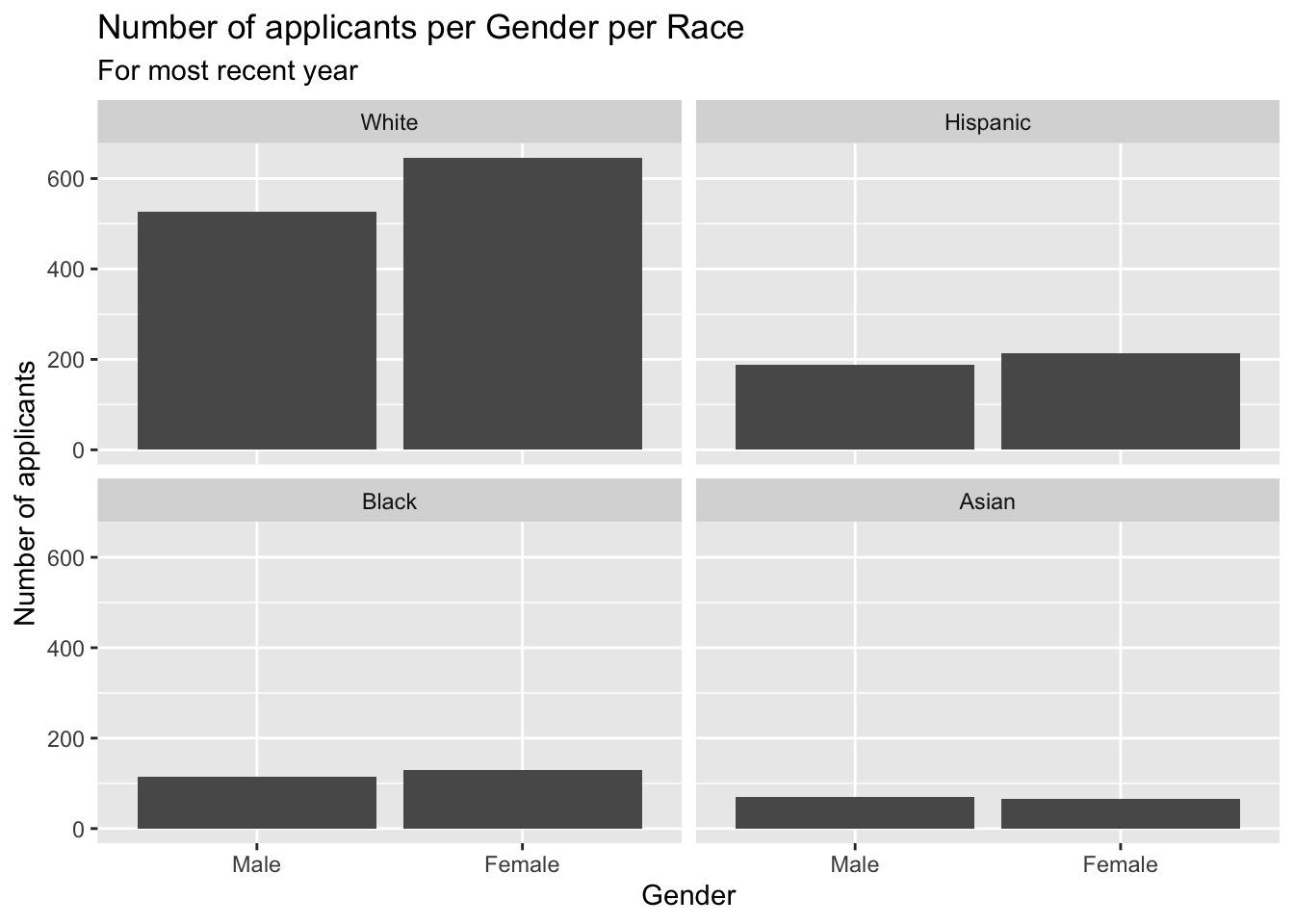
3.5.9 Column chart wrapped by facets: x, y (explicit count), facet + col()
This graph displays the same information as the previous graph but goes about it entirely differently.
- Details about the general structure of the
labs()andscaleX()functions can be found in the Structure section.
3.5.10 Colored column chart wrapped by facets: x, y (explicit count), fill (redundant), facet + col()
Clearly, this is the same graph as the previous section but with bar colors specified by fill=Sex. Everything else is the same.
- Details about the general structure of the
labs()andscaleX()functions can be found in the Structure section.
3.5.11 Boxplot differentiated by 2 other columns: x, y, color + boxplot()
- Note that the
colorlegend title has a\nin it. This tellsggplotto start a new line at that point. This decreases the amount of horizontal space that the legend takes up. - The specification of the
titleuses thepaste()function. This is solely so that thetitle(in the R code) doesn’t spill out of the right side of the page on narrow displays. This function connects all of the strings together, separated by the single space shown (the value ofsepin this case). - Details about the general structure of the
labs()andscaleX()functions can be found in the Structure section.
admitdataRaceGPAPell |>
  ggplot(aes(IPEDSRaceEthnicity, UnivGPA,
             color = PellStatus)) +
    geom_boxplot(varwidth=TRUE) +
    labs(title = paste("University GPA range per",
                       "race and Pell Grant Status",
                       sep=" "),
         subtitle = "For all years",
         x = "Race/ethnicity",
         y = "University GPA",
         color = "Pell Grant\nStatus")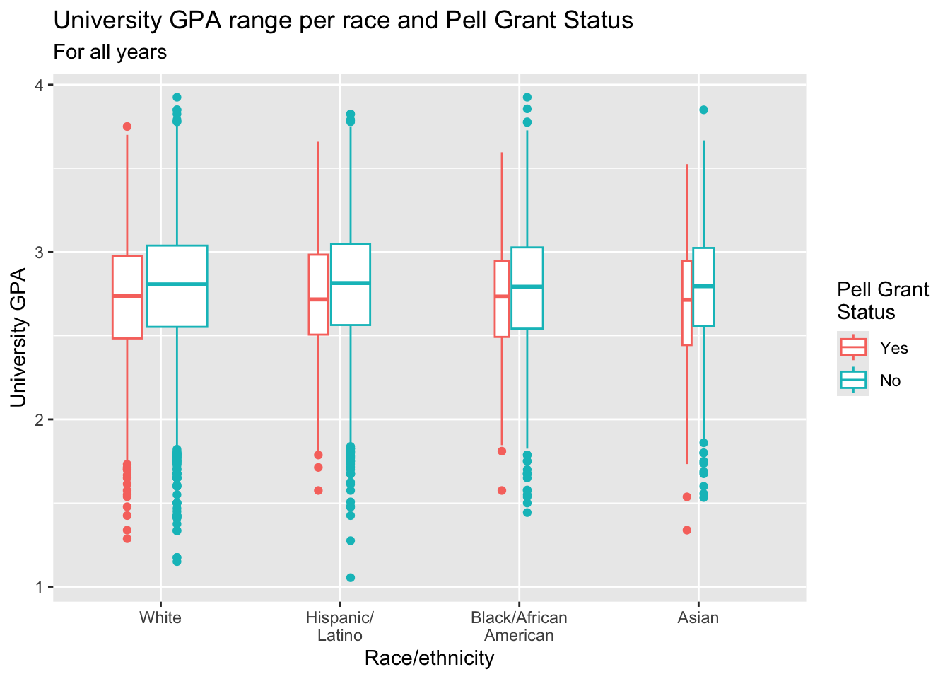
Note: See this page for information on how to put the actual sample size in the x-axis labels.
3.5.12 Colored boxplot differentiated by 2 other columns: x, y, fill + boxplot()
This graph is exactly the same as the graph in the previous section except that it uses fill instead of color to highlight Pell Status.
paste(): explained in this section.- Since
x-axis,y-axis, andfillarespecified inaes(), you can specifyx,y, andfillin thelabs()helper function. If you accidentally specifyfillinlabs()when you have not specifiedfillinaes(), then nothing will show on the graph. This is a relatively common error. - Details about the general structure of the
labs()andscaleX()functions can be found in the Structure section.
admitdataRaceGPAPell |>
  ggplot(aes(IPEDSRaceEthnicity, UnivGPA,
             fill = PellStatus)) +
    geom_boxplot(varwidth=TRUE) +
    labs(title = paste("University GPA range per",
                       "race and Pell Grant Status",
                       sep=" "),
         subtitle = "For all years",
         x = "Race/ethnicity",
         y = "University GPA",
         fill = "Pell Grant Status")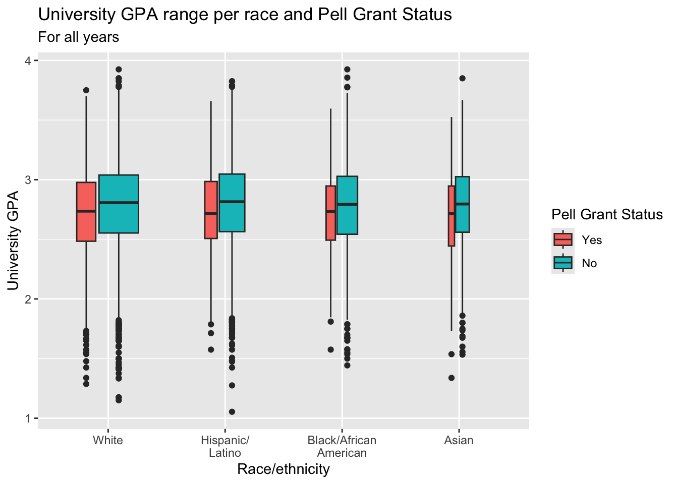
3.5.13 Boxplot differentiated by one column and wrapped by another: x, y, facet + boxplot()
This graph displays the same data as in the previous graph except that it uses facet_wrap() instead of fill or color to differentiate Pell Status.
paste(): explained in this section.- Details about the general structure of the
labs()andscaleX()functions can be found in the Structure section.
admitdataRaceGPAPell |>
  ggplot(aes(IPEDSRaceEthnicity, UnivGPA)) +
    facet_wrap(~PellStatus,
               labeller = label_both) +
    geom_boxplot(varwidth=TRUE) +
    labs(title = paste("University GPA range per",
                       "race and Pell Grant Status",
                       sep=" "),
         subtitle = "For all years",
         x = "Race/ethnicity",
         y = "University GPA")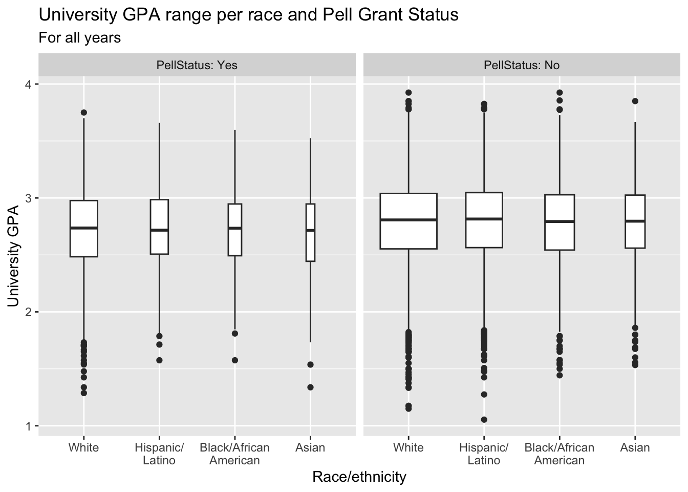
3.5.14 Horizontal boxplot differentiated by one column and wrapped by another: x, y, facet + horizontal boxplot()
This graph displays the same data as in the previous graph except that it displays the boxplots horizontally.
paste(): explained in this section.- Details about the general structure of the
labs()andscaleX()functions can be found in the Structure section.
admitdataRaceGPAPell |>
  ggplot(aes(IPEDSRaceEthnicity, UnivGPA)) +
    facet_wrap(~PellStatus,
               labeller = label_both) +
    geom_boxplot(varwidth=TRUE) +
    coord_flip() +
    labs(title = paste("University GPA range per",
                       "race and Pell Grant Status",
                       sep=" "),
         subtitle = "For all years",
         x = "Race/ethnicity",
         y = "University GPA")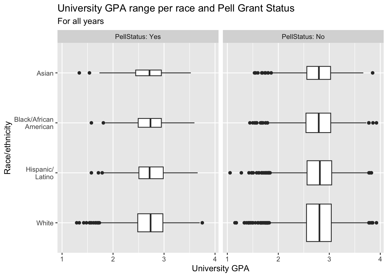
3.6 Ordered, numeric, discrete
If you have one column that is ordered (e.g., a series of dates), another that is discrete (e.g., sex, Pell Grant Status, race/ethnicity, etc.), and another column that is numeric, then the situation is calling out for a line graph that further differentiates (based on the discrete column) via either colors or facets. Let’s look at a few examples.
3.6.1 Line chart: x, y, color + line()
paste(): explained in this section.- The
colorof the lines is determined byGender(as shown inaes()). Note thatlabs()does not specify text forcolorbut that it still saysGenderin the legend. You do not have to specify a text label for every term inaes(). - Details about the general structure of the
labs()andscaleX()functions can be found in the Structure section.
admitdataYearGenderCount |>
  ggplot(aes(x = AdmitCalendarYear,
             y = Count,
             color = Gender)) +
    geom_line(linewidth = 1) +
    labs(title = paste("Number of Admits by",
                       "Gender Per Calendar Year",
                       sep = " "),
         x = "Calendar Year",
         y = "Number of Admits") +
    scale_y_continuous(limits = c(0, 900),
                       breaks = c(0, 150, 300, 450,
                                  600, 750, 900)) +
    scale_x_continuous(limits = c(2011, 2022),
                       breaks = c(2012, 2014, 2016,
                                  2018, 2020, 2022))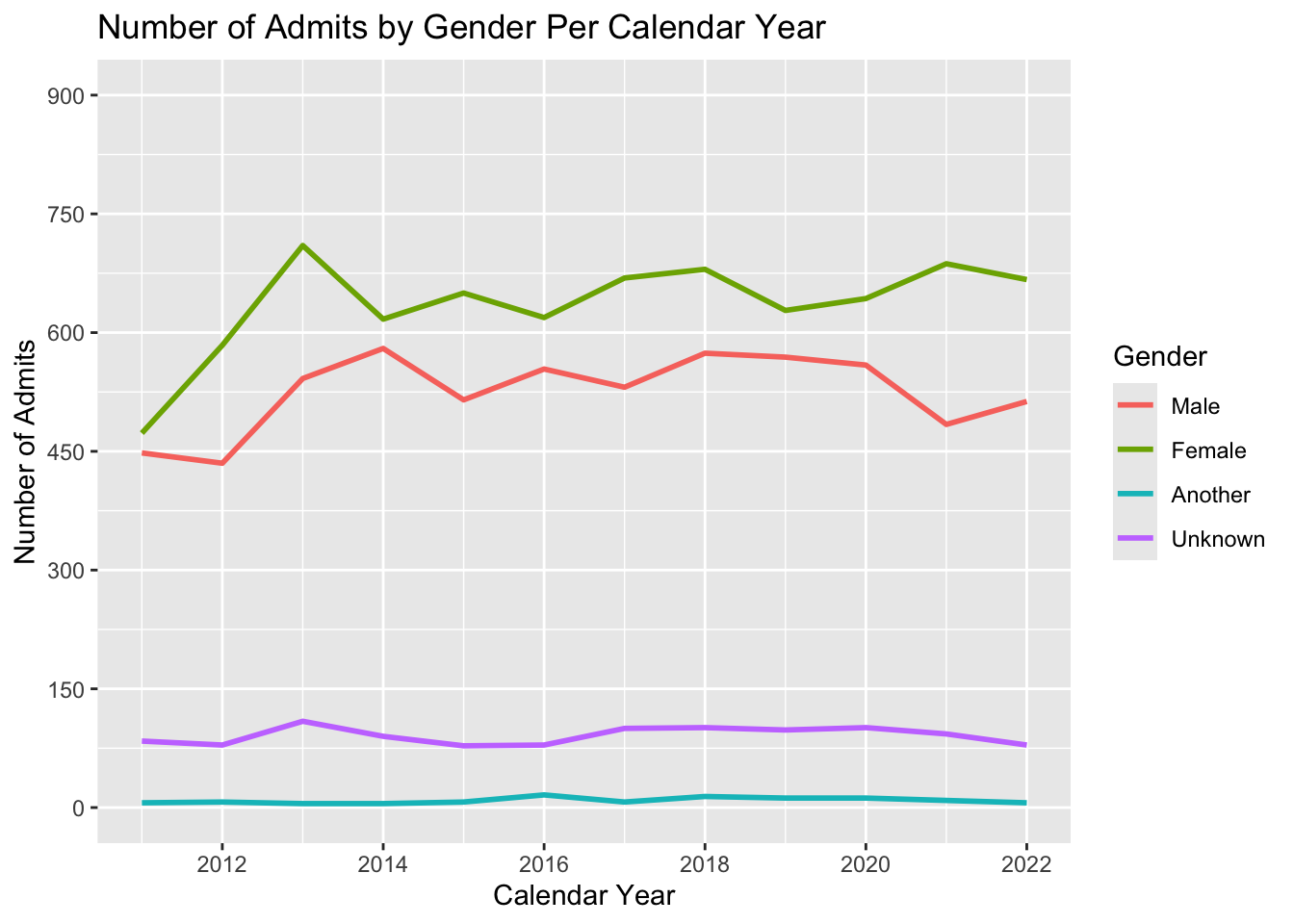
babynames |>
  filter(Name %in% c("Jennifer", "Teresa", "Karen",
                     "Linda", "Nancy") &
           Sex == "F") |>
  ggplot(aes(x = YearOfBirth,
             y = Number,
             color=Name)) +
    geom_line(linewidth = 1) +
    labs(title = paste("Number of Births with",
                       "a Given Name Per Year",
                       sep = " "),
         x = "Calendar Year",
         y = "Number of babies born with a given name") +
    scale_x_continuous(limits = c(1880, 2020),
                       breaks = c(1880, 1900, 1920,
                                  1940, 1960, 1980,
                                  2000, 2020)) +
    scale_y_continuous(breaks = c(0, 20000, 40000,
                                  60000, 80000,
                                  100000),
                       labels = c("0", "20k", "40k",
                                  "60k", "80k", "100k"))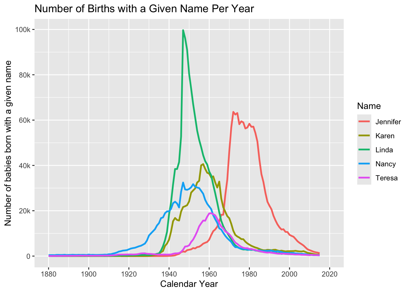
3.6.2 Line chart wrapped by facets: x, y, facet + line()
This graph displays the same data as in the previous section; however, we are now differentiating on Gender via a facet_wrap() instead of color.
paste(): explained in this section.- Details about the general structure of the
labs()andscaleX()functions can be found in the Structure section.
admitdataYearGenderCount |>
  ggplot(aes(x = AdmitCalendarYear,
             y = Count)) +
    facet_wrap(~Gender,
               labeller = label_both) +
    geom_line(linewidth = 1) +
    labs(title = paste("Number of Admits by",
                       "Gender Per Calendar Year",
                       sep = " "),
         x = "Calendar Year",
         y = "Number of Admits") +
    scale_y_continuous(limits = c(0, 900),
                       breaks = c(0, 150, 300, 450,
                                  600, 750, 900)) +
    scale_x_continuous(limits = c(2011, 2022),
                       breaks = c(2012, 2014, 2016,
                                  2018, 2020, 2022))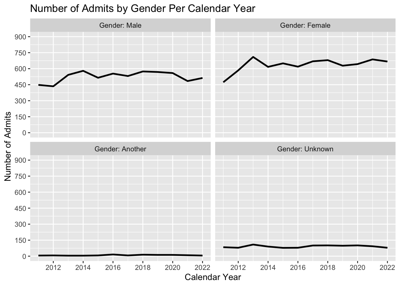
3.7 2 continuous
3.7.1 Point plot with fitted line: x, y + point() + smooth()
- Details about the general structure of the
labs()andscaleX()functions can be found in the Structure section.
admitdataIncGPAGender |>
  ggplot(aes(x = FamilyIncome, y = UnivGPA)) +
    geom_point(alpha = 0.2) +
    geom_smooth(alpha = 1.0) +
    labs(title = "University GPA by Family Income",
         subtitle = "For all years",
         x = "Family Income",
         y = "University GPA") +
    scale_y_continuous(limits = c(1.0, 4.0),
                       breaks = c(1.0, 2.0, 3.0, 4.0),
                       labels = c("1.0", "2.0",
                                  "3.0", "4.0")) +
    scale_x_continuous(breaks = c(0, 50000, 100000,
                                  150000, 200000,
                                  250000),
                       labels = c("$0", "$50k",
                                  "$100k", "$150k",
                                  "$200k", "$250k"))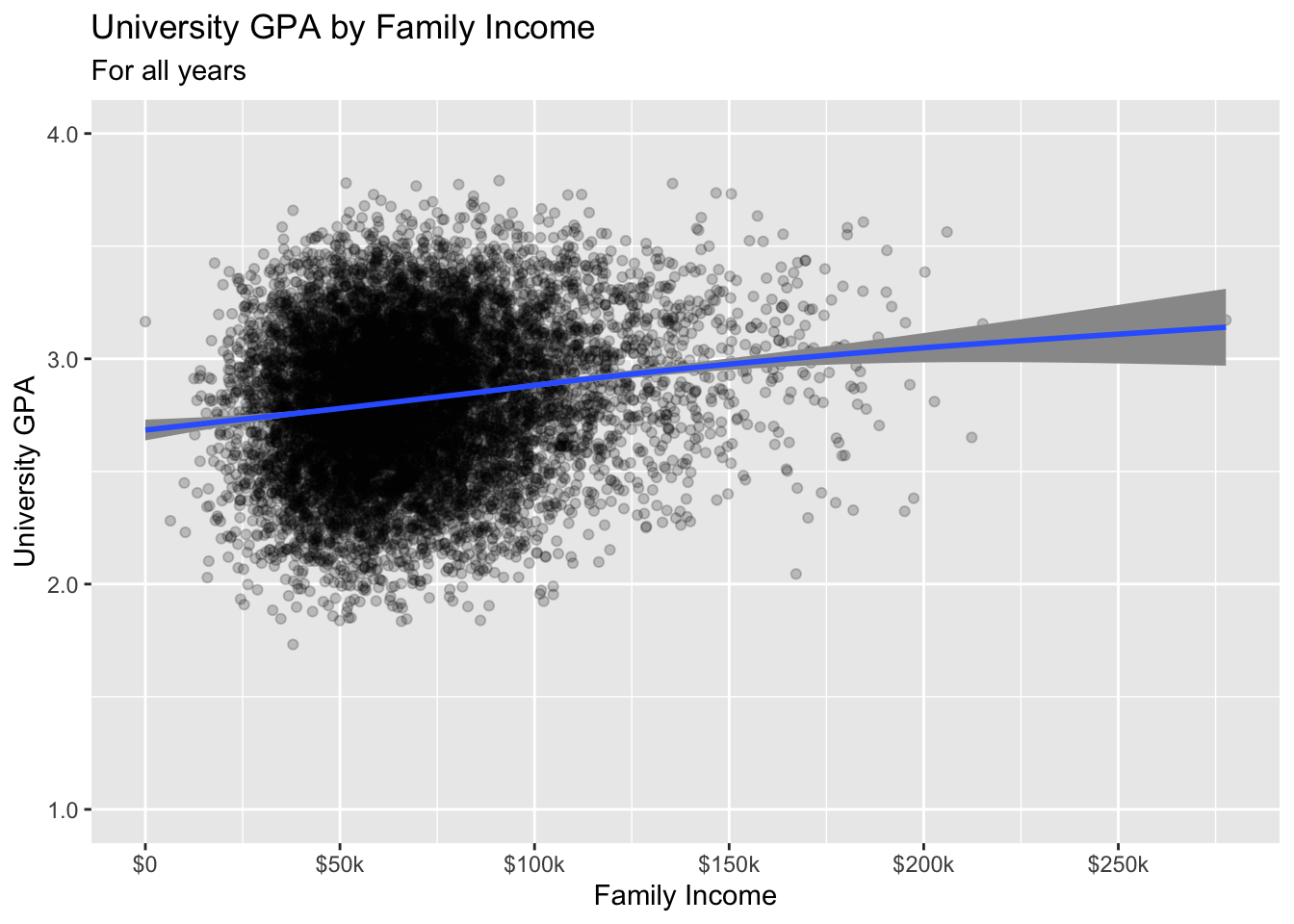
3.7.2 Hexplot with fitted line: x, y + hex() + smooth()
- Details about the general structure of the
labs()andscaleX()functions can be found in the Structure section.
admitdataIncGPAGender |>
  ggplot(aes(FamilyIncome, UnivGPA)) +
    geom_hex(bins = 50) +
    geom_smooth() +
    labs(title = "University GPA range by Family Income",
         subtitle = "For all years",
         x = "Family Income",
         y = "University GPA") +
    scale_y_continuous(limits = c(1.0, 4.0),
                       breaks = c(1.0, 2.0, 3.0, 4.0),
                       labels = c("1.0", "2.0",
                                  "3.0", "4.0")) +
    scale_x_continuous(breaks = c(0, 50000, 100000,
                                  150000, 200000,
                                  250000),
                       labels = c("$0", "$50k",
                                  "$100k", "$150k",
                                  "$200k", "$250k"))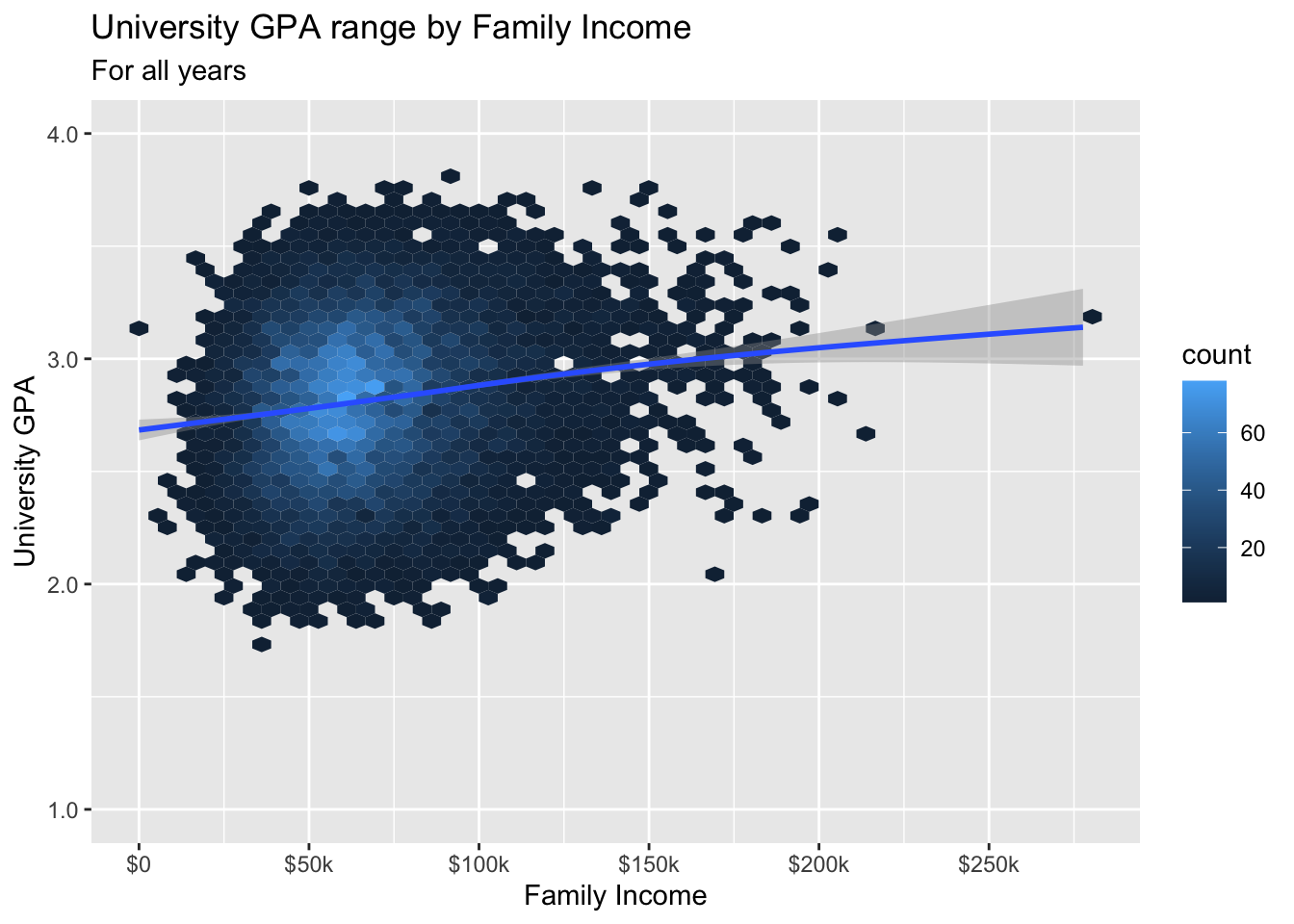
3.7.3 Density/2D plot with fitted line: x, y + density_2d() + smooth()
- Details about the general structure of the
labs()andscaleX()functions can be found in the Structure section.
admitdataIncGPAGender |>
  ggplot(aes(FamilyIncome, UnivGPA)) +
    geom_density_2d_filled(alpha = 0.5) +
    geom_density_2d(linewidth = 0.25, color = "black") +
    geom_smooth() +
    labs(title = "University GPA range by Family Income",
         subtitle = "For all years",
         x = "Family Income",
         y = "University GPA") +
    scale_y_continuous(limits = c(1.0, 4.0),
                       breaks = c(1.0, 2.0, 3.0, 4.0),
                       labels = c("1.0", "2.0",
                                  "3.0", "4.0")) +
    scale_x_continuous(breaks = c(0, 50000, 100000,
                                  150000, 200000,
                                  250000),
                       labels = c("$0", "$50k",
                                  "$100k", "$150k",
                                  "$200k", "$250k"))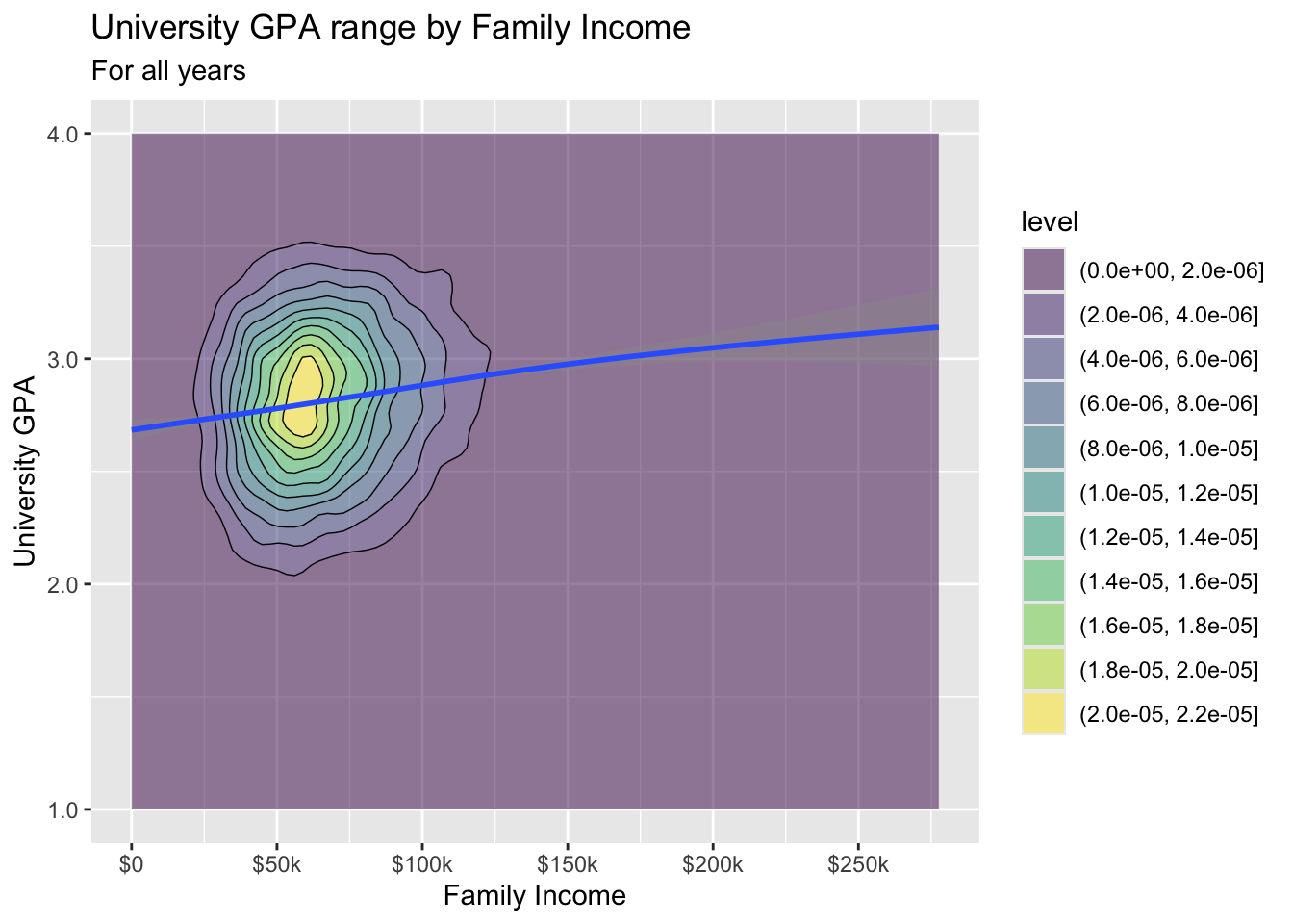
3.7.4 Boxplot based on continuous column: x, y + boxplot()
- Details about the general structure of the
labs()andscaleX()functions can be found in the Structure section.
admitdataIncGPAGender |>
  ggplot(aes(x = FamilyIncome, y = UnivGPA)) +
    geom_boxplot(aes(group=cut_width(FamilyIncome,
                                     width=25000,
                                     boundary=0),
                     varwidth=TRUE)) +
    labs(title = "University GPA range by Family Income",
         subtitle = "For all years",
         x = "Family Income",
         y = "University GPA") +
    scale_y_continuous(limits = c(1.0, 4.0),
                       breaks = c(1.0, 2.0, 3.0, 4.0),
                       labels = c("1.0", "2.0",
                                  "3.0", "4.0")) +
    scale_x_continuous(breaks = c(0, 50000, 100000,
                                  150000, 200000,
                                  250000),
                       labels = c("$0", "$50k",
                                  "$100k", "$150k",
                                  "$200k", "$250k"))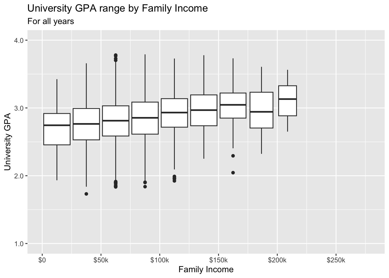
3.8 2 continuous, 1 discrete
3.8.1 Point plot with fitted line for subsets: x, y, color + point() + smooth()
paste(): explained in this section.- Details about the general structure of the
labs()andscaleX()functions can be found in the Structure section.
admitdataIncGPAMF |>
  ggplot(aes(x = HSGPA, y = UnivGPA, color = Gender)) +
    geom_point(alpha = 0.3) +
    geom_smooth(method = "gam", alpha = 1.0) +
    labs(title = paste("University GPA vs.",
                       "High School GPA by Gender",
                       sep = " "),
         subtitle = "For all years",
         x = "HS GPA",
         y = "University GPA") +
    scale_y_continuous(limits = c(1.0, 4.0),
                       breaks = c(1.0, 2.0, 3.0, 4.0),
                       labels = c("1.0", "2.0",
                                  "3.0", "4.0"))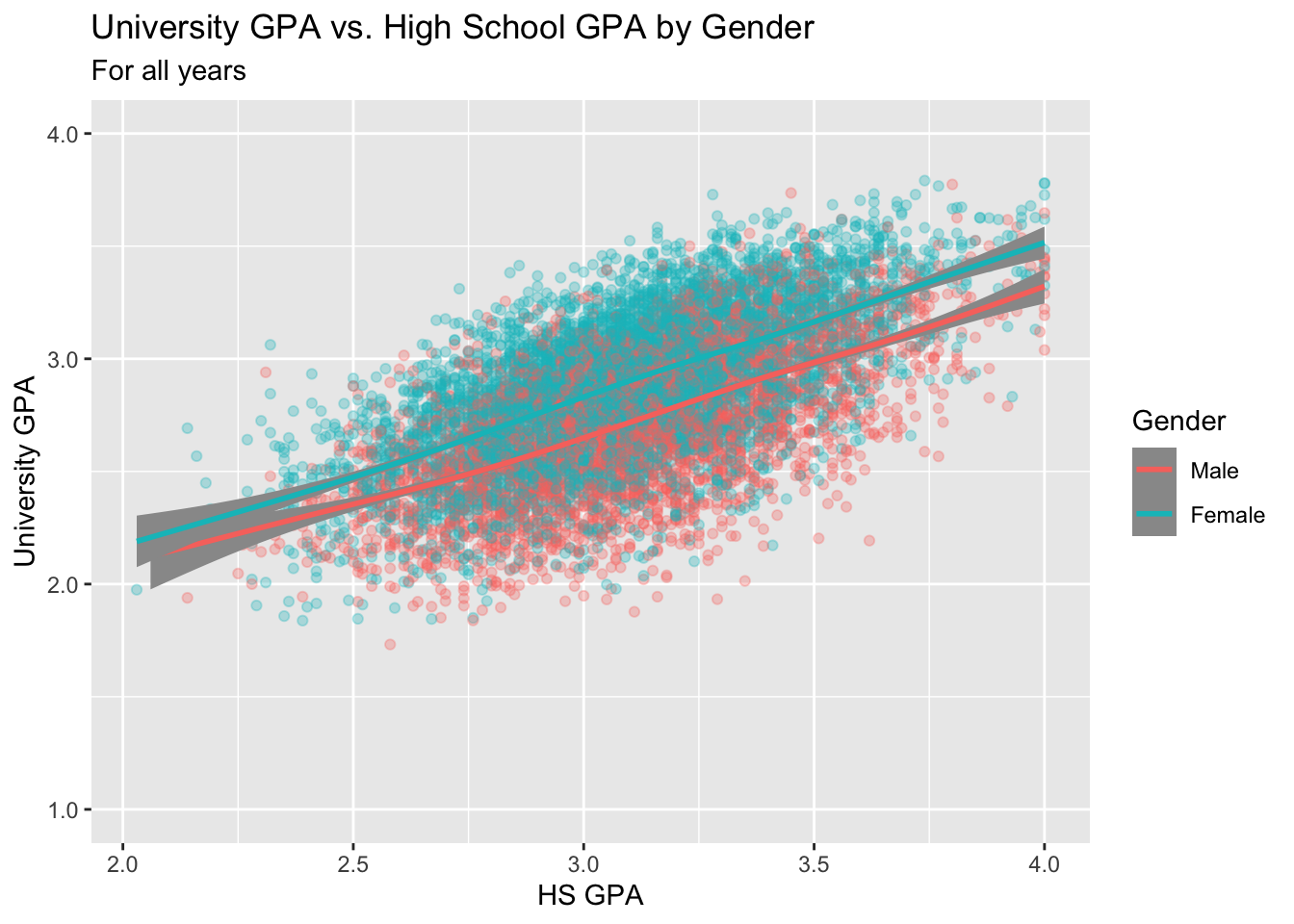
3.8.2 Point plot with fitted line wrapped by facets: x, y, facet + point() + smooth()
This is the same data as shown in this graph; however, here we use facets to differentiate the gender values rather than colors.
paste(): explained in this section.- Details about the general structure of the
labs()andscaleX()functions can be found in the Structure section.
admitdataIncGPAMF |>
  ggplot(aes(x = HSGPA, y = UnivGPA)) +
    facet_wrap(~Gender) +
    geom_point(alpha = 0.3) +
    geom_smooth(method = "gam", alpha = 1.0) +
    labs(title = paste("University GPA vs.",
                       "High School GPA by Gender",
                       sep = " "),
         subtitle = "For all years",
         x = "HS GPA",
         y = "University GPA") +
    scale_y_continuous(limits = c(1.0, 4.0),
                       breaks = c(1.0, 2.0, 3.0, 4.0),
                       labels = c("1.0", "2.0",
                                  "3.0", "4.0"))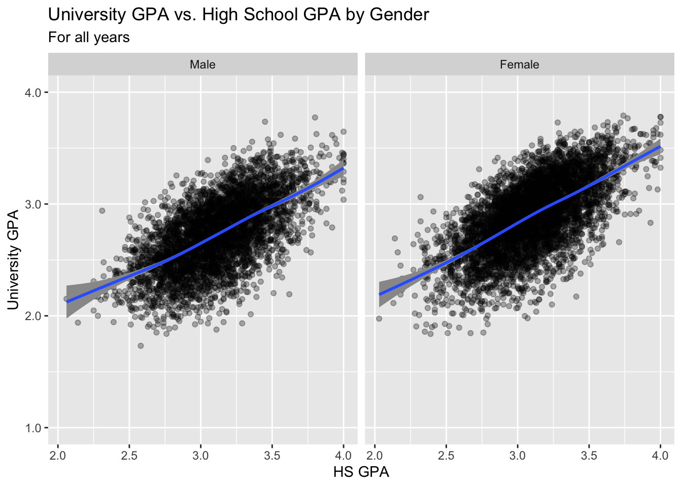
3.8.3 Boxplot wrapped by facets: x, y, facet + boxplot()
Again, this is the same data as in the previous section; however, this time, instead of displaying all of the data with point, we display a summary of the data with a boxplot.
paste(): explained in this section.- Details about the general structure of the
labs()andscaleX()functions can be found in the Structure section.
admitdataIncGPAMF |>
  ggplot(aes(x = HSGPA, y = UnivGPA)) +
    facet_wrap(~Gender) +
    geom_boxplot(aes(group=cut_width(HSGPA,
                                     width=0.25,
                                     boundary=2.0))) +
    labs(title = paste("University GPA vs.",
                       "High School GPA by Gender",
                       sep = " "),
         subtitle = "For all years",
         x = "HS GPA",
         y = "University GPA") +
    scale_y_continuous(limits = c(1.0, 4.0),
                       breaks = c(1.0, 2.0, 3.0, 4.0),
                       labels = c("1.0", "2.0",
                                  "3.0", "4.0"))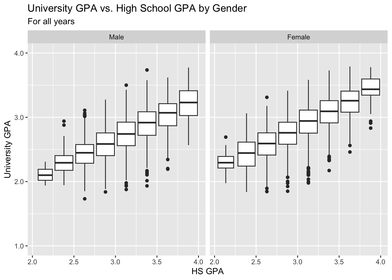
The following graph simplifies the previous one by ignoring Gender and displaying a boxplot for all data in each bin.
admitdataIncGPAMF |>
  ggplot(aes(x = HSGPA, y = UnivGPA)) +
    geom_boxplot(aes(group=cut_width(HSGPA,
                                     width=0.25,
                                     boundary=2.0)),
                 varwidth=TRUE) +
    labs(title = "University GPA ranges vs. High School GPA",
         subtitle = "For all years",
         x = "HS GPA",
         y = "University GPA") +
    scale_y_continuous(limits = c(1.0, 4.0),
                       breaks = c(1.0, 2.0, 3.0, 4.0),
                       labels = c("1.0", "2.0",
                                  "3.0", "4.0")) +
    scale_x_continuous(limits = c(2.0, 4.0),
                       breaks = c(2, 2.5, 3.0, 3.5, 4.0),
                       labels = c("2.0", "2.5",
                                  "3.0", "3.5",
                                  "4.0"))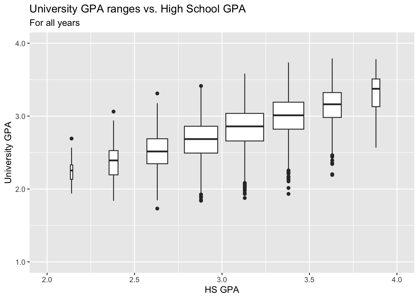
3.8.4 Violin plot wrapped by facets: x, y, facet + violin()
We are, again, displaying the same data as in the previous section.
paste(): explained in this section.- Details about the general structure of the
labs()andscaleX()functions can be found in the Structure section.
admitdataIncGPAMF |>
  ggplot(aes(x = HSGPA, y = UnivGPA)) +
    facet_wrap(~Gender) +
    geom_violin(aes(group=cut_width(HSGPA,
                                    width=0.25,
                                    boundary=2.0),
                    scale="count")) +
    labs(title = paste("University GPA distributions vs.",
                       "High School GPA by Gender",
                       sep = " "),
         subtitle = "For all years",
         x = "HS GPA",
         y = "University GPA") +
    scale_y_continuous(limits = c(1.0, 4.0),
                       breaks = c(1.0, 2.0, 3.0, 4.0),
                       labels = c("1.0", "2.0",
                                  "3.0", "4.0"))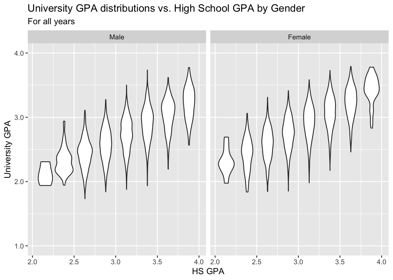
3.8.5 Jitter and box plot by subset: x, y, color + jitter() + boxplot()
This graph, again displaying the same underlying data as in this previous section.
paste(): explained in this section.- Details about the general structure of the
labs()andscaleX()functions can be found in the Structure section.
admitdataIncGPAMF |>
  ggplot(aes(x = Gender,
             y = UnivGPA,
             color = HSGPA)) +
    geom_jitter(alpha = 0.3) +
    geom_boxplot(alpha = 1.0,
                 linewidth=0.75,
                 color = "black",
                 fill = NA) +
    labs(title = paste("University GPA",
                       "distributions by",
                       "Gender (and HS GPA)",
                       sep = " "),
         subtitle = "For all years",
         x = "Gender",
         y = "University GPA",
         color = "HS GPA") +
    scale_y_continuous(limits = c(1.0, 4.0),
                       breaks = c(1.0, 2.0, 3.0, 4.0),
                       labels = c("1.0", "2.0",
                                  "3.0", "4.0"))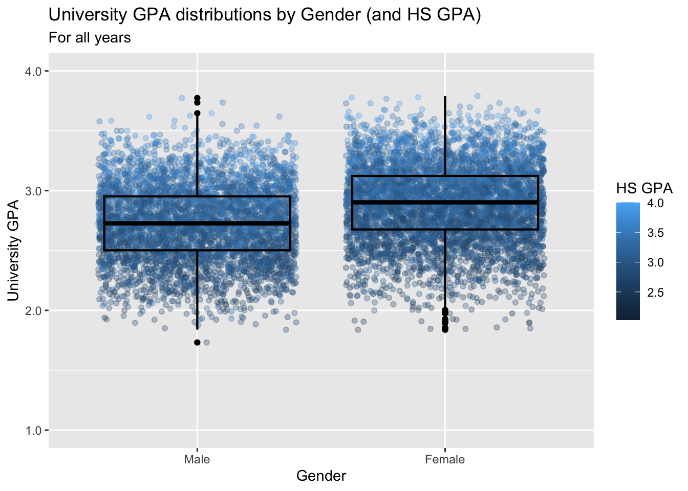
3.9 2 continuous, 2 discrete
In this section we will be working with three fairly complex sets of data and showing varying ways of highlighting relationships within that data. We are very much drawing on ggplot’s strengths and flexibility with these graphs.
3.9.1 Point plot with fitted line for subsets wrapped by facet: x, y, color, facet + point() + smooth()
as_labelleris a helper function that makes a function usable as alabellerfunction within eitherfacet_wrap()orfacet_grid().- In this case, the function
to_full_name()will transform the all-caps 4-letter code to its full name. This function is used infacet_wrap()to make the label at the top of each facet more understandable. - Another function used as a
labelleris defined in this section. paste(): explained in this section.- Details about the general structure of the
labs()andscaleX()functions can be found in the Structure section.
to_full_name <- as_labeller(c("ARTS" = "Arts",
                           "BUSI" = "Business",
                           "HUMA" = "Humanities",
                           "STEM" = "STEM"))
admitdataHSUnivMFMajor |>
  ggplot(aes(x = HSGPA, y = UnivGPA, color = Gender)) +
    facet_wrap(~ProbableMajorType,
               labeller = to_full_name) +
    geom_point(alpha = 0.3) +
    geom_smooth(method = "gam", alpha = 1.0) +
    labs(title = paste("University GPA",
                       "distributions by",
                       "Gender (and HS GPA)",
                       sep = " "),
         subtitle = "For all years",
         x = "HS GPA",
         y = "University GPA") +
    scale_y_continuous(limits = c(1.0, 4.0),
                       breaks = c(1.0, 2.0, 3.0, 4.0),
                       labels = c("1.0", "2.0",
                                  "3.0", "4.0"))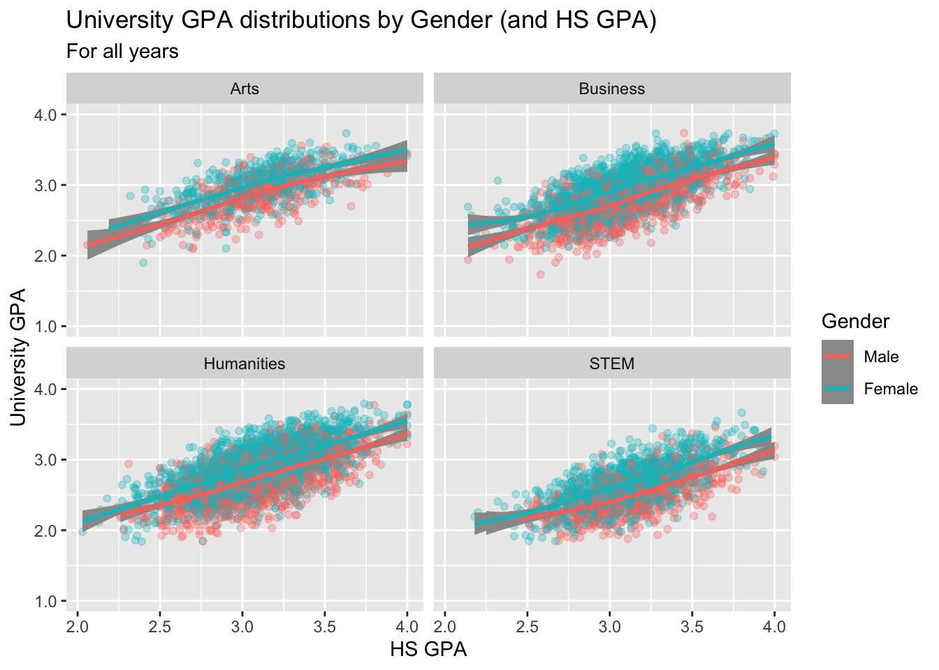
3.9.2 Point plot with fitted line wrapped by a facet grid: x, y, facet_grid + point() + smooth()
We are, again, displaying the same data as shown in the previous section; however, in this case, we are using facet_grid() instead of facet_wrap().
guide_axis(): explained in this section.paste(): explained in this section.- The
to_title()function at the top returns a string “In Title Text”. We use this as alabellerso thatProbableMajorTypeprints In Title Text instead of in all-caps as the string is defined. - Details about the general structure of the
labs()andscaleX()functions can be found in the Structure section.
to_title <- function(string_input) str_to_title(string_input)
admitdataHSUnivMFMajor |>
  ggplot(aes(x = HSGPA, y = UnivGPA)) +
    facet_grid(
      ProbableMajorType~Gender,
      labeller = labeller(Gender = label_both,
                          ProbableMajorType = as_labeller(to_title))) +
    geom_point(alpha = 0.3) +
    geom_smooth(method = "gam", alpha = 1.0) +
    labs(title = paste("University GPA vs.",
                       "HS GPA by Gender",
                       "& Student Type",
                       sep = " "),
         subtitle = "For all years",
         x = "HS GPA",
         y = "University GPA") +
    scale_y_continuous(limits = c(1.0, 4.0),
                       breaks = c(1.0, 2.0, 3.0, 4.0),
                       labels = c("1.0", "2.0",
                                  "3.0", "4.0")) +
    scale_x_discrete(guide = guide_axis(angle = 45))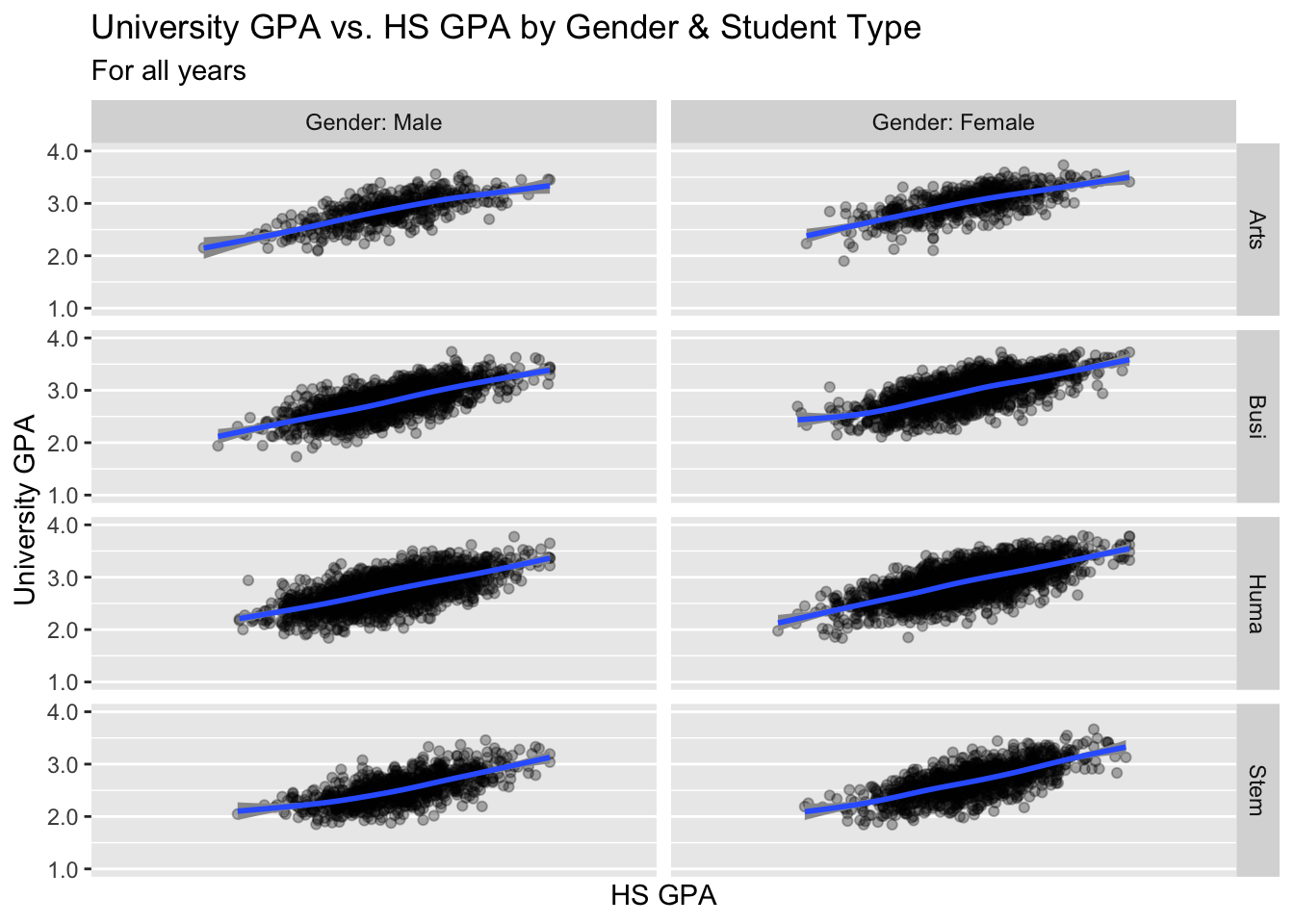
3.9.3 Boxplot wrapped by a facet grid: x, y, facet_grid + boxplot()
This is, again, plotting the same values as shown in the previous section. We are building on the approach used in this section.
paste(): explained in this section.- Details about the general structure of the
labs()andscaleX()functions can be found in the Structure section.
admitdataHSUnivMFMajor |>
  ggplot(aes(x = HSGPA, y = UnivGPA)) +
    facet_grid(ProbableMajorType~Gender) +
    geom_boxplot(aes(group=cut_width(HSGPA,
                                     width=0.25,
                                     boundary=2.0))) +
    labs(title = paste("University GPA vs.",
                       "HS GPA by Gender",
                       "& Student Type",
                       sep = " "),
         subtitle = "For all years",
         x = "HS GPA",
         y = "University GPA") +
    scale_y_continuous(limits = c(1.0, 4.0),
                       breaks = c(1.0, 2.0, 3.0, 4.0),
                       labels = c("1.0", "2.0",
                                  "3.0", "4.0"))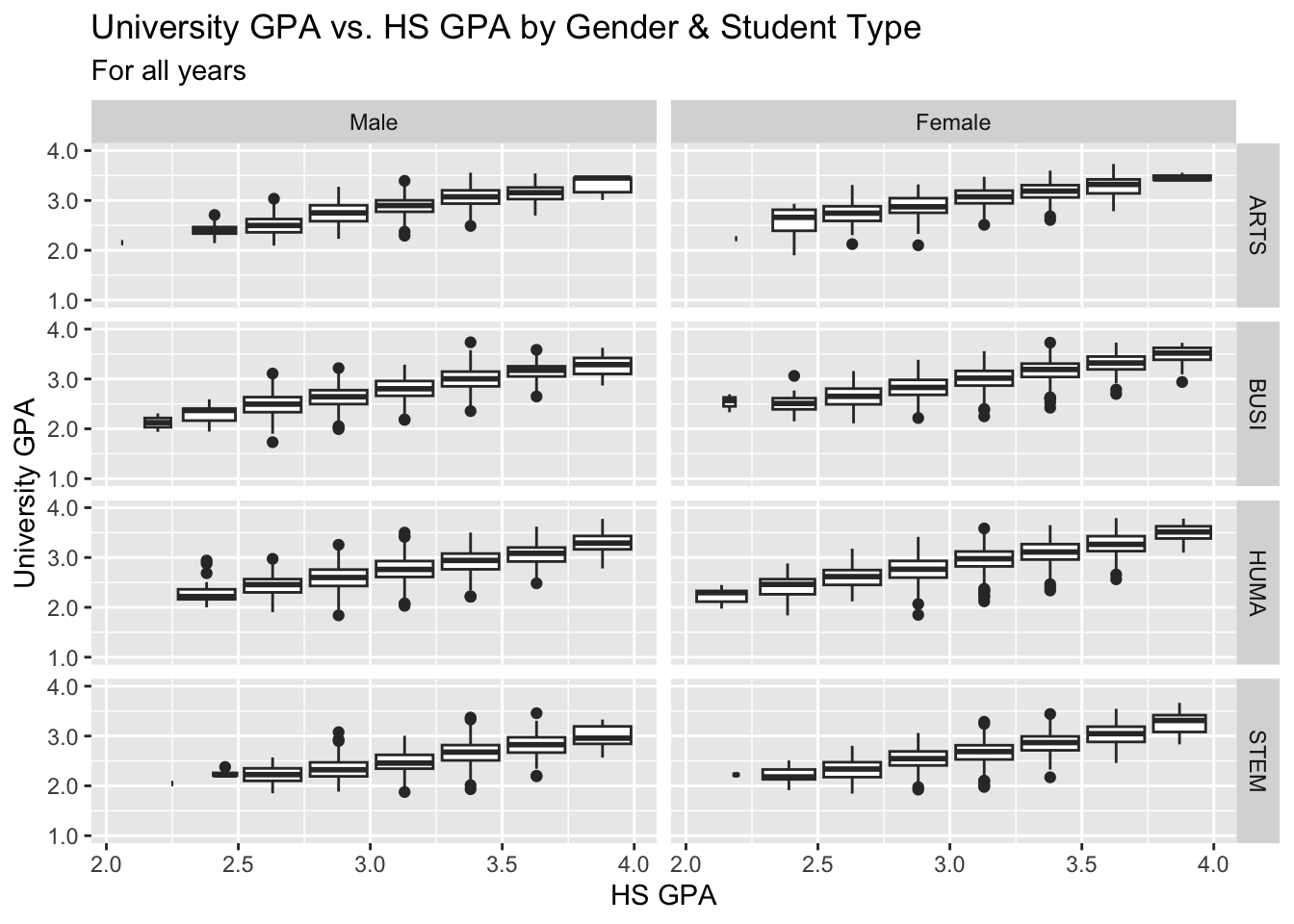
3.9.4 Violin wrapped by a facet grid: x, y, facet_wrap + violin()
Again, this graph is based on the same data as the previous section.
paste(): explained in this section.- Details about the general structure of the
labs()andscaleX()functions can be found in the Structure section.
admitdataHSUnivMFMajor |>
  ggplot(aes(x = HSGPA, y = UnivGPA)) +
    facet_grid(ProbableMajorType~Gender) +
    geom_violin(aes(group=cut_width(HSGPA,
                                     width=0.25,
                                     boundary=2.0))) +
    labs(title = paste("University GPA vs.",
                       "HS GPA by Gender",
                       "& Student Type",
                       sep = " "),
         subtitle = "For all years",
         x = "HS GPA",
         y = "University GPA") +
    scale_y_continuous(limits = c(1.0, 4.0),
                       breaks = c(1.0, 2.0, 3.0, 4.0),
                       labels = c("1.0", "2.0",
                                  "3.0", "4.0"))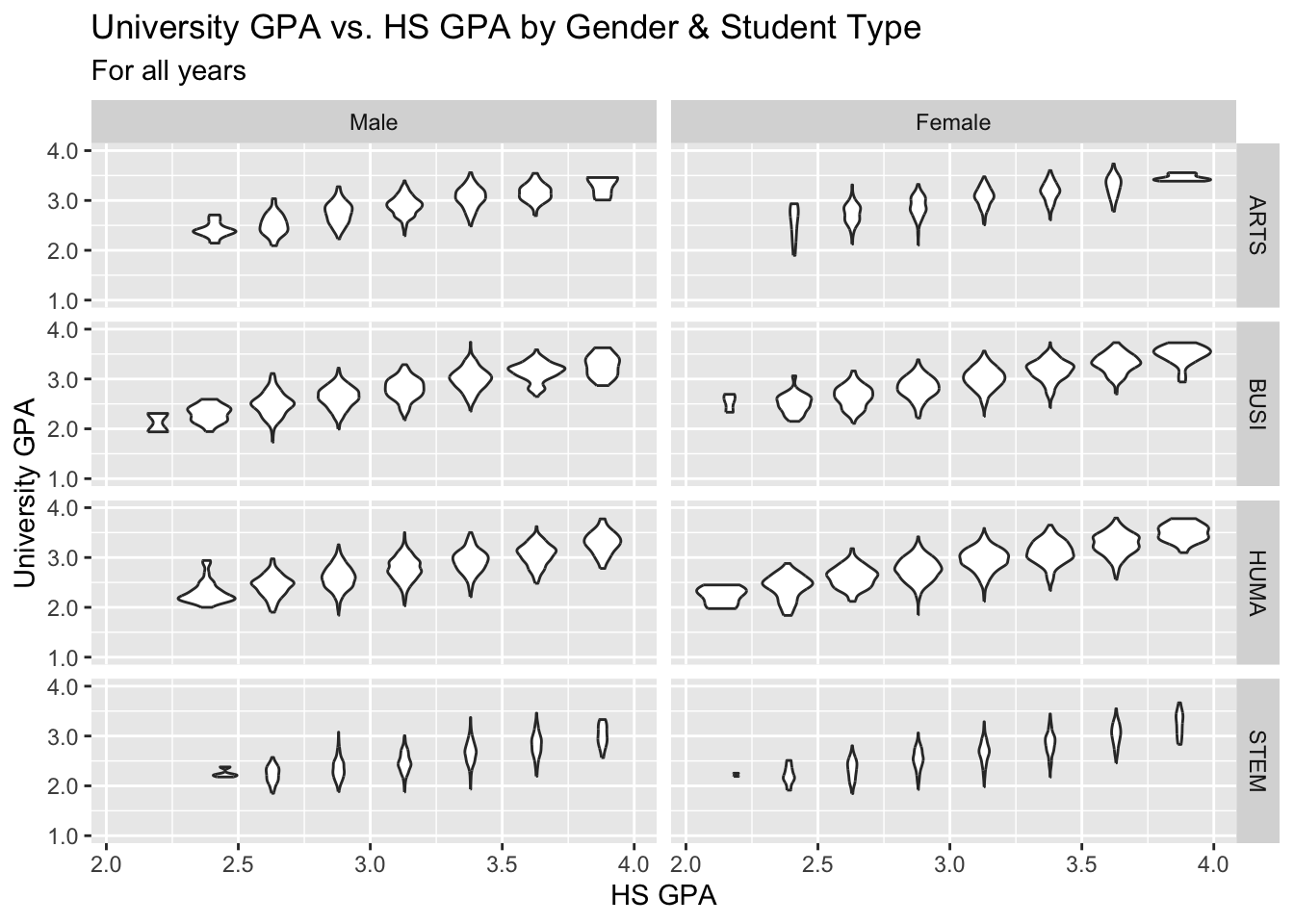
3.9.5 Jitter and box plot for subsets wrapped by a facet: x, y, color, facet + jitter()
This graph is based on the data shown in the previous graph and builds on the approach used in this section.
paste(): explained in this section.- Details about the general structure of the
labs()andscaleX()functions can be found in the Structure section.
admitdataHSUnivMFMajor |>
  ggplot(aes(x = Gender,
             y = UnivGPA,
             color = HSGPA)) +
    facet_wrap(~ProbableMajorType,
               ncol=4) +
    geom_jitter(alpha = 0.3) +
    geom_boxplot(alpha = 1.0,
                 linewidth=0.75,
                 color = "black",
                 fill = NA,
                 varwidth = TRUE) +
    labs(title = paste("University GPA vs.",
                       "HS GPA by Gender",
                       "& Student Type",
                       sep = " "),
         subtitle = "For all years",
         x = "HS GPA",
         y = "University GPA",
         color = "HS GPA") +
    scale_y_continuous(limits = c(1.0, 4.0),
                       breaks = c(1.0, 2.0,
                                  3.0, 4.0),
                       labels = c("1.0", "2.0",
                                  "3.0", "4.0"))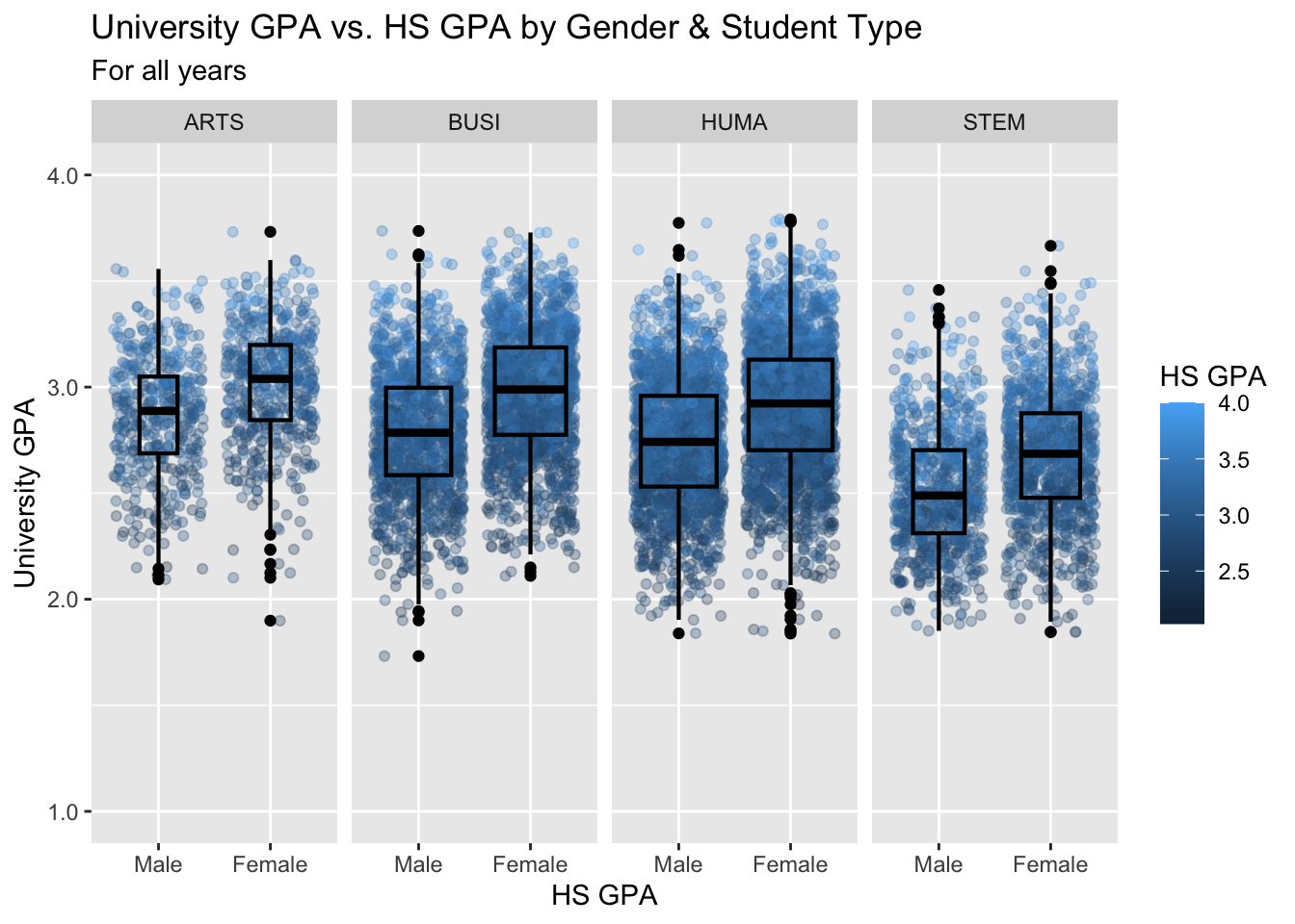
3.9.6 Boxplot differentiated by two columns and wrapped by a facet: x, y, color, facet + boxplot()
In this section we are working with new data, but we are building on the approach used in this section.
paste(): explained in this section.- The
colorvalue inlabs()has a\nin it. This tellsggplotto start a new line after the end ofGrant. We do this because we want the legend to the right of the graph to take up less width. - Details about the general structure of the
labs()andscaleX()functions can be found in the Structure section.
admitdataRaceUnivPellMajor |>
  ggplot(aes(IPEDSRaceEthnicity, UnivGPA,
             color = PellStatus)) +
    facet_wrap(~ProbableMajorType) +
    geom_boxplot(varwidth=TRUE) +
    labs(title = paste("University GPA ranges",
                       "by Race/ethnicity",
                       "and by Gender &",
                       "Pell Grant status",
                       sep = " "),
         subtitle = "For all years",
         x = "Race/ethnicity",
         y = "University GPA",
         color = "Pell Grant\nStatus") +
    scale_y_continuous(limits = c(1.0, 4.0),
                       breaks = c(1.0, 2.0, 3.0, 4.0),
                       labels = c("1.0", "2.0",
                                  "3.0", "4.0"))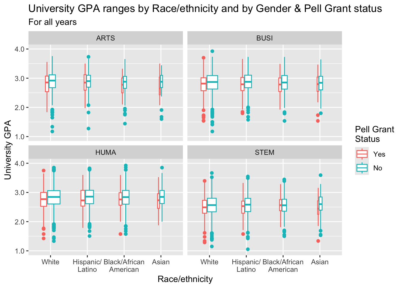
3.9.7 Boxplot differentiated by one column and wrapped by a facet grid: x, y, facet_grid + boxplot()
In this graph, we are again displaying the distribution of UnivGPA against race/ethnicity; however, in this case we are using facet_grid() on both StudentType (first time freshmen vs. transfer) and PellStatus (yes or no).
paste(): explained in this section.- Details about the general structure of the
labs()andscaleX()functions can be found in the Structure section.
admitdataRaceUnivPellMajor |>
  ggplot(aes(IPEDSRaceEthnicity, UnivGPA)) +
    facet_grid(StudentType~PellStatus) +
    geom_boxplot(varwidth=TRUE) +
    labs(title = paste("University GPA ranges",
                       "by Race/ethnicity",
                       "and by Gender &",
                       "Pell Grant status",
                       sep = " "),
         subtitle = "For all years",
         x = "Race/ethnicity",
         y = "University GPA",
         color = "Pell Grant\nStatus") +
    scale_y_continuous(limits = c(1.0, 4.0),
                       breaks = c(1.0, 2.0, 3.0, 4.0),
                       labels = c("1.0", "2.0",
                                  "3.0", "4.0"))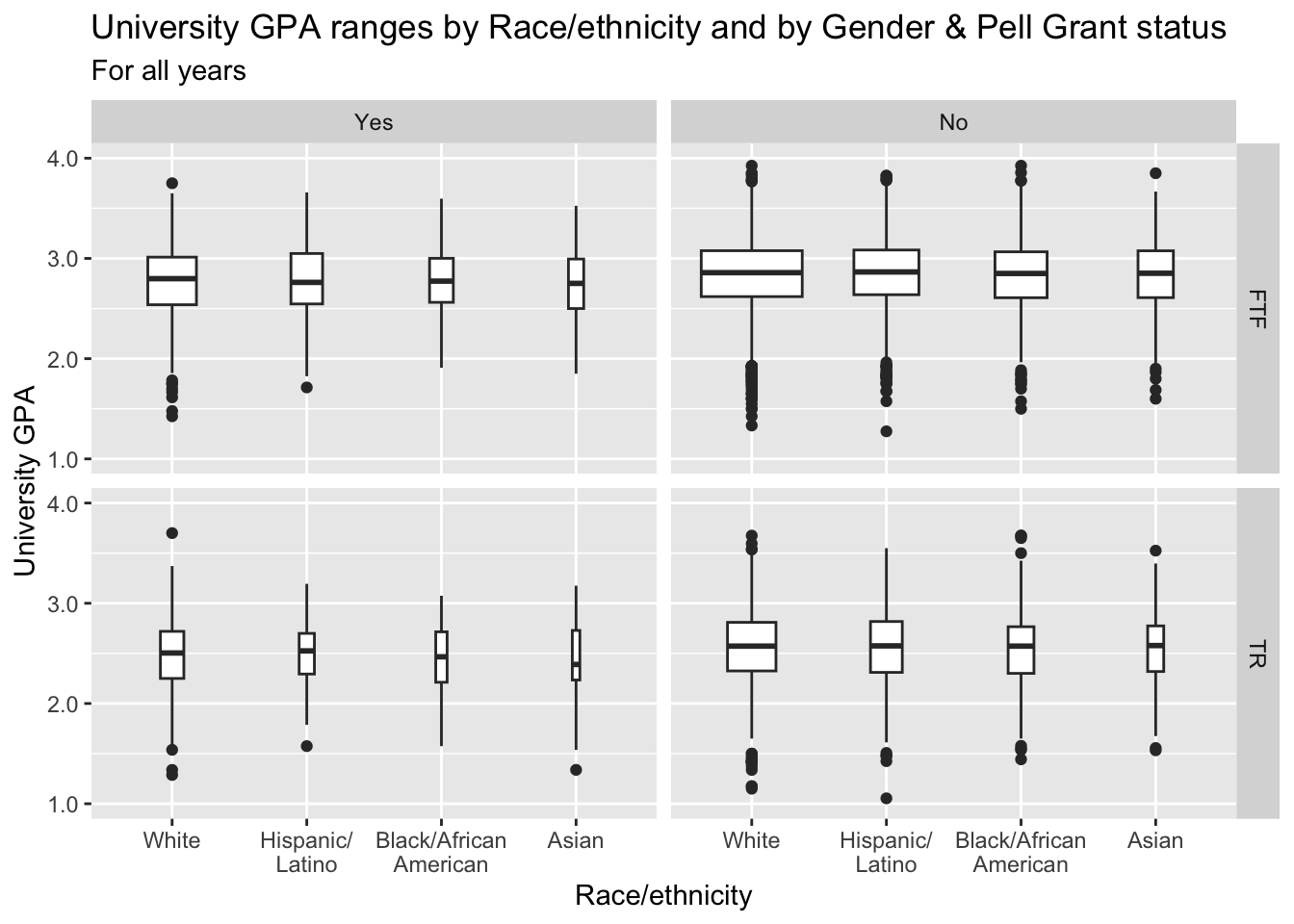
3.9.8 Horizontal boxplot differentiated by one column and wrapped by a facet grid: x, y, facet_grid + horizontal boxplot()
This is exactly the same graph as in the previous section except that we flipped the graph horizontally using coord_flip().
paste(): explained in this section.- Details about the general structure of the
labs()andscaleX()functions can be found in the Structure section.
admitdataRaceUnivPellMajor |>
  ggplot(aes(IPEDSRaceEthnicity, UnivGPA)) +
    facet_grid(StudentType~PellStatus) +
    geom_boxplot(varwidth=TRUE) +
    coord_flip() +
    labs(title = paste("University GPA ranges",
                       "by Race/ethnicity",
                       "and by Gender &",
                       "Pell Grant status",
                       sep = " "),
         subtitle = "For all years",
         x = "Race/ethnicity",
         y = "University GPA",
         color = "Pell Grant\nStatus") +
    scale_y_continuous(limits = c(1.0, 4.0),
                       breaks = c(1.0, 2.0, 3.0, 4.0),
                       labels = c("1.0", "2.0",
                                  "3.0", "4.0"))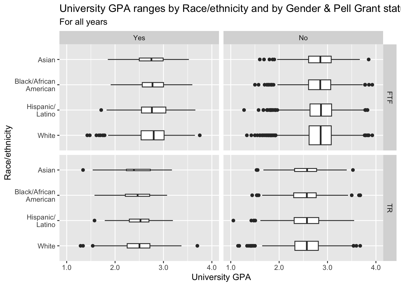
3.9.9 Boxplot and jitter differentiated by two discrete and one continuous column: x, y, size, color + boxplot() + jitter()
paste(): explained in this section.- Details about the general structure of the
labs()andscaleX()functions can be found in the Structure section.
student_RaceSexPCISAT |>
  ggplot(aes(Race, SAT)) +
    geom_jitter(aes(size = PCI20,
                    color = Sex),
               alpha = 0.3,
               width = 0.25) +
    geom_boxplot(fill = NA,
                 color = "black",
                 varwidth = TRUE) +
    labs(title = paste("SAT ranges by",
                       "Race/ethnicity and",
                       "by Gender & Per",
                       "Capita Income",
                       sep = " "),
         subtitle = "For all years",
         x = "Race/ethnicity",
         y = "SAT scores",
         color = "Gender",
         size = "Per Capita\nIncome '20") +
    scale_y_continuous(limits = c(800, 1600),
                       breaks = c(800, 1000, 1200,
                                  1400, 1600))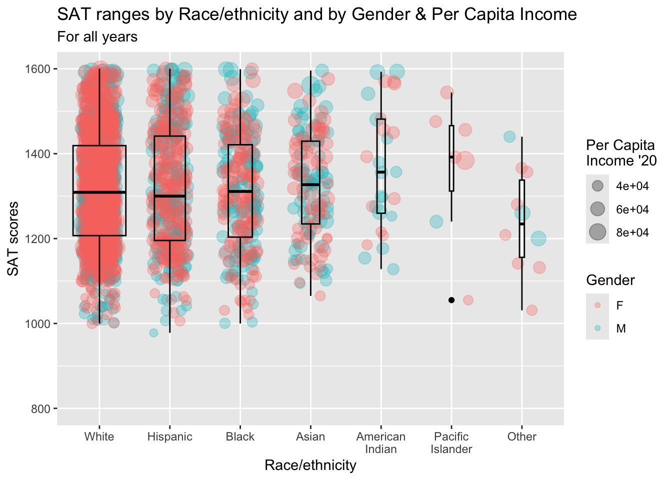
3.9.10 Horizontal boxplot and jitter differentiated by two discrete and one continuous column: x, y, size, color + horizontal boxplot() + point()
This is the same graph as in the previous section except that it has had the coordinates flipped and differentiates based on Sex for both points and boxplot.
paste(): explained in this section.limits = rev: explained in this section.- Details about the general structure of the
labs()andscaleX()functions can be found in the Structure section.
student_RaceSexPCISAT |>
  ggplot(aes(Race, SAT))+
    geom_jitter(aes(size = PCI20,
                   color = Sex),
               alpha = 0.3,
               width = 0.25) +
    geom_boxplot(aes(fill = Sex),
                 color = "black",
                 varwidth = TRUE) +
    coord_flip() +
    labs(title = paste("SAT ranges by",
                       "Race/ethnicity and",
                       "by Gender & Per",
                       "Capita Income",
                       sep = " "),
         subtitle = "For all years",
         x = "Race/ethnicity",
         y = "SAT scores",
         color = "Gender",
         fill = "Gender",
         size = "Per Capita\nIncome '20") +
    scale_y_continuous(limits = c(800, 1600),
                       breaks = c(800, 1000, 1200,
                                  1400, 1600)) +
    scale_x_discrete(limits = rev)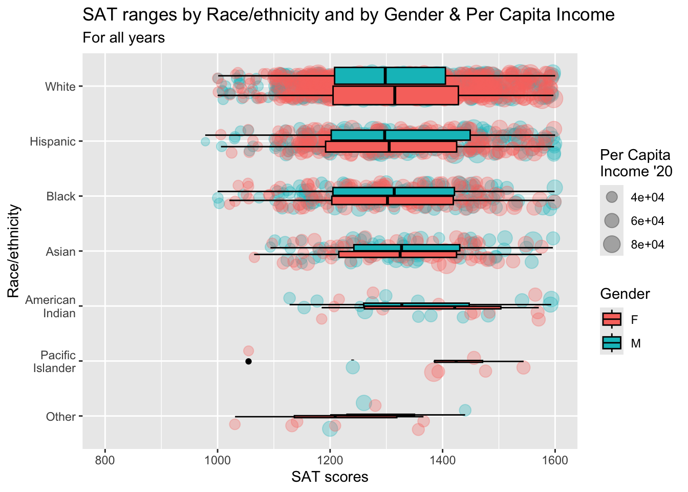
3.9.11 Horizontal boxplot and jitter differentiated by one discrete and one continuous column wrapped by a facet: x, y, size, facet + horizontal boxplot() + point()
This graph represents the same data as shown in the previous section. The only difference is that we are using a facet_wrap() based on Sex instead of using a color in the plots.
scale_x_discrete(limits = rev)is explained in this section.paste(): explained in this section.- Details about the general structure of the
labs()andscaleX()functions can be found in the Structure section.
student_RaceSexPCISAT |>
  ggplot(aes(Race, SAT)) +
    geom_jitter(aes(size = PCI20),
               alpha = 0.3,
               width = 0.25) +
    geom_boxplot(color = "blue",
                 fill = NA) +
    facet_wrap(~Sex) +
    coord_flip() +
    labs(title = paste("SAT ranges by",
                       "Race/ethnicity and",
                       "by Gender & Per",
                       "Capita Income",
                       sep = " "),
         subtitle = "For all years",
         x = "Race/ethnicity",
         y = "SAT scores",
         color = "Gender",
         size = "Per Capita\nIncome '20") +
    scale_y_continuous(limits = c(800, 1600),
                       breaks = c(800, 1000, 1200,
                                  1400, 1600)) +
    scale_x_discrete(limits = rev)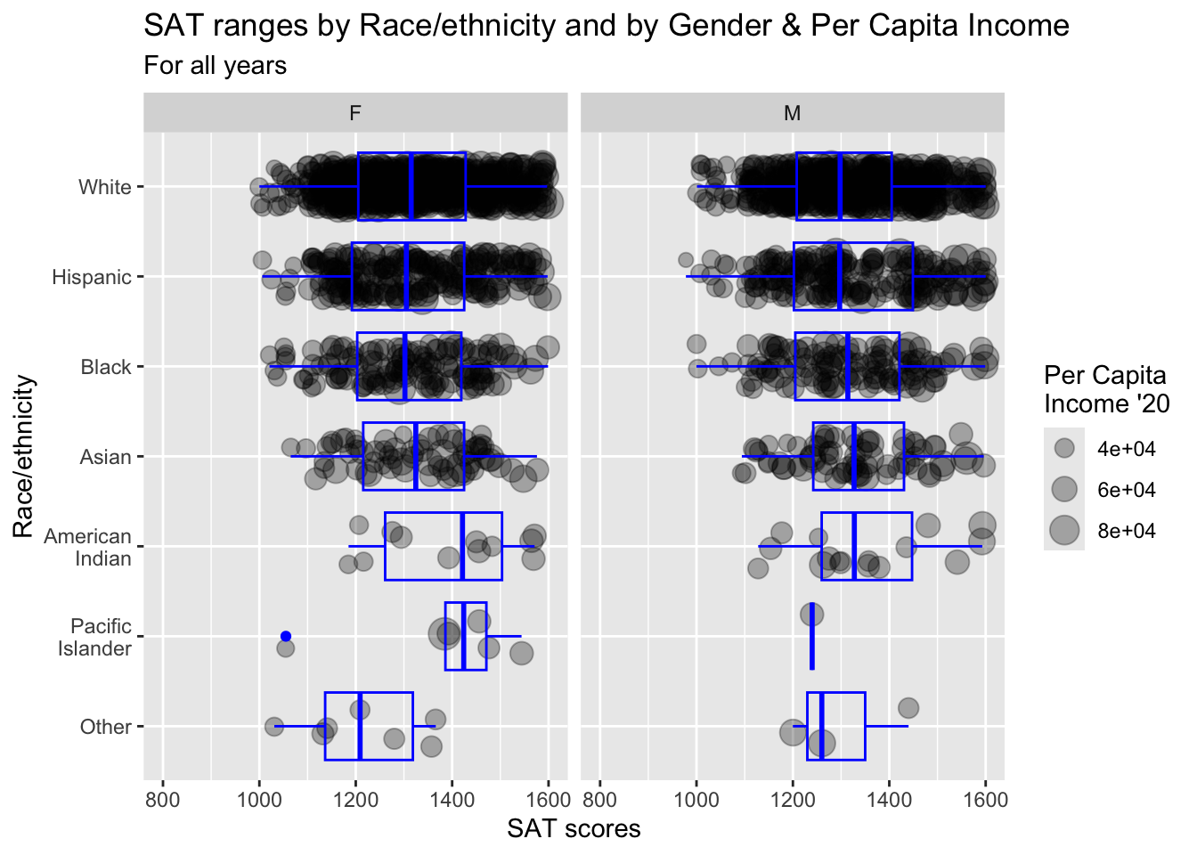
3.10 3 continuous, 2 discrete
In this last section, we display data based on five separate columns, with three of them being continuous. We have to make decisions very carefully here in order to help the reader interpret the data as easily as possible.
3.10.1 Horizontal boxplot and point differentiated by one discrete and two continuous columns wrapped by a facet: x, y, size, color, facet + horizontal boxplot() + jitter()
scale_x_discrete(limits = rev)is explained in this section.paste(): explained in this section.- Details about the general structure of the
labs()andscaleX()functions can be found in the Structure section.
student_WHBASATPCIAge |>
  ggplot(aes(Race, SAT)) +
    geom_point(aes(size = PCI20,
                   colour = Age),
               alpha = 0.3) +
    geom_boxplot(linewidth = 1,
                 fill = NA,
                 varwidth = TRUE) +
    facet_wrap(~Sex) +
    coord_flip() +
    labs(title = paste("SAT ranges by",
                       "Race/ethnicity and",
                       "by Gender, Age, &",
                       "Per Capita Income",
                       sep = " "),
         subtitle = "For all years",
         x = "Race/ethnicity",
         y = "SAT scores",
         color = "Age",
         size = "Per Capita\nIncome '20") +
    scale_y_continuous(limits = c(800, 1600),
                       breaks = c(800, 1000, 1200,
                                  1400, 1600)) +
    scale_x_discrete(limits = rev)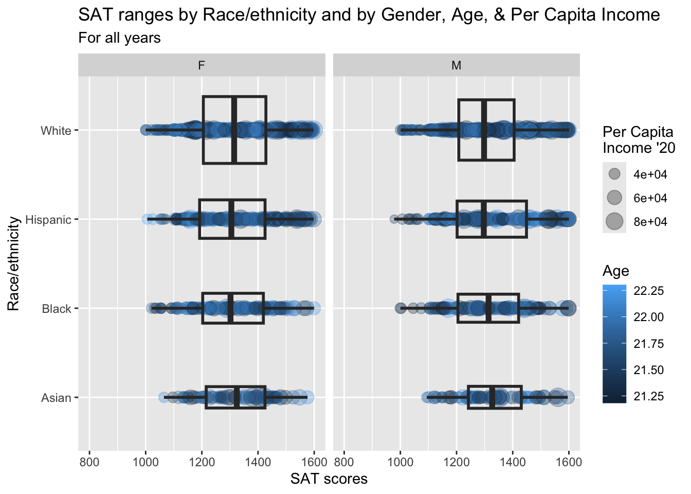
3.10.2 Horizontal boxplot and jitter differentiated by one discrete and two continuous columns wrapped by a facet: x, y, size, color, facet + horizontal boxplot() + jitter()
We are displaying the exact same information that we did in the previous section.
scale_x_discrete(limits = rev)is explained in this section.paste(): explained in this section.- Details about the general structure of the
labs()andscaleX()functions can be found in the Structure section.
student_WHBASATPCIAge |>
  ggplot(aes(Race, SAT)) +
    geom_jitter(aes(size = PCI20,
                   colour = Age),
               alpha = 0.3) +
    geom_boxplot(linewidth = 1,
                 fill = NA,
                 varwidth = TRUE) +
    facet_wrap(~Sex) +
    coord_flip() +
    labs(title = paste("SAT ranges by",
                       "Race/ethnicity and",
                       "by Gender, Age, &",
                       "Per Capita Income",
                       sep = " "),
         subtitle = "For all years",
         x = "Race/ethnicity",
         y = "SAT scores",
         color = "Age",
         size = "Per Capita\nIncome '20") +
    scale_y_continuous(limits = c(800, 1600),
                       breaks = c(800, 1000, 1200,
                                  1400, 1600)) +
    scale_x_discrete(limits = rev)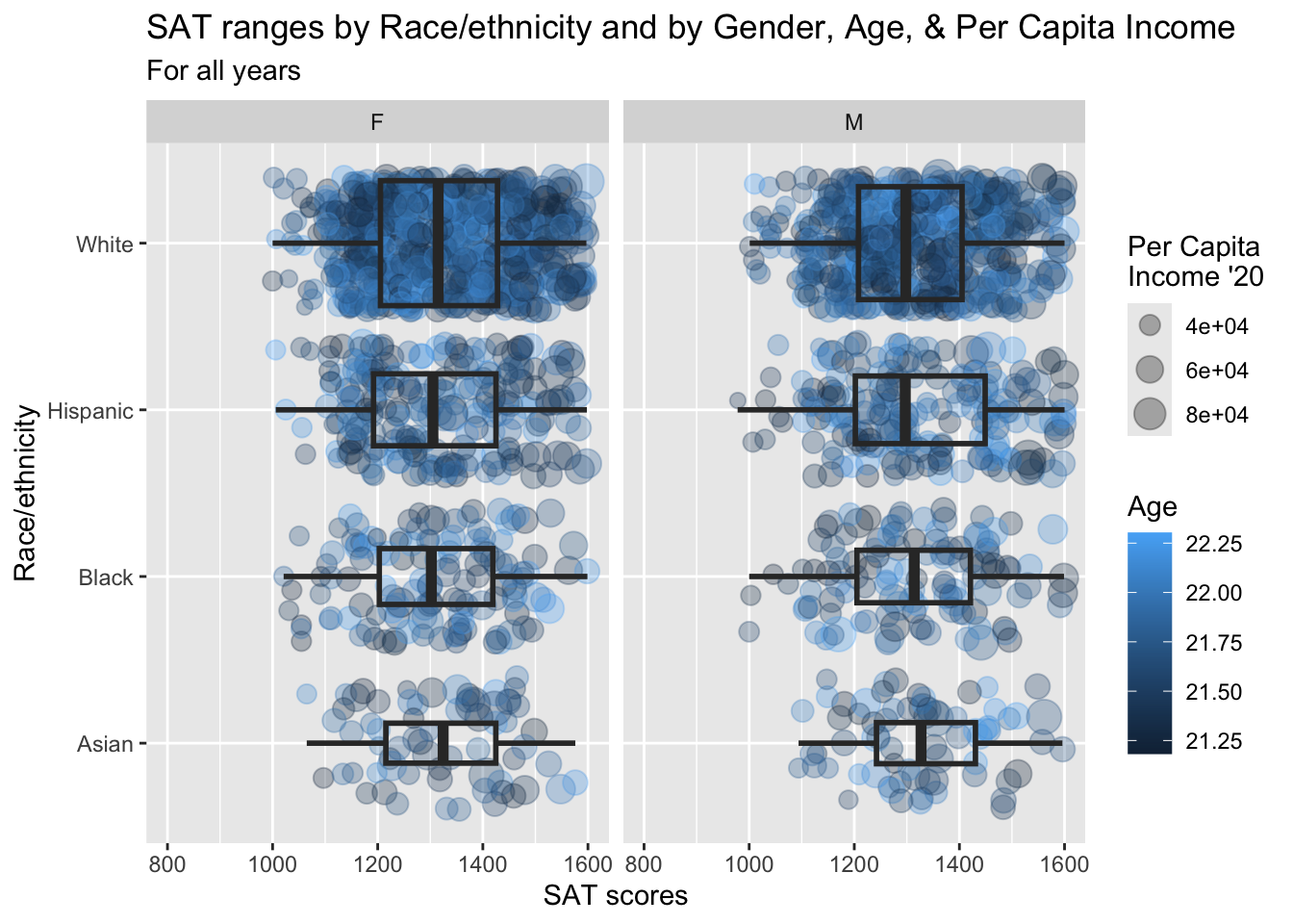
3.10.3 Horizontal violin and jitter differentiated by one discrete and two continuous columns wrapped by a facet: x, y, size, color, facet + horizontal violin() + jitter()
Again, we are displaying the same information as shown in the previous section.
scale_x_discrete(limits = rev)is explained in this section.paste(): explained in this section.- Details about the general structure of the
labs()andscaleX()functions can be found in the Structure section.
student_WHBASATPCIAge |>
  ggplot(aes(Race, SAT)) +
    geom_jitter(aes(size = PCI20,
                   colour = Age),
               alpha = 0.3) +
    geom_violin(scale = "count",
                linewidth = 1,
                fill = NA) +
    facet_wrap(~Sex) +
    coord_flip() +
    labs(title = paste("SAT distributions by",
                       "Race/ethnicity and",
                       "by Gender, Age, &",
                       "Per Capita Income",
                       sep = " "),
         subtitle = "For all years",
         x = "Race/ethnicity",
         y = "SAT scores",
         color = "Age",
         size = "Per Capita\nIncome '20") +
    scale_y_continuous(limits = c(800, 1600),
                       breaks = c(800, 1000, 1200,
                                  1400, 1600)) +
    scale_x_discrete(limits = rev)
4 Other resources
- R Graph Gallery
- R Graphics Cookbook, 2nd edition
- learnbyexample
- agroshare.is.ed.ac.uk: great site
- Details on modifying a theme is here.
