Paint: Geometries
Before you read this page, we recommend that you understand both the introductory graphics page and the illustrative example.
1 Introduction
This page continues the process of building a graph while conforming to the following process:

The “gather tools & build easel” page goes through the first two steps in the process. The page you’re reading goes through the “paint” step. The final two steps are discussed in this page and this page.
Applying the analogy to the painting process, on this page you will be painting the data onto the easel that you constructed in the previous step.
We are asking you to think about your specific graphing needs in a way that you are probably not used to:
We want you to think about what columns you want to represent in a graph and then determine whether each column holds discrete values or continuous values.
Knowing these facts will take you a long way in understanding how to use R and ggplot most effectively:
- Have 2 discrete and 1 continuous column? Go to this section
- Have 1 discrete and 1 continuous column? Go to this section
And so on with the rest of the graphs in this section.
Once you are in the appropriate section, then you should take a look at the different examples and see which approach is right for you.
2 Structure
Elsewhere (e.g., on this page), we have discussed ggplot(aes()) essentially in theory since nothing is actually plotted after you just use that construct. However, we are now going to build on it by specifying how the different dimensions of the graph are going to be incorporated into the whole structure.
Here’s the structure of the basic statement:
Lines 3–4, together, describe how the data will be displayed on the graph — its x-value, y-value, separate bars or lines, color, size, a separate set of graphs, and so on.
Most tutorials separate geometries from facets. We do not because a facet is simply another way of representing a column in a graph. It can be used instead of representing the column as a color, the size, or whatnot. You will see many examples below in which we substitute a facet for some other representation. Which approach will be right for you is something that you will have to decide for yourself as you think about your specific challenge.
3 Available geometries
Within this page, we provide examples of each of the following. This isn’t an exhaustive list of ggplot geometries, but we think it is a useful subset for you to start with.
geom_point(): an x-y scatter plotgeom_line(): a line plotting ayvalue against an ordered set ofxvaluegeom_bar(): a bar representing the count of observations for some category; R calculates this value for yougeom_col(): a bar representing a value for some category; you have to supply this valuegeom_boxplot(): a box-and-whiskers plot representing the distribution of some continuous columngeom_histogram(): a histogram plot representing the distribution of some continuous columngeom_jitter(): a set of points in which thex-value is slightly randomized in order to keep points from being plotted over other pointsgeom_violin(): a plot representing the distribution of some continuous column
4 Examples
For these 50+ examples, we are following the graph creation process started on the aesthetics page. At the bottom of each graph, you can find a link to the first step and a link to the next step.
For each graph’s write-up, we focus on the effects of the geom_X() function call on the graph.
4.1 1 discrete (with implicit count)
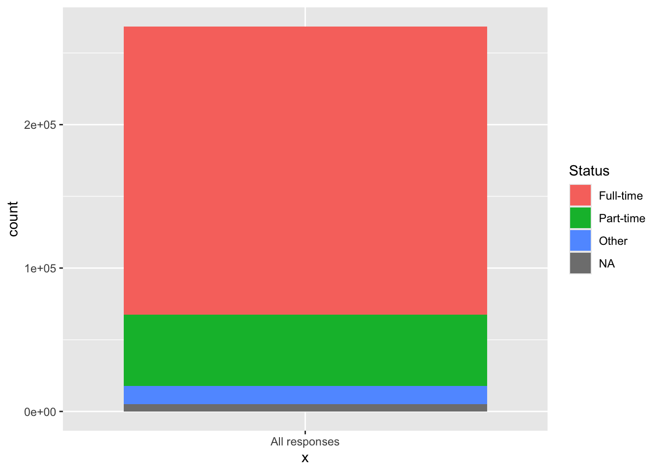
4.1.1 Single stacked bar: x (constant), y (implicit count), fill + bar()
The geom_bar() function differs from most other geoms in that it calculates values in the background. In most cases, it calculates the distribution of value across a discrete column, creating something like a histogram.
In this case, we want not to represent the varying counts for different Status values as bars but as the proportional amount of one single bar. The way to do this is to define the x-axis value as some string and set fill to the column whose values you want to count.
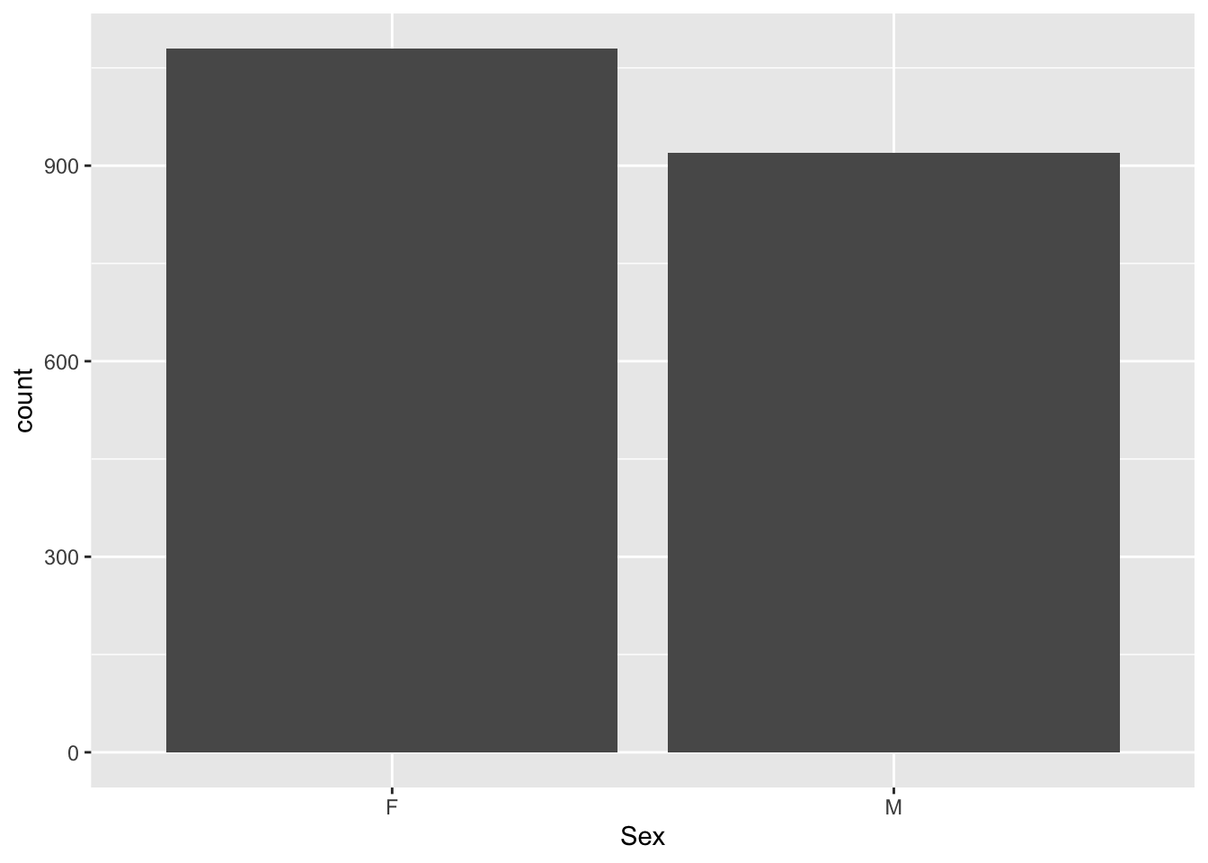
4.1.2 Bar graph showing distribution: x, y (implicit count) + bar()
This graph is the usual way of using geom_bar() to represent the distribution of values across some column that contains discrete values—in this case, Sex.
Note:
geom_bar()is equivalent togeom_bar(position="stack"). Alternatives for thepositionargument are"dodge"(side-by-side) and"fill"(stacked but set to a percenty-axis).- For any of these, as long as you’re using
geom_bar, you don’t need to perform any calculations.
Here are some links for learning more about geom_bar(): tidyverse.org, r-graph-gallery.
4.2 1 continuous
4.2.1 Histogram for continuous column: x + histogram()
This graph is a traditional histogram over a continuous column.
student_econ |>
  ggplot(aes(x = Age)) +
    geom_histogram(bins=30,
                   fill="grey",
                   color="black",
                   na.rm = TRUE)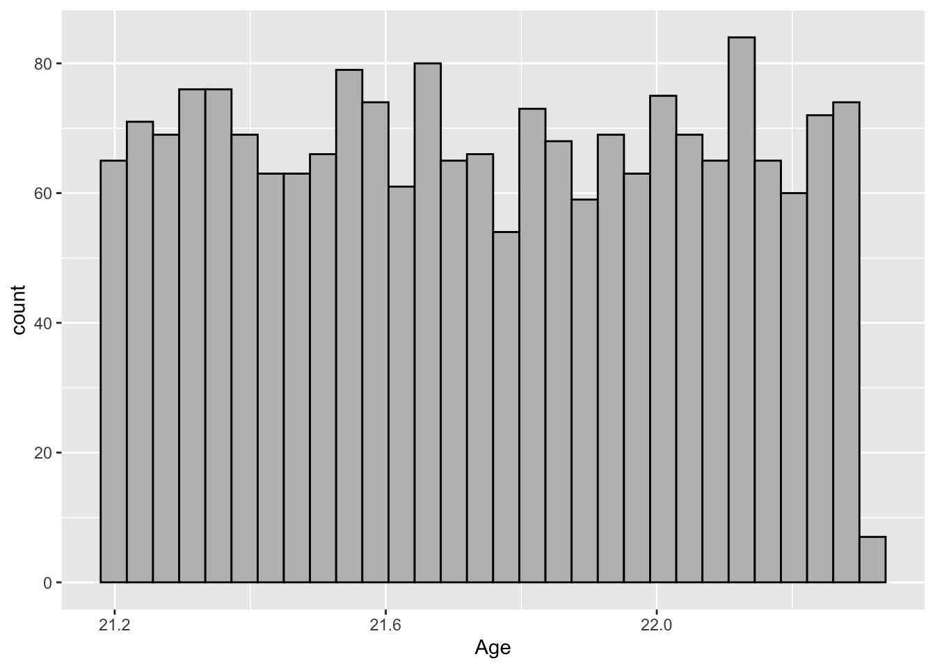
Note:
- Instead of
bins, you can setbinwidthto control the width of each individual column. - Be sure to make
fillandcolorcontrasting colors so that you can more accurately see the heights of particularxvalues. - The argument
na.rmremovesNAvalues from theAgecolumn when defining the histogram. - If we had set
y = Age(instead ofx), then the histogram would be horizontal.
Here are some links for learning more about histogram: geeksforgeeks, tidyverse.org.
4.3 2 discrete
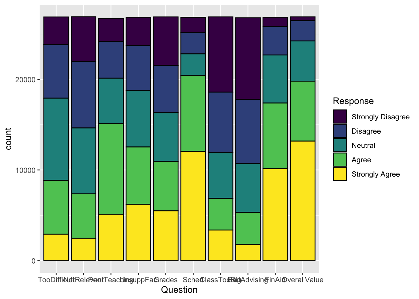
4.3.1 Stacked bar: x, y (implicit count), fill + bar()
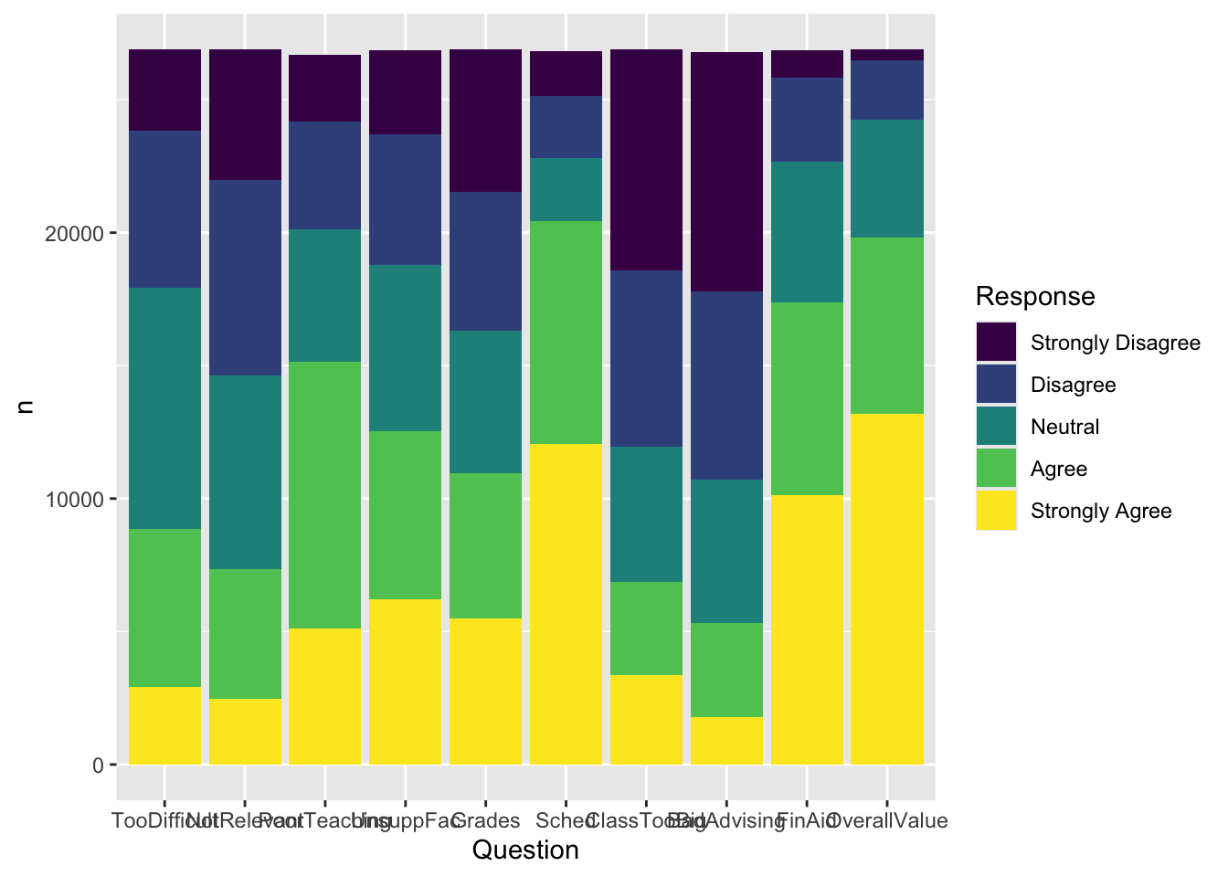
As we described above, with geom_bar() R counts values for you. Since we are setting fill but not y in aes(), each value on the x-axis will have a single bar with different colors for the different values of Response.
Note:
- The
colorargument in a bar graph is the color of the bar outline;fillis the color of the body of the bar. - The
x-axisvalue is generally a discrete column. We will see in another graph how to create such a graph over a continuous column. - If you don’t like the colors, don’t worry! We’ll address these in a future step.
Here are some links for learning more about geom_bar(): tidyverse.org, r-graph-gallery.
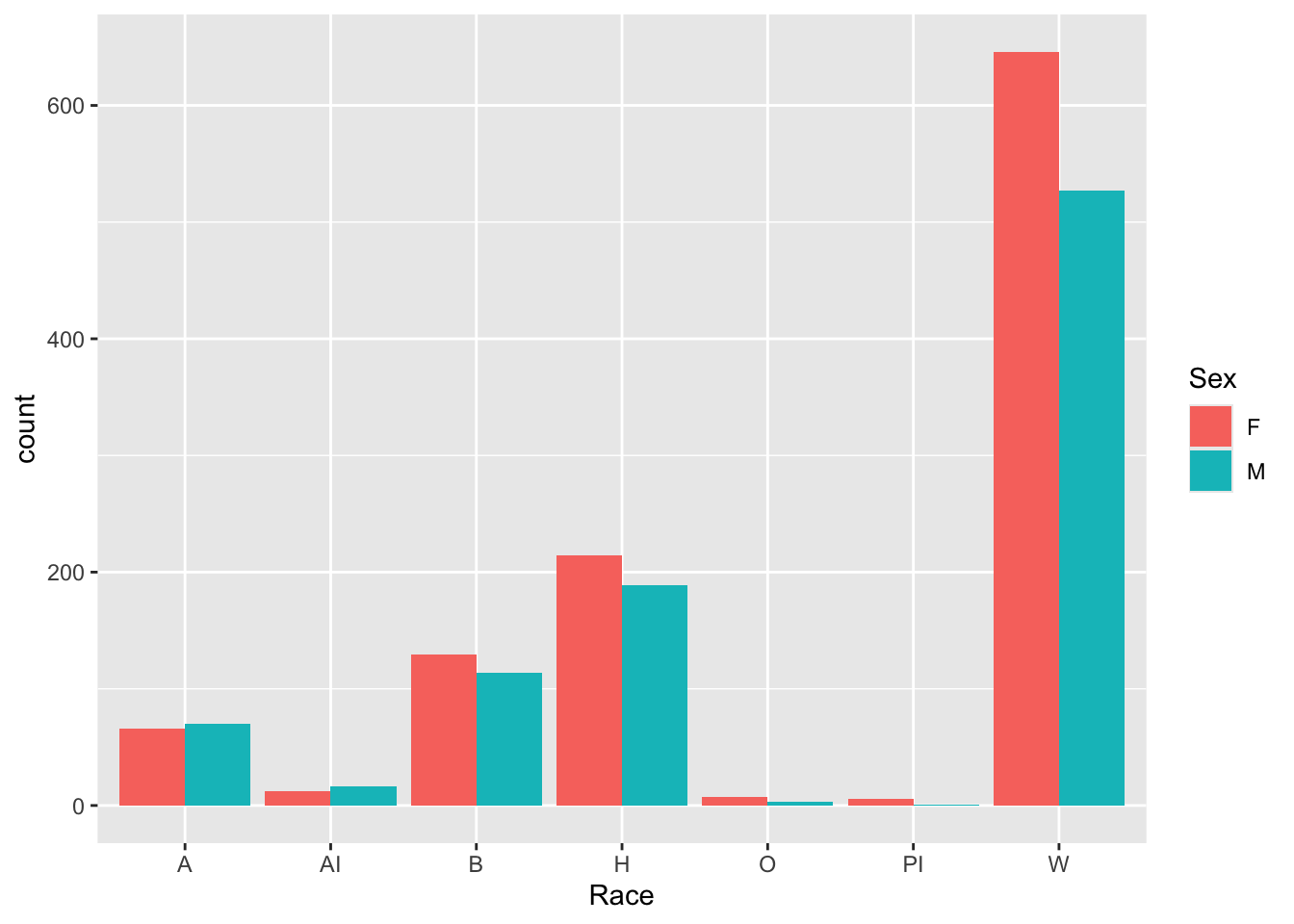
4.3.2 Grouped bar: x, y (implicit count), fill + bar()
We are building a grouped-bar graph. While the aes() call has the same structure as the one for the previous graph, we are making a change with the geom_bar() call: We have added position = "dodge" (which tells R to create grouped bars) for this graph. (We could have also set the color argument, but we simply chose not to.)
Note:
Dodgeis a somewhat complicated argument. You can learn more about it here.- You could reverse grouping and the x-axis by changing the code to
aes(Sex, fill=Race).
Here are some links for learning more about geom_bar(): tidyverse.org, r-graph-gallery.
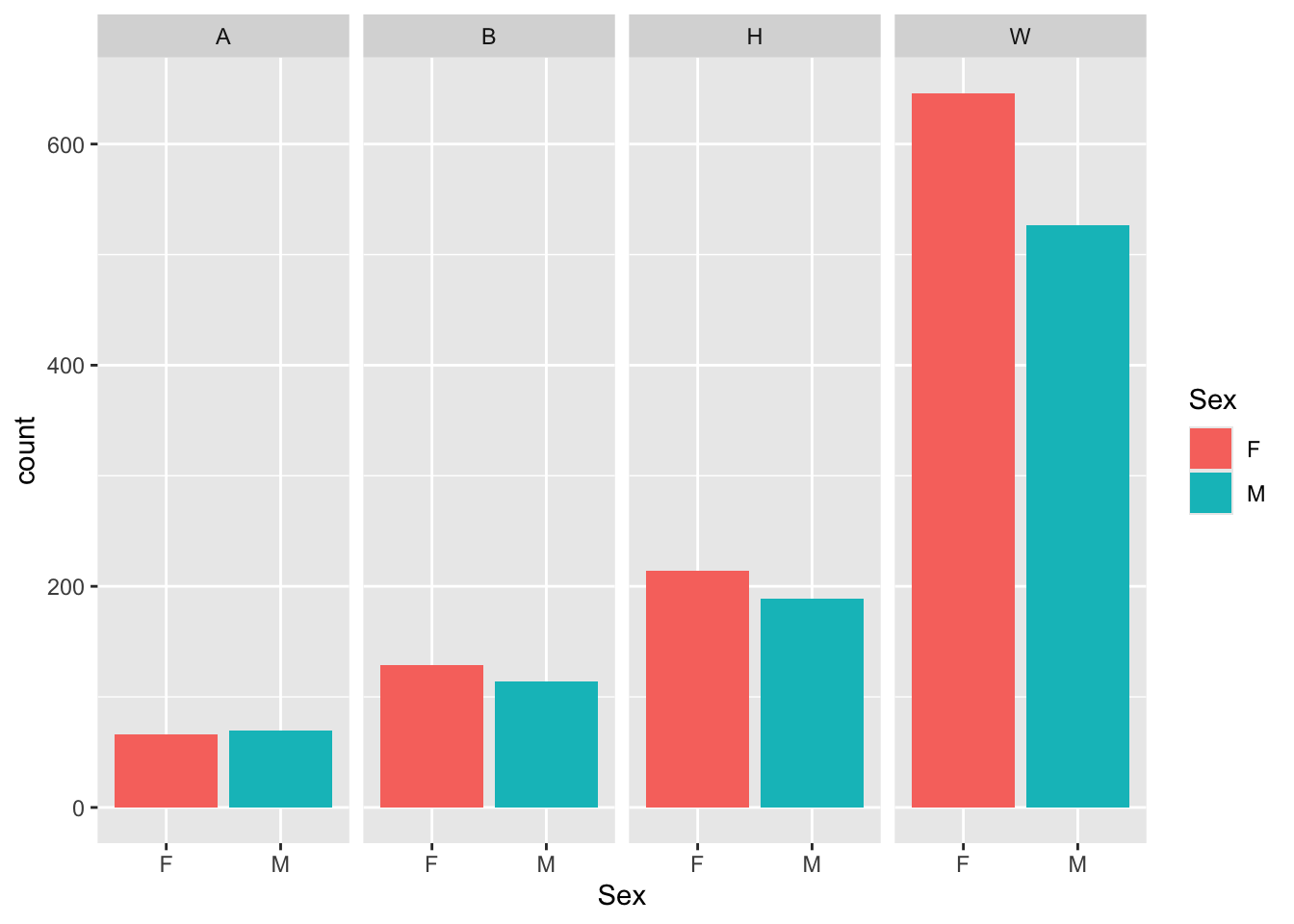
4.3.3 Facet wrap around grouped bar: x, y (implicit count), fill (redundant), facet + bar()
This graph presents the same information as the previous graph, and it also continues to create a bar graph using geom_bar(); however, the addition of facet_wrap() (in the previous step) means that adding geom_bar() in this step creates four separate bar graphs, one for each value of Race in student_econ_ABHW.
Note:
- We kept
fill = Sexso there is a legend that applies to all four graphs and the colors for eachSexis the same across all four graphs. - Note the
~Raceinfacet_wrap(). This is a short-hand way of expressingvars(Race). Feel free to use either one. - If we had left out the
ncol = 4argument infacet_wrap(), then the graphs would have displayed in a 2x2 grid. This is simply a matter of choice.
Here are some links for learning more about geom_bar(): tidyverse.org, r-graph-gallery.
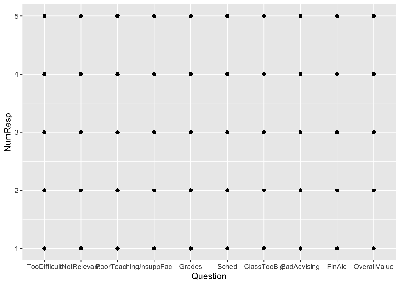
4.3.4 Failed plot: x, y + point()
We include this because we want to talk about mistakes. We created this graph—yes, we make mistakes!—when we weren’t thinking clearly. What did we want to do? Well, something like “create a point plot showing different responses to each question”. Well, that’s what it did! Each question had someone choose each possible response to each question…so there are 5x10 (50) dots on the graph.
Does that really tell us much of anything? No, not really. Maybe average choice or median choice would make sense. Or distribution of choices. In any case, we either need to calculate something or represent the popularity of each response in some way.
Be clear about what you want to show, and be clear about which type of geom you should use. Or you’ll get something like this graph!
Here are some resources so that you can learn more about geom_point(): tidyverse.org, R for Data Science, STHDA.
- Start the graph creation process
- We are not continuing this example.
4.4 1 discrete, 1 continuous
4.4.1 Point plot of averages: x, y + point()
Okay, here’s another graph that isn’t too great. This is a different type of mistake: using the wrong geom. Using a point() plot almost requires that the x-axis and y-axis columns be ordered — that is, the plots on the left be smaller than points on the right. This is not the case with Question.
Further, the reader wants to connect-the-dots and, in this case, that makes no sense. A bar chart, seen in examples below, would have been a better choice.
survey |>
  group_by(Question) |>
  summarize(Avg = mean(NumResp)) |>
  ggplot(aes(Question, Avg)) +
    geom_point()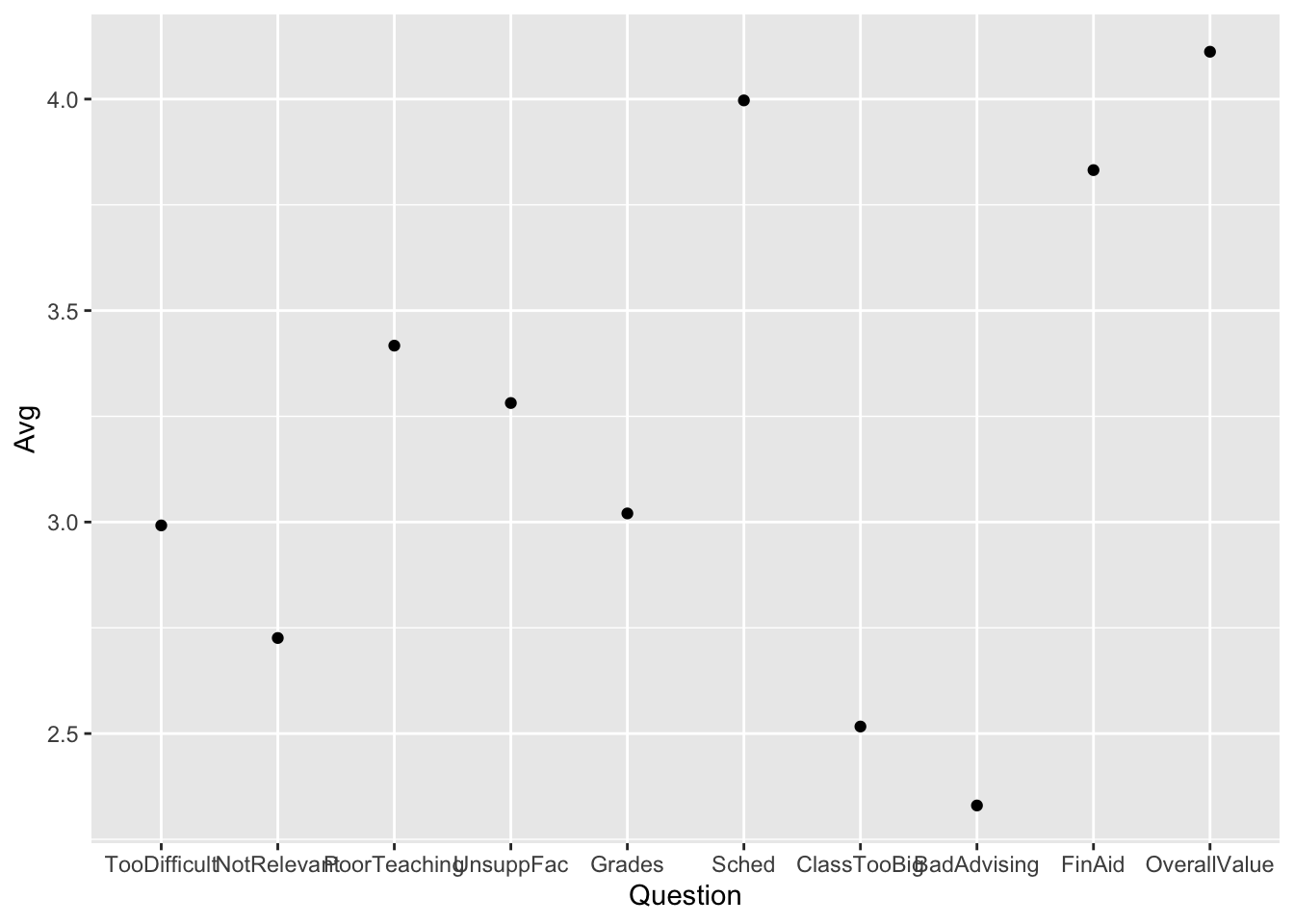
Resources about choosing the right chart type:
Here are some resources so that you can learn more about geom_point(): tidyverse.org, R for Data Science, STHDA.
- Start the graph creation process
- We are not continuing this example.
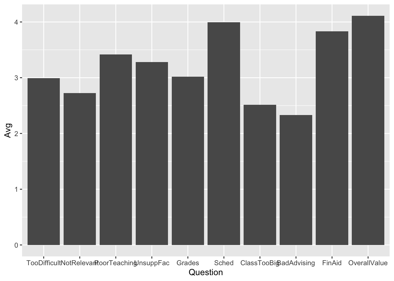
4.4.2 Bar chart of averages: x, y + col()
geom_col() differs from geom_bar() in that it requires that you do the calculation for it; that is, you have to supply both the x-axis and y-axis values. Here we have done this with Question and Avg, respectively.
Notice how easy it was to change from point() (above) to col() (below) — change just one line.
Here are some resources so that you can learn more about geom_col(): tidyverse.org, R Graphics Cookbook, Appsilon.
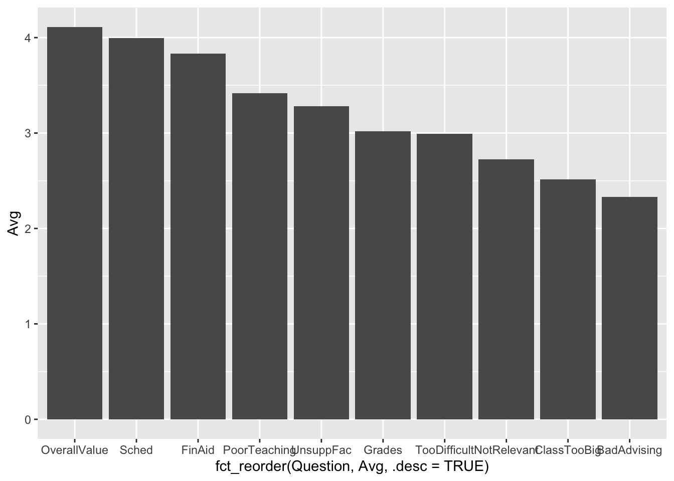
4.4.3 Bar chart with sorted averages: x (reordered), y + col()
Suppose that you liked the previous bar chart but want to display the columns in order by their values? Well, this leads to the following change in the aes() call:
Note:
- The
aes()call isaes(x = fct_reorder(xcolname, col1), col2). In this case (and, we would guess, most cases), we havecol1andcol2as the same column,Avg.col1determines the ordering of thex-axisvalues whilecol2determines the value to be plotted. - If you wanted to print in ascending order, then either use
.desc = FALSEor leave out the.descargument all together (i.e.,FALSEis the default value).
Here are some resources so that you can learn more about geom_col(): tidyverse.org, R Graphics Cookbook, Appsilon.
You can learn more about fct_reorder() on this page.
4.4.4 Boxplot reliant on other variable: x, y + boxplot()
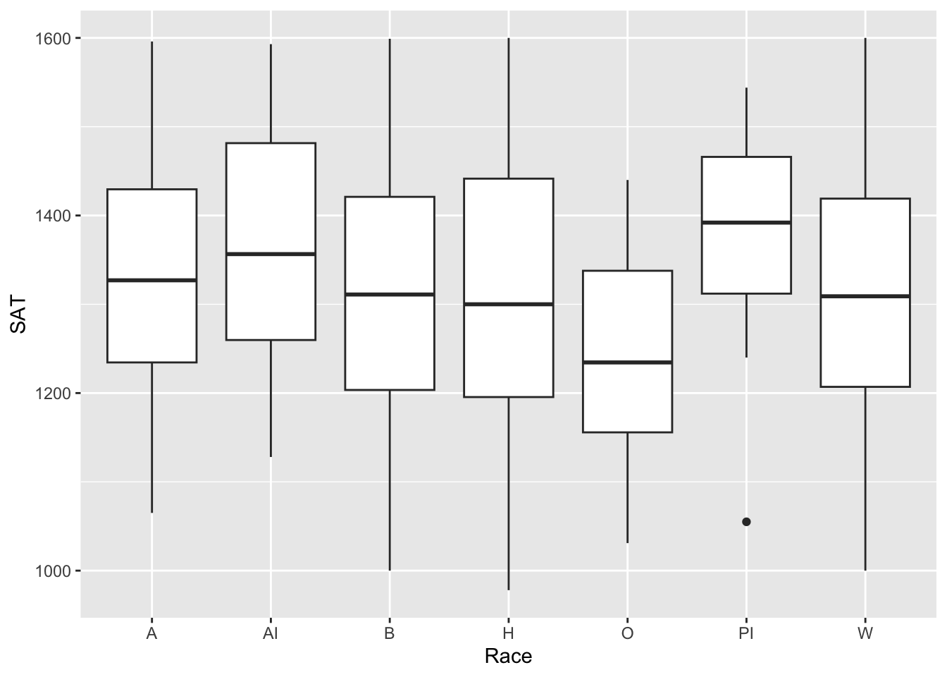
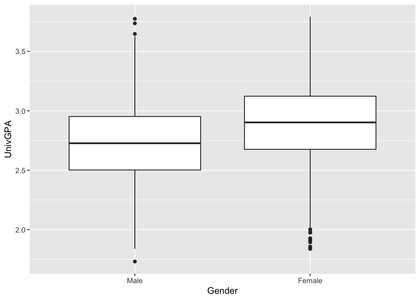
Suppose that you wanted to see the basics of the distribution of a column’s values. This is exactly what a boxplot is for—it shows the minimum, first and second and third quartiles, and maximum. It also highlights any values that are considered outliers. In this section, we are going to show two examples.
In this example, we show the distribution of SAT values by the Race of the applicant:
In this example, we show the distribution of UnivGPA values by the Gender of the applicant:
Here are some resources so that you can learn more about geom_boxplot(): tidyverse.org, STHDA, R Graph Gallery.
4.4.5 Violin chart reliant on other variable: x, y + horizontal violin()
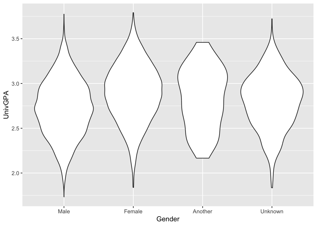
Suppose that you wanted a bit more insight into the distribution of a columns values than that which can be provided by a boxplot. This is where the violin graph comes in. It displays a continuous distribution showing finer-grained detail than that displayed by a boxplot. In this section, we are going to demonstrate a variety of ways to display a violin graph.
This first one tells ggplot to group values by Gender and calculate the distribution for UnivGPA values. According to geom_violin(), Gender should be placed on the x-axis (and, therefore, the distributions should go up the vertical axis) and the violin graphs should be scaled according to the number of data points in the distribution.
admitdatagendergpa |>
  ggplot(aes(x = Gender, y = UnivGPA)) +
    geom_violin(scale="count", orientation = "x")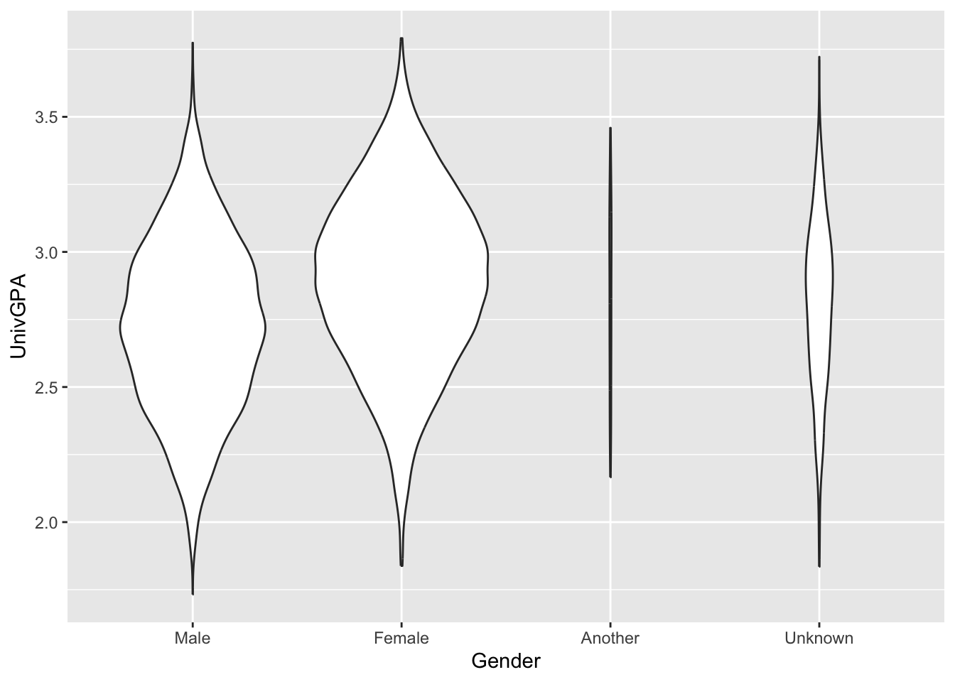
The defaults for the geom_violin() call are only slightly different.
- The
orientationdefaults to determining which column is discrete and which is continuous, and calculates the distribution on the continuous column — in this case,UnivGPA…so it is the same asorientation = "x". - The
scaleargument defaults to"area"so that the area of all the graphs are the same. Thus, the distribution forAnotherandUnknownare much smaller than the previous graph.
Now, let’s look at two different ways of flipping the graphs so that they are horizontal — that is, lying along the x-axis.
The first approach is to switch the x and y argument values in aes() and to change orientation to "y".
admitdatagendergpa |>
  ggplot(aes(x = UnivGPA, y = Gender)) +
    geom_violin(scale="count",
                orientation = "y")
The other approach is to keep the x and y argument values the same but to add a call to coord_flip().
admitdatagendergpa |>
  ggplot(aes(x = Gender, y = UnivGPA)) +
    geom_violin(scale="count") +
    coord_flip()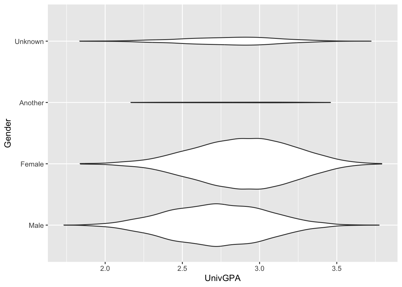
Finally, we can make it easier to differentiate the four values of Gender by specifying fill = Gender.
admitdatagendergpa |>
  ggplot(aes(x = Gender,
             y = UnivGPA,
             fill=Gender)) +
    geom_violin(scale="count") +
    coord_flip()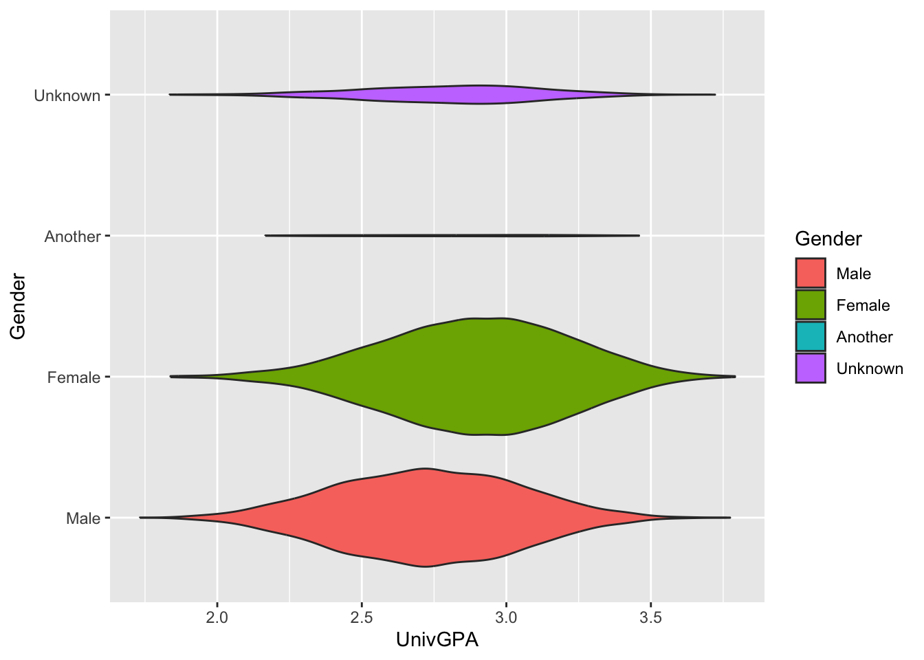
Note:
- The
scaleargument is quite useful to understand."area"is the default and ensures that all violins have the same area."count"(used here) ensures that areas are scaled to the number of observations.
Here are some resources so that you can learn more about geom_violin(): tidyverse.org, STHDA, R Project, Geeks for Geeks.
4.5 2 discrete, 1 continuous
4.5.1 Grouped bar (x, y, fill + col())
This works if both x and fill are discrete (or, better, factors).
This one is similar to this graph but uses geom_col(). Because it’s using geom_col(), we have to calculate the value that we want to display; in this case, the n column has the value that we need.
Sometimes, we want to show the bars next to each other rather than stacked. This means that we should set position="dodge" value for geom_col(). We also set the color of the bar outlines to black.
surveyQRN |>
  ggplot(aes(x = Question,
             y = n,
             fill = Response)) +
    geom_col(position="dodge",
             color = "black")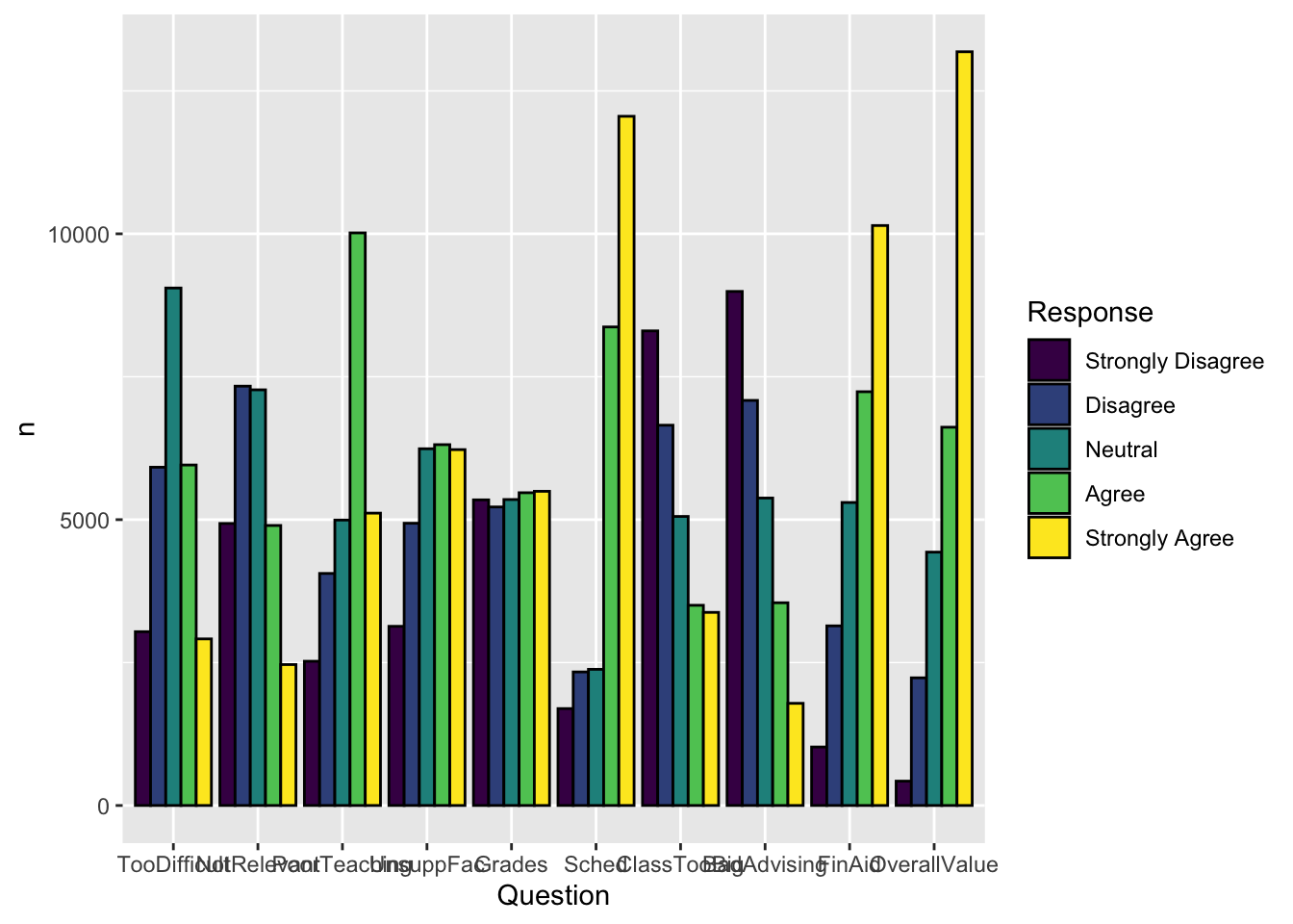
Another example which displays the same graph as shown in this section. In this case, the value to be displayed had not been calculated yet, so we used the summarize() function to do so. We then specified the graph in the same way as we did previously.
student_econ |>
  group_by(Race, Sex) |>
  summarize(Count = n()) |>
  ggplot(aes(Race,
             y = Count,
             fill = Sex)) +
    geom_col(position="dodge")
Here are some resources so that you can learn more about geom_col(): tidyverse.org, R Graphics Cookbook, Appsilon.
4.5.2 Facets around bar (x, y, facet + col())
This graph, again, displays the data shown in the graphs in this section. In this case, we are using geom_col() to display a bar chart with the columns side-by-side.
surveyQRN |>
  ggplot(aes(x = Response, y = n)) +
    facet_wrap(~Question, ncol = 2) +
    geom_col(position="dodge")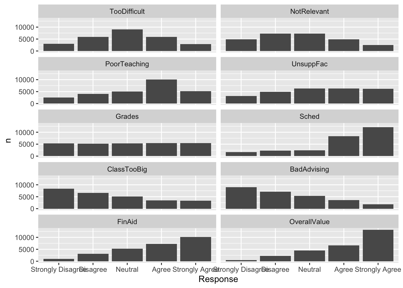
Let’s look at the various functions and arguments of note:
facet_wrap()specifies that each facet is a separateQuestionand that the facets will be displayed in two columns (ncol = 2).- Within each facet,
Responseis displayed along thex-axisandn(the number of each response chosen) is the height of the bar.
Here are some resources so that you can learn more about geom_col(): tidyverse.org, R Graphics Cookbook, Appsilon.
4.5.3 Facets around horizontal bar (x, y, facet + col())
In this graph, we display the same data as in the previous graph. The only difference, obviously, is that the bars are displayed horizontally.
surveyQRN |>
  ggplot(aes(x = n, y = Response)) +
    facet_wrap(~Question, ncol = 5) +
    geom_col(position="dodge")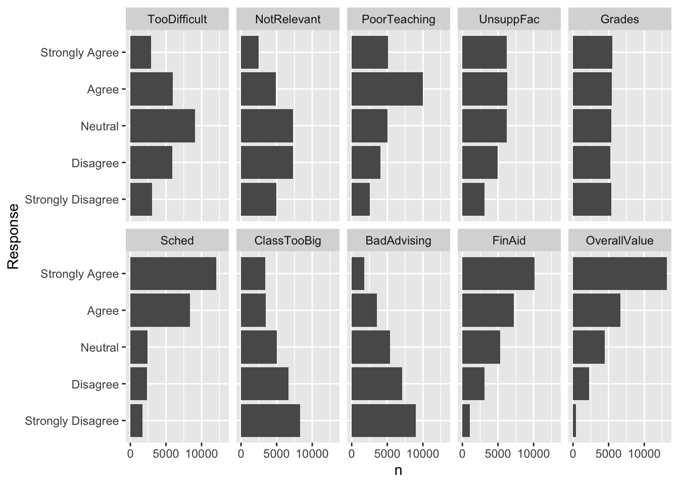
Note:
- Changing from vertical bars to horizontal is as simple as putting the discrete variable (
Response, in this case) as theyargument and the statistic to be displayed as thexargument (n, in this case). - We could have kept
ncol = 2, but we wanted to make a more compact display than that choice would enable.
Here are some resources so that you can learn more about geom_col(): tidyverse.org, R Graphics Cookbook, Appsilon.
4.5.4 Grouped bar, narrowed width of bars (x, y, fill + col())
In this and the following two sections, we are going to modify the graph shown in this section. If you look at that graph, the bar groupings are quite close to each other. In the following graph, we narrow the groups with width=0.8 in the geom_col() function.
surveyQRN |>
  ggplot(aes(x = Question,
             y = n,
             fill = Response)) +
    geom_col(position="dodge",
             width=0.8,
             color = "black")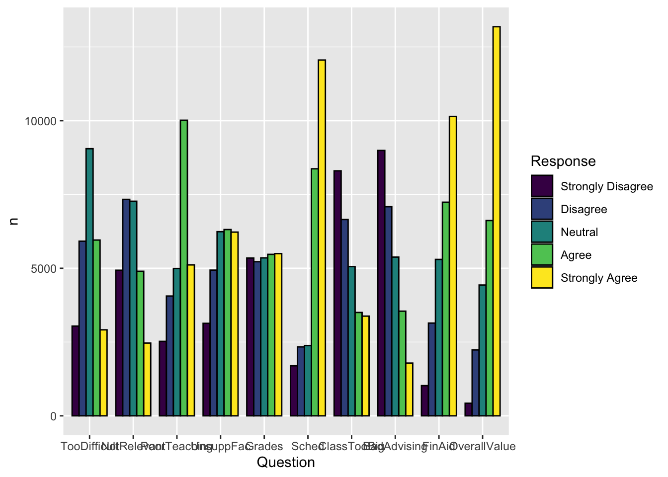
Here are some resources so that you can learn more about geom_col(): tidyverse.org, R Graphics Cookbook, Appsilon.
4.5.5 Grouped bar, narrowed & overlapping bars (x, y, fill + col())
Again, we are displaying the same data as the previous graph. This time we are narrowing the width of each group of bars (width=0.5) more than we are narrowing the width of each individual bar (width=0.9 within the geom_col() function). This results in the bars within each group overlapping each other.
surveyQRN |>
  ggplot(aes(x = Question,
             y = n,
             fill = Response)) +
    geom_col(position=position_dodge(width=0.5),
             width=0.9,
             color = "black")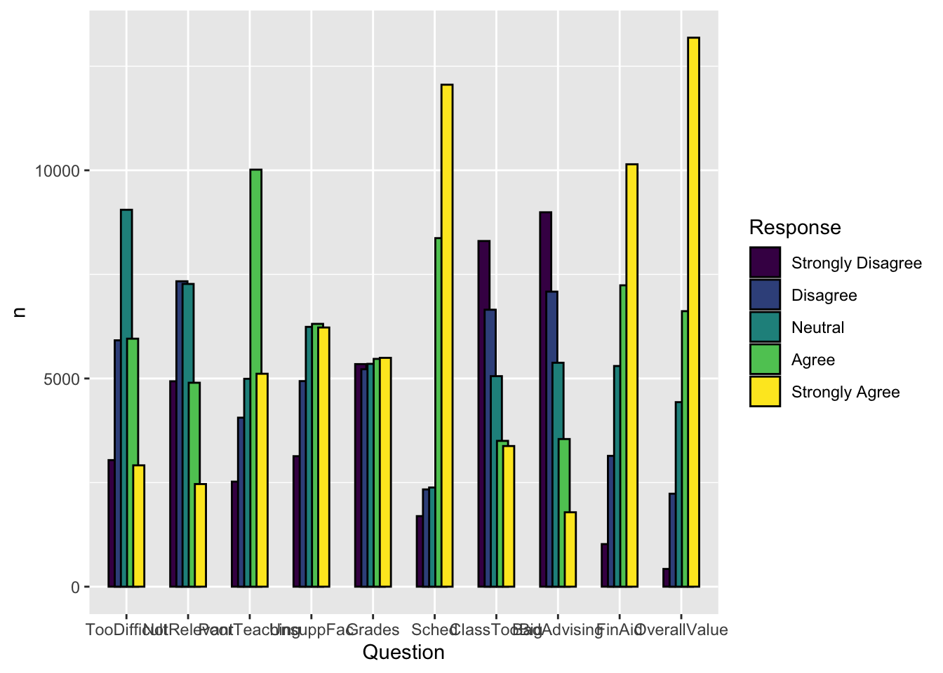
Here are some resources so that you can learn more about geom_col(): tidyverse.org, R Graphics Cookbook, Appsilon.
4.5.6 Grouped bar, narrowed & spaced bars (x, y, fill + col())
In this graph, we take the opposite approach to graph in the previous section. We narrow the groups by a small amount (width=0.9) but narrow each individual bar even more (width=0.5 within geom_col()). This results in groups of bars, but with space in between each bar.
surveyQRN |>
  ggplot(aes(x = Question,
             y = n,
             fill = Response)) +
    geom_col(position=position_dodge(width=0.9),
             width=0.5,
             color = "black")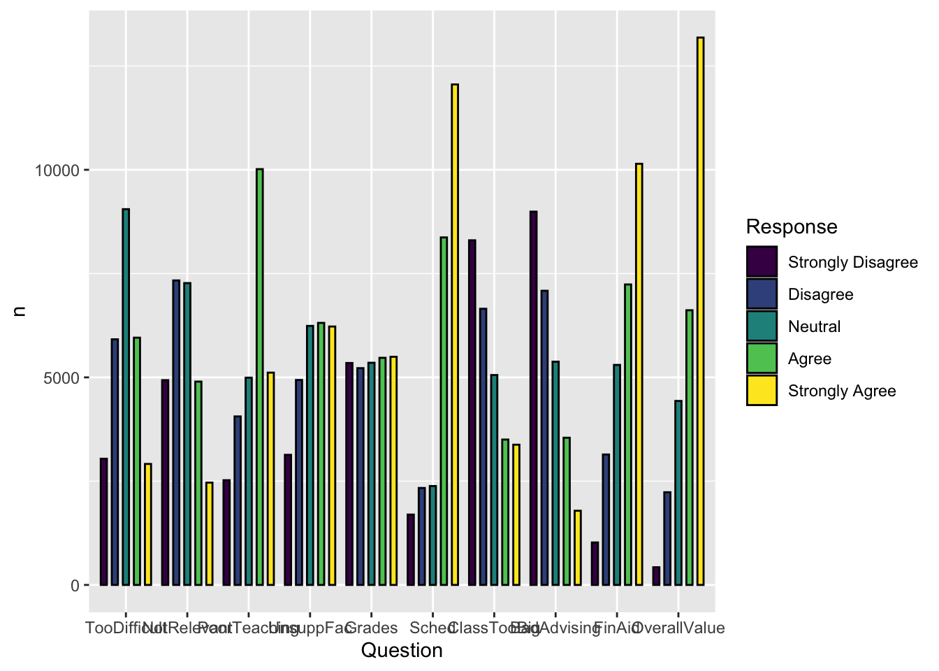
Here are some resources so that you can learn more about geom_col(): tidyverse.org, R Graphics Cookbook, Appsilon.
4.5.7 Percent Stacked bar (x, y, fill + col())
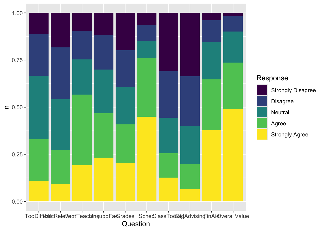
Back in this section, we created a graph that showed the raw counts of the number of each response for each question. This time we want to show the percent of answers for each response to each question. This change can be implemented by adding position="fill" to the geom_col() call.
Here are some resources so that you can learn more about geom_col(): tidyverse.org, R Graphics Cookbook, Appsilon.
4.5.8 Bar chart wrapped by a facet: x, y (implicit count), fill (redundant), facet + bar()
This graph presents the same information as in this section but without specifying the ncol argument.
Here are some links for learning more about geom_bar(): tidyverse.org, r-graph-gallery.
4.5.9 Column chart wrapped by facets: x, y (explicit count), facet + col()
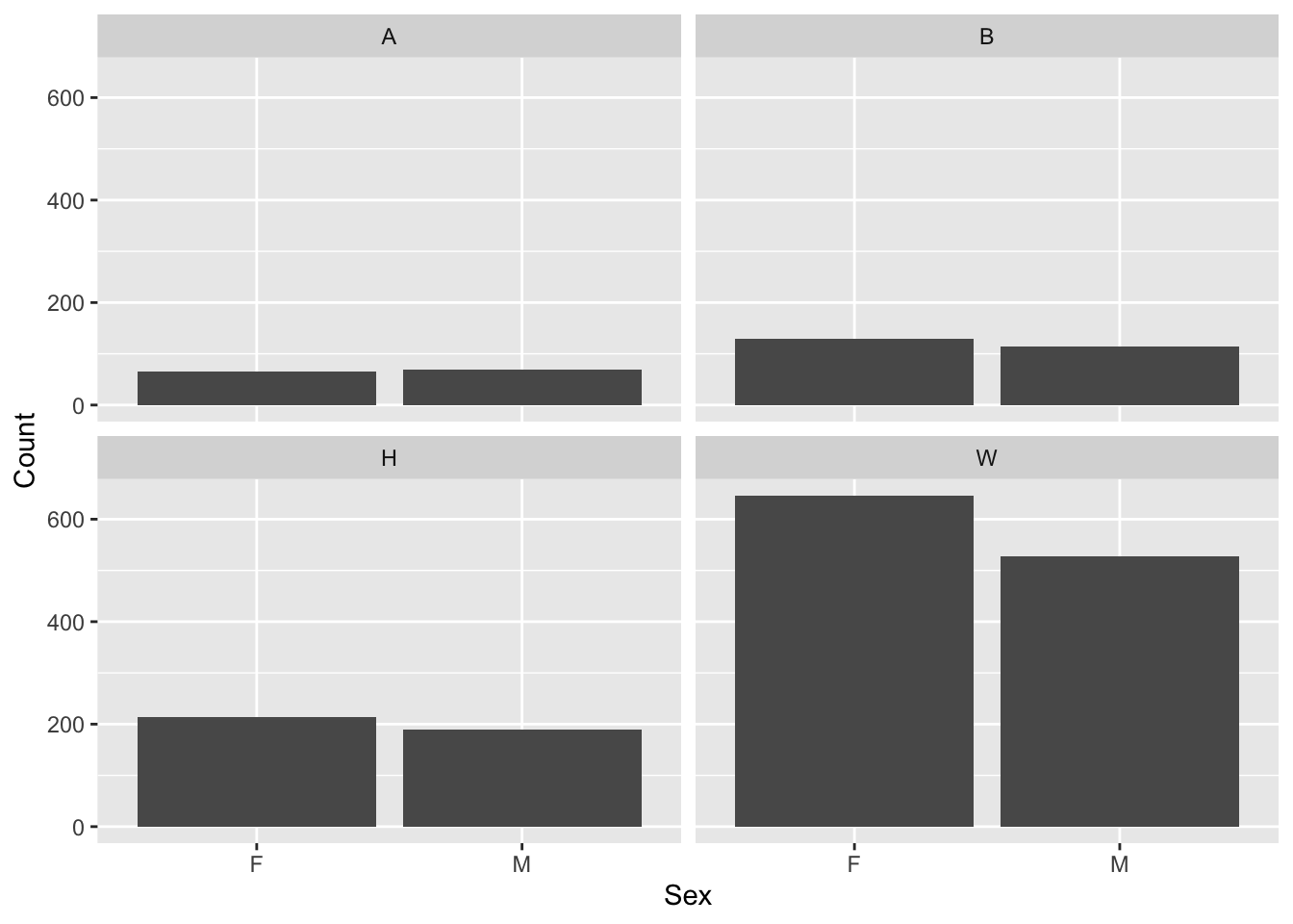
This graph displays the same information as the previous graph but goes about it entirely differently. Here we have to use a dataframe in which the Count is already calculated since we are using geom_col() to display the data. We also don’t differentiate the Sex data using the fill argument; it is just handled by the x-axis.
Here are some resources so that you can learn more about geom_col(): tidyverse.org, R Graphics Cookbook, Appsilon.
4.5.10 Colored column chart wrapped by facets: x, y (explicit count), fill (redundant), facet + col()
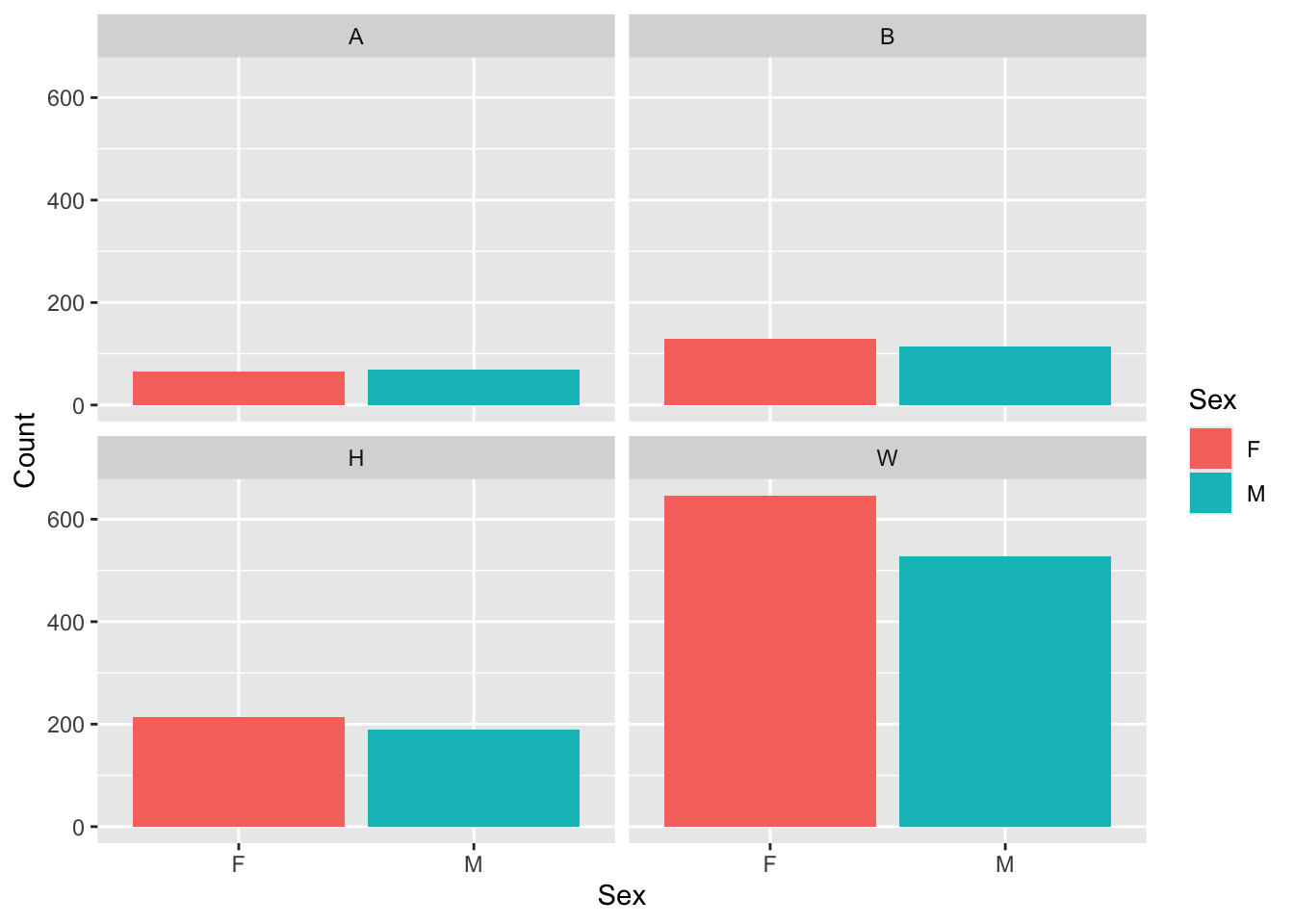
Clearly, this is the same graph as the previous section but with bar colors specified by fill=Sex. Everything else is the same.
Here are some resources so that you can learn more about geom_col(): tidyverse.org, R Graphics Cookbook, Appsilon.
4.5.11 Boxplot differentiated by 2 other columns: x, y, color + boxplot()
This graph is getting pretty far along in showing the power of ggplot in creating a graph that shows just what we want with very little effort. In this case, we want to show how the distribution of UnivGPA values depends on a combination of race/ethnicity and Pell Grant status.
admitdataRaceGPAPell |>
  ggplot(aes(IPEDSRaceEthnicity, UnivGPA,
             color = PellStatus)) +
    geom_boxplot(varwidth=TRUE)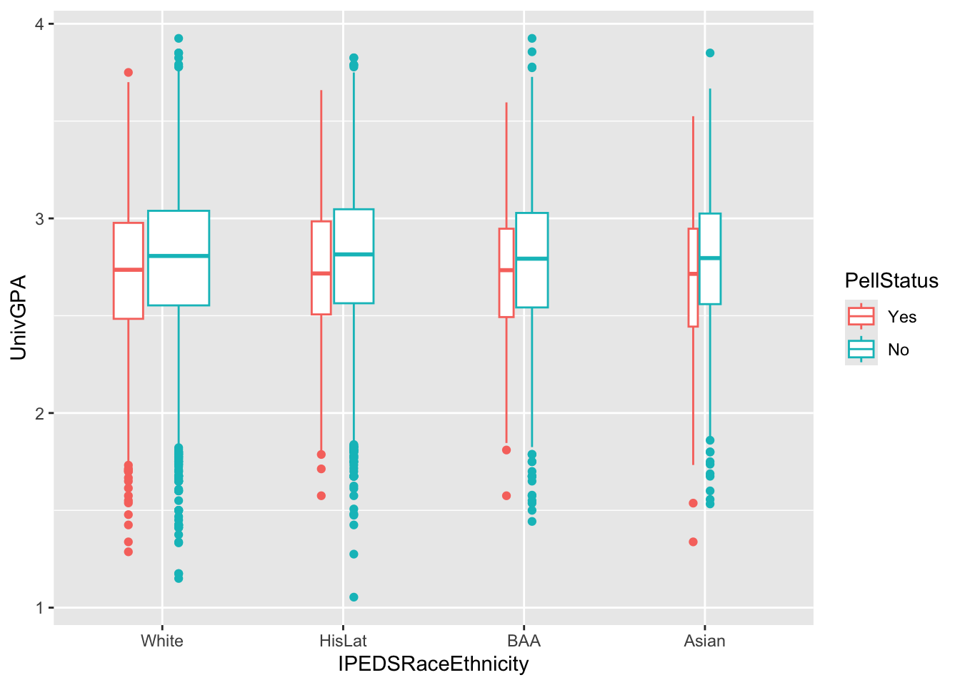
Note:
- Using
varwidth=TRUEingeom_boxplot()makes the widths of the boxplots be proportional to the underlying sample sizes. - See this page for information on how to put the actual sample size in the
x-axislabels.
Here are some resources so that you can learn more about geom_boxplot(): tidyverse.org, STHDA, R Graph Gallery.
4.5.12 Colored boxplot differentiated by 2 other columns: x, y, fill + boxplot()
This graph is exactly the same as the graph in the previous section except that it uses fill instead of color to highlight Pell Status.
admitdataRaceGPAPell |>
  ggplot(aes(IPEDSRaceEthnicity, UnivGPA,
             fill = PellStatus)) +
    geom_boxplot(varwidth=TRUE)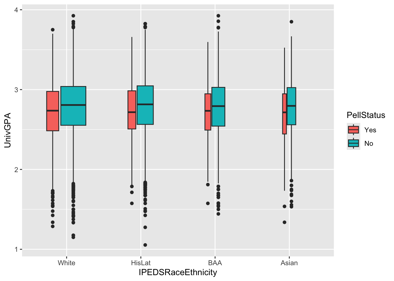
Here are some resources so that you can learn more about geom_boxplot(): tidyverse.org, STHDA, R Graph Gallery.
4.5.13 Boxplot differentiated by one column and wrapped by another: x, y, facet + boxplot()
This graph displays the same data as in the previous graph except that it uses facet_wrap() instead of fill or color to differentiate Pell Status.
admitdataRaceGPAPell |>
  ggplot(aes(IPEDSRaceEthnicity, UnivGPA)) +
    facet_wrap(~PellStatus) +
    geom_boxplot(varwidth=TRUE)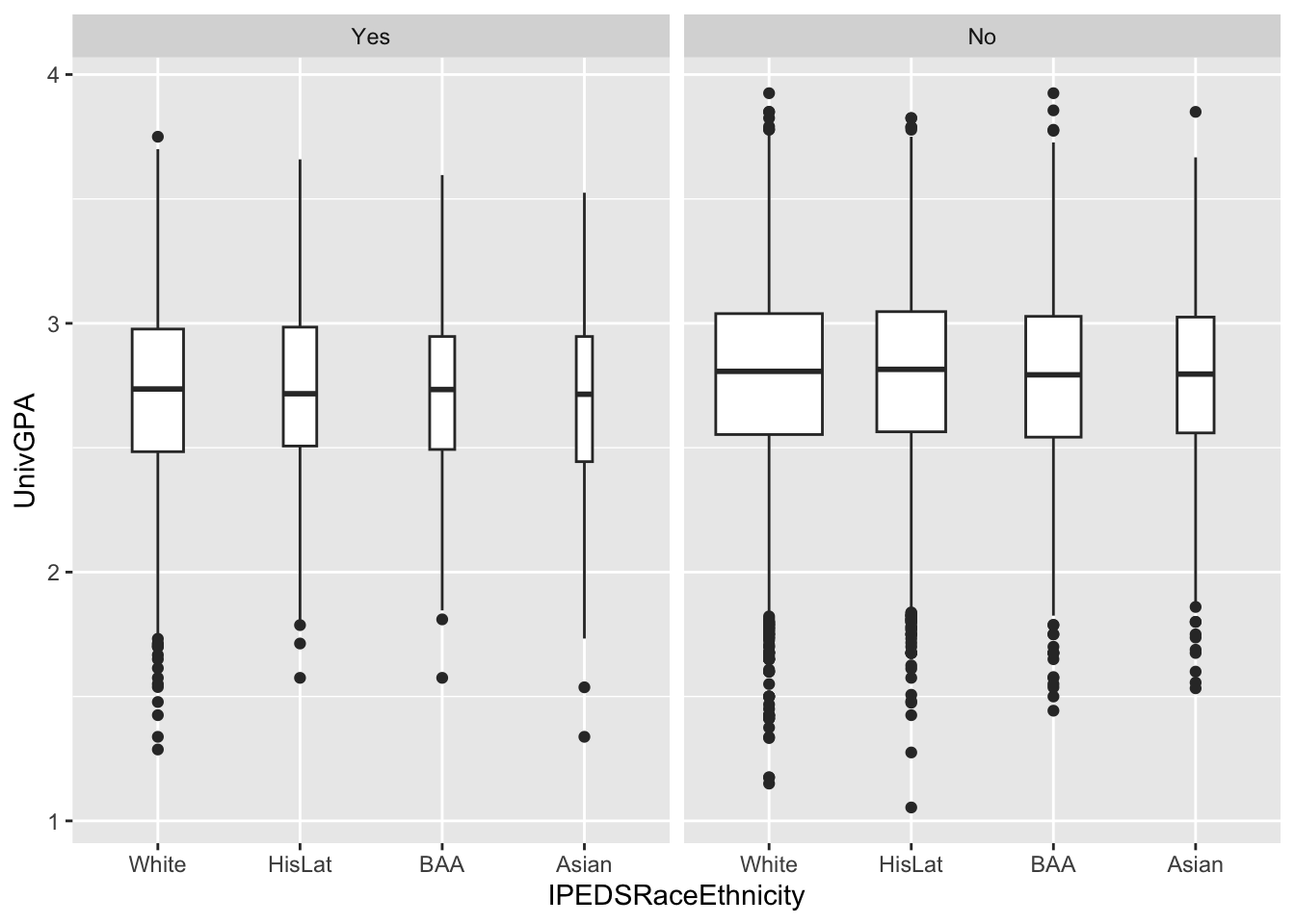
Here are some resources so that you can learn more about geom_boxplot(): tidyverse.org, STHDA, R Graph Gallery.
4.5.14 Horizontal boxplot differentiated by one column and wrapped by another: x, y, facet + horizontal boxplot()
This graph displays the same data as in the previous graph except that it displays the boxplots horizontally. Here we use our favorite method of flipping the axes—the coord_flip() function. Notice that everything else stays the same.
admitdataRaceGPAPell |>
  ggplot(aes(IPEDSRaceEthnicity, UnivGPA)) +
    facet_wrap(~PellStatus) +
    geom_boxplot(varwidth=TRUE) +
    coord_flip()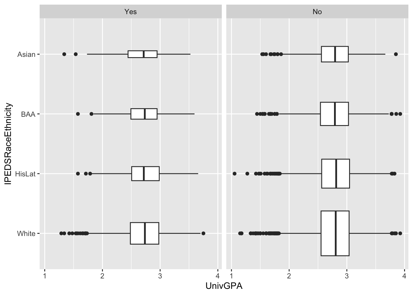
Here are some resources so that you can learn more about geom_boxplot(): tidyverse.org, STHDA, R Graph Gallery.
4.6 Ordered, numeric, discrete
If you have one column that is ordered (e.g., a series of dates), another that is discrete (e.g., sex, Pell Grant Status, race/ethnicity, etc.), and another column that is numeric, then the situation is calling out for a line graph that further differentiates (based on the discrete column) via either colors or facets. Let’s look at a few examples.
4.6.1 Line chart: x, y, color + line()
In this graph, we have the following columns:
AdmitCalendarYear: ordered;x-axisGender: discrete;colorCount: numeric;y-axis
admitdataYearGenderCount |>
  ggplot(aes(x = AdmitCalendarYear,
             y = Count,
             color = Gender)) +
    geom_line(linewidth = 1)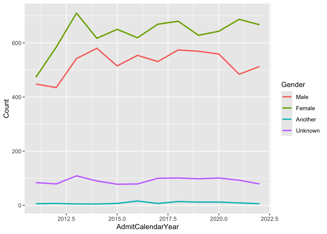
In this graph, we have the following columns:
YearOfBirth: ordered;x-axisName: discrete;colorNumber: numeric;y-axis
babynames |>
  filter(Name %in% c("Jennifer", "Teresa", "Karen",
                     "Linda", "Nancy") &
           Sex == "F") |>
  ggplot(aes(x = YearOfBirth,
             y = Number,
             color=Name)) +
  geom_line(linewidth = 1)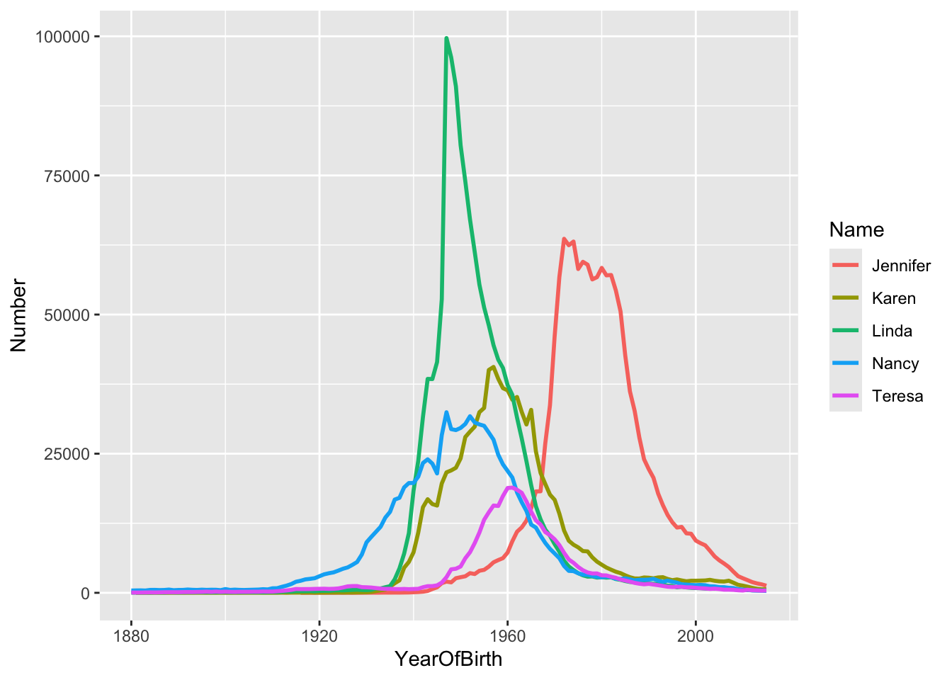
Note:
- You can use
linewidthto set the width of the stroke for the line. Play with it to see what you like and what looks best in your method of presentation (e.g., screen or printed document).
Here are some resources so that you can learn more about geom_line(): Michael Toth, Appsilon, R Charts, R Graphics Cookbook.
4.6.2 Line chart wrapped by facets: x, y, facet + line()
This graph displays the same data as in the previous section; however, we are now differentiating on Gender via a facet_wrap() instead of color.
admitdataYearGenderCount |>
  ggplot(aes(x = AdmitCalendarYear, y = Count)) +
    facet_wrap(~Gender) +
    geom_line(linewidth = 1)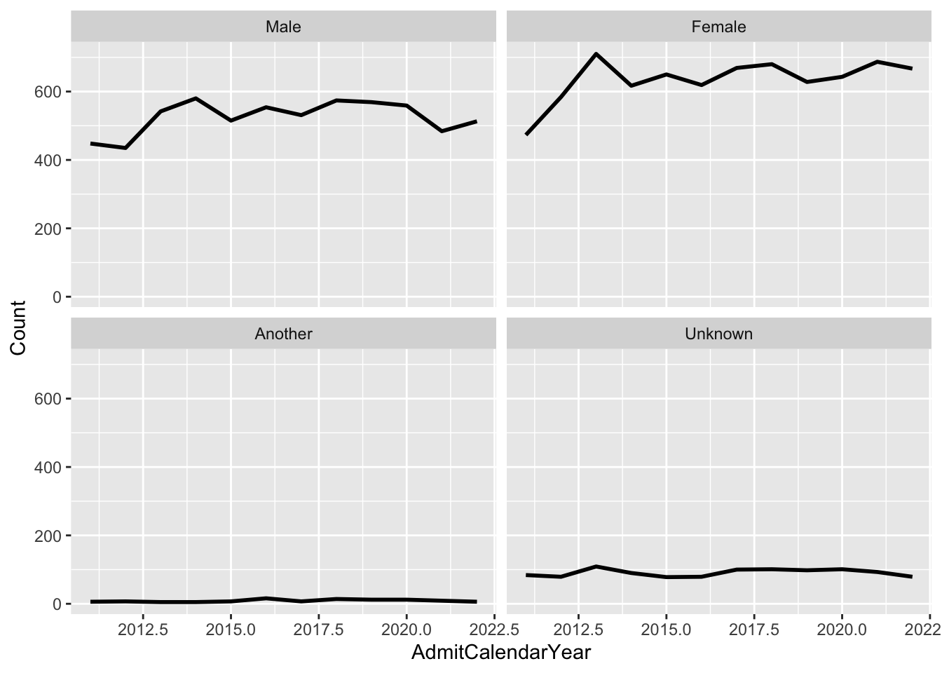
Note:
- We could have also differentiated using
colorif we had wanted to.
Here are some resources so that you can learn more about geom_line(): Michael Toth, Appsilon, R Charts, R Graphics Cookbook.
4.7 2 continuous
When you have two continuous columns, you have decisions to make about what you want to show:
- Do you want to show all the data (via point)?
- Do you want to summarize the data? If so, to what extent (i.e., boxplot or violin or smooth)?
The complexity of these decisions should encourage you to be iterative and try out different graphs until your display is most informative for your audience.
4.7.1 Point plot with fitted line: x, y + point() + smooth()
This is an amazingly informative graph that requires very little effort for what it shows:
- It plots every single point of data of
UnivGPAvs.FamilyIncome. Thealpha=0.2argument means that each point is 20% opaque and 80% transparent. - It displays a regression plot (surrounded by a 95% confidence interval). Note that, as you would expect, the confidence interval gets larger as the data plot gets sparser.
admitdataIncGPAGender |>
  ggplot(aes(x = FamilyIncome, y = UnivGPA)) +
    geom_point(alpha = 0.2) +
    geom_smooth(alpha = 1.0)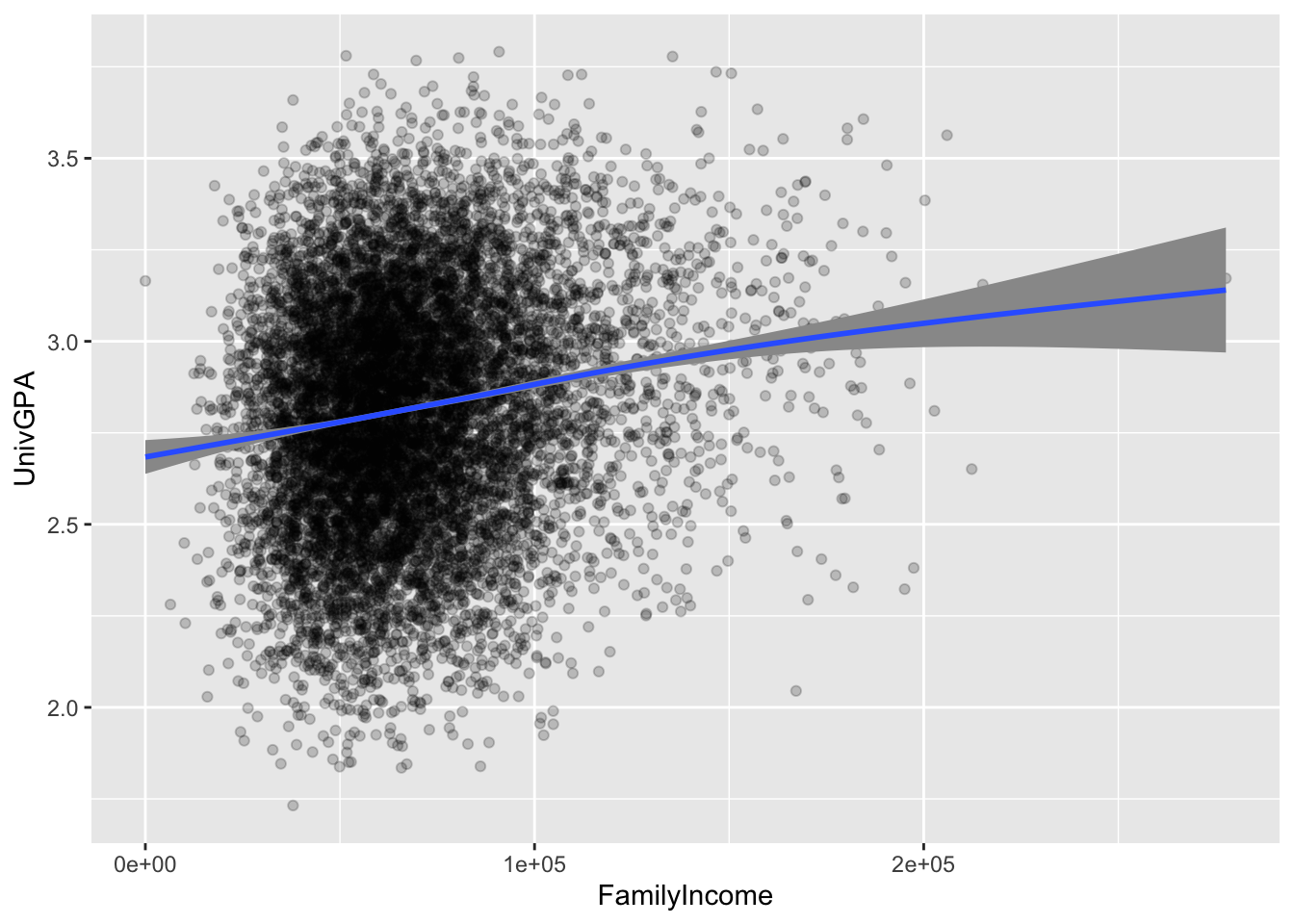
Here are some resources so that you can learn more about geom_point(): tidyverse.org, R for Data Science, STHDA.
And here are some for geom_smooth(): tidyverse.org, Sharp Sight Labs, Geeks for Geeks, R Project.
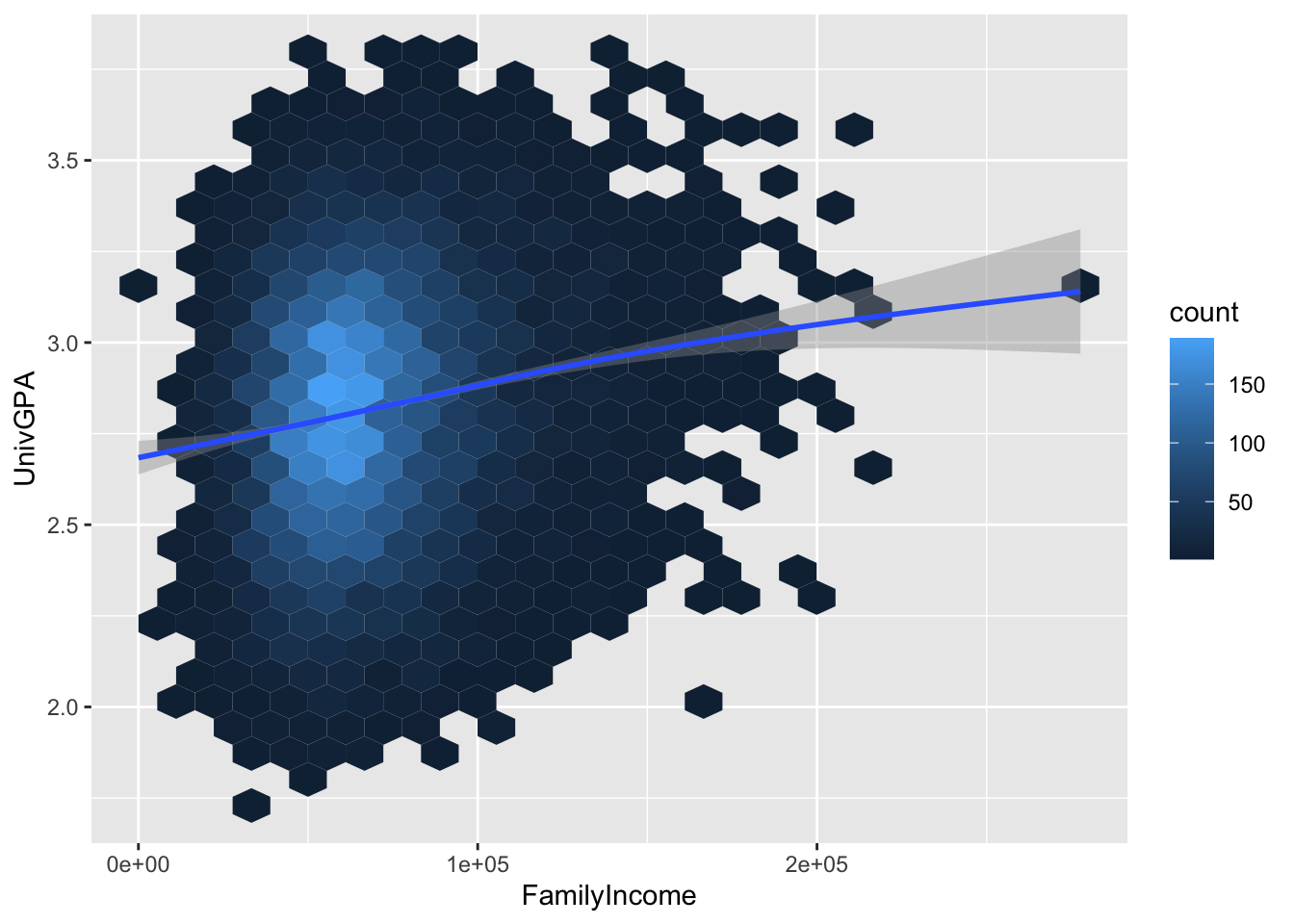
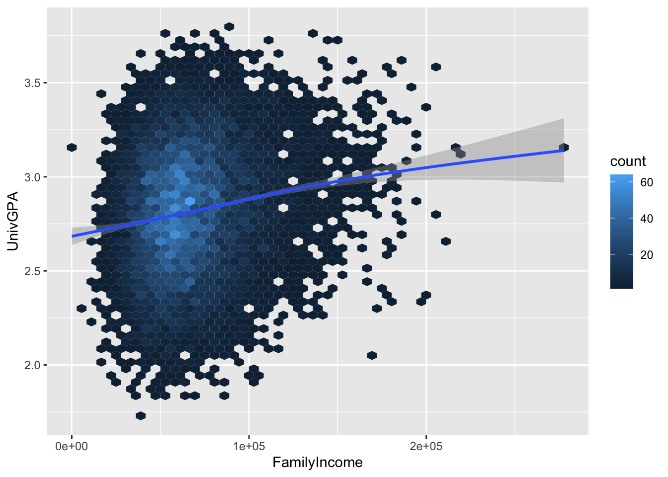
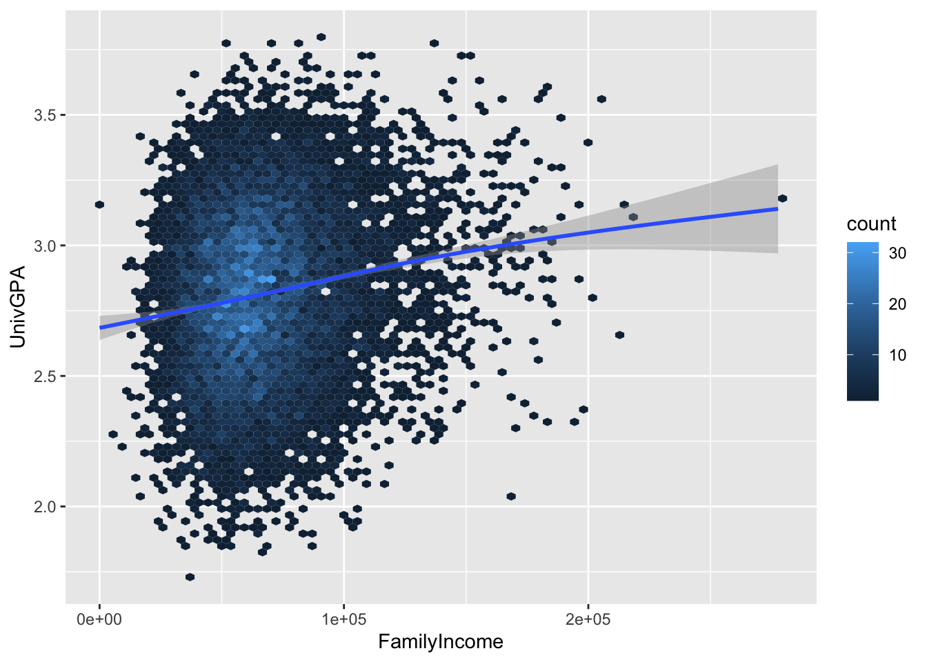
4.7.2 Hexplot with fitted line: x, y + hex() + smooth()
This plot takes a different approach to showing the density of points. R divides the grid up into hexagonal areas, counts the points in each hex, and then plots the count of those points as the fill color.
The question then remains, how small or large do we want those hexes to be? It really will depend on the size of your data set and what you want to show with the graph. To give you an idea of how the amount of detail can vary, here we set bins to 25, 50, and then 75. We will use 50 in the next sections but any one of these three could have been chosen.
Here are some resources so that you can learn more about geom_hex(): tidyverse, R for Data Science, STHDA, R Graph Gallery.
And here are some for geom_smooth(): tidyverse.org, Sharp Sight Labs, Geeks for Geeks, R Project.
4.7.3 Density/2D plot with fitted line: x, y + density_2d() + smooth()
The geom_density_2d() geoms are more tools that analysts have at their disposal for showing the density of a plot. The filled() version is the one that shows the color fills while the other one shows the lines.
admitdataIncGPAGender |>
  ggplot(aes(FamilyIncome, UnivGPA)) +
    geom_density_2d_filled(alpha = 0.5) +
    geom_density_2d(linewidth = 0.25, color = "black") +
    geom_smooth()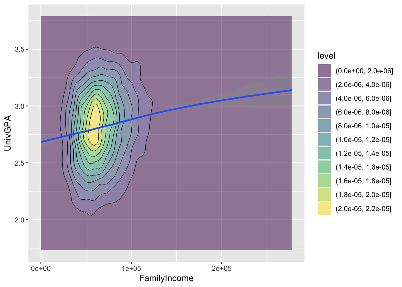
Here are some resources so that you can learn more about geom_density_2d(): tidyverse.org, R Graph Gallery, STHDA.
And here are some for geom_smooth(): tidyverse.org, Sharp Sight Labs, Geeks for Geeks, R Project.
4.7.4 Boxplot based on continuous column: x, y + boxplot()
We have used boxplot many times, starting with this section. In every example before this one, the x-axis has had discrete values. In this one, we have a continuous column, FamilyIncome. We do this by slicing the values on the x-axis into separate bins using cut_width():
- Divide values in
FamilyIncome(thex-axiscolumn) - Start the bins at
0(the leftboundary), and - Make each bin
25000wide (e.g., 0-24999, 25000-49999, etc.)
We have also specified (with varwidth=TRUE) that the width of each boxplot should be proportional to the volume of underlying data for each bin.
admitdataIncGPAGender |>
  ggplot(aes(x = FamilyIncome, y = UnivGPA)) +
    geom_boxplot(aes(group=cut_width(FamilyIncome,
                                     width=25000,
                                     boundary=0),
                     varwidth=TRUE))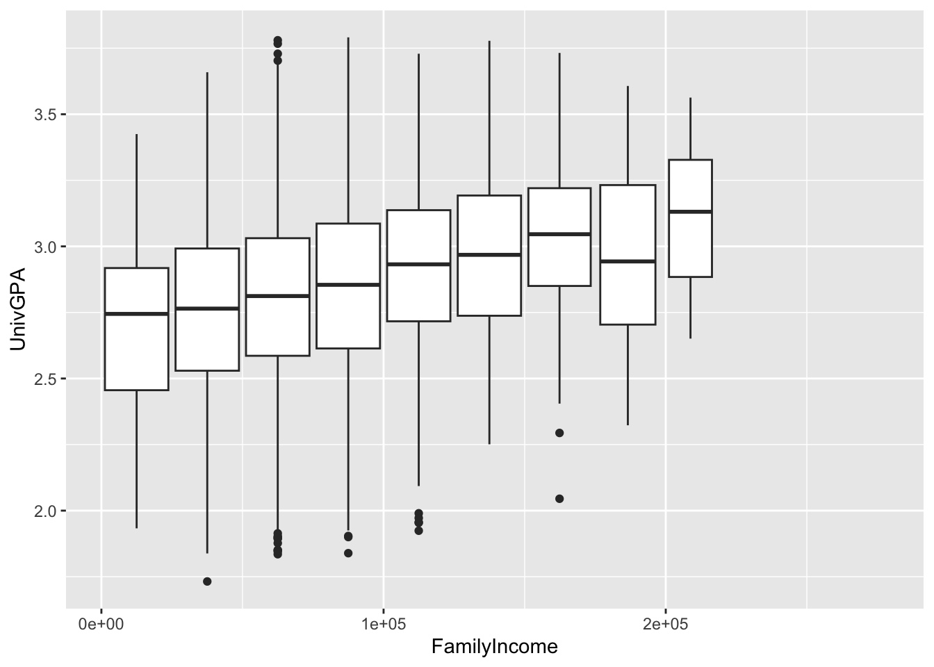
Here are some resources so that you can learn more about geom_boxplot(): tidyverse.org, STHDA, R Graph Gallery.
4.8 2 continuous, 1 discrete
The graphs in this section build on the concepts of the graphs applied in the previous section. Because such a large volume of data is to be represented by the graph, you have to be thoughtful (and experimental!) with your choices. In this section we present a variety of useful alternatives that should help you start experimenting with your own data.
In this section we create five graphs all based on the same underlying data. This should simplify the process of understanding the strengths of the different approaches.
4.8.1 Point plot with fitted line for subsets: x, y, color + point() + smooth()
Here we want to show all of the data plotted, but we also want to highlight the differences in the correction between the two genders.
- Plot
UnivGPAvs.HSGPA. Use a separate color (in all of thegeoms) for each value ofGender. - Create
pointplots withalpha=0.3so that it’s easier to see overlaps in the data. - Create a regression line and confidence interval for each
Gender.
admitdataIncGPAMF |>
  ggplot(aes(x = HSGPA, y = UnivGPA, color = Gender)) +
    geom_point(alpha = 0.3) +
    geom_smooth(method = "gam", alpha = 1.0)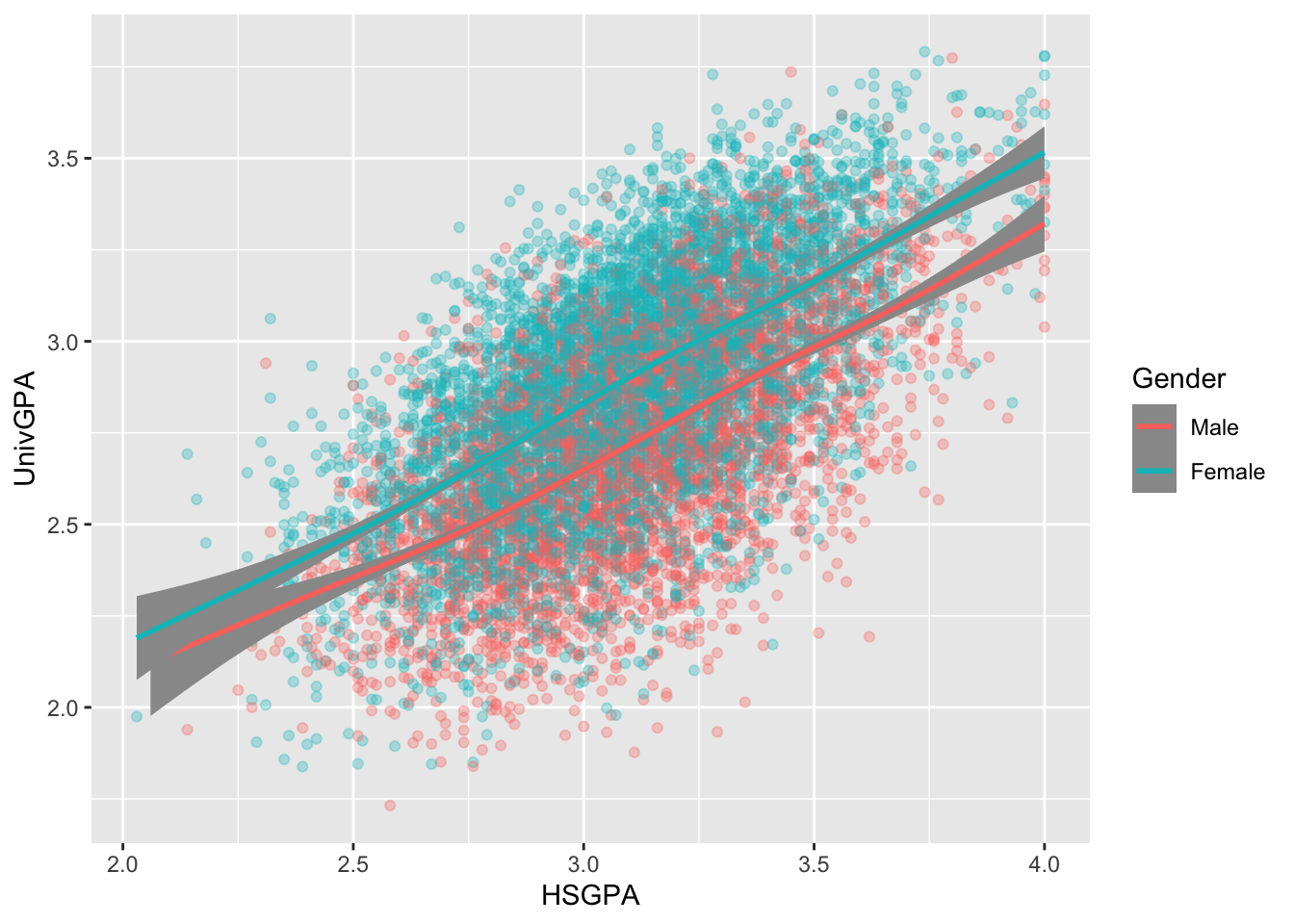
Here are some resources so that you can learn more about geom_point(): tidyverse.org, R for Data Science, STHDA.
And here are some for geom_smooth(): tidyverse.org, Sharp Sight Labs, Geeks for Geeks, R Project.
4.8.2 Point plot with fitted line wrapped by facets: x, y, facet + point() + smooth()
This is the same data as shown in this graph; however, here we use facets to differentiate the gender values rather than colors.
admitdataIncGPAMF |>
  ggplot(aes(x = HSGPA, y = UnivGPA)) +
    facet_wrap(~Gender) +
    geom_point(alpha = 0.3) +
    geom_smooth(method = "gam", alpha = 1.0)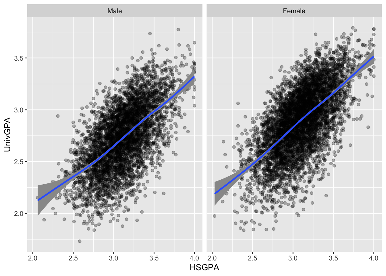
Here are some resources so that you can learn more about geom_point(): tidyverse.org, R for Data Science, STHDA.
And here are some for geom_smooth(): tidyverse.org, Sharp Sight Labs, Geeks for Geeks, R Project.
4.8.3 Boxplot wrapped by facets: x, y, facet + boxplot()
Again, this is the same data as in the previous section; however, this time, instead of displaying all of the data with point, we display a summary of the data with a boxplot. We use cut_width() as a helper function (as explained in this section).
admitdataIncGPAMF |>
  ggplot(aes(x = HSGPA, y = UnivGPA)) +
    facet_wrap(~Gender) +
    geom_boxplot(aes(group=cut_width(HSGPA,
                                     width=0.25,
                                     boundary=2.0)))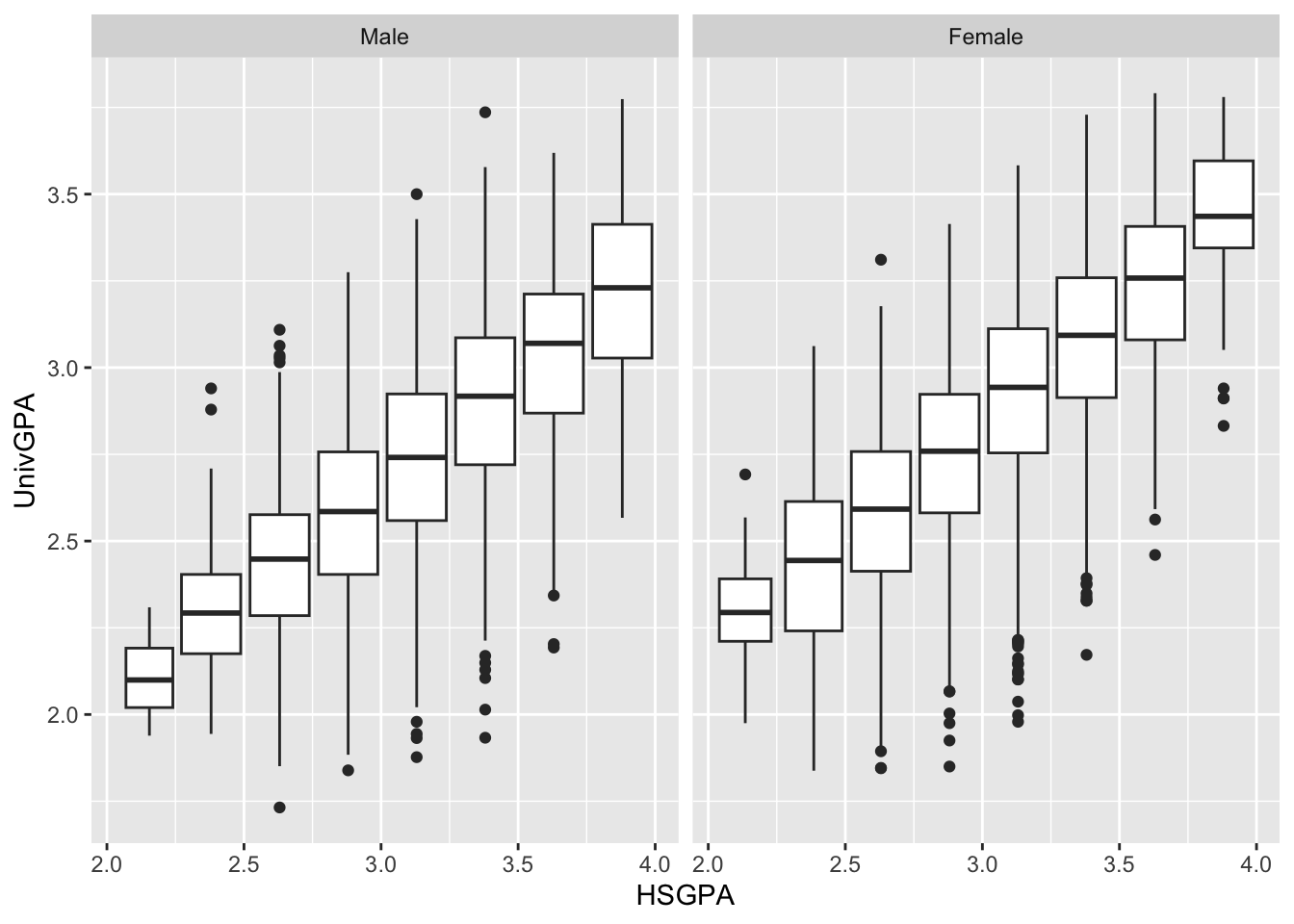
The following graph simplifies the previous one by ignoring Gender and displaying a boxplot for all data in each bin. The other difference is that the width of each boxplot varies depending on the volume of underlying data (using varwidth=TRUE).
admitdataIncGPAMF |>
  ggplot(aes(x = HSGPA, y = UnivGPA)) +
    geom_boxplot(aes(group=cut_width(HSGPA,
                                     width=0.25,
                                     boundary=2.0)),
                 varwidth=TRUE)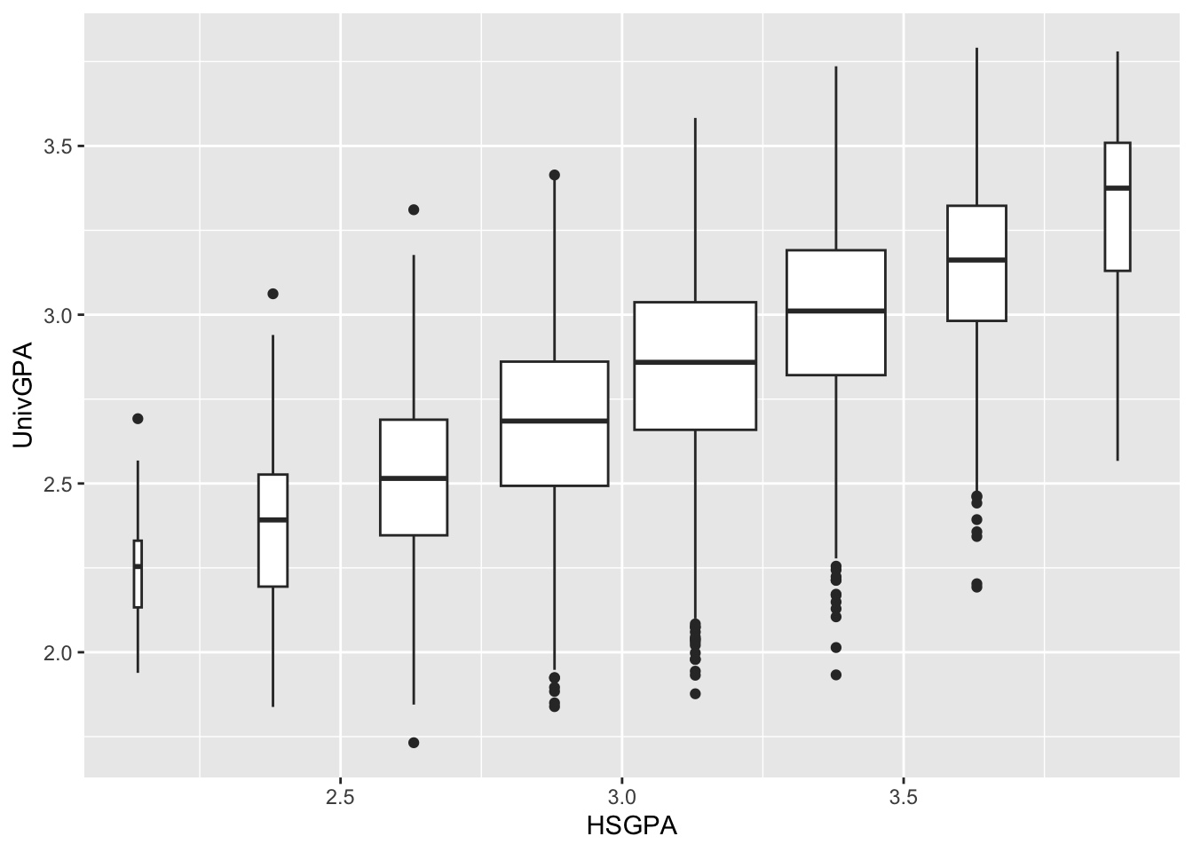
Here are some resources so that you can learn more about geom_boxplot(): tidyverse.org, STHDA, R Graph Gallery.
4.8.4 Violin plot wrapped by facets: x, y, facet + violin()
We are, again, displaying the same data as in the previous section; however, in this graph we are using a violin plot to display the distributions of data in finer detail than we could with a boxplot. We again use the cut_width() helper function to create bins on the continuous HSGPA column.
admitdataIncGPAMF |>
  ggplot(aes(x = HSGPA, y = UnivGPA)) +
    facet_wrap(~Gender) +
    geom_violin(aes(group=cut_width(HSGPA,
                                    width=0.25,
                                    boundary=2.0),
                    scale="count"))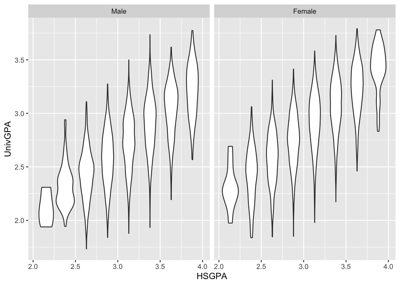
Here are some resources so that you can learn more about geom_violin(): tidyverse.org, STHDA, R Project, Geeks for Geeks.
4.8.5 Jitter and box plot by subset: x, y, color + jitter() + boxplot()
This graph, again displaying the same underlying data as in this previous section, has a lot of nuances that make it work:
- The
jitterplot shows all of the data for each gender but with the plottedx-axisvalue slightly jittered (or perturbed, or varied) so that all of the plots aren’t on top of each other. If we usedpointinstead, it would simply be a line directly aboveMaleand a line directly aboveFemale. - We displayed
jitterbeforeboxplotso that the boxplot would be displayed on top. - We set
fill=NAforboxplotso that it would be transparent, enabling thepointvalues to show. - We set
alpha=1.0forboxplotso that theblackline would be completely opaque. - We set
linewidth=1so that the boxplot would stand out sufficiently against all of the plotted points. - We set
color=HSGPAforggplotbecause we wanted the color of the point plot to vary by theHSGPA. Later in the process we will be able to set the colors so that the differences are more obvious.
admitdataIncGPAMF |>
  ggplot(aes(x = Gender,
             y = UnivGPA,
             color = HSGPA)) +
    geom_jitter(alpha = 0.3) +
    geom_boxplot(alpha = 1.0,
                 linewidth=0.75,
                 color = "black",
                 fill = NA)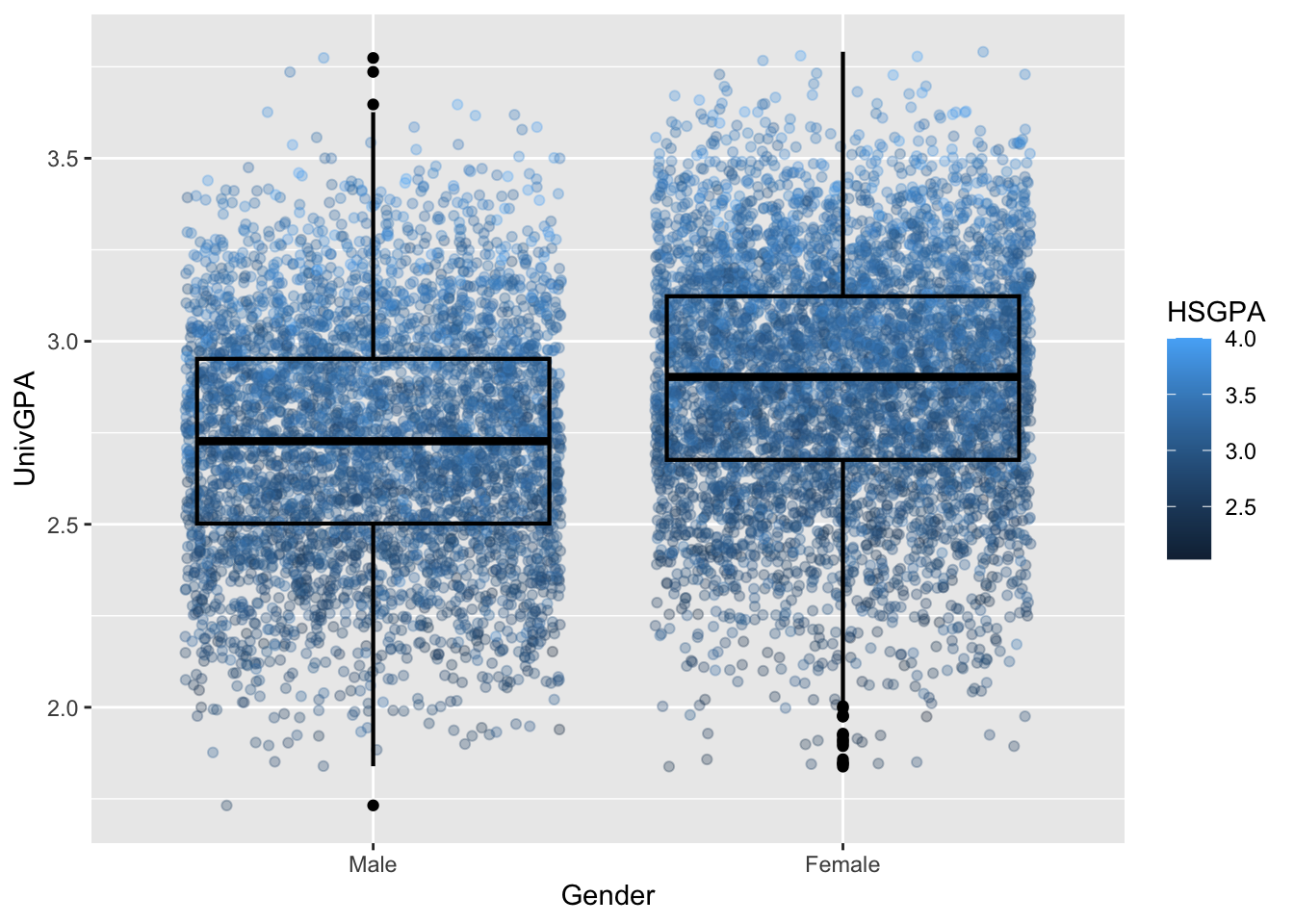
Here are some resources so that you can learn more about geom_jitter(): tidyverse.org, STHDA, Statology, R Documentation.
4.9 2 continuous, 2 discrete
In this section we will be working with three fairly complex sets of data and showing varying ways of highlighting relationships within that data. We are very much drawing on ggplot’s strengths and flexibility with these graphs.
4.9.1 Point plot with fitted line for subsets wrapped by facet: x, y, color, facet + point() + smooth()
With this graph, we want to highlight any differences between the genders among the four types of majors. We do this in the following ways:
- Use a
pointplot to show the relationship betweenUnivGPAandHSGPA(the two continuous column). - Highlight the differences between the values associated with each value of
Gender(one discrete column). - Set up facets (using
facet_wrap()) for each of the values ofProbableMajorType(the other discrete column). - Draw a regression line and associated confidence intervals using
smooth.
admitdataHSUnivMFMajor |>
  ggplot(aes(x = HSGPA, y = UnivGPA, color = Gender)) +
    facet_wrap(~ProbableMajorType) +
    geom_point(alpha = 0.3) +
    geom_smooth(method = "gam", alpha = 1.0)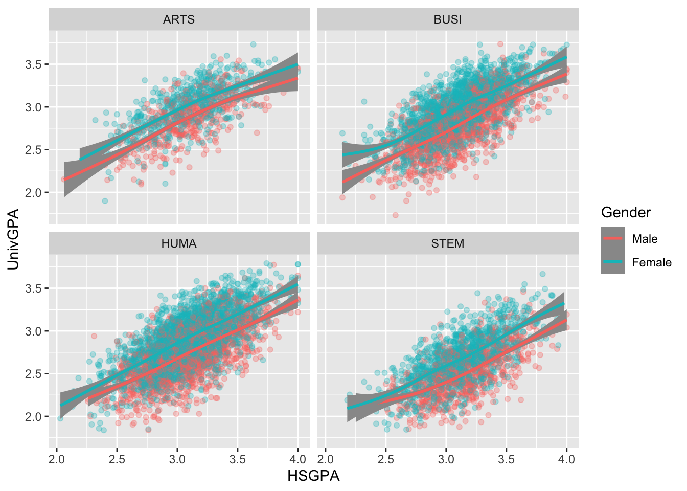
Here are some resources so that you can learn more about geom_point(): tidyverse.org, R for Data Science, STHDA.
And here are some for geom_smooth(): tidyverse.org, Sharp Sight Labs, Geeks for Geeks, R Project.
4.9.2 Point plot with fitted line wrapped by a facet grid: x, y, facet_grid + point() + smooth()
We are, again, displaying the same data as shown in the previous section; however, in this case, we are using facet_grid() instead of facet_wrap().
facet_grid() is a more powerful version of facet_wrap(). The latter sets up a series of graphs based on one column. facet_grid(), on the other hand, sets up a grid of graphs based on all of the combinations of two columns. In the following graph, we have instructed ggplot to do the following:
- Set up the values of
ProbableMajorTypedown they-axis. (There are four of these.) - Set up the values of
Genderacross thex-axis. (There are two of these.) - Create a graph containing a
pointandsmoothplot for each combination ofProbableMajorTypeandGender. (Thus, there will be eight of these.)
admitdataHSUnivMFMajor |>
  ggplot(aes(x = HSGPA, y = UnivGPA)) +
    facet_grid(ProbableMajorType~Gender) +
    geom_point(alpha = 0.3) +
    geom_smooth(method = "gam", alpha = 1.0)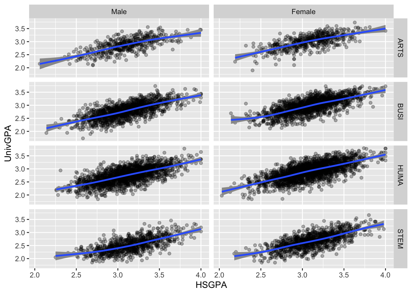
Here are some resources so that you can learn more about geom_point(): tidyverse.org, R for Data Science, STHDA.
And here are some for geom_smooth(): tidyverse.org, Sharp Sight Labs, Geeks for Geeks, R Project.
4.9.3 Boxplot wrapped by a facet grid: x, y, facet_grid + boxplot()
This is, again, plotting the same values as shown in the previous section. We are building on the approach used in this section.
In this case, we are using facet_grid() so that we are plotting the values for each type of major instead of (as before) the values from all students. The only difference in the earlier approach is that one facet line.
admitdataHSUnivMFMajor |>
  ggplot(aes(x = HSGPA, y = UnivGPA)) +
    facet_grid(ProbableMajorType~Gender) +
    geom_boxplot(aes(group=cut_width(HSGPA,
                                     width=0.25,
                                     boundary=2.0)))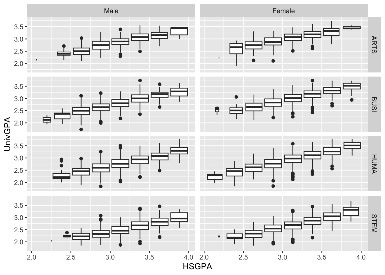
Here are some resources so that you can learn more about geom_boxplot(): tidyverse.org, STHDA, R Graph Gallery.
4.9.4 Violin wrapped by a facet grid: x, y, facet_wrap + violin()
Again, this graph is based on the same data as the previous section. It also is providing insights into the distribution of the data but, in this case, we are using violin instead of boxplot. Since the x-axis is a continuous variable, we have to use (again) the helper function cut_width() to set up the bins.
admitdataHSUnivMFMajor |>
  ggplot(aes(x = HSGPA, y = UnivGPA)) +
    facet_grid(ProbableMajorType~Gender) +
    geom_violin(aes(group=cut_width(HSGPA,
                                     width=0.25,
                                     boundary=2.0)))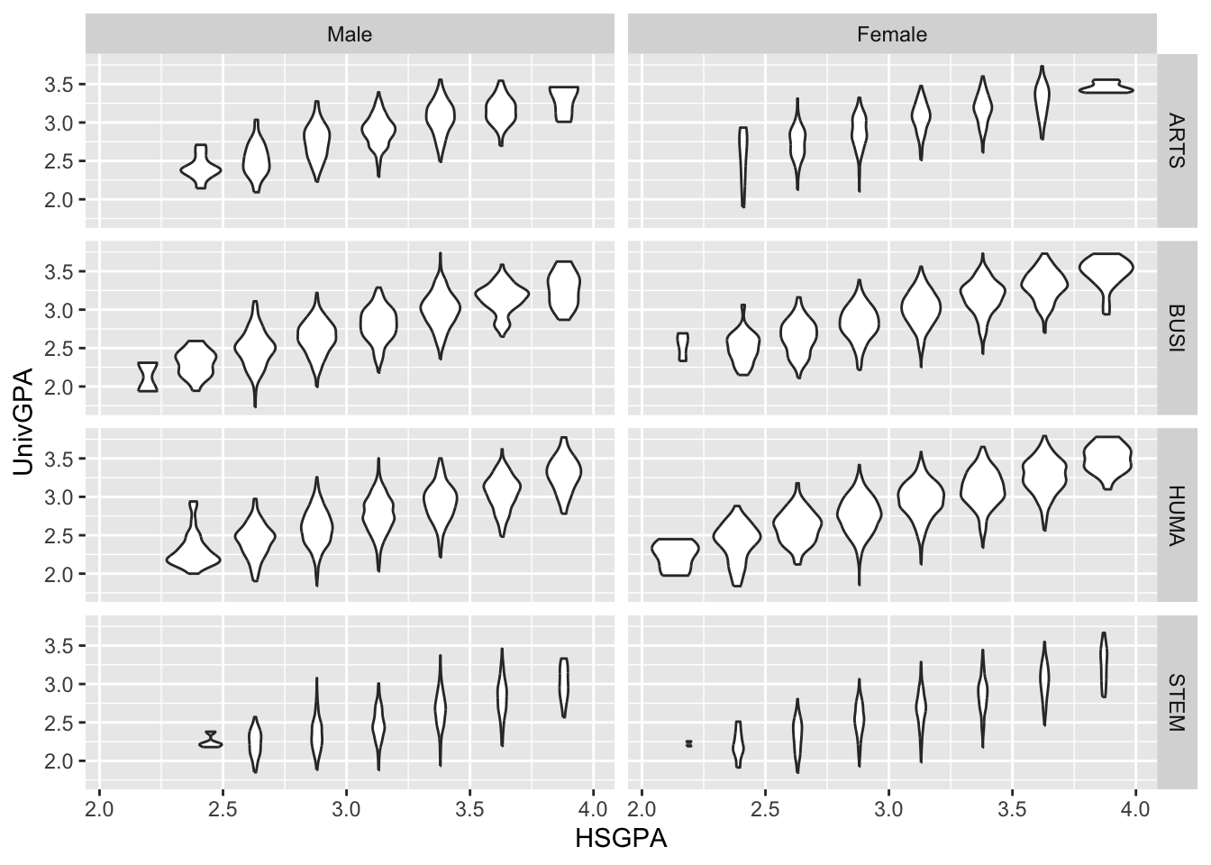
Note:
- You can see from the graph that the size of the violin graphs are automatically proportional to the count of the underlying data.
Here are some resources so that you can learn more about geom_violin(): tidyverse.org, STHDA, R Project, Geeks for Geeks.
4.9.5 Jitter and box plot for subsets wrapped by a facet: x, y, color, facet + jitter()
This graph is based on the data shown in the previous graph and builds on the approach used in this section. Two differences exist between the specifications of the two graphs:
- The addition of
facet_wrap()in the current instance, and - The addition of
varwidth = TRUEto theboxplotspecification since there are now eight boxplots and varying amounts of data behind each.
YOu can see both by the density of the point plot and the width of the boxplot just how much data are in the combination of each student type and gender.
admitdataHSUnivMFMajor |>
  ggplot(aes(x = Gender,
             y = UnivGPA,
             color = HSGPA)) +
    facet_wrap(~ProbableMajorType,
               ncol=4) +
    geom_jitter(alpha = 0.3) +
    geom_boxplot(alpha = 1.0,
                 linewidth=0.75,
                 color = "black",
                 fill = NA,
                 varwidth = TRUE)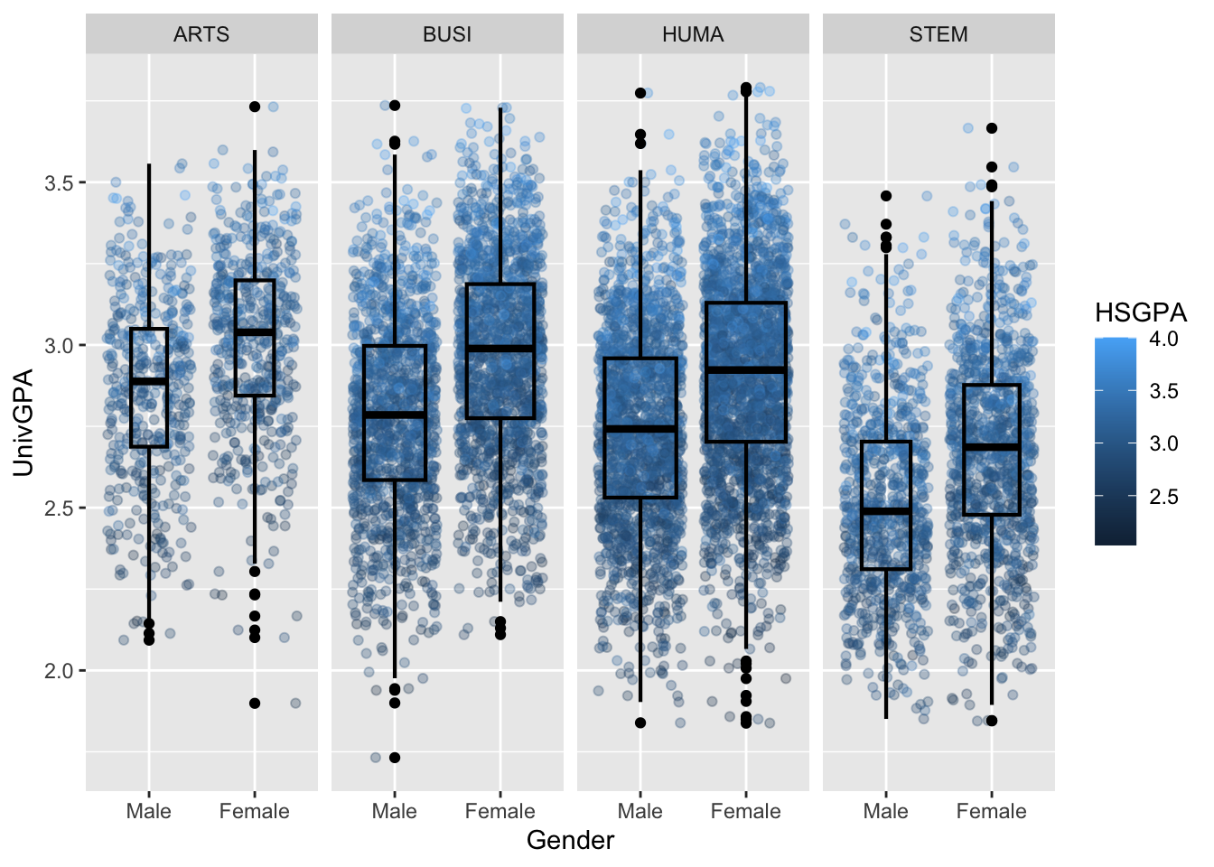
Here are some resources so that you can learn more about geom_jitter(): tidyverse.org, STHDA, Statology, R Documentation.
4.9.6 Boxplot differentiated by two columns and wrapped by a facet: x, y, color, facet + boxplot()
In this section we are working with new data, but we are building on the approach used in this section. The only difference between these two graphs are that we have added a facet_wrap() to the current graph.
admitdataRaceUnivPellMajor |>
  ggplot(aes(IPEDSRaceEthnicity, UnivGPA,
             color = PellStatus)) +
    facet_wrap(~ProbableMajorType) +
    geom_boxplot(varwidth=TRUE)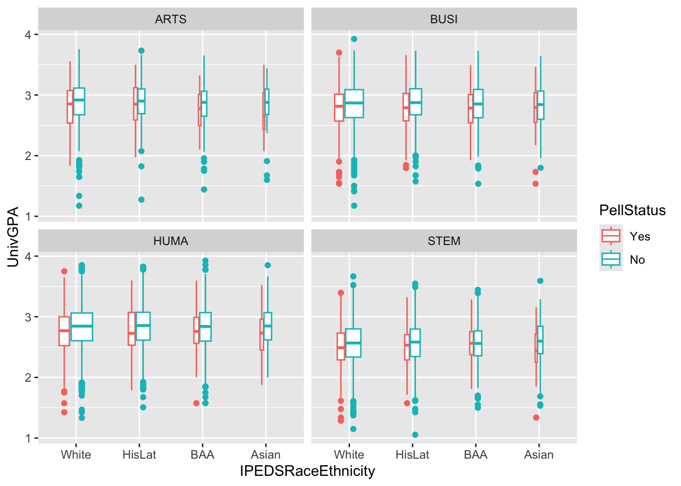
Here are some resources so that you can learn more about geom_boxplot(): tidyverse.org, STHDA, R Graph Gallery.
4.9.7 Boxplot differentiated by one column and wrapped by a facet grid: x, y, facet_grid + boxplot()
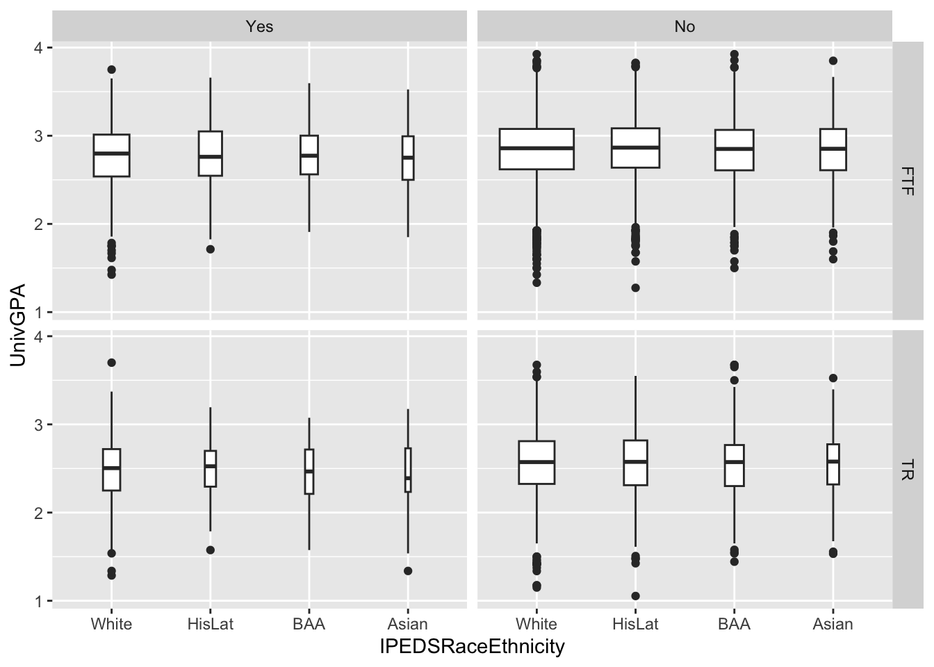
In this graph, we are again displaying the distribution of UnivGPA against race/ethnicity; however, in this case we are using facet_grid() on both StudentType (first time freshmen vs. transfer) and PellStatus (yes or no). Since we are using varwidth=TRUE for the boxplots, we can see that many more students do not have Pell Grants than not.
4.9.8 Horizontal boxplot differentiated by one column and wrapped by a facet grid: x, y, facet_grid + horizontal boxplot()
This is exactly the same graph as in the previous section except that we flipped the graph horizontally using coord_flip().
admitdataRaceUnivPellMajor |>
  ggplot(aes(IPEDSRaceEthnicity, UnivGPA)) +
    facet_grid(StudentType~PellStatus) +
geom_boxplot(varwidth=TRUE) +
coord_flip()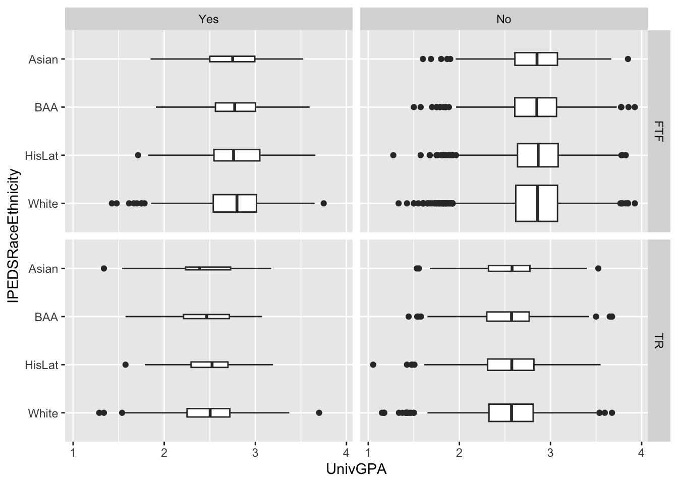
Here are some resources so that you can learn more about geom_boxplot(): tidyverse.org, STHDA, R Graph Gallery.
4.9.9 Boxplot and jitter differentiated by two discrete and one continuous column: x, y, size, color + boxplot() + jitter()
This is a different kind of graph than we have created before, and it’s based on a different, but related, data frame. With this graph we accomplish the following:
- Plot all the data points of
SAT(a continuous variable) againstRace(a discrete factor). Make the plotted points bycolor(Sex, discrete) andsize(PCI20, per capita income in 2020, continuous). - Create a
boxplotfor theSATdistribution for each value ofRace.
student_RaceSexPCISAT |>
  ggplot(aes(Race, SAT)) +
    geom_jitter(aes(size = PCI20,
                    color = Sex),
               alpha = 0.3,
               width = 0.25) +
    geom_boxplot(fill = NA,
                 color = "black",
                 varwidth = TRUE)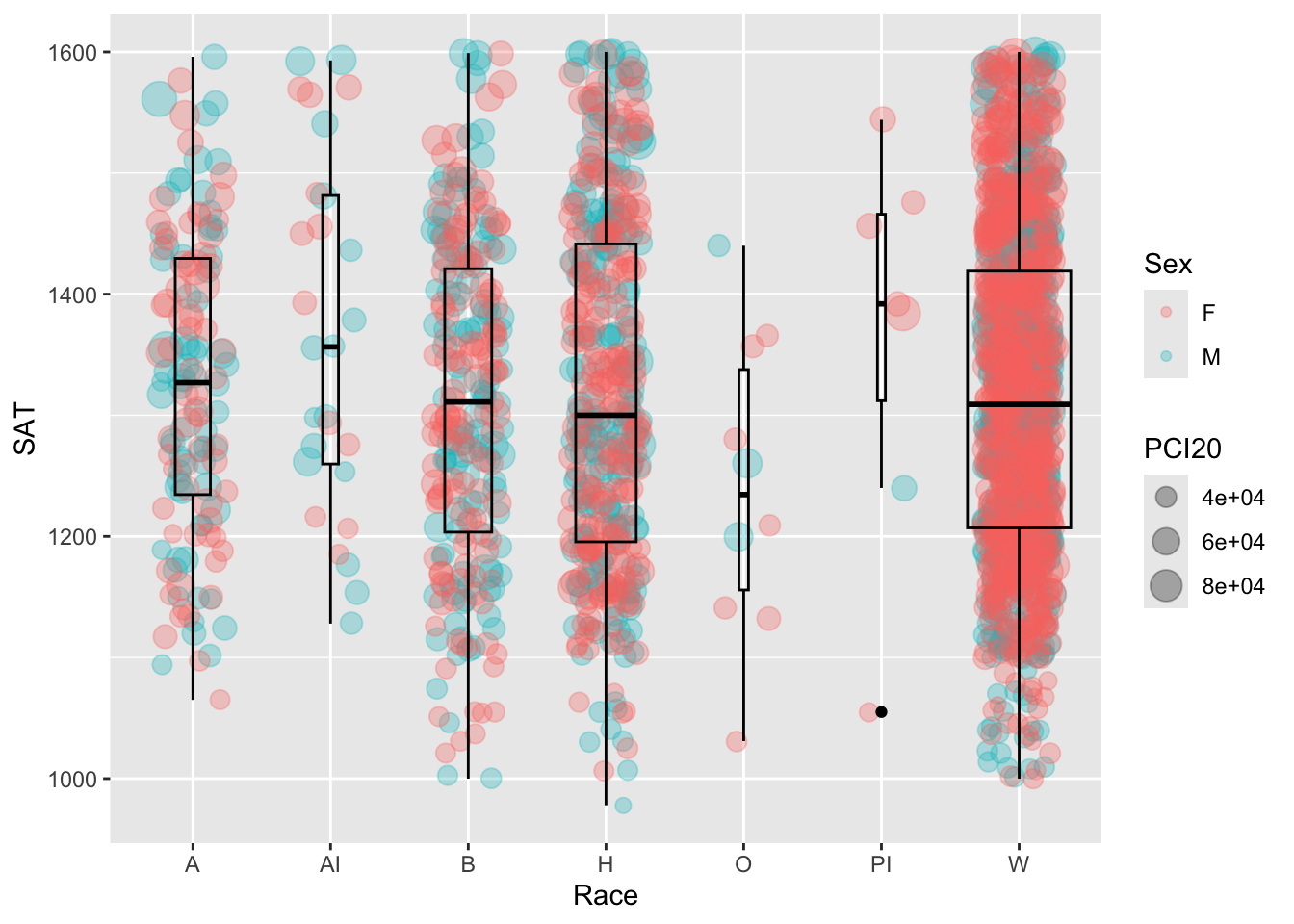
We have a new type of specification that we have to do in this graph — we have added an aes() to jitter in addition to the aes() specified in ggplot() itself.
- The
ggplotaes(Race, SAT)applies to allgeoms that will be plotted.Raceis thex-axisandSATis they-axis. - The
jitteraes(size=PCI20, color=Sex)applies to just the jitter plot. Thejitterspecification also includes information aboutalphaandwidth. The best way to think about whyalphaandwidthare not included in theaes()specification are that they do not vary with column values — they are static forjitter. - Similarly,
boxplotspecifies values forfill,color, andvarwidth. These apply to the whole of theboxplot. Notice thatcoloris specified here even though it is specified injitter— they are independent of each other. boxplotis defined afterjitterso it will go on top of the plotted points. The necessitates thatfillforboxplotbe transparent (i.e.,NA).
Here are some resources so that you can learn more about geom_boxplot(): tidyverse.org, STHDA, R Graph Gallery.
Here are some resources so that you can learn more about geom_jitter(): tidyverse.org, STHDA, Statology, R Documentation.
4.9.10 Horizontal boxplot and jitter differentiated by two discrete and one continuous column: x, y, size, color + horizontal boxplot() + point()
This is the same graph as in the previous section except that it has had the coordinates flipped (using the coord_flip() helper function).
student_RaceSexPCISAT |>
  ggplot(aes(Race, SAT))+
    geom_jitter(aes(size = PCI20,
                   color = Sex),
               alpha = 0.3,
               width = 0.25) +
    geom_boxplot(fill = NA,
                 color = "black",
                 varwidth = TRUE) +
    coord_flip()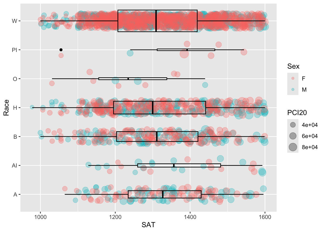
Suppose we decide that we want to see the boxplot not for the overall data for each Race but for each combination of Race and Sex. The way to do this is to tell ggplot that fill won’t be static (set to NA) but will depend on the value of Sex. This change requires that a new aes() be added to boxplot with fill = Sex included. We could have also added color = Sex as well, but the lines would not be visible against the background of colored jitter points.
student_RaceSexPCISAT |>
  ggplot(aes(Race, SAT))+
    geom_jitter(aes(size = PCI20,
                   color = Sex),
               alpha = 0.3,
               width = 0.25) +
    geom_boxplot(aes(fill = Sex),
                 color = "black",
                 varwidth = TRUE) +
    coord_flip()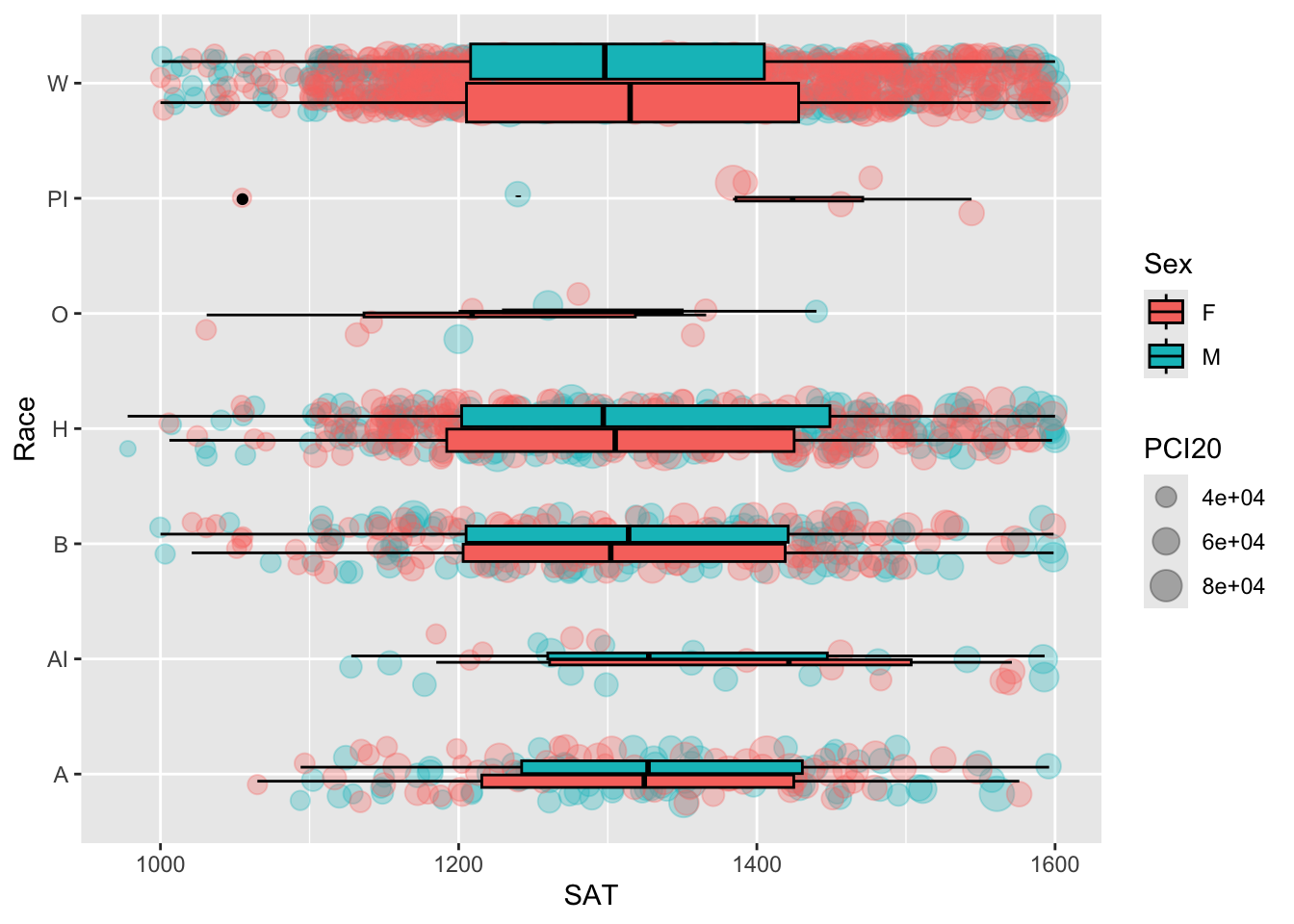
We noted just above that we could have added color = Sex to the aes() for boxplot but didn’t. We note here that if we had added this to the boxplot aes(), then color = Sex would have been in the statements for both jitter and boxplot. If it applies to both, then we can simply move color = Sex to the controlling ggplot aes() statement (and remove it from both geom aes() statements), as shown here.
student_RaceSexPCISAT |>
  ggplot(aes(Race, SAT, color = Sex))+
    geom_jitter(aes(size = PCI20),
               alpha = 0.3,
               width = 0.25) +
    geom_boxplot(aes(fill = Sex),
                 varwidth = TRUE) +
    coord_flip()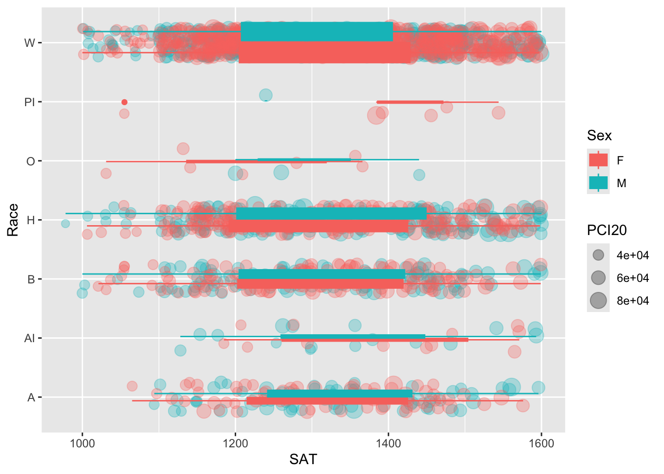
We don’t like this version as much as the previous one, but we wanted to demonstrate the relationships among the different aes() statements in the command.
Here are some resources so that you can learn more about geom_boxplot(): tidyverse.org, STHDA, R Graph Gallery.
Here are some resources so that you can learn more about geom_jitter(): tidyverse.org, STHDA, Statology, R Documentation.
4.9.11 Horizontal boxplot and jitter differentiated by one discrete and one continuous column wrapped by a facet: x, y, size, facet + horizontal boxplot() + point()
This graph represents the same data as shown in the previous section. The only difference is that we are using a facet_wrap() based on Sex instead of using a color in the plots.
student_RaceSexPCISAT |>
  ggplot(aes(Race, SAT)) +
    geom_jitter(aes(size = PCI20),
               alpha = 0.3,
               width = 0.25) +
    geom_boxplot(color = "blue",
                 fill = NA) +
    facet_wrap(~Sex) +
    coord_flip()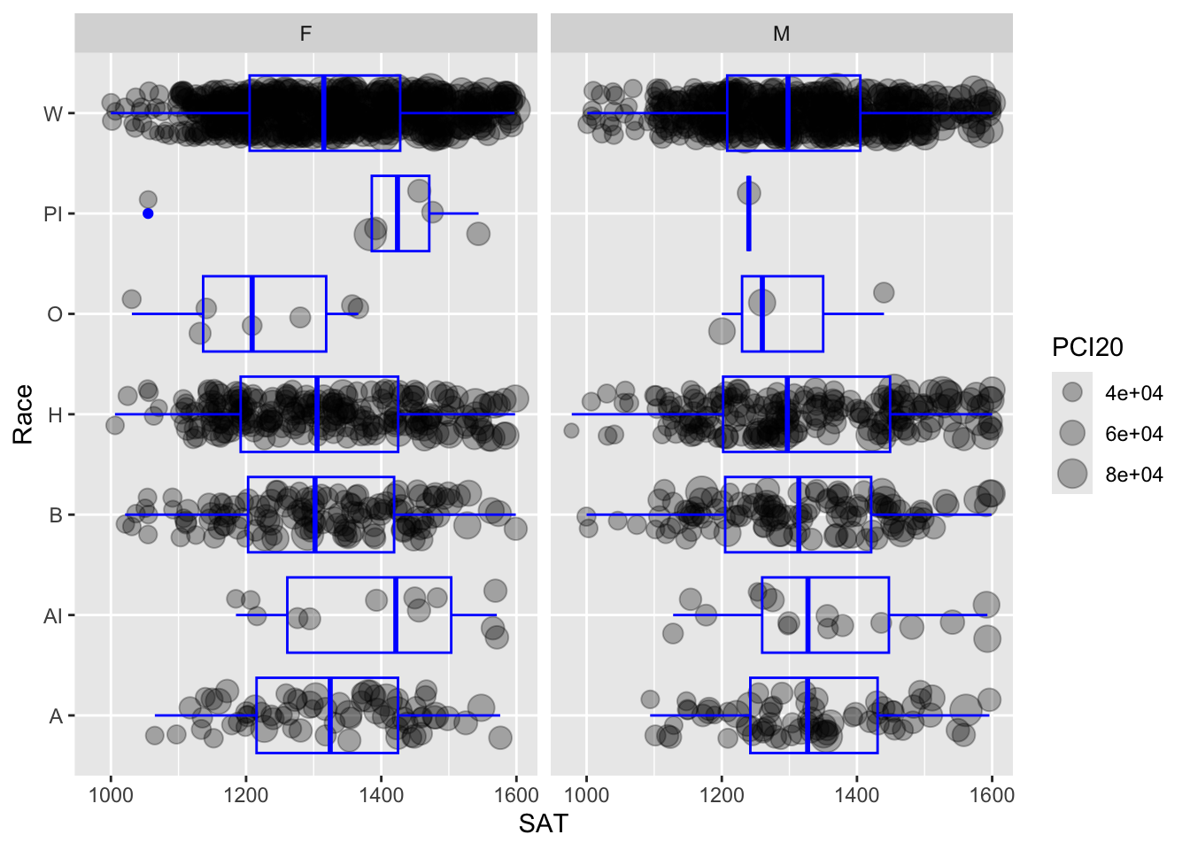
Here are some resources so that you can learn more about geom_boxplot(): tidyverse.org, STHDA, R Graph Gallery.
Here are some resources so that you can learn more about geom_jitter(): tidyverse.org, STHDA, Statology, R Documentation.
4.10 3 continuous, 2 discrete
In this last section, we display data based on five separate columns, with three of them being continuous. We have to make decisions very carefully here in order to help the reader interpret the data as easily as possible.
4.10.1 Horizontal boxplot and point differentiated by one discrete and two continuous columns wrapped by a facet: x, y, size, color, facet + horizontal boxplot() + jitter()
Here we are displaying information related to five columns:
SAT(continuous) plotted against each value ofRace(discrete).- A
pointplot with thesizeof the point determined byPCI20(continuous) and thecolordetermined byAge(also continuous). - A
boxplotofSATvalues for each value ofRace(since theggplotaes()statement specifiesRaceandSAT). - The width of each
boxplotis determined by the underlying count of data (sincevarwidth=TRUE). - Separate facets are created for each value of
Sex, so we should have eight separateboxplots(2 values ofSextimes 4 values ofRace).
student_WHBASATPCIAge |>
  ggplot(aes(Race, SAT)) +
  geom_point(aes(size = PCI20,
                 colour = Age),
             alpha = 0.3) +
  geom_boxplot(linewidth = 1,
               fill = NA,
               varwidth = TRUE) +
  facet_wrap(~Sex) +
  coord_flip()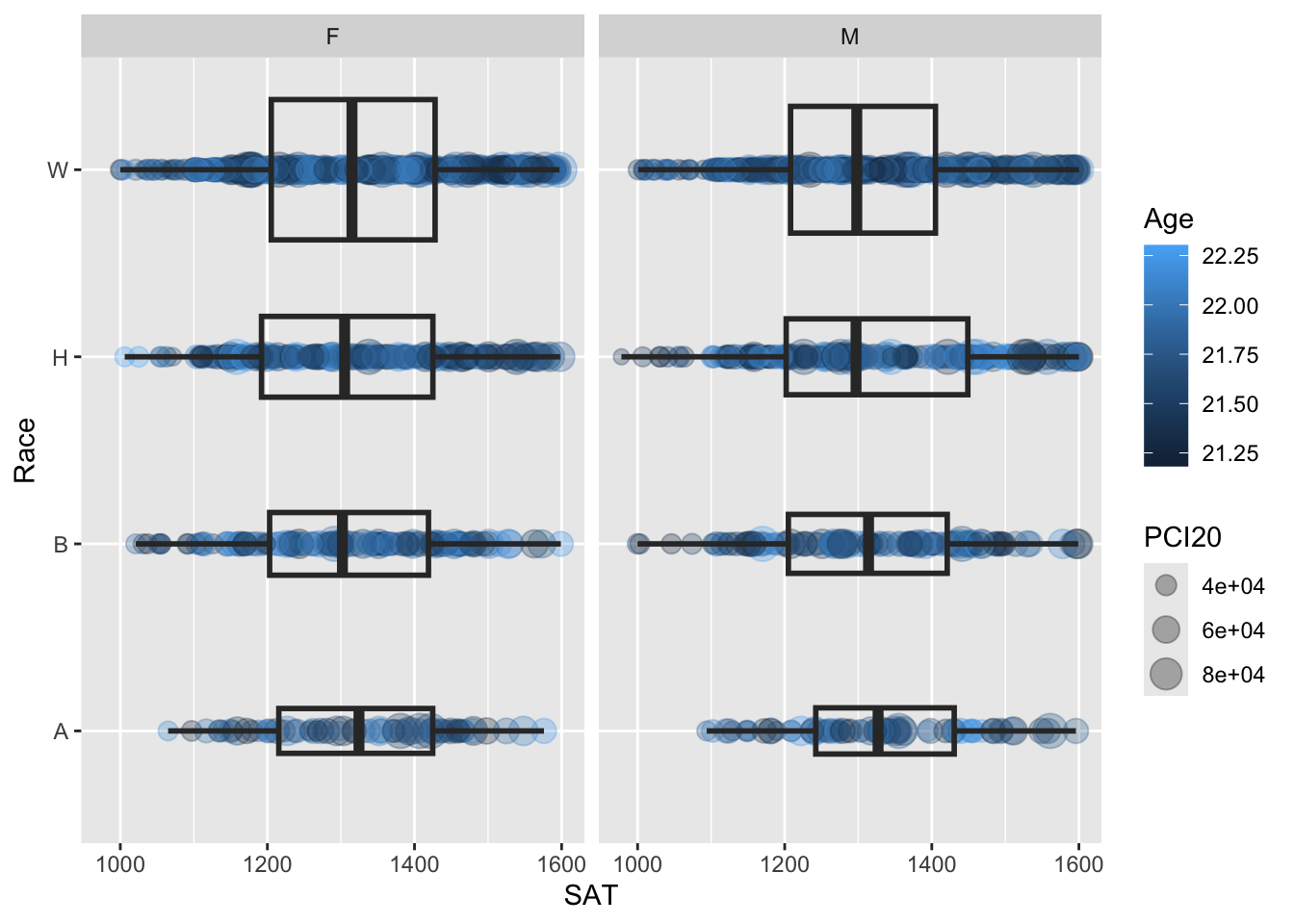
Here are some resources so that you can learn more about geom_boxplot(): tidyverse.org, STHDA, R Graph Gallery.
Here are some resources so that you can learn more about geom_point(): tidyverse.org, R for Data Science, STHDA.
4.10.2 Horizontal boxplot and jitter differentiated by one discrete and two continuous columns wrapped by a facet: x, y, size, color, facet + horizontal boxplot() + jitter()
We are displaying the exact same information that we did in the previous section. The problem with the previous graph is that the points ended up being plotted over each other; this makes it difficult to see just how much data there is (or isn’t).
To change this, we are making the simplest possible change — we are changing geom_point() with geom_jitter(). Everything else stays exactly the same. It is now much easier to see how much data there is for each combination of values of Race and Sex. The width of each boxplot drives the point home, but it’s reinforced with the number of visible points for each.
student_WHBASATPCIAge |>
  ggplot(aes(Race, SAT)) +
  geom_jitter(aes(size = PCI20,
                 colour = Age),
             alpha = 0.3) +
  geom_boxplot(linewidth = 1,
               fill = NA,
               varwidth = TRUE) +
  facet_wrap(~Sex) +
  coord_flip()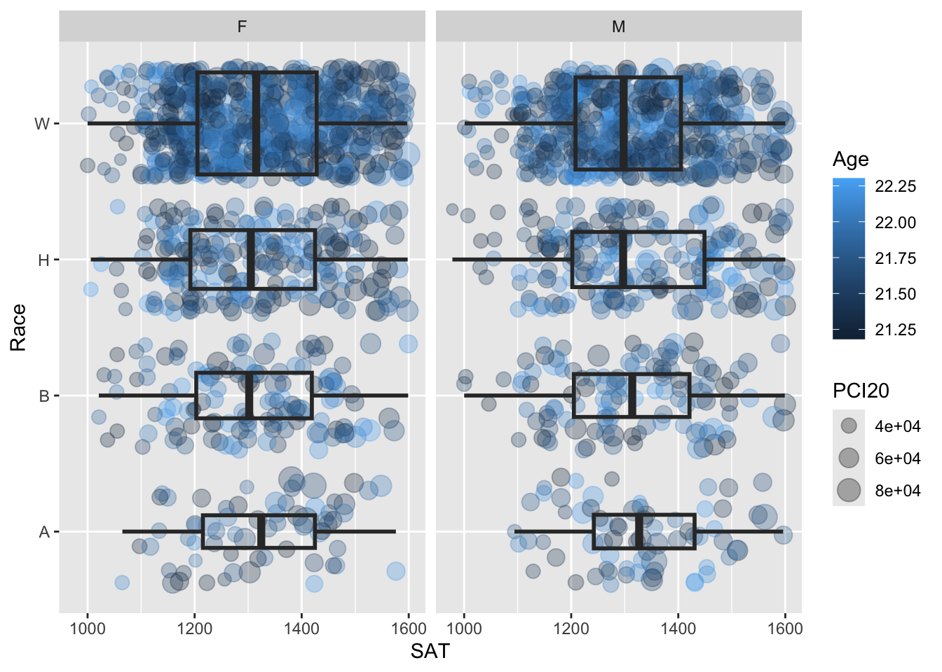
Here are some resources so that you can learn more about geom_boxplot(): tidyverse.org, STHDA, R Graph Gallery.
Here are some resources so that you can learn more about geom_jitter(): tidyverse.org, STHDA, Statology, R Documentation.
4.10.3 Horizontal violin and jitter differentiated by one discrete and two continuous columns wrapped by a facet: x, y, size, color, facet + horizontal violin() + jitter()
Again, we are displaying the same information as shown in the previous section but this time we want to display a more detailed representation of the distribution of data — that is, we want to use violin instead of boxplot.
This is as simple as replacing the call to geom_boxplot() with geom_violin() with the additional need to add the argument scale = "count" to ensure that the violin plots are sized according to the amount of underlying data.
student_WHBASATPCIAge |>
  ggplot(aes(Race, SAT)) +
  geom_jitter(aes(size = PCI20,
                 colour = Age),
             alpha = 0.3) +
  geom_violin(scale = "count",
              linewidth = 1,
              fill = NA) +
  facet_wrap(~Sex) +
  coord_flip()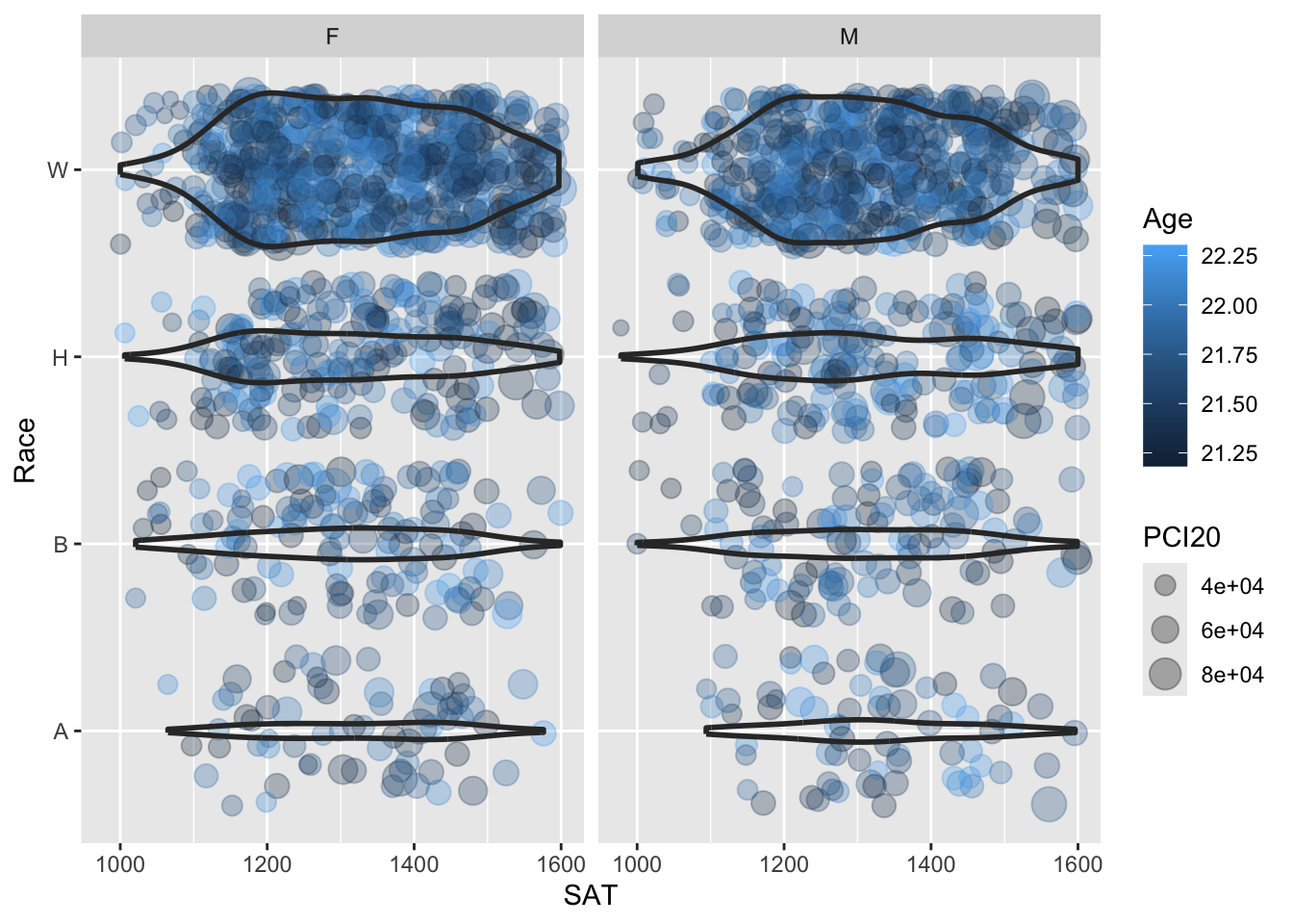
Here are some resources so that you can learn more about geom_violin(): tidyverse.org, STHDA, R Project, Geeks for Geeks.
Here are some resources so that you can learn more about geom_jitter(): tidyverse.org, STHDA, Statology, R Documentation.
5 Other resources
- R Graph Gallery
- R Graphics Cookbook, 2nd edition
- learnbyexample
- agroshare.is.ed.ac.uk: great site
- Details on modifying a theme is here.
