The conversion process
Scott: Lots of explanation needs to be added.
One of the more complicated concepts that the analyst has to deal with in R is the difference between wide data (as is typically used in spreadsheets) and long data (as is typically used in statistical analysis).
In this page we attempt to disambiguate the two concepts, show how to recognize wide data, and demonstrate how some tools in R can simplify the process of converting wide data to long data.
1 An example of wide data
We have downloaded some data from the Web representing the Honda Corporation’s self-reported vehicle sales from 2013 to 2020. Below is a screenshot of that data.
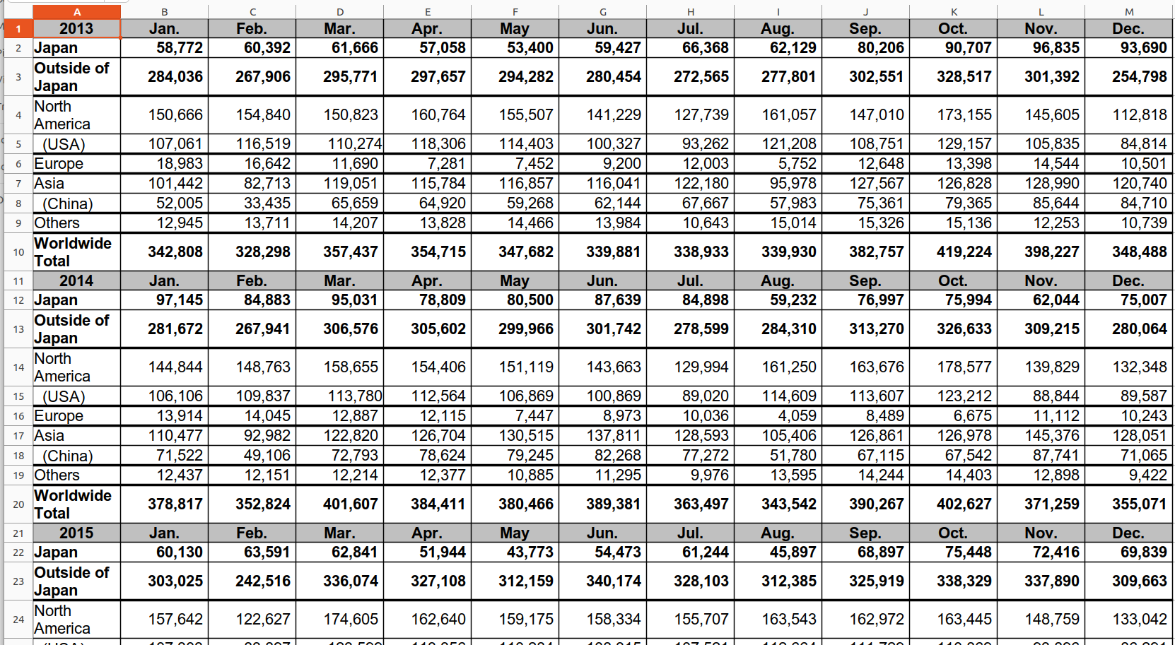 This is a typical layout for spreadsheet data—calendar months across the top, categories of data down the side, and a table of numbers in the body of the table. One slight complication is that there are eight tables (one for each year) of data stacked on top of each other.
This layout is good for spreadsheet workers as it makes it easier to see lots of data at once; unfortunately, it makes it difficult for R-based analysts to do their work.
2 Why long data is preferred over wide data
Much of why long data is preferred over wide data can be understood if you think about it in terms of a graph (without even knowing how R handles graphs).
Think of a typical graph with an X-axis and a Y-axis. Any plot (line, point, bar, etc.) in the graph by necessity shows a y value for a specific x value given a specific functional relationship. The only way that two functions can be plotted on the same graph is if they define some relationship between the same domains of x values and y values.
2.1 Baby name data
Consider the data frame in Figure 1 .
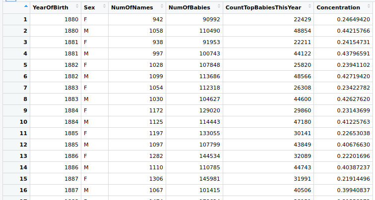
This has the following information about the names of babies born in specific years:
YearOfBirth: the year the baby was bornSex: the sex of the babyNumOfNames: the number of unique names assigned to the babies born in this year of this sexNumOfBabies: the number of babies born in this year of this sexCountTopBabiesThisYear: the number of babies born in this year of this sex who had one of the ten most popular namesConcentration: the percentage of babies born in this year of this sex who had one of the ten most popular names (i.e.,CountTopBabiesThisYear/NumOfBabies)
Let’s think about different graphs that we might set up:
x = YearOfBirthandy = NumOfNames. We might plot one line showing the number of unique male names and another showing the number of unique female names.x = YearOfBirthandy = Concentration. We might plot the weighted average concentration for both male and female baby names born in a certain year.x = Sexandy = NumOfBabies. We might plot a bar graph comparing the total number of male versus female babies born in the 1940s.
Notice for each of these examples, the function (described in the bullet points above) tells you a value from the y domain that results when given a value in the x domain. To be more specific, consider the first example: Once you tell me the YearOfBirth (a number in the x domain), I can tell you the appropriate NumOfNames value (a number in the y domain).
Here is a description of a graph that R can’t show. Suppose that we want to have a graph with two line plots. The x values for each are YearOfBirth. We would like to compare the total number of babies born each year with the number of babies born that year with popular names. The problem is that the y values are NumOfBabies and CountTopBabiesThisYear—two different domains.
A different way to think about graphs that work versus graphs that don’t work: The former takes x values from the same data frame column and y values from the same data frame column. In this example that does not work, the y values are taken from different columns. Thus, they can’t be graphed.
We must point out that this doesn’t seem right! Both of these y values are integers. Clearly, the y axis would have integer values on it. Why doesn’t this work?!? Well, this can work with R, but we have to change the data from wide data to long data. More on this below.
2.2 Student information data
Now that you’ve seen wide data, let’s take a look at long data. Here is a screenshot of a data frame containing information about (fictional) students.
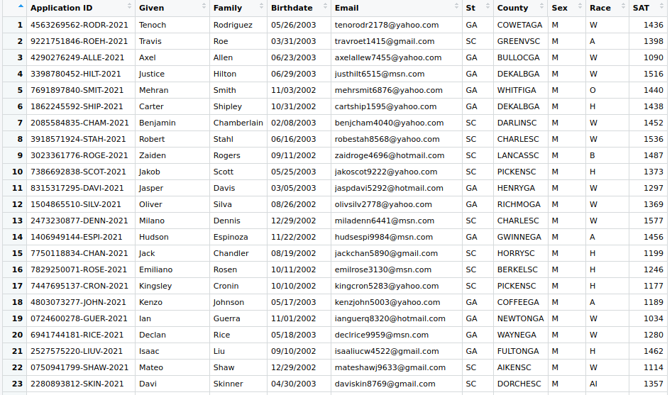
The primary graphs (and, hence, functional relationships) that can be created on this data frame relate to those showing relationships between some subset of applicants (that is, specific Application IDs) and his/her SAT scores. You might create any of the following graphs:
- Bargraphs showing the average
SATscores for eachRace(i.e.,x = Raceandy = SAT) - Box charts showing the spread of
SATscores for eachSt - Average
SATscore for everyCounty, displayed as a set of bar graphs
In each case, defining the x is a process of selecting some subset of rows, while the process of defining the y simply means choosing the value from the SAT column.
This is typical of long data. Most of the columns are used as selectors for rows while one particular column contains the y values. Sometimes, multiple columns contain different y values that might be used. The analyst must realize, however, that no single graph can contain y values from two different columns.
3 Clean up the spreadsheet
We know what wide data is; we know what long data is. Let’s now go through the process of converting data from wide to long. We will use the Honda vehicle production data above as our example.
Before this data can be exported into a CSV file, we need to clean up the spreadsheet. This will involve creating a CSV file. Notice the main differences between a spreadsheet and a CSV file:
- Spreadsheet
-
Look at the information in cell
B3in Section 2.1 — it’s284,036. What does this represent? It’s the “January 2013 production Outside of Japan.” Note that we used the column header (Jan.), the table corner (2013), and the row header (Outside of Japan). In this case, we could have used the column header or simply said that we wanted the 2nd value in the row. - CSV file
-
A CSV file is composed of rows. We do not have table corners available to us. We need to have all the information needed to describe the row available in the row itself! Take a look at the re-arrangement in Figure 3 of the Honda data:
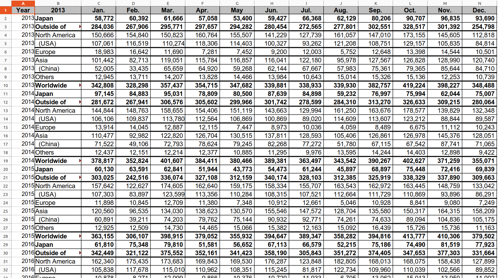
What we have done is create a new column A and put the Year from the table corner into each row. Now, if we describe the meaning of 284,036 (in cell C3), we have the information available on that row: “It’s the January production (meaning the third cell) for 2013 Outside of Japan.”
Let’s export that data into a CSV file. It results in the cell contents shown in Figure 4.
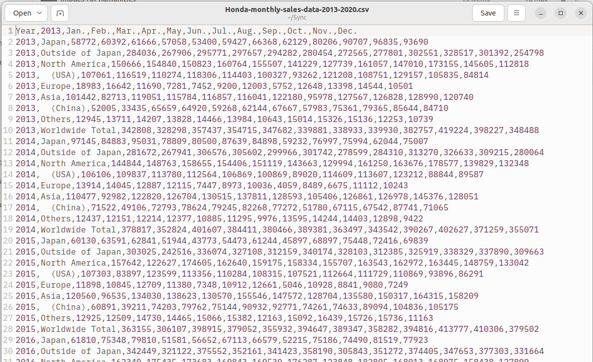
Look at the following:
- Row 1: This is the header row. It provides the interpretation of each row that follows. It tells us that the 1st value is “Year”, the 2nd value is “2013” (this is a mistake; we should have changed it to “Area”…these things happen!), and the third value is “January”.
- Row 3:
2013,Outside of Japan, 284036, 267906,.... We can tell, just by using the interpretation given by the header row that284036is the “January 2013 production Outside of Japan.”
Thus, the CSV file is basically set up as we need it so that we can use it in R.
4 Import into R
We use the following command to read the exported CSV file into a data frame named honda_data.
Use the following to display the top few rows of honda_data. Note that it wraps around to the last few columns on a second set of lines.
  Year            X2013   Jan.   Feb.   Mar.   Apr.    May   Jun.   Jul.   Aug.
1 2013            Japan  58772  60392  61666  57058  53400  59427  66368  62129
2 2013 Outside of Japan 284036 267906 295771 297657 294282 280454 272565 277801
3 2013    North America 150666 154840 150823 160764 155507 141229 127739 161057
4 2013            (USA) 107061 116519 110274 118306 114403 100327  93262 121208
5 2013           Europe  18983  16642  11690   7281   7452   9200  12003   5752
6 2013             Asia 101442  82713 119051 115784 116857 116041 122180  95978
    Sep.   Oct.   Nov.   Dec.
1  80206  90707  96835  93690
2 302551 328517 301392 254798
3 147010 173155 145605 112818
4 108751 129157 105835  84814
5  12648  13398  14544  10501
6 127567 126828 128990 120740
Here is some information about the data:
      Year         X2013                Jan.             Feb.
 Min.   :2013   Length:72          Min.   :  8569   Min.   :  5700
 1st Qu.:2015   Class :character   1st Qu.: 59790   1st Qu.: 37767
 Median :2016   Mode  :character   Median :107182   Median : 95217
 Mean   :2016                      Mean   :149886   Mean   :130184
 3rd Qu.:2018                      3rd Qu.:180148   3rd Qu.:161586
 Max.   :2020                      Max.   :476794   Max.   :416614
      Mar.             Apr.             May              Jun.
 Min.   :  5165   Min.   :     0   Min.   :     0   Min.   :  2584
 1st Qu.: 62547   1st Qu.: 42954   1st Qu.: 42619   1st Qu.: 61465
 Median :114395   Median :112858   Median :110904   Median :115643
 Mean   :153681   Mean   :140067   Mean   :141059   Mean   :152924
 3rd Qu.:200522   3rd Qu.:169025   3rd Qu.:172272   3rd Qu.:185272
 Max.   :487323   Max.   :443654   Max.   :460163   Max.   :449394
      Jul.             Aug.             Sep.             Oct.
 Min.   :  4827   Min.   :  3638   Min.   :  8030   Min.   :  6675
 1st Qu.: 62258   1st Qu.: 50309   1st Qu.: 67049   1st Qu.: 67284
 Median :109666   Median :113636   Median :120908   Median :124318
 Mean   :145704   Mean   :146049   Mean   :158802   Mean   :161018
 3rd Qu.:197908   3rd Qu.:181482   3rd Qu.:199936   3rd Qu.:182846
 Max.   :429636   Max.   :434399   Max.   :472698   Max.   :479680
      Nov.             Dec.
 Min.   :  8135   Min.   :  5353
 1st Qu.: 64143   1st Qu.: 65748
 Median :130696   Median :108996
 Mean   :161985   Mean   :145489
 3rd Qu.:212170   3rd Qu.:195740
 Max.   :492757   Max.   :428434
5 Change column names if necessary
We noted above one problem with the CSV file: the second column is named X2013 when it should be called Area. We also do not like that eleven of the twelve months have a period at the end. We can use the rename() function to change all of these column names:
Let’s make sure that it worked. The names() function lists all the column names for a data frame.
 [1] "Year" "Area" "Jan"  "Feb"  "Mar"  "Apr"  "May"  "Jun"  "Jul"  "Aug"
[11] "Sep"  "Oct"  "Nov"  "Dec"
Those all look right.
6 Use pivot_longer() to create long data.
R provides a function pivot_longer to change from wide data to long data. You need to give it four pieces of information:
data frame: Of course, you’ll have to tell it what data frame it’s going to work onnames_to: The data frame has multiple columns that you would like to combine into one—these are all names of aMonth.cols: Here you need to list (in ac()function) the names of the columns exactly as they appear in the data frame.values_to: All of the values in the old month columns will now appear in a column by themselves. What should the name of the column be? In this case, it will beSoldsince these represent units sold.
Here is the appropriate command:
7 Examine the new data
Let’s take a look at the new table:
# A tibble: 864 × 4
    Year Area  Month  Sold
   <int> <chr> <chr> <int>
 1  2013 Japan Jan   58772
 2  2013 Japan Feb   60392
 3  2013 Japan Mar   61666
 4  2013 Japan Apr   57058
 5  2013 Japan May   53400
 6  2013 Japan Jun   59427
 7  2013 Japan Jul   66368
 8  2013 Japan Aug   62129
 9  2013 Japan Sep   80206
10  2013 Japan Oct   90707
# ℹ 854 more rows
It now has 864 rows! This is definitely a long table! Why does it have so many rows? Well, the old table honda_data had 72 rows. Each table had 12 columns, so 72x12 is 864.
Let’s take a look at a summary of the table:
8 Clean up the new data
We know that both Area and Month have limited numbers of values that they can take and are prime candidates for becoming factors. Let’s make it so.
8.1 Work on Area
First, let’s convert Area to a factor and list out the names of the factor levels:
[1] "(China)"          "(USA)"            "Asia"             "Europe"
[5] "Japan"            "North America"    "Others"           "Outside of Japan"
[9] "Worldwide Total"
We can also see how many rows take on each different factor level:
# A tibble: 9 × 2
  Area                 n
  <fct>            <int>
1 (China)             96
2 (USA)               96
3 Asia                96
4 Europe              96
5 Japan               96
6 North America       96
7 Others              96
8 Outside of Japan    96
9 Worldwide Total     96
Notice those two factor levels with parentheses. Let’s rename those and remove the parentheses in each:
Again, let’s take a look at the levels of the Area factor to see if the above command worked:
[1] "China"            "USA"              "Asia"             "Europe"
[5] "Japan"            "North America"    "Others"           "Outside of Japan"
[9] "Worldwide Total"
These factor levels seem to be in a somewhat random order. We want to reorder them so that they are larger divisions to smaller divisions (this is arbitrary but it’s what we have chosen to do for this example). We will validate that it works by using the levels() function again.
honda_long$Area <-
  factor(honda_long$Area,
         levels = c("Worldwide Total",
                    "Japan", "Outside of Japan", "North America",
                    "Asia", "Europe", "Others",
                    "USA", "China")
         )
levels(honda_long$Area)
[1] "Worldwide Total" "Japan" "Outside of Japan" "North America"
[5] "Asia" "Europe" "Others" "USA"
[9] "China" The Area factor is now ready to use.
8.2 Work on Month
We will now go through the same process with Month. Let’s convert it to a factor and list out the names of its levels:
[1] "Apr" "Aug" "Dec" "Feb" "Jan" "Jul" "Jun" "Mar" "May" "Nov" "Oct" "Sep"We can now see how many rows take on each different factor level:
# A tibble: 12 × 2
   Month     n
   <fct> <int>
 1 Apr      72
 2 Aug      72
 3 Dec      72
 4 Feb      72
 5 Jan      72
 6 Jul      72
 7 Jun      72
 8 Mar      72
 9 May      72
10 Nov      72
11 Oct      72
12 Sep      72
All of these factor level names seem fine, but they are in alphabetical order. As we know, the months aren’t in alphabetical order. Let’s change that right now with the factor() function:
honda_long$Month <-
  factor(honda_long$Month,
         levels = c("Jan", "Feb", "Mar", "Apr",
                    "May", "Jun", "Jul", "Aug",
                    "Sep", "Oct", "Nov", "Dec"))
levels(honda_long$Month)
[1] "Jan" "Feb" "Mar" "Apr" "May" "Jun" "Jul" "Aug" "Sep" "Oct" "Nov" "Dec"The Month factor is now ready to use.
9 Check the new, long data
Let’s go back and look at a summary of the long data:
      Year                    Area         Month          Sold
 Min.   :2013   Worldwide Total : 96   Jan    : 72   Min.   :     0
 1st Qu.:2015   Japan           : 96   Feb    : 72   1st Qu.: 54960
 Median :2016   Outside of Japan: 96   Mar    : 72   Median :112244
 Mean   :2016   North America   : 96   Apr    : 72   Mean   :148904
 3rd Qu.:2018   Asia            : 96   May    : 72   3rd Qu.:189256
 Max.   :2020   Europe          : 96   Jun    : 72   Max.   :492757
                (Other)         :288   (Other):432
In the Area and Month columns, we now have a lot more information immediately available since they have been defined to be factors.
Check the data itself:
# A tibble: 6 × 4
   Year Area  Month  Sold
  <int> <fct> <fct> <int>
1  2013 Japan Jan   58772
2  2013 Japan Feb   60392
3  2013 Japan Mar   61666
4  2013 Japan Apr   57058
5  2013 Japan May   53400
6  2013 Japan Jun   59427
The original wide honda_data data frame has now been fully converted to a useful long honda_long data frame. It’s tedious but R handles most of the difficult steps for you.
