Multiple graphs
A common task for an IR professional is to create a document (HTML, PDF, or Word) that shows information for separate entities (departments, classes, professors, etc.). The combination of R and Quarto does not make this as easy as one might hope…but it is possible to create such a report.
This page goes through the following steps. You will probably set echo to FALSE for all of the code blocks in this document when you give it to whomever asked for it. For now, we’ll show the code.
Preparation: Read in the usual libraries.Read in data: Read in the data that you’ll need.Calculations: Calculate the data that you’ll need that does not already exist.Multiple graphs: Create the graphs with a single block of code instead of having to repeat a set of code multiple times, one for each section.
We have made the structure of the document as general as we could. We assume that each section has the following structure:
- The name of the department in the heading (which starts on a new page)
- A general introduction to the graph that applies to all departments
- A paragraph of text that is specialized for a particular department
- The
ggplot()graph for that department.
1 Preparation
Read in the necessary R libraries. The usual stuff.
Also defining some functions that we’ll need at the end.
2 Read in data
Read in the necessary data. Using the usual read_csv() statements, we create the following data frames: courses, enroll, terms, and subjects.
3 Calculations
Calculate new data from the data we’ve read in. This includes whatever calculations that we need to do for this data. There is nothing here that is unusual or specialized for our need to create multiple graphs below.
grades = enroll |>
  left_join(courses, by = "CourseSectionID") |>
  left_join(subjects, by = "SubjectID") |>
  select(CourseSectionID,
         CourseID,
         SubjectName,
         StudentID,
         GradePoints,
         SubjectID) |>  # this one is new for today!
  mutate(CourseNum = as.integer(str_sub(CourseID, # This is new!
                                        str_length(CourseID)-2,
                                        str_length(CourseID))))
all_courses = grades |>
  mutate(CourseNum = as.integer(str_sub(CourseID,
                                        str_length(CourseID)-2,
                                        str_length(CourseID)))) |>
  group_by(SubjectID, SubjectName, CourseID,
           CourseNum) |>
  summarize(Enrollment = n(),
            GPA = round(mean(GradePoints, na.rm = TRUE), 2))
all_courses = all_courses |>
  mutate(CourseLevel = as.character(CourseNum %/% 100))
4 Multiple graphs
This is the new stuff. When you adapt this to your own document, you can put all of the following code into one big R code block. For our purposes, we are going to separate it into smaller blocks so that we can explain what’s going on.
This is the key to all that we do below. We need to create a vector of all of the SubjectID values so that we can reference them as we create all of the sections.
The my_plots variable will hold all of the ggplots() that we create below. It will be a list whose length will match the number of subjects. In the last line, we ensure that we can access the values in my_plots with the names of the subjects and not integer values.
The std_intro variable holds the text that is used at the beginning of each subject area. If you do not want to use this in your document, you should define this variable as the empty string (e.g., std_intro = "").
The special_intro variable will hold all of the introductory text that we use for a specific department. These lines create the variable as a list with as many items as there are subjects, specifies that they can be referenced by the names of the departments, and then initializes the contents of each to be an empty string.
Now that the special_intro variable has been created and initialized, it’s time to put appropriate values for the departments that need them. Notice that we have only put values for two departments. We could have written text for each department if we had desired to. Also, the paste() function concatenates the strings it is given while adding a space in-between each one.
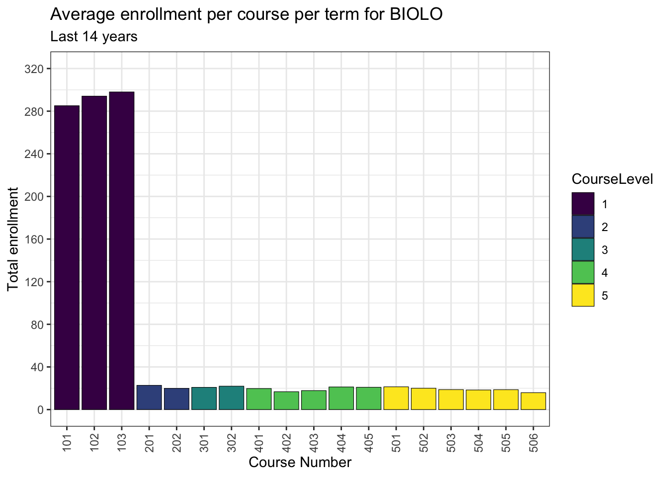
Now it is time to create the plots for each department. None of this code is specialized for printing these multiple graphs other than in line 8 where the ggplot() is assigned to my_plots[[my_subject]]. We will use this value below when we create the sections.
I would encourage you to make sure that you have defined the graph correctly before you begin to write this type of document. Knowing the code is error-proof will make it easier to debug while you are going through this process.
for (my_subject in all_subjects) {
  temp_courses = all_courses |>
    filter(SubjectID == my_subject)

  my_plots[[my_subject]] <-
    ggplot(temp_courses,
           aes(x = as.character(CourseNum),
               y = Enrollment / 28,
               fill = CourseLevel)) +
      geom_bar(stat = "identity") +
      geom_col(color = "black", linewidth=0.2) +
      labs(title = str_c("Average enrollment per course per term for",
                         my_subject, sep = " "),
           subtitle = "Last 14 years",
           x = "Course Number",
           y = "Total enrollment") +
      scale_x_discrete(guide = guide_axis(angle = 90)) +
      scale_y_continuous(limits = c(0, 320),
                         breaks = c(0, 40, 80, 120, 160,
                                    200, 240, 280, 320)) +
      theme_bw() +
      scale_fill_viridis_d()
}
We now have everything that we need to create the sections and their associated text and graphs. The following code does just that. You shouldn’t have to change the code in this section. While you cannot see it in this document, we have set the following execution option at the top of the block of code just below:
#| output: asisThis will not work without it. Again, this goes at the top of the following block of code — without it, it will not work!
Also, as you can see, this code does just what we said it would do: it prints the header, the standard introduction, the specialized introduction, and then the plot. I want to emphasize that there is no code or text in this document after the following block of R code. Everything after it is generated by these few lines.
for (my_subject in all_subjects) {
  print_header(my_subject)
  print_para(std_intro)
  print_para(special_intro[[my_subject]])
  print_plot(my_plots[[my_subject]])
}
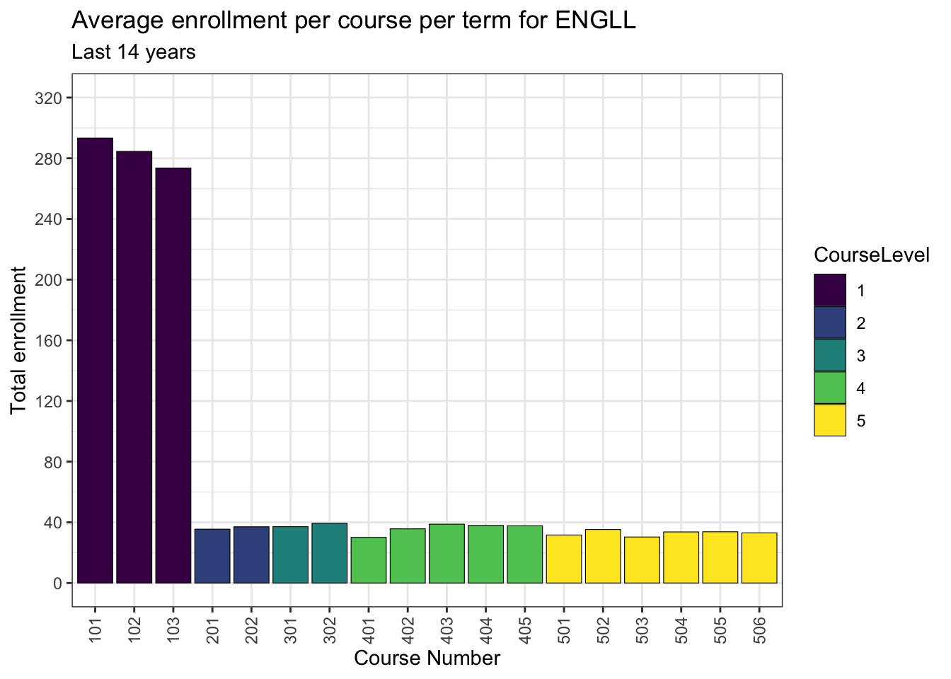
4.1 ENGLL
This is my standard intro for all of the plots. I’m writing it this way in order to make it easier to compose.
This is my special intro for the English Language and Literature area. I can write anything that I want.
4.2 HISTO
This is my standard intro for all of the plots. I’m writing it this way in order to make it easier to compose.

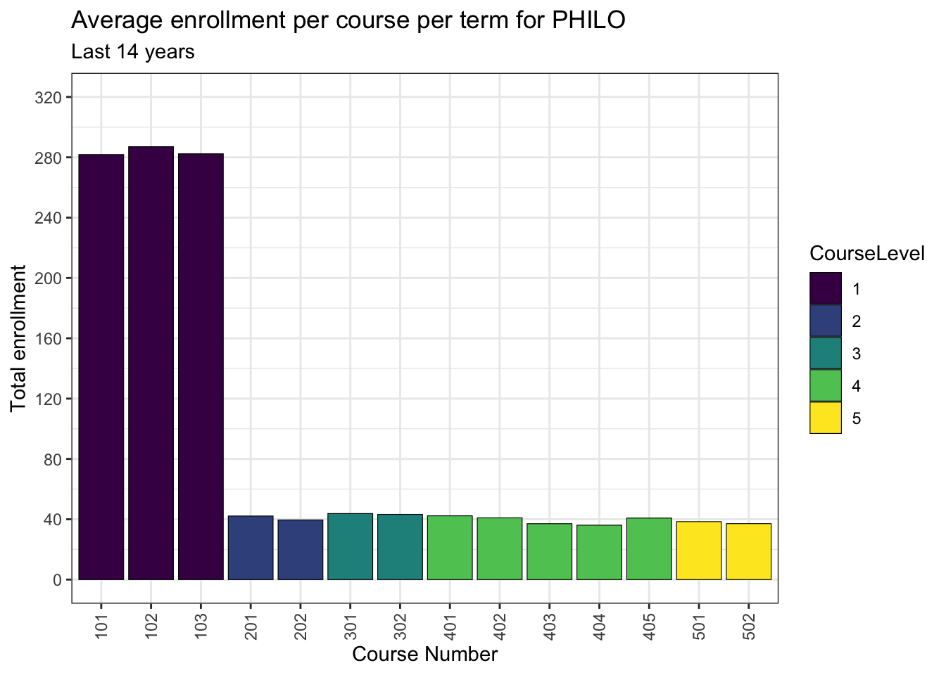
4.3 PHILO
This is my standard intro for all of the plots. I’m writing it this way in order to make it easier to compose.
4.4 POLSC
This is my standard intro for all of the plots. I’m writing it this way in order to make it easier to compose.

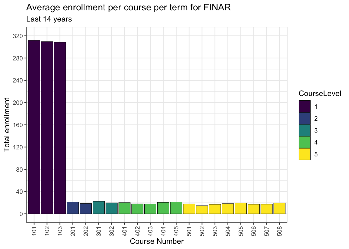
4.5 FINAR
This is my standard intro for all of the plots. I’m writing it this way in order to make it easier to compose.
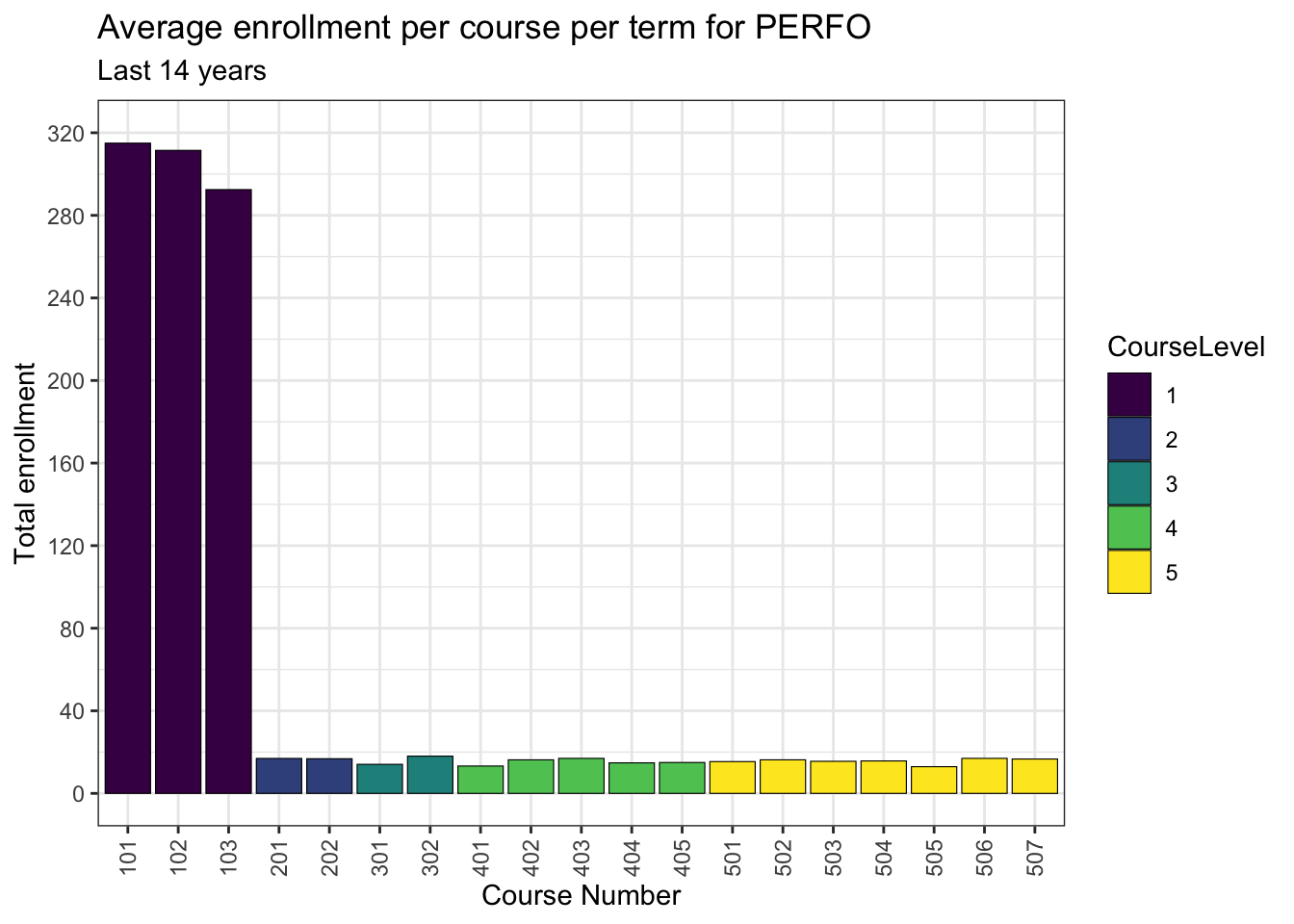
4.6 PERFO
This is my standard intro for all of the plots. I’m writing it this way in order to make it easier to compose.
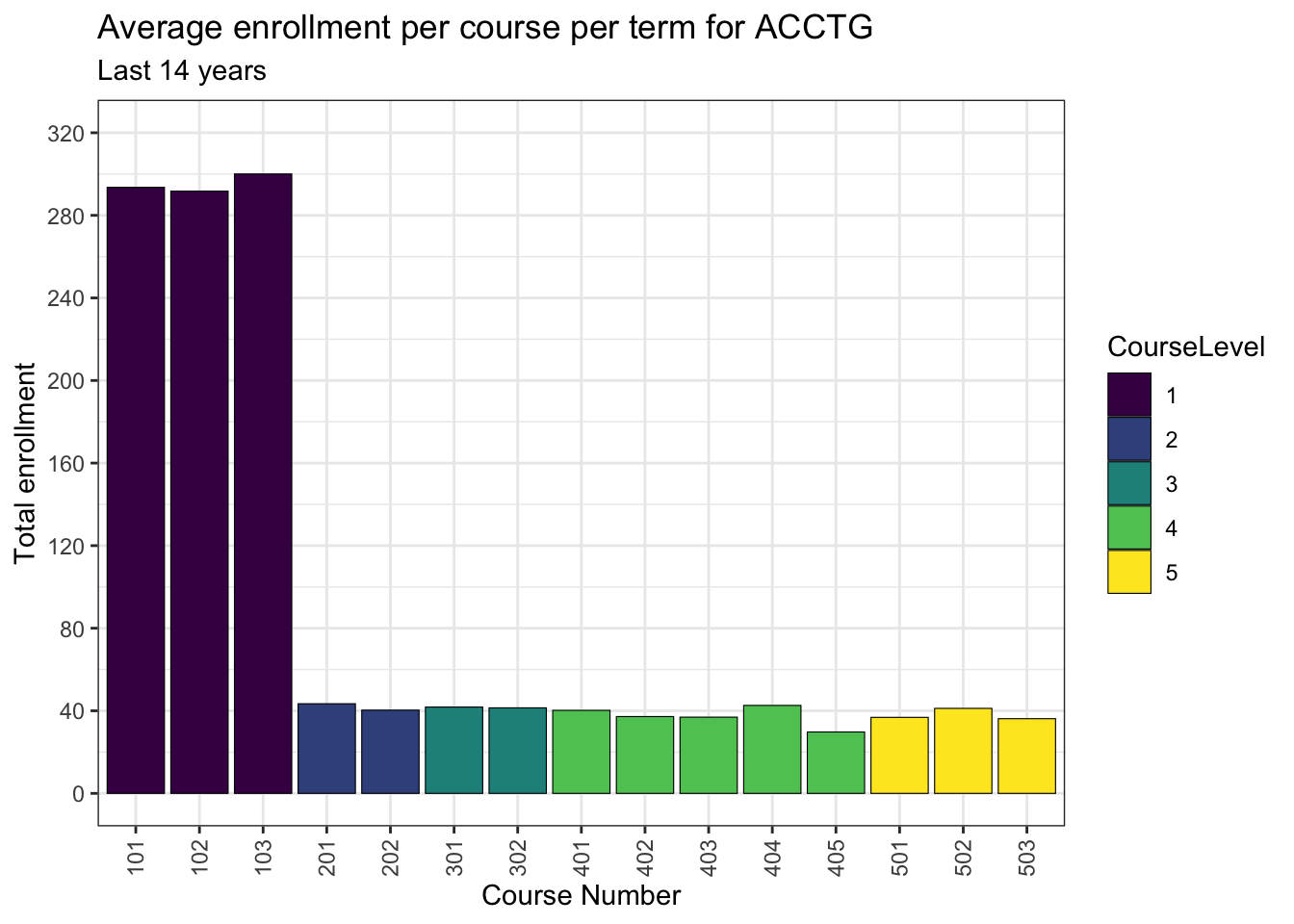
4.7 ACCTG
This is my standard intro for all of the plots. I’m writing it this way in order to make it easier to compose.
This is my intro for ACCTG. I will say something just for them.
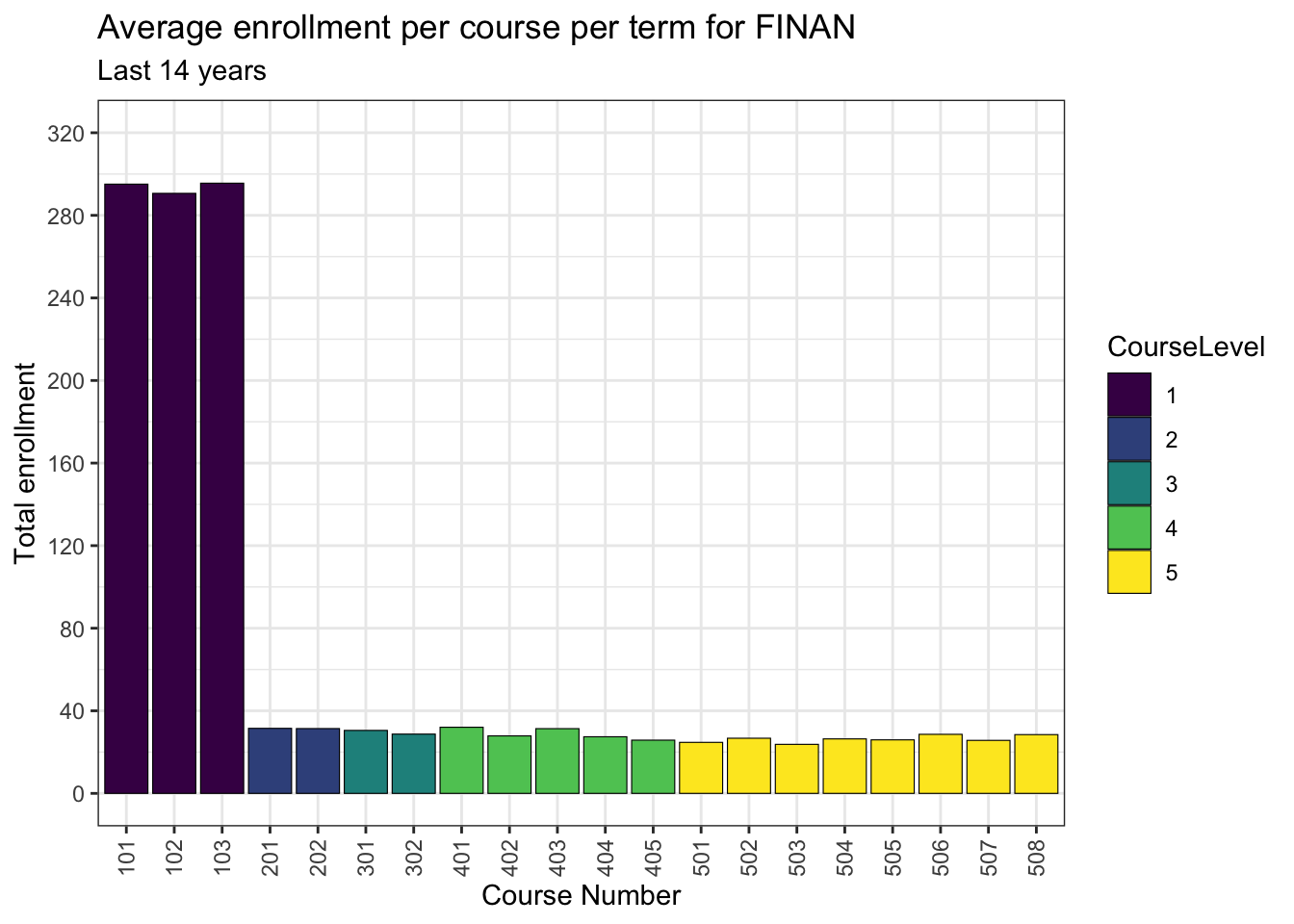
4.8 FINAN
This is my standard intro for all of the plots. I’m writing it this way in order to make it easier to compose.
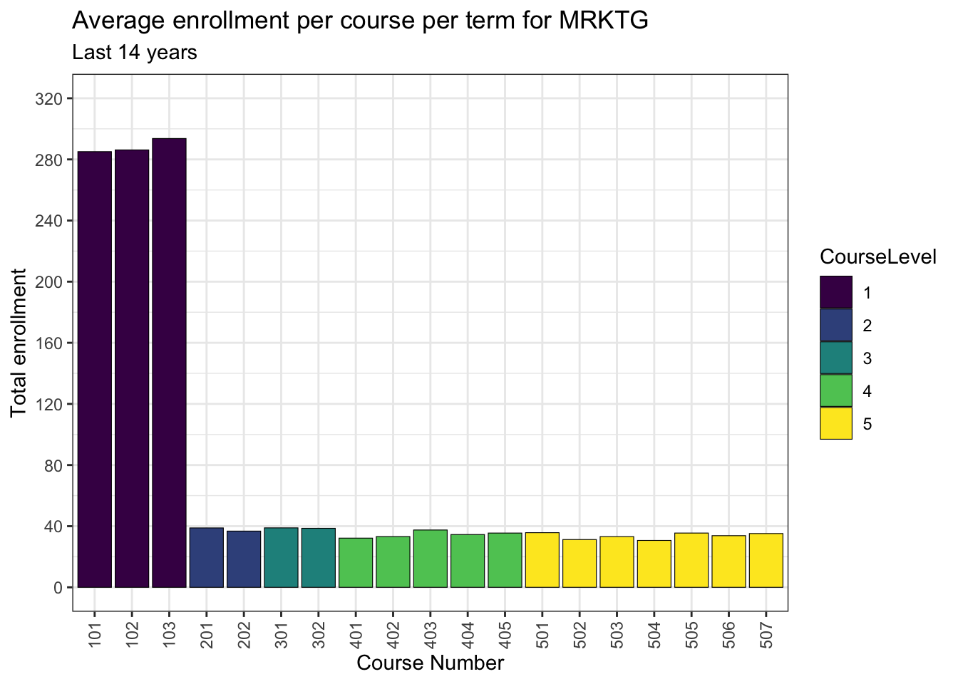
4.9 MRKTG
This is my standard intro for all of the plots. I’m writing it this way in order to make it easier to compose.
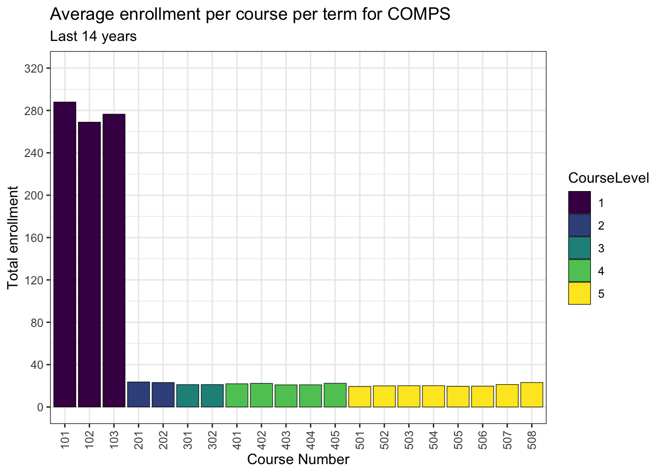
4.10 COMPS
This is my standard intro for all of the plots. I’m writing it this way in order to make it easier to compose.
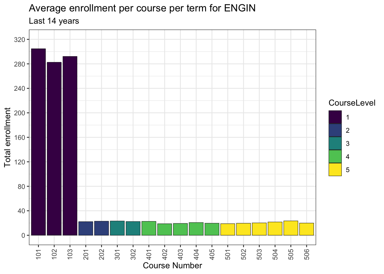
4.11 ENGIN
This is my standard intro for all of the plots. I’m writing it this way in order to make it easier to compose.
4.12 BIOLO
This is my standard intro for all of the plots. I’m writing it this way in order to make it easier to compose.
