# A tibble: 2,000 × 2
   PCI20   SAT
   <dbl> <dbl>
 1 22644  1191
 2 29738   978
 3 29895  1061
 4 29895  1068
 5 32702  1031
 6 32702  1162
 7 32702  1165
 8 32702  1186
 9 32702  1197
10 32702  1204
# ℹ 1,990 more rowsIllustrative graphing example
1 Gathering the data
The first step of any graph creation process is ensuring that you have the data that you need.
We’re going to start with the student_econ data frame; specifically, we are focusing on PCI20 and SAT:
As we change what we are graphing, we will continue to ensure that we have the data available.
2 Mapping
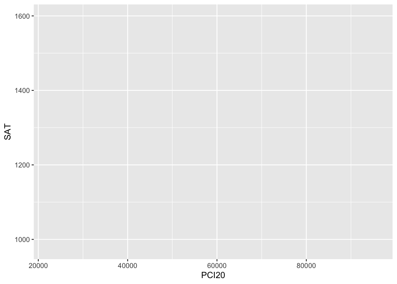
The very basics for defining a plot in ggplot are the data and the mapping. In Figure 1, we tell ggplot that we will be working with the data in student_econ, and that we want PCI20 on the x axis and SAT on the y axis.
You can clearly see that data is not plotted on the graph yet. That’s because we haven’t told it how we want it to be plotted. That will come next. But you can see that the axes seem to have the correct values on them.
3 Geometry
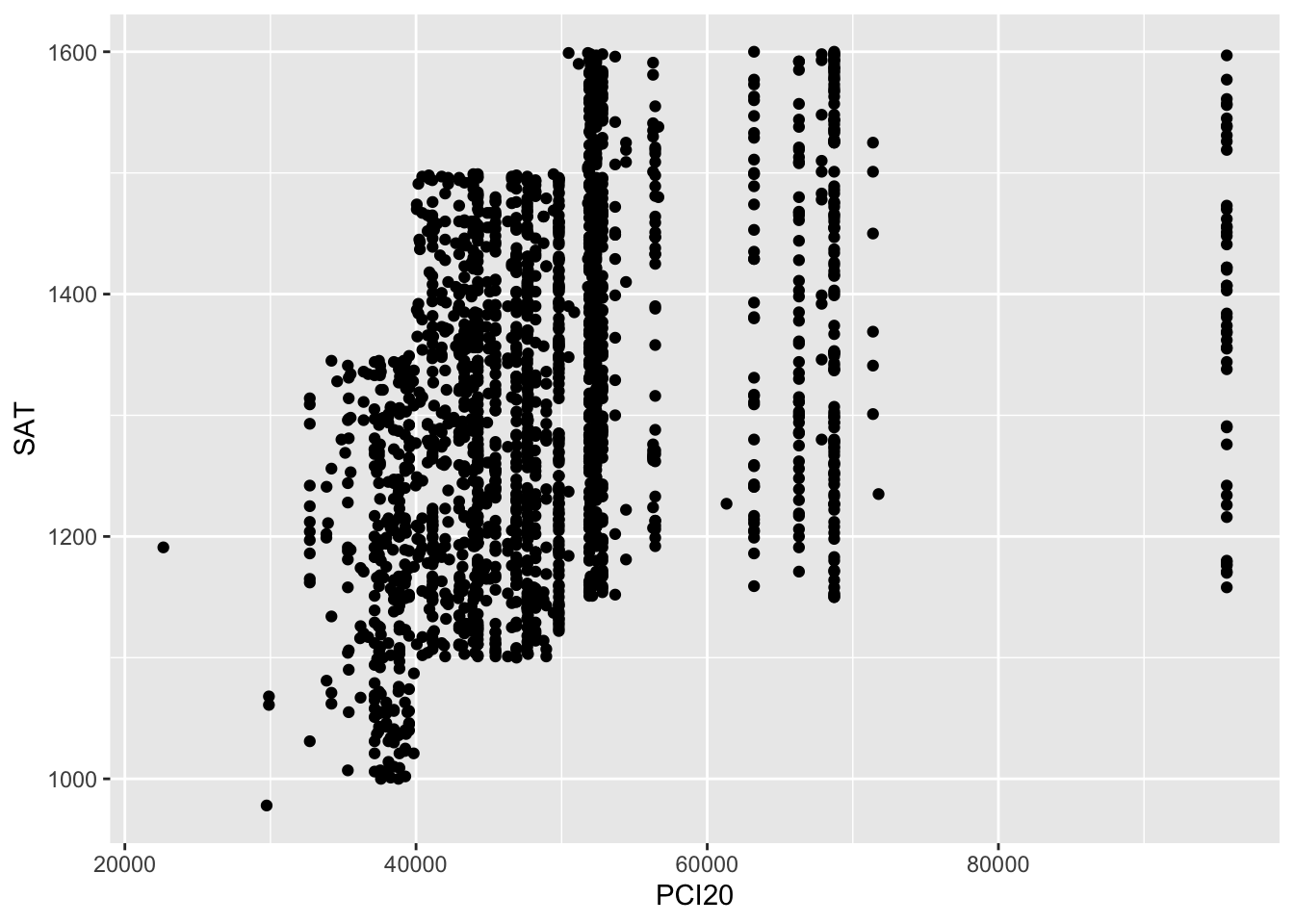
Next, in Figure 2, we tell ggplot that we want a scatterplot on the graph. It knows because of our specification of the x axis and y axis in the previous step that the scatterplot will involve these two data sets.
Speaking of the x axis and y axis, did you see that we no longer have either mapping = in the first argument of ggplot or x = and y = in the first two arguments to aes()? We can get away with these shortcuts because ggplot assumes that the first argument of ggplot() will be the mapping term and the first two arguments of aes() will be x and then y.
This is how we will write these terms from here on out, but you can write them however you’d like.
At this point, every point is the same color. We want to see if female students and male students score differently across different income levels.
First, let’s see that we have the data:
# A tibble: 2,000 × 3
   PCI20   SAT Sex
   <dbl> <dbl> <fct>
 1 22644  1191 M
 2 29738   978 M
 3 29895  1061 F
 4 29895  1068 F
 5 32702  1031 F
 6 32702  1162 F
 7 32702  1165 F
 8 32702  1186 F
 9 32702  1197 F
10 32702  1204 F
# ℹ 1,990 more rows
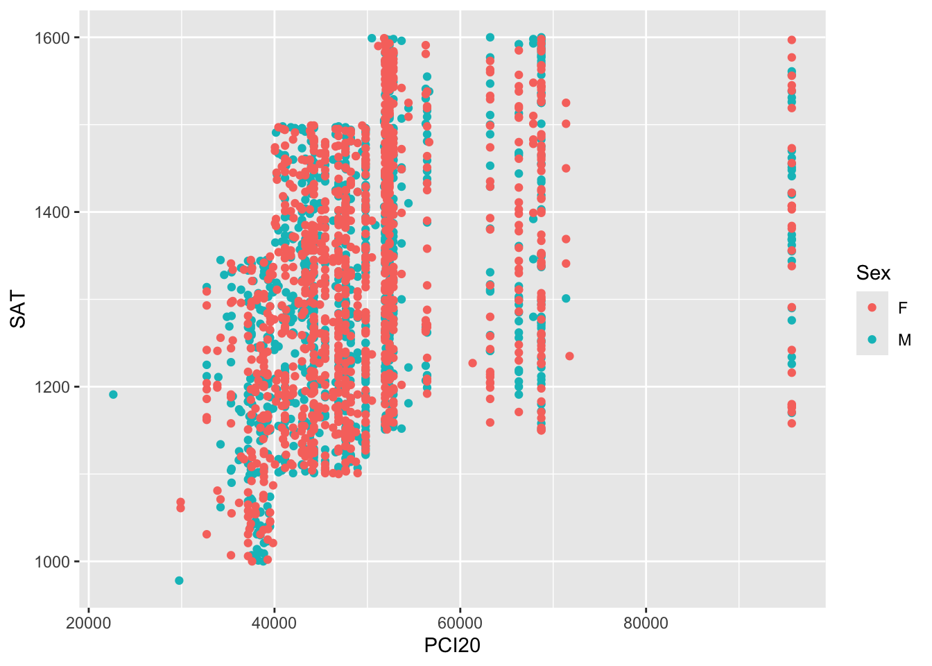
In Figure 3, we specify that the color (colour or color; they are synonyms and can be used interchangeably) of the plotted point should represent the Sex of the applicant. That’s the only change that has to be made; ggplot does the rest.
Suppose that for some reason that you want to change the colors that are used in the scatterplot. If the data have some correspondence to colors, then this would be a great feature to take advantage of. Alternatively, your organization might have a specific color palette that it likes to use; again, this would be a great way to apply that palette.
As you can see in Figure 4, you can change these colors with the scale_color_manual() function.
student_econ |>
  ggplot(aes(PCI20, SAT,
             colour = Sex)) +
geom_point() +
scale_color_manual(values = c("gold", "darkgreen"))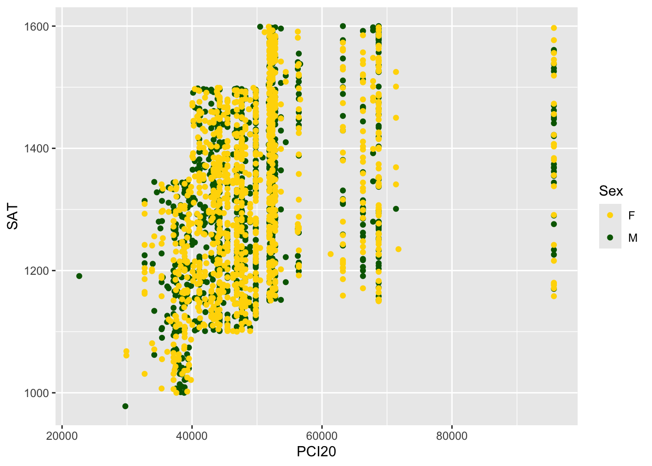
We’re having a bit of trouble seeing all of the plotted points since so many of them have the same x values. We can make them semi-transparent by using the alpha value in the plot. In Figure 5, this change is made on line 3. You’ll now be able to see where the points overlap.
student_econ |>
  ggplot(aes(PCI20, SAT,
             colour = Sex)) +
  geom_point(alpha = 0.5) +
  scale_color_manual(values = c("gold", "darkgreen"))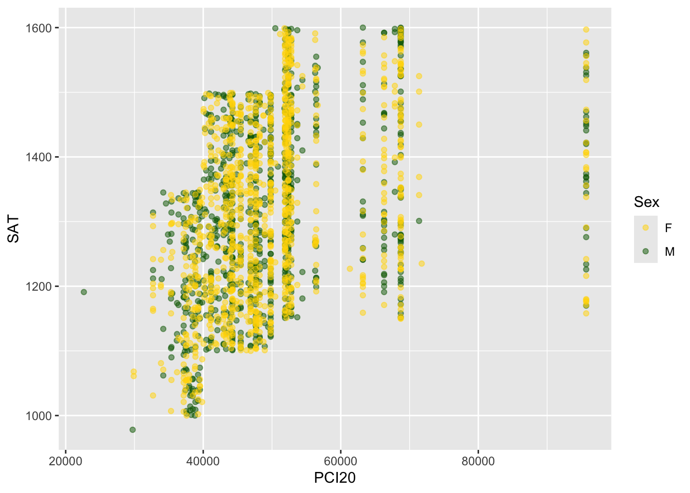
All of the above are useful for viewing the documents online, but sometimes we have to print these on black-and-white printers. If that’s the case, then you should make the changes as shown in Figure 6.
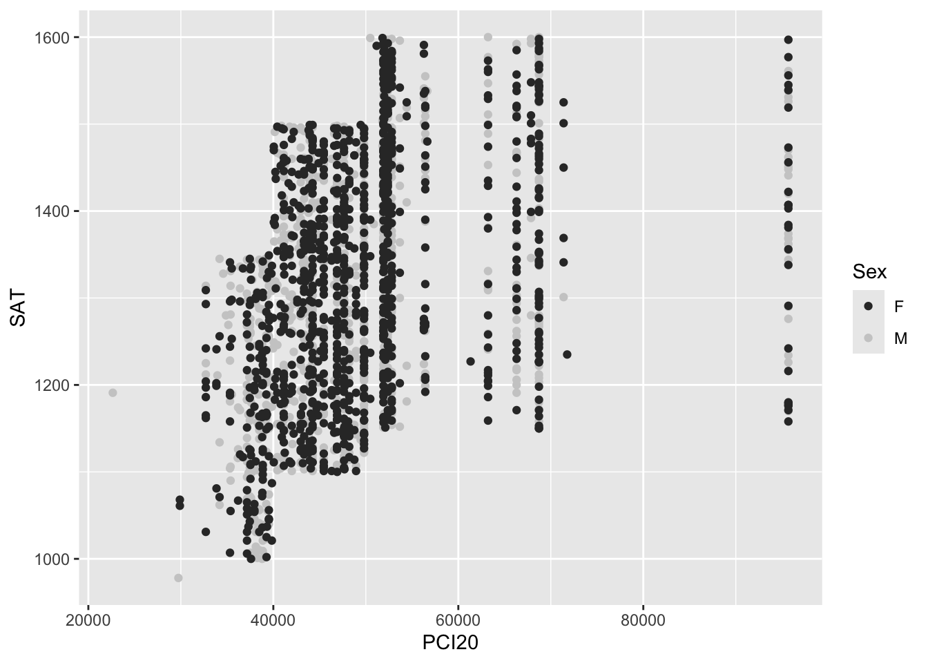
You might notice in the previous figure that the grey dots are difficult to see against the grey background. We fix this in Figure 7 with the addition of theme_classic() (as well as adding the alpha value again).
student_econ |>
  ggplot(aes(PCI20, SAT,
             colour = Sex)) +
  geom_point(alpha = 0.5) +
  scale_color_grey() +
  theme_classic()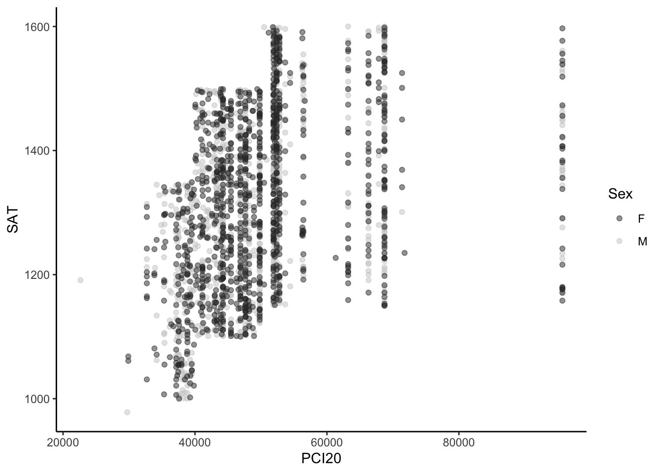
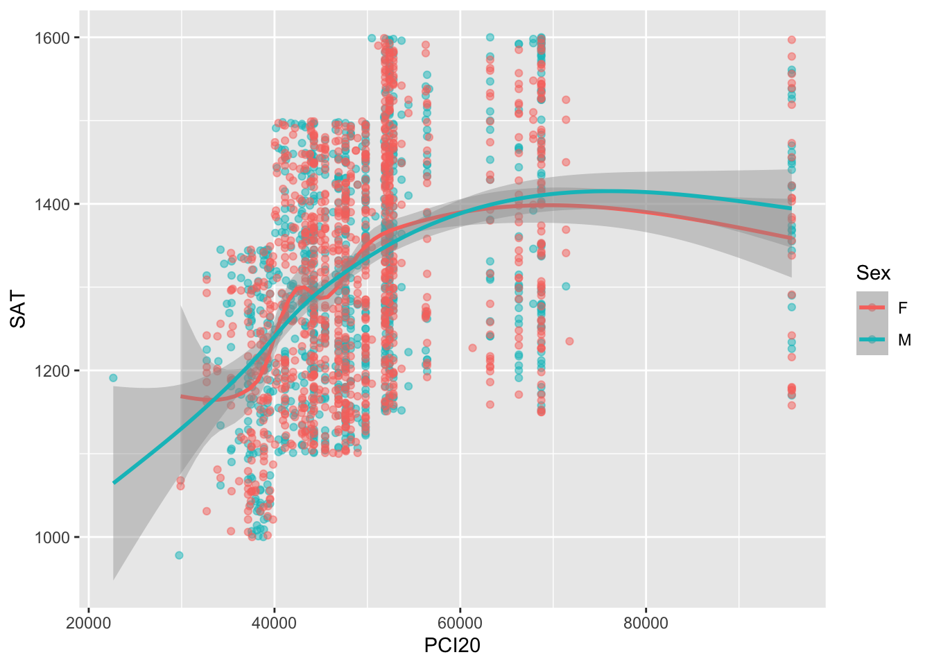
We are now going to go back to the graph as it was in Figure 3 except, for now, in Figure 8, we are going to add the alpha value so that we can better see all the plotted values.
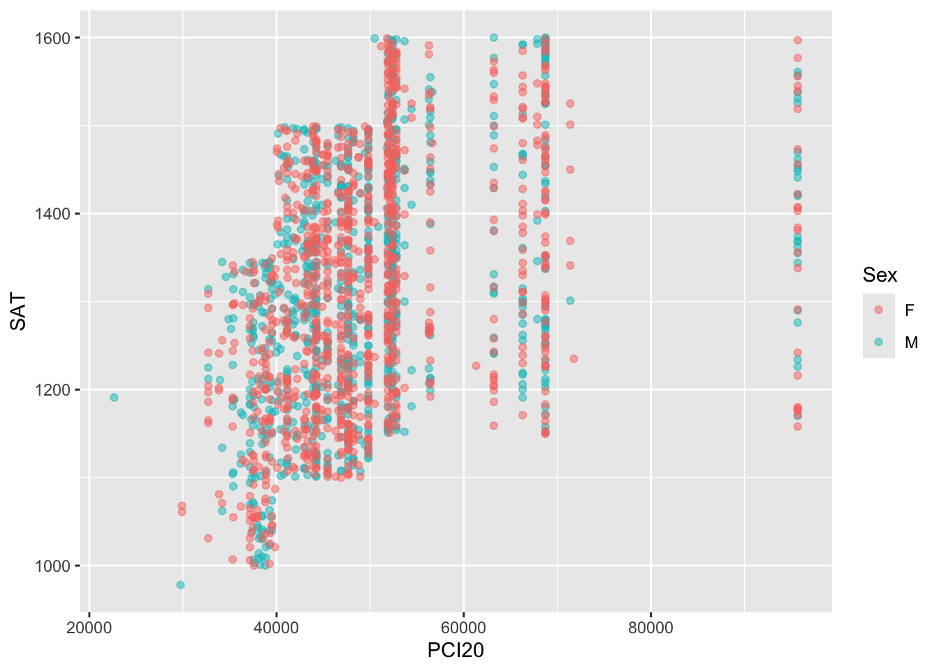
Certainly this is useful; however, it might be more useful to get an idea of where a fitted curve through the values would go with separate lines for males and females. Figure 9 shows these two lines; you can see how close they are throughout.
4 Facets
Now that we have finished specifying the geometry of the graph, we shall specify the facets. When you tell ggplot that you want a facet on variable Z, then ggplot will create separate graphs for every different value of Z.
In this case, we want to create a facet on the St variable. Let’s verify that we have the data that we need:
# A tibble: 2,000 × 4
PCI20 SAT Sex St
<dbl> <dbl> <fct> <fct>
1 22644 1191 M GA
2 29738 978 M GA
3 29895 1061 F GA
4 29895 1068 F GA
5 32702 1031 F GA
6 32702 1162 F GA
7 32702 1165 F GA
8 32702 1186 F GA
9 32702 1197 F GA
10 32702 1204 F GA
# ℹ 1,990 more rowsIn Figure 10, we tell ggplot that we want a facet on the St variable. Since we are asking for a facet on just one variable, then we use the facet_wrap() function. Since the St variable has just two values in this sample (fictional) data set, this will create two separate graphics with the same structure as the previous graph…but the data will be divided so that all of the applicants from one state are in one graph. The idea is that this should allow the analyst to see if the applicants differ from one state to another.
student_econ |>
  ggplot(aes(PCI20, SAT,
             colour = Sex)) +
geom_point(alpha = 0.5) +
geom_smooth() +
facet_wrap(~St)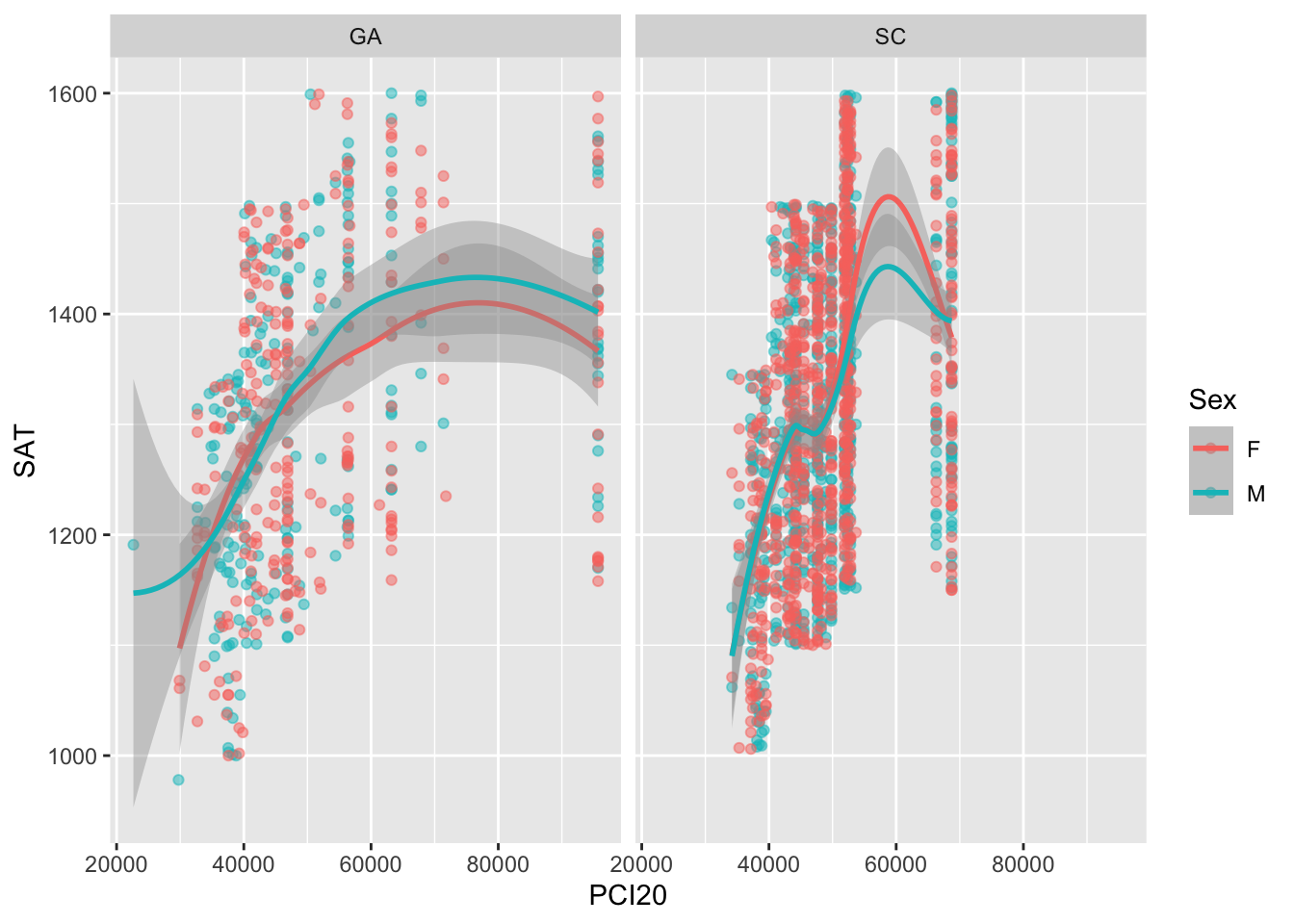
If we want to create facets for the combination of two separate variables, then we use the facet_grid() function (as shown in Figure 11). This allows us to drill a bit deeper and see if the relationship between PCI20 and SAT scores varies not simply by the state but by some particular combination of state and race.
But (again), let’s ensure that we have the data that we need:
# A tibble: 2,000 × 5
PCI20 SAT Sex Race St
<dbl> <dbl> <fct> <fct> <fct>
1 22644 1191 M W GA
2 29738 978 M H GA
3 29895 1061 F W GA
4 29895 1068 F W GA
5 32702 1031 F W GA
6 32702 1162 F W GA
7 32702 1165 F B GA
8 32702 1186 F W GA
9 32702 1197 F W GA
10 32702 1204 F W GA
# ℹ 1,990 more rowsGiven that races with codes "W", "H", "B", and "A" dominate the records, we will limit the graphs to just those rows:
student_econ |>
select(PCI20, SAT, Sex, Race, St) |>
filter(Race %in% c("W", "H", "B", "A")) |>
arrange(PCI20, SAT)# A tibble: 1,955 × 5
PCI20 SAT Sex Race St
<dbl> <dbl> <fct> <fct> <fct>
1 22644 1191 M W GA
2 29738 978 M H GA
3 29895 1061 F W GA
4 29895 1068 F W GA
5 32702 1031 F W GA
6 32702 1162 F W GA
7 32702 1165 F B GA
8 32702 1186 F W GA
9 32702 1197 F W GA
10 32702 1204 F W GA
# ℹ 1,945 more rowsNote that it can be a useful bit of documentation to include all the various select, filter, and join commands in the graph definition statement itself.
student_econ |>
select(PCI20, SAT, Sex, Race, St) |>
filter(Race %in% c("W", "H", "B", "A")) |>
ggplot(aes(PCI20, SAT,
colour = Sex)) +
geom_point(alpha = 0.5) +
geom_smooth() +
facet_grid(vars(Race), vars(St))
In other cases—especially if the data is going to be used in multiple ways—you might want to create a data frame and store it separately and then define the graph. Consider this:
student_econ_grid <-
student_econ |>
select(PCI20, SAT, Sex, Race, St) |>
filter(Race %in% c("W", "H", "B", "A"))
student_econ_grid |>
ggplot(aes(PCI20, SAT,
colour = Sex)) +
geom_point(alpha = 0.5) +
geom_smooth() +
facet_grid(vars(Race), vars(St))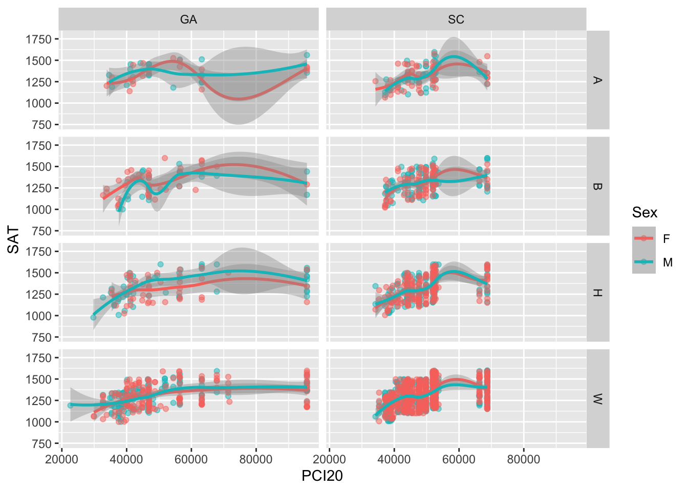
That’s it for facets for this graph. We will continue this discussion with the one-facet version rather than the two-facet version.
5 Coordinate space
Now to specify the coordinate space for this graph. This usually means that you want to change the axes in some way—the grid marks, the labels, the range of values, etc.
In Figure 12, we use the scale_x_continuous() and scale_y_continuous() functions to do the following:
scale_x_continuous: specify where the grid marks (breaks) should go, and then specify what the labels should be at those breaks.scale_y_continuous: specify where the grid marks (breaks) should go. We are satisfied with the labels as they currently are but we do want to ensure the range covers the entire set of possible SAT scores.
student_econ |>
  ggplot(aes(PCI20, SAT,
             colour = Sex)) +
  geom_point(alpha = 0.5) +
geom_smooth() +
facet_wrap(~St) +
scale_x_continuous(breaks = c(20000, 40000,
60000, 80000,
100000),
labels = c("$20k", "$40k",
"$60k", "$80k",
"$100k")) +
scale_y_continuous(limits = c(800, 1600),
breaks = c(800, 1000, 1200,
1400, 1600))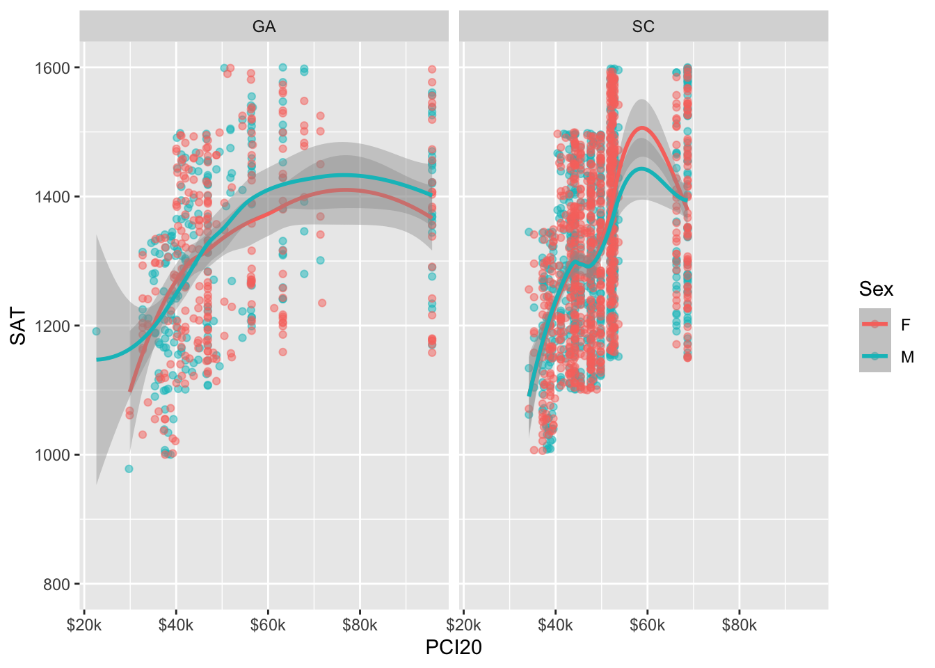
In the previous graph, it’s a bit unclear as to what the x-value is for the right-most plotted values. While we specified that the graph should have breaks all the way up to “$100k”, it is not actually displaying that value on the axis. In order to change this, we need to increase the maximum value of the x axis.
In Figure 13, we use the limits value to increase the maximum value on the x axis.
student_econ |>
  ggplot(aes(PCI20, SAT,
             colour = Sex)) +
  geom_point(alpha = 0.5) +
  geom_smooth() +
facet_wrap(~St) +
scale_x_continuous(limits = c(20000, 105000),
breaks = c(20000, 40000,
60000, 80000,
100000),
labels = c("$20k", "$40k",
"$60k", "$80k",
"$100k")) +
scale_y_continuous(limits = c(800, 1600),
breaks = c(800, 1000, 1200,
1400, 1600))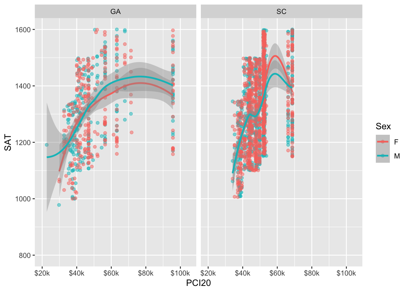
6 Labels
The labels section of the ggplot specification allows you to set all kinds of information related to the title, axes, and legend.
In Figure 14, we use the labs() function to specify the graph title, the graph subtitle, the x axis label, the y axis label, and the title of the color legend.
student_econ |>
  ggplot(aes(PCI20, SAT,
             colour = Sex)) +
  geom_point(alpha = 0.5) +
  geom_smooth() +
  facet_wrap(~St) +
  scale_x_continuous(limits = c(15000, 105000),
                     breaks = c(20000, 40000,
                                60000, 80000,
                                100000),
                     labels = c("$20k", "$40k",
                                "$60k", "$80k",
                                "$100k")) +
  scale_y_continuous(limits = c(800, 1600),
                     breaks = c(800, 1000, 1200,
                                1400, 1600)) +
  labs(title = "Examining relationship between PCI and SAT scores",
       subtitle = "2022 Applicants",
       x = "Per Capita Income (2020)",
       y = "SAT scores",
       color = "Gender")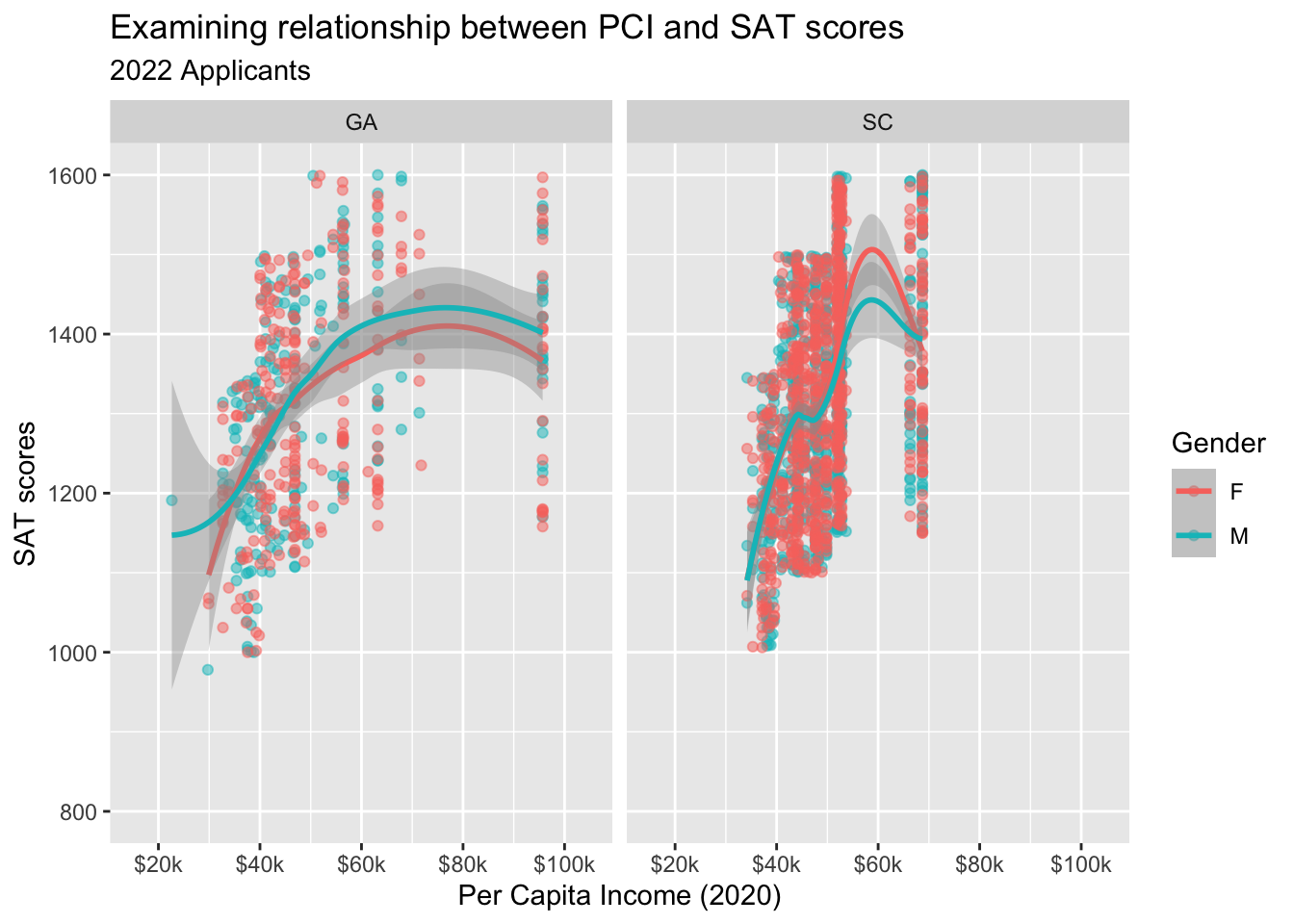
7 Theme
We are now finalizing the look of our graph. The data representation has been taken care of. Now it is time to tweak the final appearance.
In Figure 15, we first set the graph to use one of many themes that are already defined in ggplot. You’ll see that it mainly adds a border and removes the background grey from the plot body.
student_econ |>
  ggplot(aes(PCI20, SAT, colour = Sex)) +
  geom_point(alpha = 0.5) +
  geom_smooth() +
  facet_wrap(~St) +
  scale_x_continuous(limits = c(15000, 105000),
                     breaks = c(20000, 40000,
                                60000, 80000,
                                100000),
                     labels = c("$20k", "$40k",
                                "$60k", "$80k",
                                "$100k")) +
  scale_y_continuous(limits = c(750, 1600),
                     breaks = c(800, 1000, 1200,
                                1400, 1600)) +
  labs(title = "Examining relationship between PCI and SAT scores",
       subtitle = "2022 Applicants (by state)",
       x = "Per Capita Income (2020)",
       y = "SAT scores") +
  theme_bw()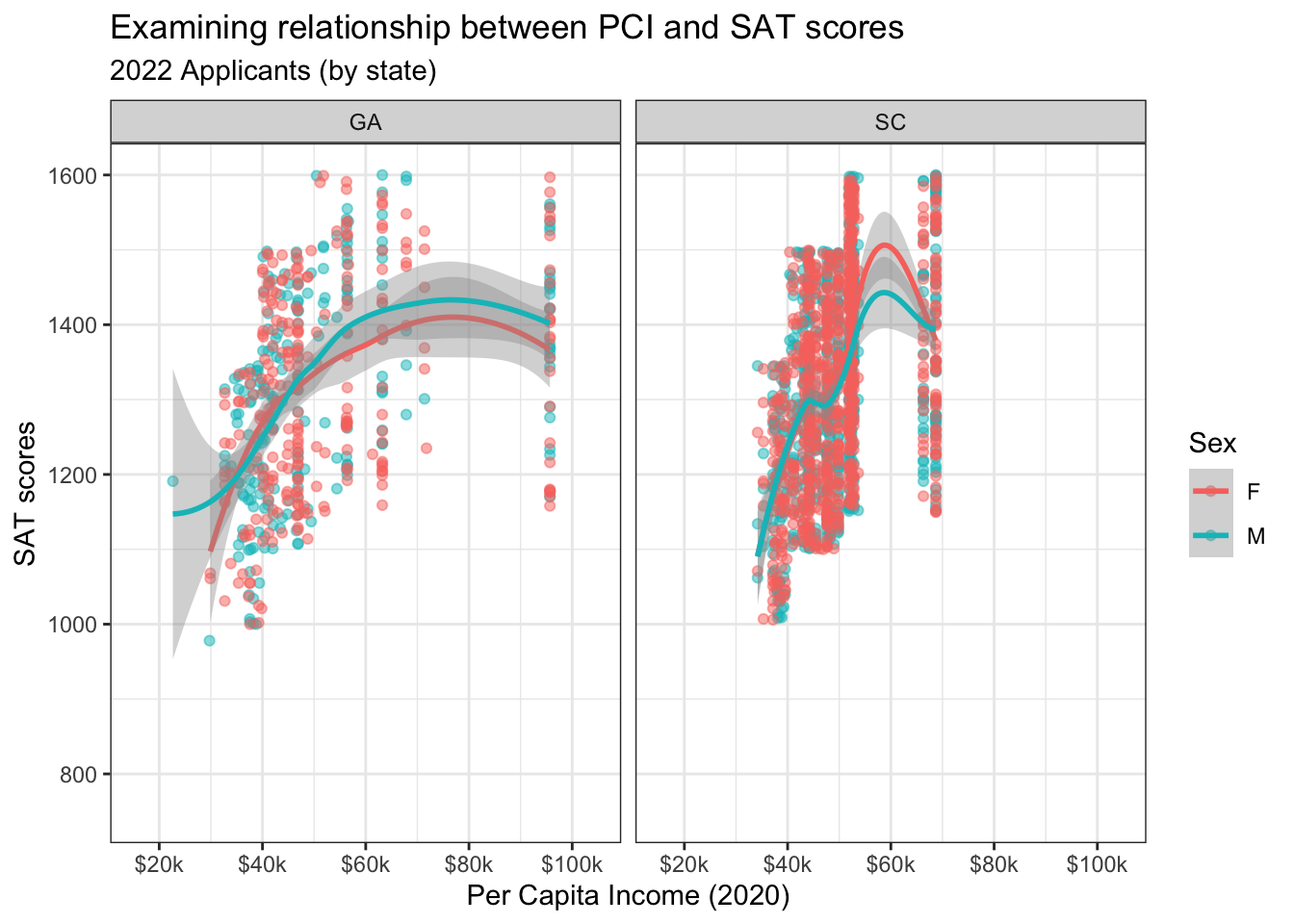
The ggplot package allows us to build on these predefined themes. In Figure 16, we make the following changes:
legend.position: We specify that we want the legend to be in the lower-right corner of the graph. Since there is open space here, it allowsggplotto make the graph body bigger.title: We specify that the title and subtitle of the graph as well as the names of both axes and the title of the legend should all beboldand purple.
student_econ |>
  ggplot(aes(PCI20, SAT, colour = Sex)) +
  geom_point(alpha = 0.5) +
  geom_smooth() +
  scale_x_continuous(limits = c(15000, 105000),
                     breaks = c(20000, 40000,
                                60000, 80000,
                                100000),
                     labels = c("$20k", "$40k",
                                "$60k", "$80k",
                                "$100k")) +
  scale_y_continuous(limits = c(750, 1600),
                     breaks = c(800, 1000, 1200,
                                1400, 1600)) +
  labs(title = "Examining relationship between PCI and SAT scores",
       subtitle = "2022 Applicants",
       x = "Per Capita Income (2020)",
       y = "SAT scores") +
  theme_bw() +
  theme(legend.position = c(0.8, 0.2),
        title = element_text(colour = "#582C83",
                             face = "bold"))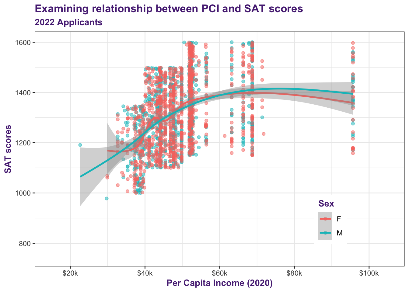
8 Summary
Figure 16 is obviously quite complex. No one, not even the most experienced R programmer, would build that in one, two, or even three attempts. We wouldn’t. And we wouldn’t expect you to, either.
Actually, it’s kind of the whole point of ggplot: enable you to iteratively explore the data and determine which graphs you want to spend more time on because they deserve that time!
You can see that the graph was built up in distinct steps. You could stop at any moment after the first few and you would still have a useful graph.
Further, having defined the program for this graph, if you were to get a new set of data for your applicants next year, then you could simply plug in the data and it would immediately create these same graphs.
Having presented this example, we absolutely do not expect that you now understand ggplot and all of its nuances. The motivating idea has been to walk you through the whole process and show you some of the possibilities.
Now we will highlight a bit more for you in this page.
