Introduction to Tableau
1 Overview
1.1 Description of the course
You will go through the entire process of creating a Tableau dashboard
- from data import and transformation
- through design & analysis
- to implementation and sharing.
We have two learning tracks: Observe and Deep Dive.
Notes
The idea for this class is that you want to learn how to use Tableau and Prep Builder. Both of these have many layers of features. My goal is to help you learn to navigate through them.
1.2 Learning Track #1: Observe
For students who just want to come to class but not commit any time outside of it, you can expect the following:
- Learn what Business Intelligence software is
- Learn the general capabilities of Tableau software
- Learn the skill and knowledge requirements necessary to use Tableau software effectively
- Learn the steps needed to build basic dashboards in Tableau
- Practice these learnings through in-class activities on a common data set
Notes
You can definitely come to class and watch it like a YouTube video. You’ll pick up what it’s like to use this software.
1.3 Learning Track #2: Deep Dive
For students who are willing to commit 5-10 hours per week outside of class (reading the book, using the software), you can expect the following (in addition to previous items):
- Build charts and dashboards with Tableau
- Learn how to plan and execute dashboard projects effectively with needed planning documents
- Build a simple dashboard and a chart or two by going through the book’s instructions.
Notes
I’ve built this class to support students who want to learn both what it means to be a data visualization specialist generally and Tableau user specifically.
The book documents many, if not all, of the processes needed to conceive of, design, and build Tableau dashboards.
1.4 Schedule
- Week 1 Overview
- Introduction to Tableau and data visualization generally. Go through the whole cycle.
- Week 2: Preparing the plan and the data
- Define a project, import data, clean & transform data, understand data; prepare to build charts
- Week 3: Building charts
- Go through the details of building charts
- Week 4: Building the dashboard
- Go through all the details of building a dashboard and sharing it
Notes
We have a four-week class and a four-chapter book. You do not need to read the chapters before that week’s class. However, each chapter will contain much more detail than I will be able to cover in class time itself.
This first week provides an overview of the whole process. We will go through, at a high level, each of the steps of the process of designing, creating, and delivering a Tableau dashboard.
During the second week, we will go through the planning and data stages of building a dashboard. We will focus on Prep Builder during this week because ensuring that you have reliable data is how data professionals build up trust with their partners.
During the third week, we will focus on chart building in Tableau Desktop. This software has immense capabilities in this area and would take many months to examine in any depth, let alone develop some facility and nuance with the tool. We focus here on the basic capabilities and vocabulary around the process.
In the last week of class, we actually build the dashboard and learn about the capabilities Tableau Desktop has for sharing dashboards. The dashboard building process that we will cover is much simpler than the chart building process, and the sharing process is dead simple.
During class, sometimes you will use the software and sometimes you will not. Using Tableau requires a good bit of conceptual knowledge before you dive into it. I’ll cover that during the class.
We will also get you exposure to the software during class. The details will be available to you in the book and with developing your own dashboard but we will teach you to navigate the software during class.
You will have to ask questions when you need help. If you are on the Deep Dive track, I encourage you to find study partners to work through the material outside of class.
1.5 The book
- Written by me for you
- Four chapters, one per week
- Ten appendices
- Project (description and charts)
- Tableau details (chart types and color palettes)
- Importing and pivoting (vital for your future usage of Tableau)
- Guideline documents
- Dashboard Project
- example Dashboard Project Document
- Chart samples
- Chart Creation Checklist, &
- Use of Chart Creation Checklist for multiple charts)
Notes
The first thing you’ll notice when looking at the book is that it contains four chapters but also ten appendices! That’s kind of ridiculous.
The chapters are the thread that ties the four weeks together. The appendices are the in-depth conceptual explanations, technical details, and document templates that can help broaden your knowledge around data visualization and Tableau.
I will strive to indicate throughout the course which appendices might be useful companions at the appropriate time.
1.6 Tableau Desktop software
What it is
- Software for creating and delivering dashboards
- Dashboards…
- enable decision-makers to use data to support the creation of business value
- provide a concise, objective, and quantitative view of how the organization is performing relative to expectations
What it isn’t
- Software to explore data (such as
RorExcel) - Software to create
WIBN(“wouldn’t it be nice”) graphs
Notes
- It’s as complex to use as any software that I’ve encountered in my 40+ years of working on computers
- It’s designed for data visualization specialists for whom this is their only job
- To get (and stay) good at using it, you should work on this software 20-40 hours per week for a year or two
- You should subscribe to several YouTube channels on Tableau in order to learn new skills, and watch an hour or more of videos each week while completing community challenges that expand your skill set
1.7 Checking in
- Technology (Tableau & Prep Builder) working okay?
- Today, have you downloaded the three
zipfiles? - Class Web page for file downloads:
1.8 zip files (fake data)
- Week 1 (new for today)
-
Contained within
SLO-Fake-Data.zipslo_fake_data_neat_wide.csvslo_fake_data_neat_wide.tfl
- Appendix B: Importing examples (downloaded earlier)
-
Contained within
AppendixB.zipexercise-records.csv(142b)school-grades.csv(151b)student-monoitoring.csv(733KB)
- Course project (downloaded earlier)
-
Contained within
StudentActivity.zipstudent_activity.csv(19.2MB)
2 An overview of the whole dashboard creation process
2.1 The Dashboard Creation Process
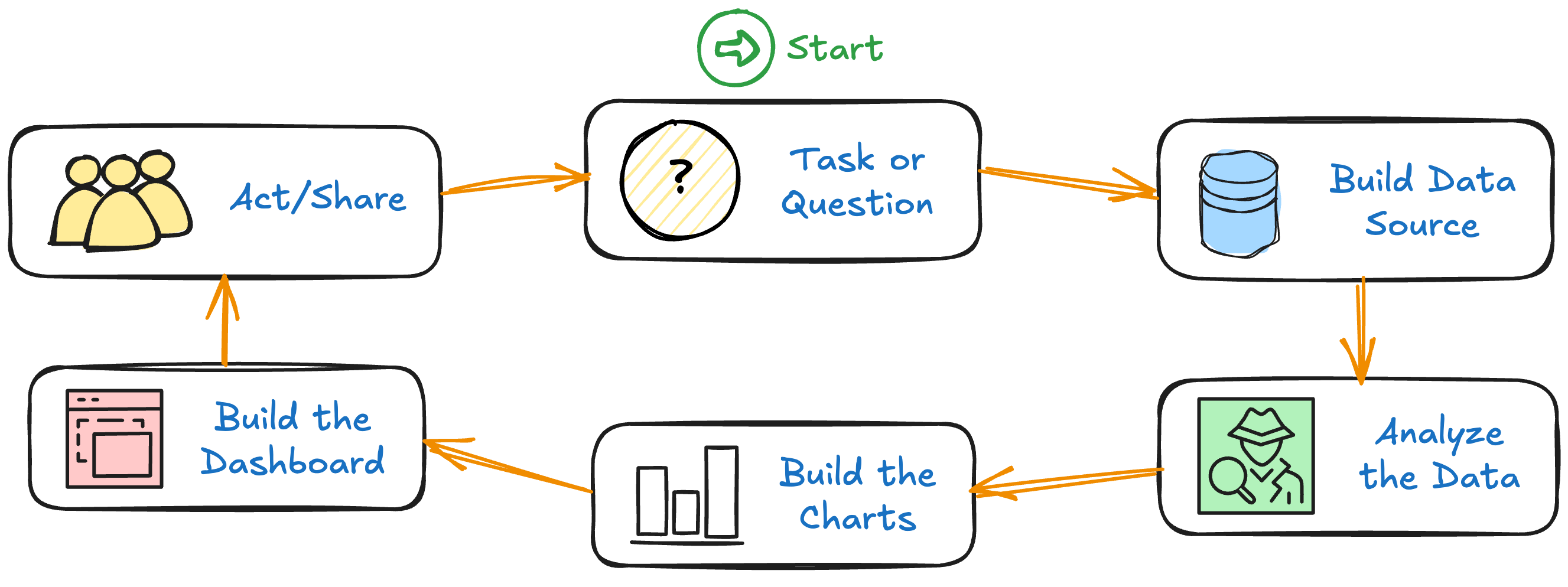
- This is the process we’ll go through during the next three weeks of this course
- Today we take a peek at each stage
- Future weeks provide deeper probes of each stage
Notes
- Task or Question
- The most important step: Define the question and what an answer might look like.
- Build Data Source
- Get the data, understand what data you have, prepare it to be used
- Analyze the Data
- Make sure that you have the data you need to answer the questions that you want to answer.
- Build the Charts
- Developing charts with Tableau Desktop
- Build the Dashboard
- Develop the dashboard and integrate the charts that you have developed
- Act/Share
- Act on the insights and/or share your analysis using Tableau Cloud
2.2 Step 1: Task or Question
- Work with decision-maker
- Determine the specific question being asked
- How can you help answer it
- What type of action might be taken in response
- What does an answer look like (mock-up)
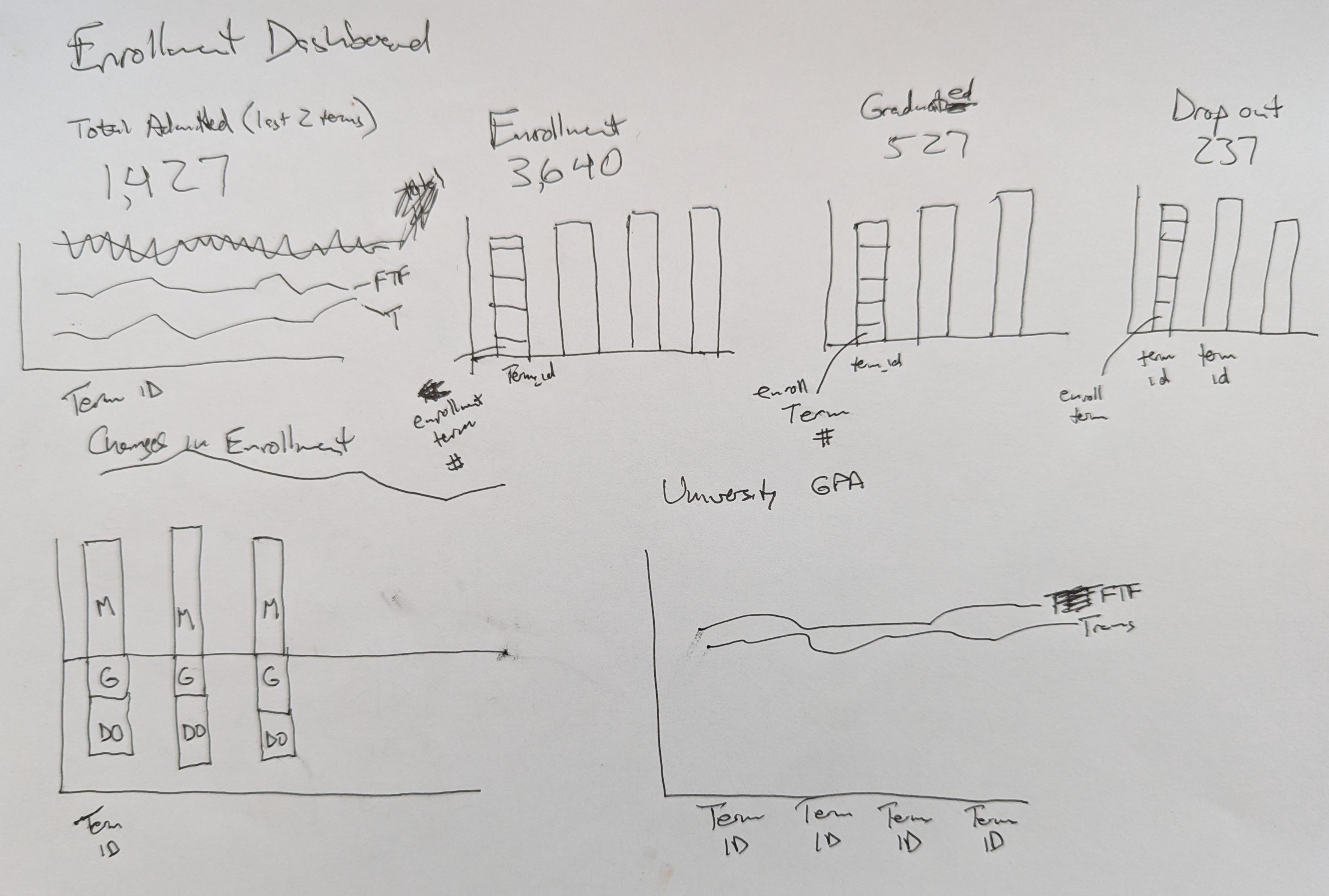
Section 2.2, Appendices A & D & E
Notes
- This is all needed to justify (and focus) the effort
2.3 Task 1: Defining your own question
- Working within a group, define a question that you want to be able to answer for your own organization. Discuss.
- Think about some big Excel files that you work on and send to others.
- What’s the big decision that the decision-makers are faced with?
- What information would a dashboard contain? What charts? What BANs should be displayed?
Notes
- Spend 5 minutes on this, and then we’ll share as a class.
2.4 Step 2: Build Data Source
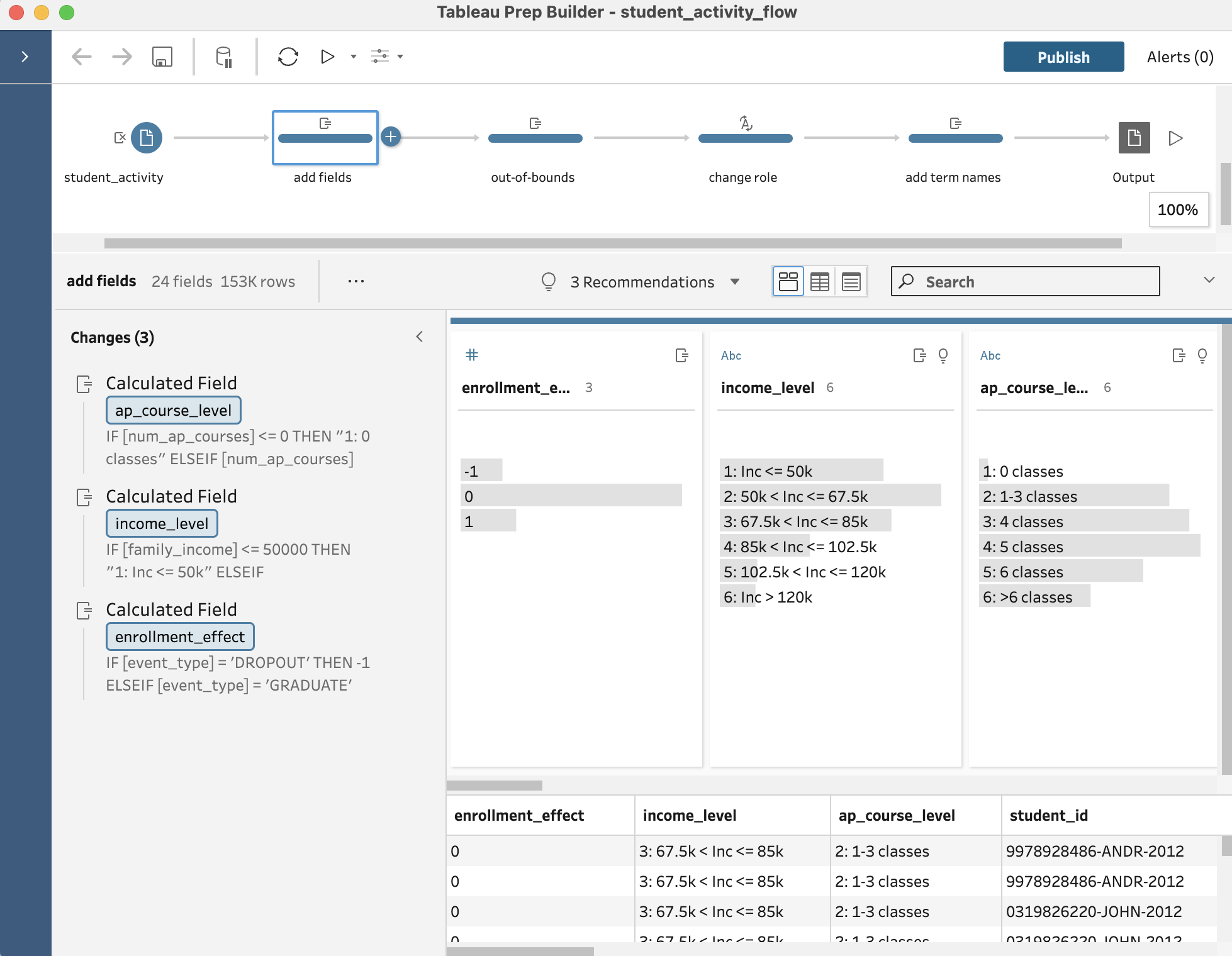
- Prep Builder
-
- Can import from many sources
- Documents data transformation steps
- A programmatic, reusable flow
- Book
- Sections 2.3, A.3, B
Notes
- Those sources include Excel, CSV.
- The main benefit of
Prep Builderis that it separates the data from any of the transformation steps - Let’s now take a look at this software
2.5 Task 2: Look at Prep Builder
- Be sure that you have downloaded
slo_fake_data_neat_wide.csvslo_fake_data_neat_wide.tfl
- Load
Prep Builder - Click on
Open a Flow- Load
slo_fake_data_neat_wide.tfl
- Load
Notes:
- Go through the layout of the screen
-
- Flow (on top)
- Changes (on left)
- Field contents (center)
- Table view
- Look at details of the Flow
-
- Import
- Calc new column
- Rename and remove
- Calc avg rating
- Pivot
- Reorder fields
- Output
- Wrap-up
-
- Be sure to
Publishthe data - Remember what you call it and where you put it
- Be sure to
2.6 Step 3: Analyze the Data
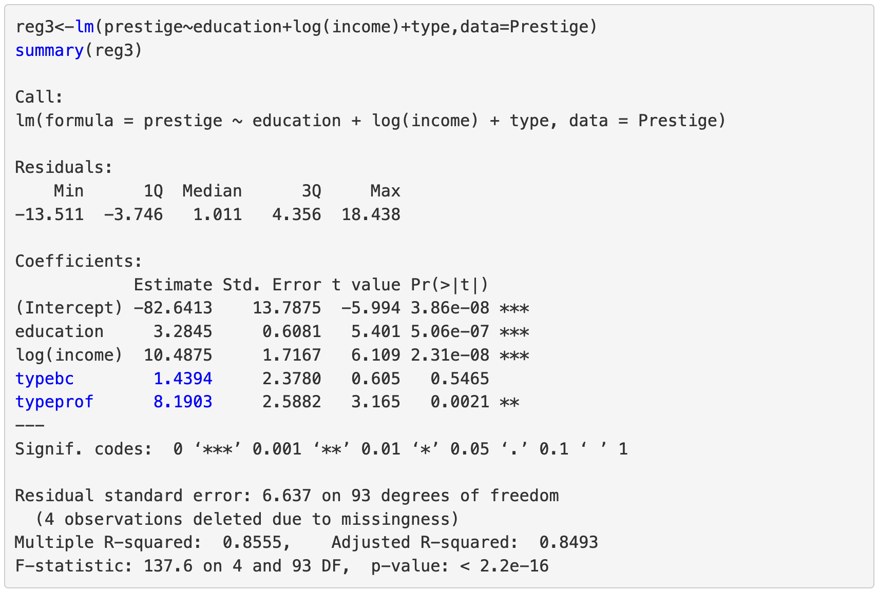
With R (preferred) or Excel. We’re not covering this topic at all in this class.
Notes
There’s a tendency to use charts as proof of a relationship between two variables. It would be better, and more informative, if we all learned to use statistics to look for those relationships.
2.7 Readings on Statistical Analysis
- Resources
- Classes
R is a great place to start since it’s free, open source, 30-years-old, and has a huge set of learning resources for it.
2.8 Recap
Now that we
- Know the question and how it might be answered
- Have the data
- Understand the data
It’s time to start the dashboard building process in Tableau Desktop.
2.9 Task 3: Starting Tableau
- Open
Tableau Desktop - On left, under
Connect->To a Fileclick onMore... - Change the file type at bottom to
Tableau Data Extract (*.hyper) - Open the file that you created as output in
Prep Builder - Let’s go through the process together for starting the dashboard building process
Notes
- Name the table (bottom left).
- Click on the
Extractradio button (upper right). - Click on the
New Worksheetbutton (bottom).
2.10 Terms to be familiar with for chart-building
- Dimensions
- Measures (& metrics)
- Attributes
- Discrete & Continuous
- Parameters
- Calculated fields
- Filters
Notes
- Dimensions categorize your data (e.g.,
Home State,Gender,Race). - Measures are quantitative fields you aggregate (e.g.,
Univ GPA).- Sometimes we refer to “metrics” as the name of the field and “measures” as the value of that field (when we need to be precise in certain instances).
- Attributes (
ATTR()) are used when you need to aggregate a dimension but still ensure that Tableau only returns a single value or signals if there’s more than one unique value (e.g., returning * for multiple home states for one student). - A discrete field represents separate, distinct values. These values are treated as categories or individual labels, and Tableau treats them as finite groups. Discrete fields create headers in visualizations (like columns in a table or labels on an axis), and they result in a finite number of possibilities.
- A continuous field represents data that exists on a spectrum or range. Continuous fields are numeric and can take any value within a given range. In Tableau, continuous fields create axes in charts and are treated as infinitely divisible.
- Parameters are changeable user (or analyst) inputs that affect how a chart displays its data.
- Calculated fields are fields that are calculated from a combination of existing fields, parameters, and other values.
- A filter controls what data a chart displays.
2.11 Step 4: Build the Charts
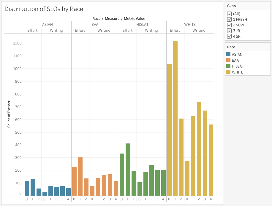
Task 4 (together): Let’s build this chart! (Chapter 3, App. C, F, G, H)
Notes
- Columns:
Race,Measure,Metric Value - Rows:
CNT(Extract) - Graph Type:
Bar - Color: choose a standard (“categorical”) color palette
- Appendix I shows you how to create a custom color palette
- Filter: on
Race - Title:
- Define it
- Format it
- Tooltips
- Control filter (for
Class) - Format the grid
2.12 Readings on Chart Design
Notes
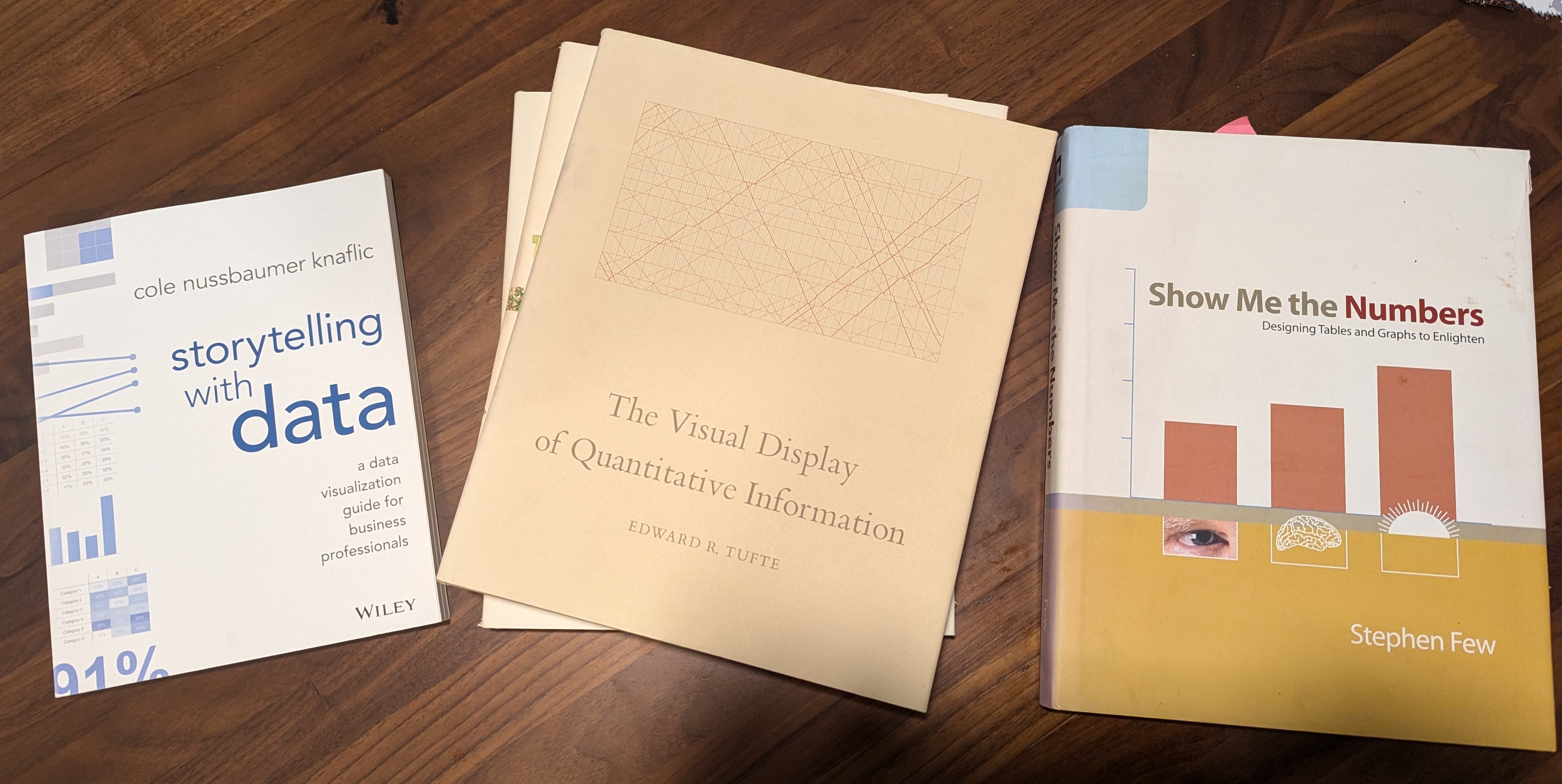
- Visual Display of Quantitative Information, by Edward Tufte
- Show Me the Numbers, by Stephen Few
- Storytelling with Data by Cole Knaflic
2.13 Step 5: Build the Dashboard
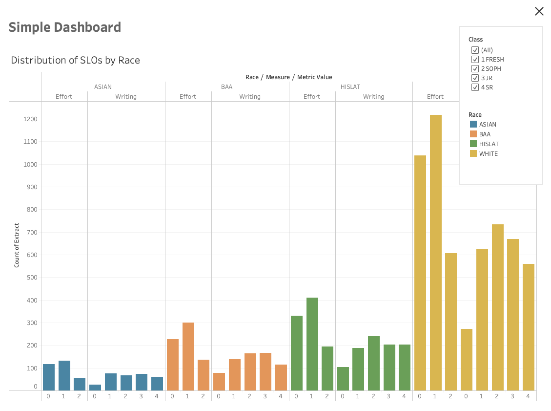
Task 5 (together): Let’s build this dashboard! (Section 4.1)
Terms
- Containers
- Item hierarchy
- Floating vs. Tiled
- Inner padding
- Outer padding
- Filters
- Legends
- Size
Notes
- Containers in Tableau are structural elements that hold and organize other components (like charts, filters, and text) in a dashboard. There are two types: horizontal (organizes items in a row) and vertical (organizes items in a column).
- Item hierarchy refers to the nesting of elements within containers in a dashboard. For example, a chart might be inside a vertical container, which itself might be inside a larger horizontal container.
- Floating elements are placed freely on the dashboard and can overlap with other items. They behave like layers that you can move independently of other items.
- Tiled elements are locked into a grid structure, with each new element snapping into place beside or below existing ones. They automatically adjust to fill the available space.
- Inner padding is the space inside a container, between the content (like a chart or filter) and the container’s borders.
- Outer padding is the space outside a container, between the container itself and the other elements around it.
- Filters allow you to restrict the data displayed on a dashboard. These are user-friendly dropdown menus, sliders, or multi-select lists added to a dashboard, allowing users to control what data they see.
- Legends provide context for color-coded charts or maps, helping users interpret what the colors represent. Proper use of color ensures that important information is easy to see and interpret.
- Dashboard size can be set to fixed, automatic, or range. This determines how the dashboard adapts when viewed on different screen sizes or devices.
3 Wrap-up
3.1 Announcements
Before next week’s class
- Read the following:
- Chapter 1
- Appendices A & C & D & E
- You should start working on a Dashboard Project Document for a dashboard of your own
Next week
- We will work through Chapter 2 in more detail and with a more complicated project
- I will be at a conference Saturday -> Tuesday
