Preparing

Author

Scott Moore

Before today’s class

  1. Download week2.zip file from at rforir.com/classes/tableau_oct24.html.
  2. Make a folder week2 in your class folder.
  3. After extracting the files from the ZIP file, drag them to the week2 folder.
  • Student activity pivot example
    • student_activity.csv
    • student_activity_output.hyper
    • student_activity_in_class-flow.tfl
  • Simple pivot examples
    • wide_in_class_wk2.csv
    • grades_wk2_inclass.csv


  • Student monitoring pivot example
    • student-monitoring.csv
    • student-monitoring-in-class-flow.tfl
  • Chart types
    • charttypes-workbook.twb

It would make sense if you had this in the same subdirectory as your week1 folder. But no big deal if it’s not.
Overview

Today’s class

  • Planning the dashboard project
  • Using Prep Builder to import, clean, and export data
  • “Wide” vs “Long” data
  • Chart-building basics
Note
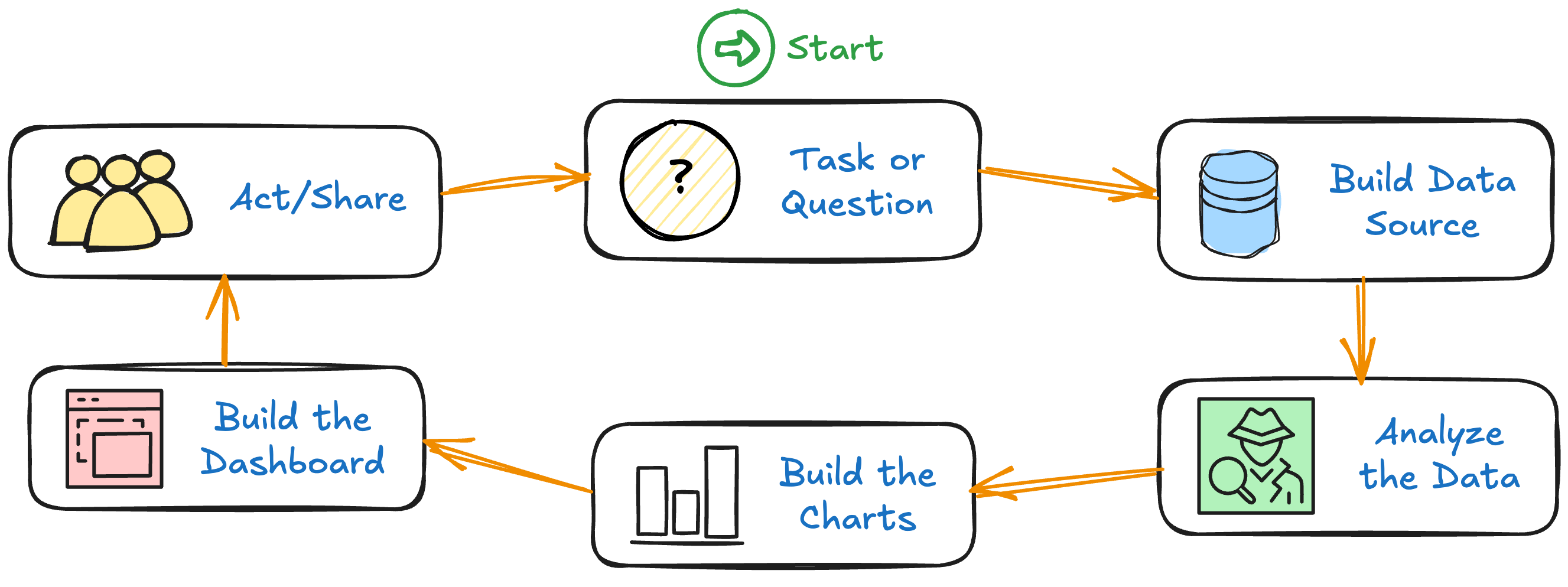
  • Last week we went through the whole dashboard-creation process quickly.
  • This is now week 1 of the 3-week process of going through the whole process more deliberately.
  • You know how the whole thing works; now we want to explore more in-depth, and figure out where some of the “gotchas” are.

Planning the dashboard project

Dashboard Project Document

See App. D (for the template) and App. E (for an example).

  • Who use
  • Why need
  • What metrics
  • How use
  • When
  • What is success?
  • Charts
    • Sketch of the charts
    • Limit the information
  • Dashboard design
    • Structure
    • Interactions & filters
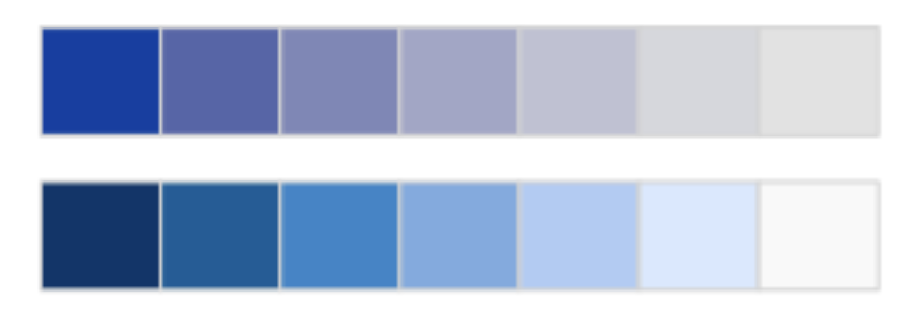
  • Also: Colors

Activity: Dashboard Project Document

  1. Skim Appendix E.
  2. Consider these questions:
    • What do you like about this document?
    • What challenges do you see?
    • What does it tell you about Tableau dashboards?
  3. Discuss in a group for 5 minutes.
  4. We will discuss as a class afterwards.

Decision-making books

  • The Scout Mindset by Julia Galef
  • Don’t Believe Everything You Think by Thomas Kida
  • Thinking, Fast and Slow by Daniel Kahneman

Colors

Evaluation

Green
#6A9F58
Yellow
#D9B650
Red
#D35F5F

Headings & subheadings

Dark Gray
#303030
Medium Gray
#b3b3b3

Primary colors (Categorical)

Blue
#4A85A3
Muted orange
#E3965A

  • See Appendix I.
  • Demo with charttypes-workbook

Diverging

Sequential

Notes

  • Have a plan for colors beforehand.
  • Understand uses of the different palette types.
  • You’ll probably come up with a palette (or set of palettes), define them, and use them on all (or most) of your dashboards.

Using Prep Builder to import, clean, and export data

Prep Builder capabilities

  • Data cleaning: rename fields, split fields, combine fields, remove fields, calculate new fields
  • Data blending: combine data from multiple files; we do not cover this in our workshop
  • Data shaping (Appendix B): change from wide to long data; we’ll cover this later today
  • Automation: can set up a “flow” and run it multiple times against changed data
  • Semi-visual interface: helps document all the transformations you define

Terms we need to know

  • Identifiers (uniquely identify a row)
  • Dimensions (categorize data)
  • Discrete (separate distinct values; many times it’s a small number of values)
  • Continuous (usually real numbers or date/times)
  • Long vs wide data (coming soon today!)


  • KPI (key performance indicator; a standard of success)
  • (Business) Metrics (used to track performance)
  • Measures (number that can be used in calculations; fundamentally, this is just a number)

Prep Builder flow

Discussed & demonstrated in Sections 2.3 & A.3.4.

  1. Load data
  2. Add fields
  3. Fix out-of-bounds values


  1. Change role of data
  2. Add term names
  3. Output data
  • Have one folder with your dashboard’s input data, flow, output data .hyper file, and Tableau Dashboard .twb file…as well as all associated documents.

Go through the actions in Appendix A.3.4.

Task (part 1): Create Prep Builder flow

  1. Open Tableau Prep Builder
  2. Click the Open a Flow button
  3. Choose student_activity_in_class_flow.tfl
  4. Examine data for a few moments
  • Binned (blue) vs. count (grey) bars
  • Examine the profile panels in detail
  • Notice the recommendations box
  • Note that I try to separate different types of actions into different boxes
  • Try to give the boxes useful names

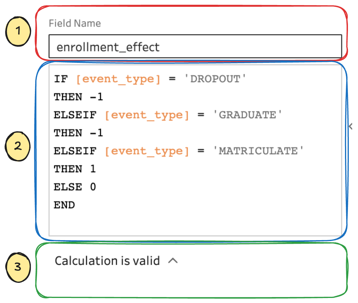
Calculation parts

  1. Specifies the new field name
  2. Defines the calculation
  3. Look here for problems!

Tableau Calculation Field #1

Form

SOME-CALCULATION

Example

[event_season] + " " + STR([event_calendar_year])

Tableau Calculation Field #2

Form: IF-THEN

IF comparison THEN return-value 
END

Example

IF [hs_gpa] <= 4.0 
THEN [hs_gpa]
END

Note!

  • The typed form does not matter
  • Just be consistent!

Notes:

  • Trouble with this is that it doesn’t give a value when the comparison fails

Tableau Calculation Field #3

Form: IF-THEN-ELSE

IF comparison THEN return-value-1
ELSE return-value-2
END

Example

IF [hs_gpa] <= 4.0 
THEN [hs_gpa]
ELSE 4.0
END

Note!

  • Always, always, always check the new calculated field to see if the calculation is doing what you want!!!

Tableau Calculation Field #4

Form: IF-THEN-ELSEIF-ELSE

IF comparison THEN return-value-1
ELSEIF comparison THEN return-value-2
...
ELSE return-value-x
END

Example

IF [event_type] = 'DROPOUT'
THEN -1
ELSEIF [event_type] = 'GRADUATE'
THEN -1
ELSEIF [event_type] = 'MATRICULATE'
THEN 1
ELSE 0
END

Task (part 2): Create Prep Builder flow

  1. Add out-of-bounds calculations for univ_gpa and hs_gpa
  2. Change role of home_state
  3. Calculate event_term_name and admit_term_name
  4. Remove fields (student_id)
  5. Reorder fields (focus on date fields)
  6. Output data
  7. Run flow

Out of bounds

IF [hs_gpa] <= 4.0 
THEN [hs_gpa]
ELSE 4.0
END
IF [univ_gpa] <= 4.0
THEN [univ_gpa]
ELSE 4.0 
END

Calculate term names

[event_season] + " " + STR([event_calendar_year])
[admit_season] + " " + STR([admit_calendar_year])

Remove fields

Get rid of student_id

Reorder fields

  • Put all date fields near each other.
  • Put enrollment_effect near event_type

“Wide” vs “Long” data

Introduction

  • This will totally mess with your mind
  • It will violate every insight that you have building data tables in a spreadsheet
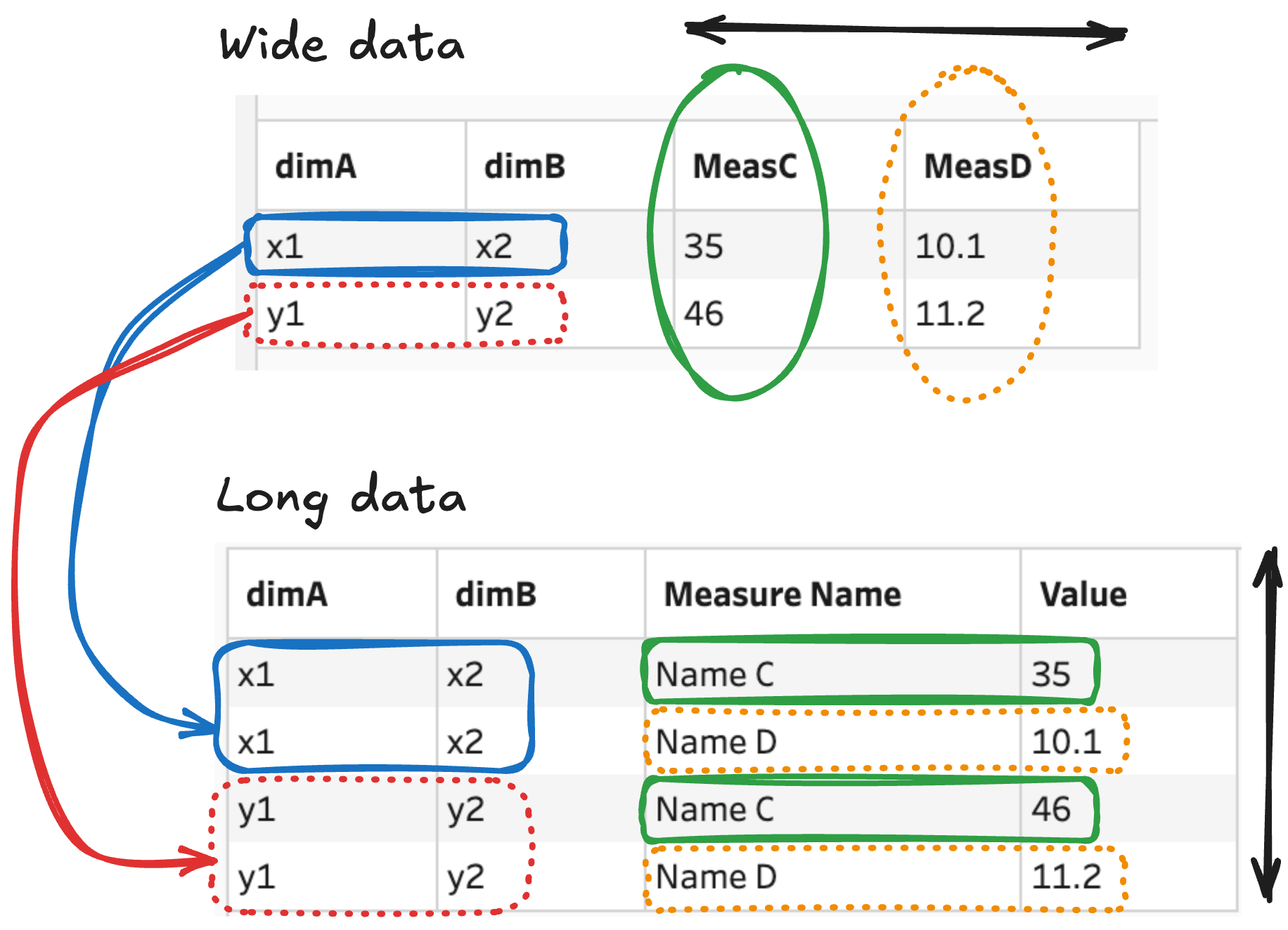
  • Wide data: spreadsheets
  • Long data: analytic data tables (Tableau, R, etc.)
  • The “Pivot” tool converts from wide to long
  • What we’re going to do

“Wide” vs “Long” graphically

Demonstrate graphically

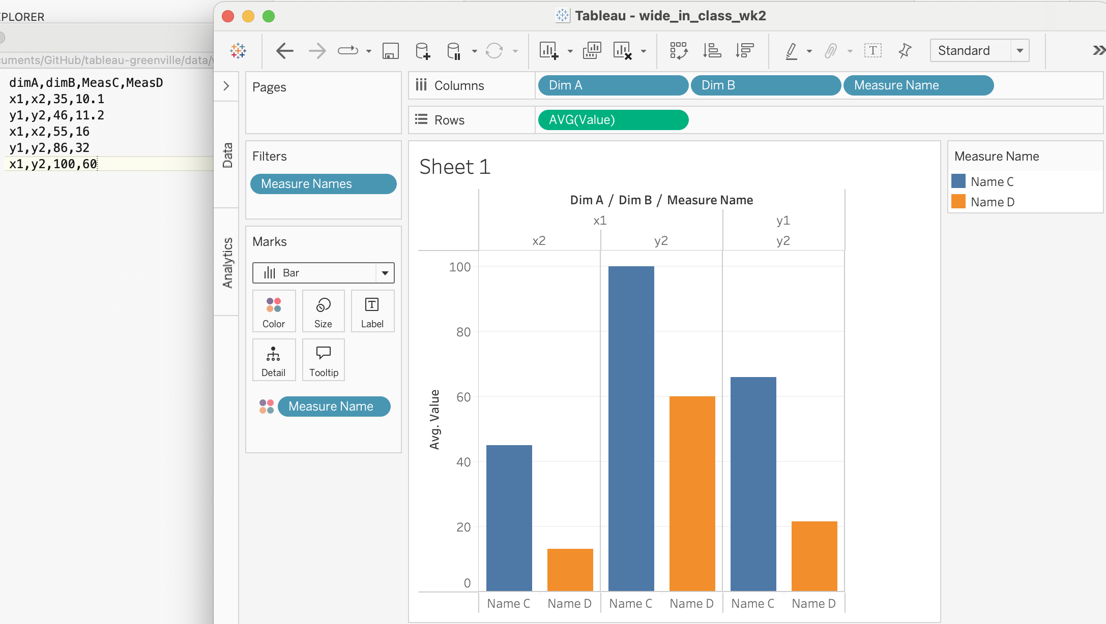
WvL: Small example (group) #1

  • Open Prep Builder
  • Connect to wide_in_class_wk2.csv
  • We’re going to pivot this
  • When done, output to wide_to_long_in_class.hyper

WvL: Small example (group) #2

  • Open Prep Builder
  • Connect to grades_wk2_inclass.csv
  • We’re going to pivot this
  • When done, output to grades_wk2_long.hyper

WvL: Bigger example (group) #3

  • Look at student_monitoring.csv in a spreadsheet
  • Then open student_monitoring-in-class-flow.tfl in Prep Builder

Task (small group)

In a data worksheet that you have, can you recognize wide data?

Chart-building basics

Some terms that we need to understand

  • Measures & Dimensions (again)
  • Shelves
  • Cards
  • Parameters
  • Calculated fields

We’re going to be working with charttypes-workbook.twb for the rest of the class.

Wrap-up

Class discussion

Let’s talk about your projects/dashboards:

  • What is your question?
  • What is your data?
  • What might be done?

Speaker notes go here.

Before next week’s class

  • Read the following:
    • Chapter 2
    • Appendix B
    • Appendix I
  • For your personal project (if appropriate):
    • You should have already finished the draft of your Dashboard Project Document
    • Define and run a Prep flow that extracts the data from the source (Excel file or CSV file), transforms it, and outputs it.

Survey

Removed now that the class is over.