Automating & Elevating Assessment Analysis & Reporting with R/ggplot
aka, “The Grammar of Graphics”
Today’s session
Goal: Introduce you to an innovative way of creating graphs — and doing your work — that is powerful and makes you more efficient
Flow
- Introduction & Motivation
- Data flow
- Demo #1: Quick graphs for a Survey
- Demo #2: Quick graphs for Student Information
- Demo #3: Beautiful graphs
- Other uses of graphs
- Summary
Notes
I’m super excited about today’s topic, because this changed how how I approach working with data and graphics, very much for the better. I was already familiar enough with Excel, Python, and Tableau that I’ve written books about each for classes that I’ve taught, and I can say definitively that what we’re going to talk about today is much better than them in many instances.
My goal for today’s session is that you agree with me or, at least, think that this option is worth investigating further!
We’re going to focus on comparing working with Excel to this new way of operating. I’ve been teaching spreadsheets since — get ready for this — 1985 with Lotus 1-2-3. BTW, I actually don’t want to know how many of you weren’t born yet, or that your parents were in elementary school.
This is the basic flow of today’s chat:
- Go through my view of why working with Excel is not appropriate for most data analysis and graphing needs
- Show how
Randggplotideally fit within the overall data picture at an institution - Go through three — time permitting — demonstrations of how to build
ggplotgraphs, some for quick exploratory data analysis and others for inclusion in formal reports - Show a couple other use cases for
ggplotgraphs - And wrap it up with a description of how you might get started
1 Introduction & Motivation
1.1 Why “Grammar of Graphics”?
With R/ggplot, you describe the graphs you want to see.
- Some parts of the “sentence” describing a graph are required.
- Some parts of the “sentence” are optional.
- The “parts of speech” are defined and are independent of the other parts of speech.
1.2 Current pain points for Excel
Assess as part of an overall workflow:
- Limited scalability: limited size of data sets
- Difficult to automate because it’s manual interface-intensive
- Non-transparent: When looking at a graph, it is not apparent how you might re-create it
- Limited flexibility for both the following:
- data representation (i.e., data all in one table) and
- graph presentation (limited library of graph types)
Notes
- My context for assessing Excel is to think of it as part of a work flow from data to analysis or presentation or report, and to assess that workflow for its “scalability, automatability, flexibility, documentability, and transparency
- Excel comes up short in all of those dimensions
1.3 Benefits of R/ggplot graphics
It’s easiest just to say
the opposite of the problems with Excel.
I don’t want to belabor the point in theory. Let’s belabor the point in detail!
Notes
- Flexibility
-
ggplotallows you to create a wide variety of plots (e.g., faceted plots, histograms, boxplots, heatmaps) beyond Excel’s standard offerings, and it’s easy to customize virtually every aspect of the plot. - Data Transparency
-
With
ggplot, you define each part of the visualization explicitly in code, making the process transparent, reproducible, and auditable, unlike Excel, where chart creation involves manual steps. - Reproducibility
-
Once a
ggplotscript is created, it can be reused with new data effortlessly, while Excel requires redoing many manual steps every time data changes. - Automation
-
ggplotintegrates with R, allowing automated data manipulation, visualization, and report generation (e.g., within scripts or Quarto documents). Excel relies on more manual input for generating charts, which is time-consuming and prone to errors. - Aesthetic Control
-
ggplotoffers detailed aesthetic control over themes, colors, and styling, ensuring professional-quality visualizations. Excel’s design options, while functional, are more limited and harder to fine-tune. - Faceting and Layering
-
ggplotexcels at creating faceted charts (multiple plots based on subsets of the data) and layering multiple data visualizations in one plot, something Excel cannot do easily. - Scalability
-
ggplothandles larger datasets more efficiently, whereas Excel can slow down or crash with large amounts of data or complex charts. - Integration with Data Workflow
-
ggplotintegrates seamlessly into the broader data workflow in R (ETL, analysis, reporting), eliminating the need for separate tools or manual data exports to Excel for charting. - Advanced Customization
-
ggplotsupports advanced customizations like custom labels, annotations, and interactions between chart components, offering far more precision than Excel. - Non-Linear Relationships and Statistical Graphics
-
ggplotcan easily handle and visualize non-linear relationships, model fits, and statistical summaries (e.g., regression lines, confidence intervals), which is far more cumbersome in Excel.
2 Data flow
2.1 From data capture to reports
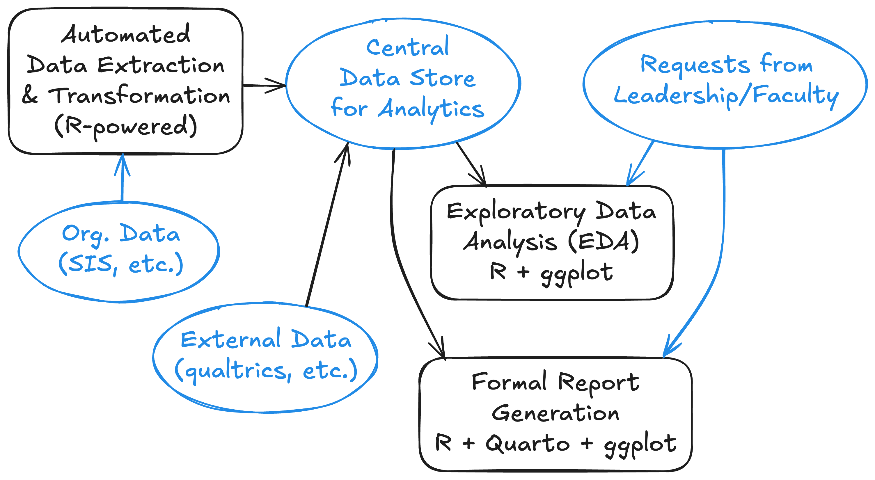
Black boxes & lines are R-powered activities.
Notes
- I want to emphasize that this work, as is all work on graphics (whether in Excel or R or whatever), is done in a broader context.
- The data is captured by organizational IT systems related to tuition, student services, admissions, etc.
- Then its transformed and loaded into a form that can be analyzed
- Requests come in from leadership & faculty for either
- Formal reports or
- To look into a question that they have
3 Demo #1: Quick graphs for a Survey
3.1 The Fake Survey Data
- Wrote a program to create it (it’s all made up!)
- The process (all handled with a script combining
Rand markdown created withinRStudio)- Import the data
- Transform the data
- Create some graphs
- My script that prepares data to be manipulated:
manipulate-survey.qmd
Notes
- We’re going to look at a bunch of graphs
- They’re all based on fake data!
- I wrote a program that generated megabytes of data, and we’re using a small slice of it
- Behind the scenes, I am importing the data and transforming the data for analysis
- For the rest of this session we’re going to look at graphs to understand how R approaches this work
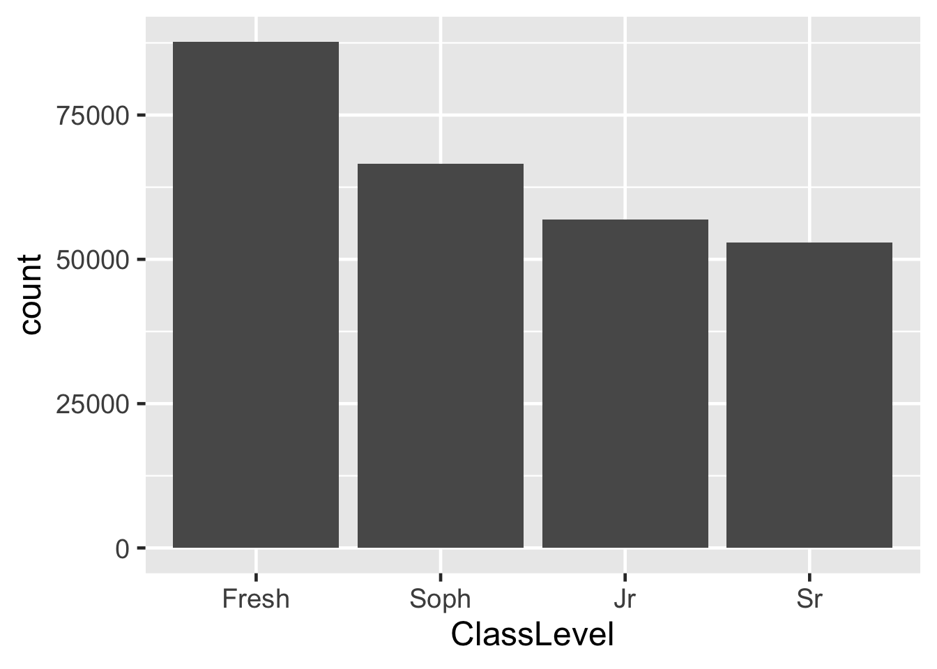
3.2 Vertical bar graph
Notes
- Explain how to read the command
- data
- survey
- ClassLevel
- pipe
- aesthetics
- geometry (a histogram showing the distribution of a single variable, in this case)
- data
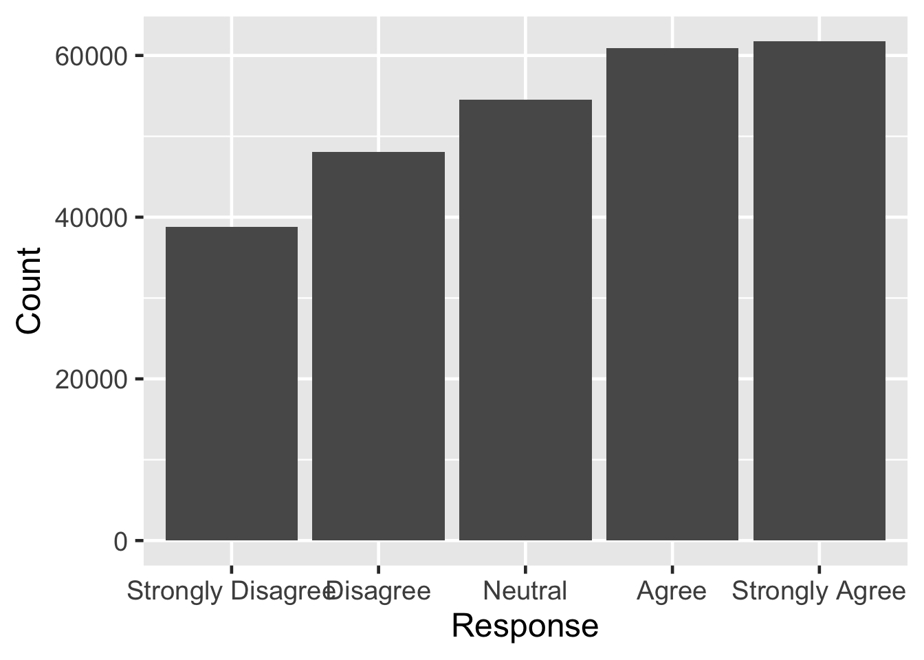
3.3 Vertical Bar (every response)
Notes
- Here, we have a
columnchart in which we have to specify the height of the bar - x: the categories (individual bars)
- y: the height of those bars
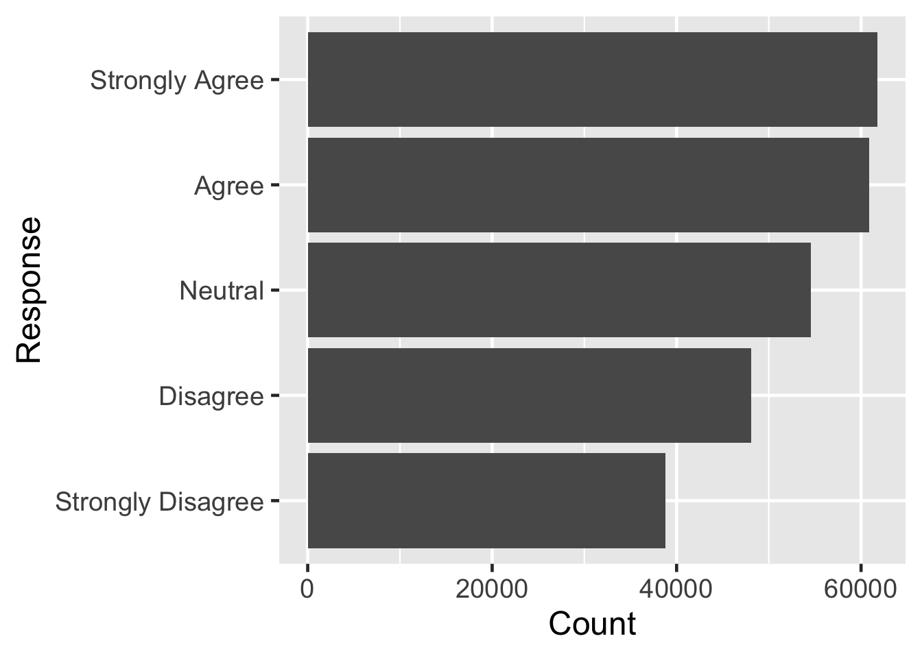
3.4 Bar (every response)
Notes
- The only change here is that we have swapped the
xandyvalues.
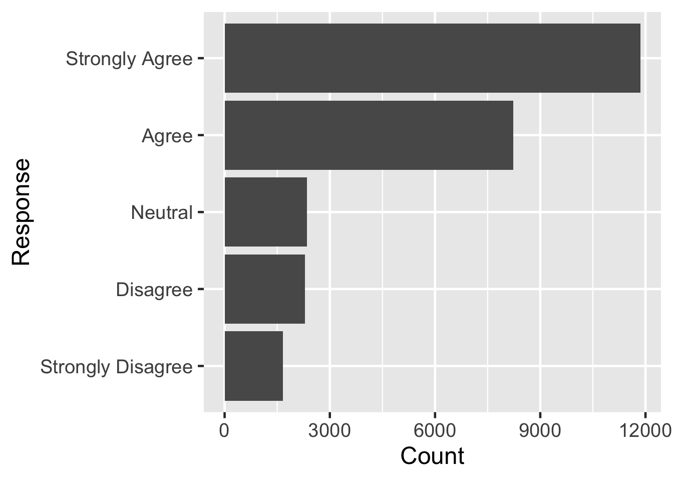
3.5 Bar (one question)
Notes
- Here, we are graphing information for just one of the questions.
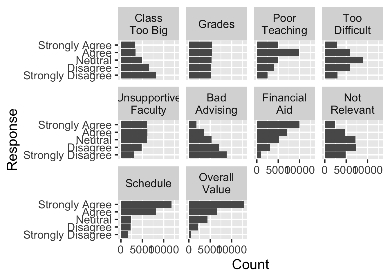
3.6 Faceted bar (each question)
Notes
- This is exactly the same command as the previous one, except we have told it to create a separate graph for each question.
- These are called facets
3.7 Side-by-side bar
surveyQRN |>
  ggplot(aes(x = Question, y = Count, fill = Response)) +
    geom_col(position = "dodge", color="black", linewidth=0.25) +
  scale_x_discrete(guide = guide_axis(angle=45))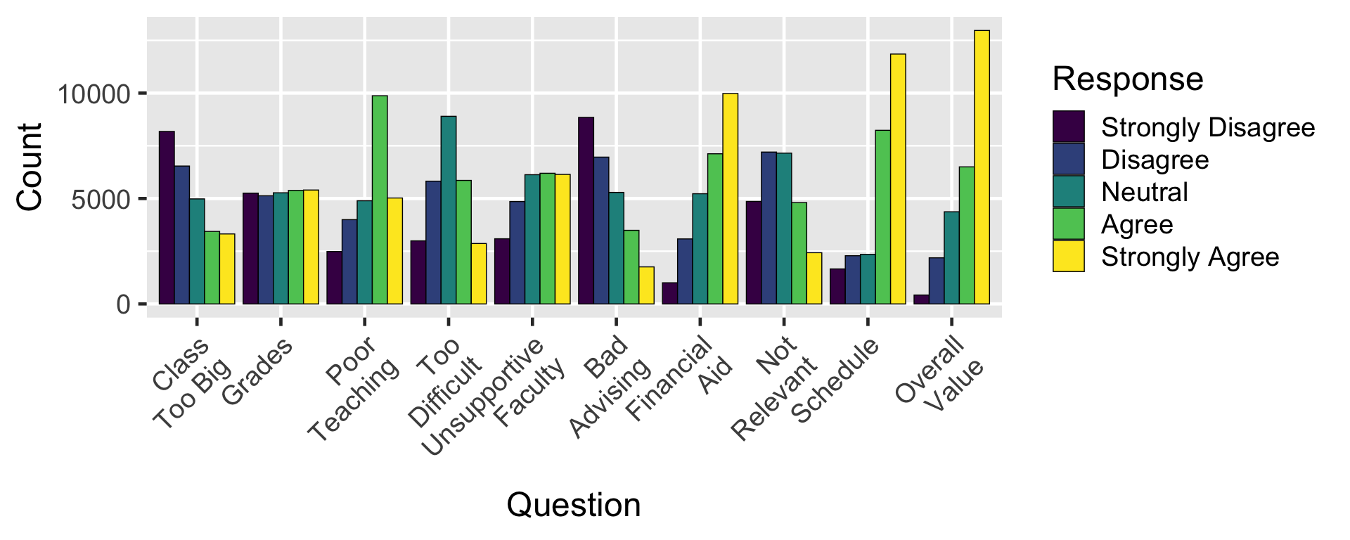
Notes
- The only change here is that
fillis used instead of afacetto show the information. + scale_x_discrete(guide = guide_axis(angle = 45)), color="black", linewidth=0.25
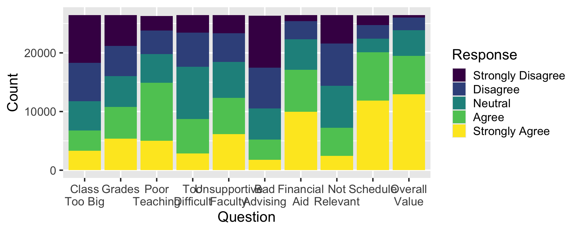
3.8 Stacked bar
Notes
- And, here, the bars are stacked instead of side-by-side.
- Notice, in all of these, we just told R what to display but not how to draw it.
- It figured out all the details.
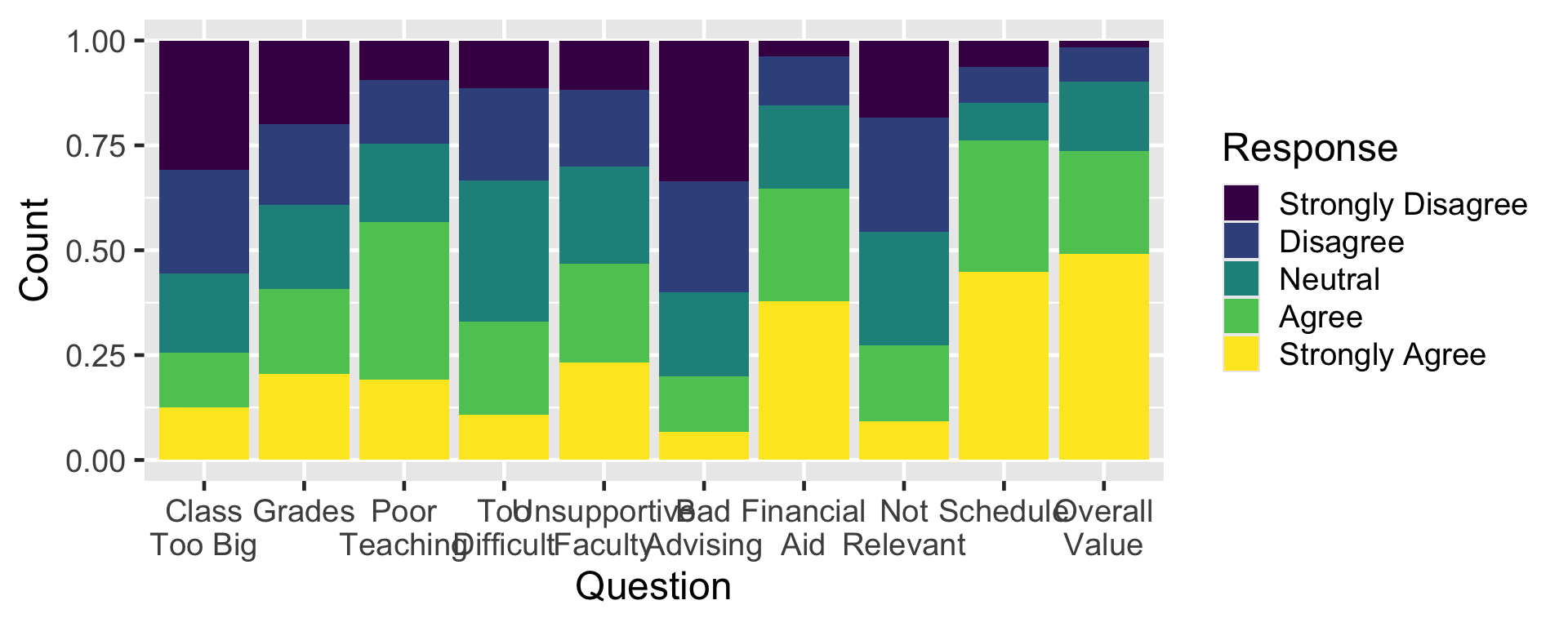
3.9 Normalized bar
Notes
- And, here, the bars are stacked instead of side-by-side.
- Notice, in all of these, we just told R what to display but not how to draw it.
- It figured out all the details.
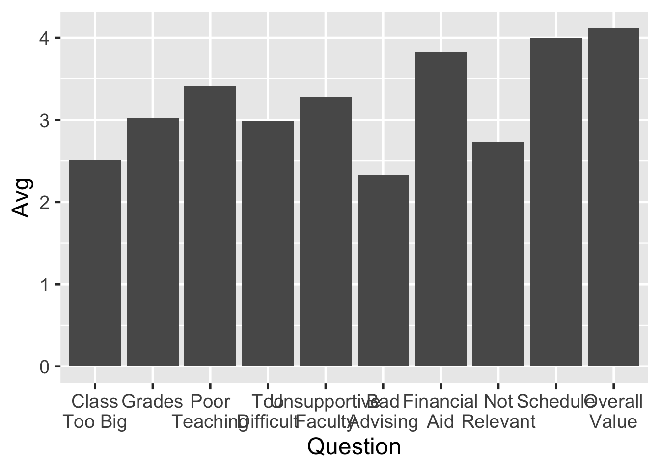
3.10 Bar (new statistic: average)
Notes
- We’re using the same data here, but now we’re displaying a new statistic.
- It’s the same
geom_colthat we’ve been using, but theyvalue is different.
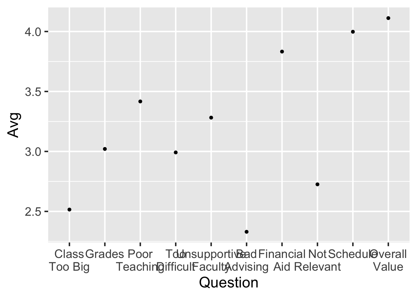
3.11 Point (averages)
Notes
- We can also use a point plot.
- Notice that the
yaxis values changed.
3.12 Point + Text
surveyQAvg |>
  ggplot(aes(x = Question, y = Avg)) +
geom_point() +
geom_text(aes(label = sprintf("%1.2f", Avg),
y = Avg + 0.07))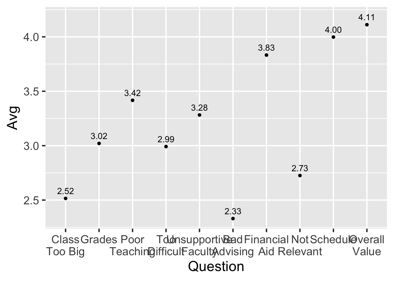
Notes
- Here we are combining two plots, a point and a text plot.
- I found it shocking that you could do this.
- Having been trained on Excel, when I was learning to plot point, I wanted to plot the values next to it (as shown here). So I was looking for the optional value in the point plot to say “print out the value when plotting”…but R already knows how to do it with the
textplot.
4 Demo #2: Quick graphs for Student Information
Notes
- I want to show you a few different types of plots that have decimal (real) numbers.
- We’re going to be looking at more fake data.
- This has to do with data that’s gathered during the admissions process — things like race, sex, per capita income, SAT scores.
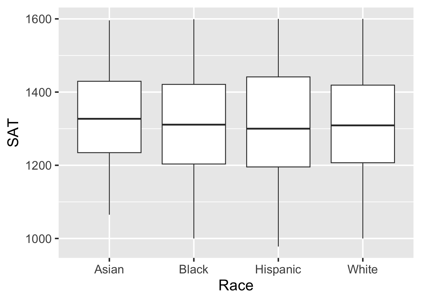
4.1 Box plot
Notes
- This is a box plot showing statistics related to the distribution of SAT scores for applicants of each race.
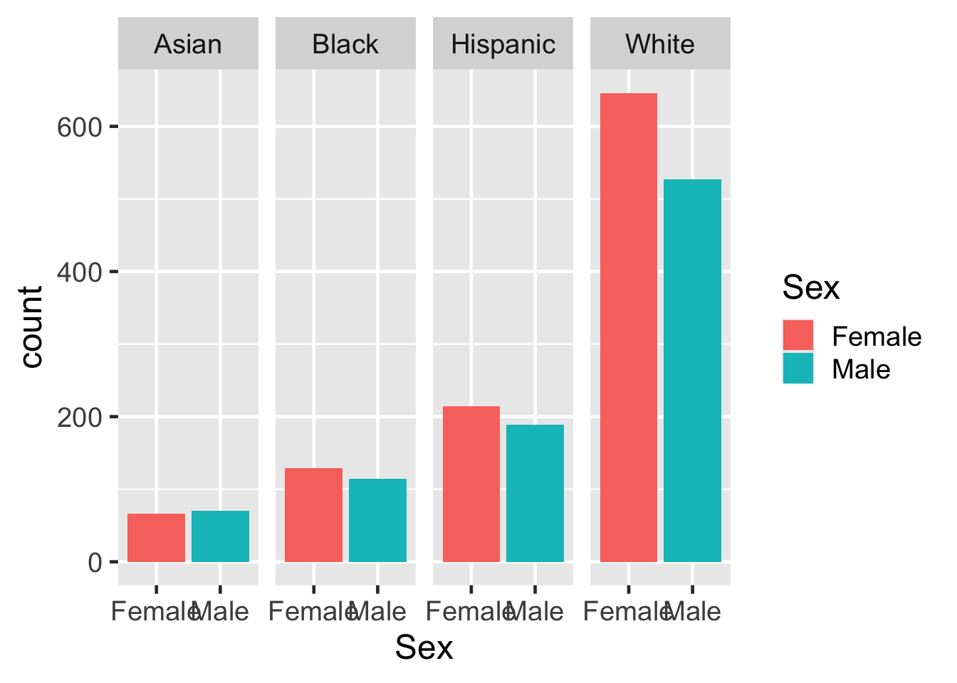
4.2 Faceted bar graph
Notes
- This bar chart shows the mix of gender and race in the applicant pool.
- Notice that we have colored the bars based on gender.
4.3 Box with Point plot
student_econ |>
  ggplot(aes(Race, SAT)) +
    geom_point(aes(size = PCI20, color = Sex)) +
    geom_boxplot(fill = NA, color = "black", varwidth = TRUE)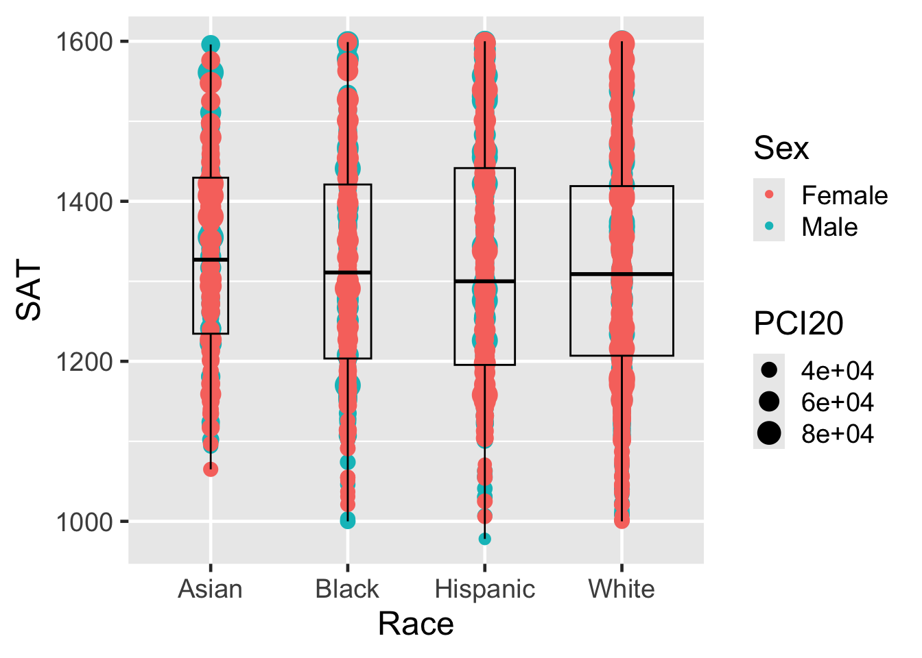
Notes
- Here we are trying to see the distribution of actual applicants in the range of values.
- But the values are being plotted over each other so it’s hard to see.
4.4 Box with Point/alpha plot
student_econ |>
  ggplot(aes(Race, SAT)) +
    geom_point(aes(size = PCI20, color = Sex), alpha = 0.25) +
    geom_boxplot(fill = NA, color = "black", varwidth = TRUE)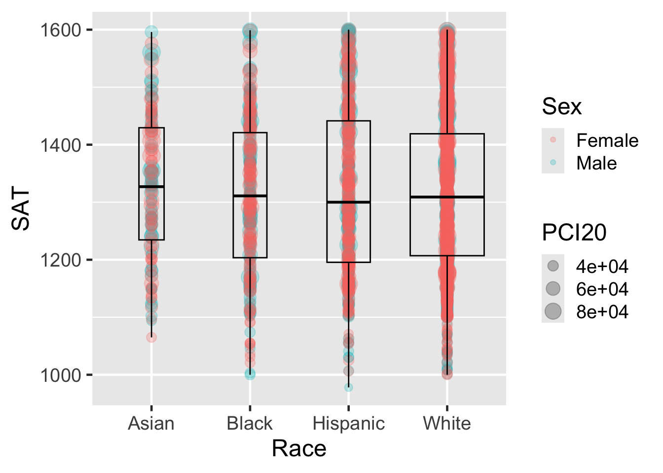
Notes
- I’ve only added the
alphasetting. It makes the points tranlucent so that more values plotted in the same position would look darker. - There are just too many points.
4.5 Box plot with Jitter plot
student_econ |>
  ggplot(aes(Race, SAT)) +
    geom_jitter(aes(size = PCI20, color = Sex),
               alpha = 0.25, width = 0.25) +
    geom_boxplot(fill = NA, color = "black", varwidth = TRUE)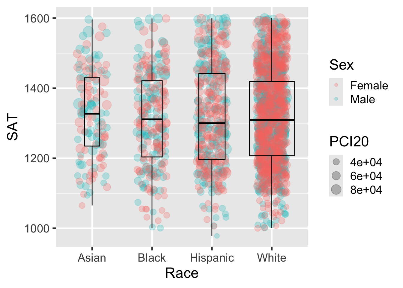
Notes
- Instead of
point, I’m usingjitterwhich keeps theyvalue the same for each point but slightly jitters thexvalue so that the plots aren’t placed on top of each other so easily.
4.6 Scatter plot with Regression
admitdata |>
  ggplot(aes(x = HSGPA, y = UnivGPA, color = Gender)) +
    facet_wrap(~ProbableMajorType) +
    geom_point(alpha = 0.2) +
    geom_smooth(method = "gam", alpha = 1.0)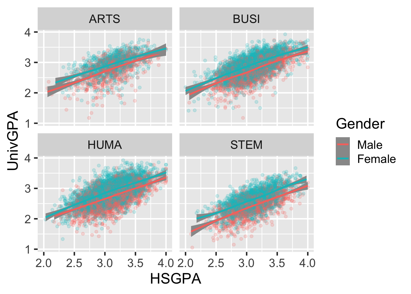
Notes
- We have two plots here
- One is a scatter plot of HS GPA versus university GPA.
- Then I tell R to plot a regression line, separate for each gender.
- It calculates all of the values as needed (including the confidence interval).
5 Demo #3: Beautiful graphs
Notes
- There are two different approaches to building a graph in R.
- One is what we’ve been looking at — an exploratory approach, where you’re looking for patterns in the data.
- The other is the beautiful, detailed, designed version for formal reports and presentations.
- I’m just going to give the barest of introductions here.
- As you’ll see, it builds on what we’ve done so far.
5.1 Defining a graph

# The structure of an R/tidyverse ggplot specification
dataframename |>
ggplot(aes(X)) +
facet_Z(column-info) +
geom_Y(optional-stuff) +
labs(...) +
scale_x_continuous/discrete(...) +
scale_y_continuous/discrete(...)
theme_A() +
scale_fill/color_B(specification)- 1
- Gather data
- 2
- Build the easel
- 3
- Paint
- 4
- Construct the frame
- 5
- Refine
Notes
- This is an overview of the process that you’ll go through when describing your graph for
R. - We’ve already worked through the first three stages.
- Now we’re going to see what
Rcan do for us when we start telling it about the frame (the axes, legends, labels, etc.) and then refining it with themes (colors, fonts, etc.) - These last two steps are optional, but they’re always there for you to modify as needed.
- And once you do it, you won’t have to do it again when the data changes.
5.2 Detailed distribution of grades
Code
admitdata |>
  ggplot(aes(Gender, UnivGPA)) +
    stat_halfeye(aes(fill = Gender),
                  adjust = 0.5, width = 0.3,
                  .width = 0, alpha = 0.5,
                  justification = -0.3, point_color = NA) +
    stat_dots(aes(slab_color = Gender),
              side = "left", scale = 0.7) +
    geom_boxplot(width = 0.1, outlier.shape = NA,
                 fill = "darkgrey") +
    facet_wrap(~IPEDSRaceEthnicity, ncol = 4) +
    labs(title = "Distribution of GPAs at Graduation by Gender by Race",
         subtitle = "For admits from Fall 2013 to Spring 2019",
         x = element_blank(),
         y = "University GPA",
         fill = element_blank(),
         slab_color = element_blank()) +
    scale_y_continuous(limits = c(1.0, 4.0),
                       breaks = c(1.0, 2.0, 3.0, 4.0),
                       labels = c("1.0", "2.0",
                                  "3.0", "4.0")) +
    theme_economist() +
    scale_colour_economist()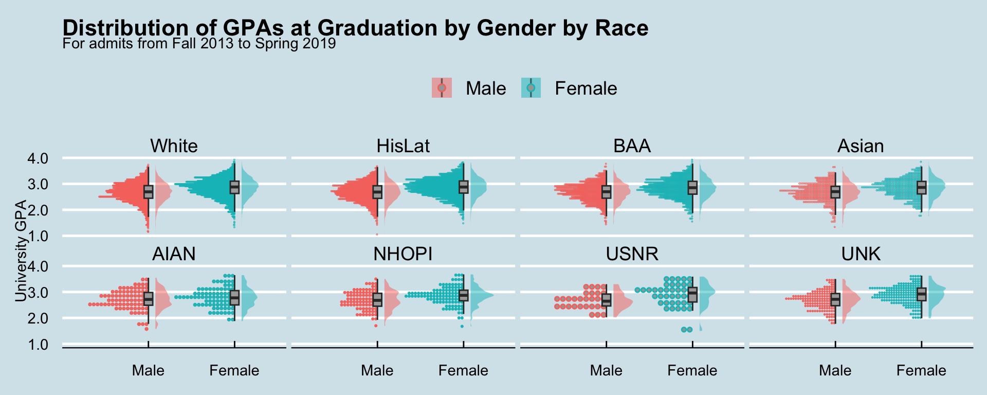
Theme: economist
Notes
- This shows three different ways of looking at a distribution of values
- A boxplot
- A smoothed distribution
- And individual plotting of values
- This uses the
economisttheme that someone defined to get the look of The Economist
5.3 Hex plot (theme: 538)
Code
student_activity |>
  ggplot(aes(x = hs_gpa, y = univ_gpa)) +
    geom_hex() +
    geom_smooth(method = "lm", alpha = 1.0)+
    labs(title = "University GPA by HS GPA",
         subtitle = "For admits from Fall 2013 to Spring 2019",
         x = "HS GPA",
         y = "GPA at graduation") +
    scale_y_continuous(limits = c(1.0, 4.0),
                       breaks = c(1.0, 2.0, 3.0, 4.0),
                       labels = c("1.0", "2.0",
                                  "3.0", "4.0")) +
    scale_x_continuous(limits = c(2.0, 4.0),
                       breaks = c(2.0, 2.5, 3.0, 3.5, 4.0),
                       labels = c("2.0", "2.5",
                                  "3.0", "3.5", "4.0")) +
    scale_fill_distiller(palette = "GnBu",
                         direction = 1,
                         name = "Count") +
    theme_fivethirtyeight()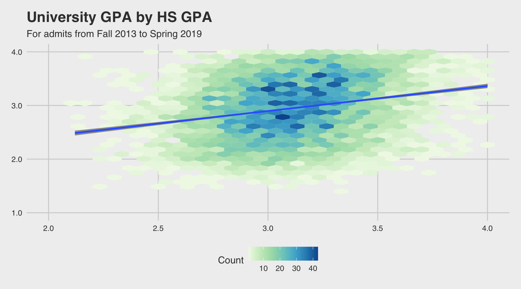
Notes
- This is another way of showing a correlation between two real-valued variables.
- Darker values mean that more points were plotted in that area.
- It’s plotted using the style of the
538web site which deals with lots of data.
5.4 Stacked bar (theme: minimal)
Code
surveycalc |>
  ggplot(aes(Question, y = n,
             fill=forcats::fct_rev(Response))) +
    geom_bar(stat = "identity", color="black") +
    geom_label(aes(label = str_c(sprintf("%1.1f",
                                         percent * 100),
                                 "%",
                                 sep = "")),
               position = position_stack(vjust = 0.5),
               fill = "black",
               color = "white", fontface = "bold",
               size = 3.5) +
    labs(title = "Number of responses per question",
         subtitle = "For all years",
         x = "Question",
         y = "Number of each response",
         fill = "Response") +
    scale_y_continuous(limits = c(0, 30000),
                       breaks = c(0, 5000, 10000,
                                  15000, 20000,
                                  25000, 30000),
                       labels = c("0", "5k", "10k",
                                  "15k", "20k",
                                  "25k", "30k")) +
    scale_x_discrete(guide = guide_axis(angle = 45)) +
    theme_minimal() +
    theme(panel.grid.major.x = element_blank()) +
    scale_fill_brewer(palette = "PuBu", direction=-1)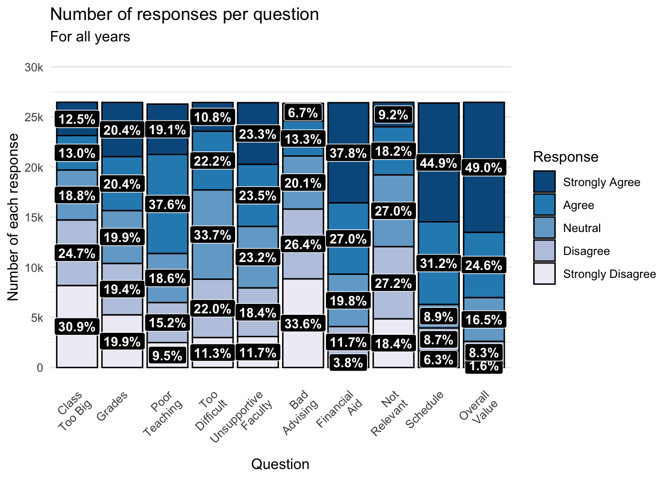
Notes
- Nothing fancy here — just a combined plot showing actual counts on the
yaxis, percentage counts of each response, and values plotted directly on the graph. - This uses the
minimaltheme.
5.5 Labelled bar graph (stata)
Code
surveyQAvg |>
  ggplot(aes(x = fct_reorder(Question, Avg, .desc = TRUE),
             Avg)) +
    geom_col(alpha = 0.8, fill = "darkgrey", color = "black") +
    geom_text(aes(label = sprintf("%1.2f", Avg),
                  y = Avg + 0.17),
              size = 4, color = "black") +
    labs(title = "Average response per Survey Question (in descending order)",
         subtitle = "For all years",
         x = "Question",
         y = "Average score") +
    scale_y_continuous(limits = c(0, 5),
                       breaks = c(1, 2, 3, 4, 5),
                       labels = c("1.0", "2.0",
                                  "3.0", "4.0", "5.0")) +
    scale_x_discrete(guide = guide_axis(angle = 45)) +
    theme_stata(base_size=14)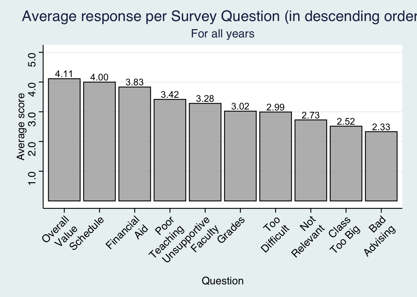
Notes
- Our final graph shows the same bar graph that we’ve shown before, but we have sorted the bars by height.
- We have also printed the values of the height of the graph just above the bar.
- We use the
statatheme which copies the look of graphs produced by that program.
6 Other uses of graphs
6.1 Exporting a graph
- You can export these graphs for use in other programs (
png,jpeg,pdf). - The command below always exports the most recently created graph to a file.
The graph:
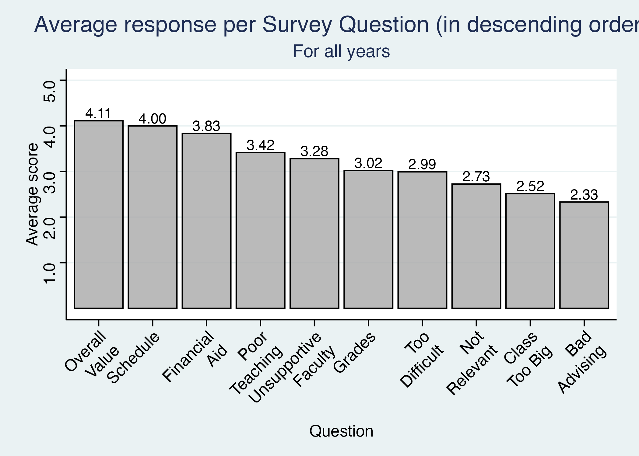
Just what it says on the chart.
6.2 Creating formatted documents
- Formatted reports (see
ggplot-presentation.pdf)- Can have whatever text, graphics, calculations that you like
- No copying and pasting; it’s all in one document
- Presentations (this very presentation)
- Web sites (the whole rforir.com site)
Notes
- All of this can be integrated into presentation works quite naturally.
- Show the
ggplot-report.pdffile. - Mention that this presentation was created in the same way that the report was created.
7 Summary
7.1 Demonstrated ggplot benefits
- Flexibility
- Support for experimentation, exploration, and formal reports & presentations
- Automation
- Advanced customization
- Integration with overall data workflow
7.2 Call To Action
- Support for Adoption for IR professionals:
- Communities of Practice (ThIRsdays)
- Resources (rforir.com)
- Courses (at Furman).
- Start Small: Try
Rwith one report. Use it to demonstrate time savings and improvements in quality. - Resources Are Available:
R,ggplot, andQuartoare open-source and free. Essentially risk-free to try.
Notes
- Here’s my call to action for you
-
- You can start small. This software is all free.
- Lots and lots of resources and classes exist to support your learning journey.
- Track the benefits for yourself and the organization.
- Closing thought
-
The (free) tools are out there, waiting to make your work faster, more transparent, and more impactful. Take the first step, and soon you’ll wonder how you managed without them.
